
After a recent trip abroad, I was excited to go through and process my images. I came across an image that I felt looked great in both color and black and white. Unsure of what to do, I started questioning the criteria that I use to determine if a photo should be left in color or converted to black and white. In the process, I decided to ask my colleagues and came up with a guide.
Granted, the end decision is personal and subjective, it was interesting to hear what other photographers do when deciding on what direction to go and what guidelines they use to get to that decision. I expected to find a few obvious answers, but a majority of the answers were really interesting to read.
In sum, here are some points echoed by many people:
1. If color plays no importance for the strength of the image, it should be in black and white.
2. A black and white image typically portrays emotions better over a color one.
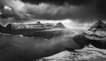
3. A stronger tonal contrast sets itself up well for a black and white image. It allows you to fill in the rest of the blanks with your mind.
4. Color should add a point of visual interest through the image, enhancing upon what is there.
5. If the colors cannot be saved, such as strong casts, the fallback is converting it to black and white.
Here are some great answers in specific from photographers who chimed in:
Troy D. Davidson – Black and white allows my mind to fill in the blanks and find a deeper level of seeing.
Keri Luke Campbell - I look at the pre-existing colour content and then consider what the most effective way of getting the emotional response I want out of the observer is. I view colour is a function. Hue adds character and it adds a sense of tone-dependent playfulness, this is very apparent if a scene is naturally very colourful. In Grayscale images there is less visual information for the viewer to deal with and so it's a good way to get people to focus in on a single aspect of a scene. In this instance, the the less visual information, the more striking a scene appears to be with a low range of colour. Subsequently colour images with a high range of colour appear to be striking also. It's a personal judgment and with infinite colour combinations and contrasts, there are no concrete rules. This is just a part of my modus operandi.
Chris Zupo - I believe the determining factor comes in to play when you have to decide between conveying an image, or a feeling. Black and white inherently seems to hold more feeling than color, maybe it's the classic imagery behind black and white and that old world feel, or the ability to play stronger contrast than you can't with color.
Ian Woo - Did the event planners or wedding decorators overdo it with magenta LED lights? Black and white. (full response)
Ruben Vasquez - For me it depends on which will have the greater impact. An image rich in detail and contrast that color doesn't add to will likely be converted to b&w. Color is exemplary at evoking mood so images like sunsets or fashion images bursting colors will remain with its color intact.
Michael Beckerman - You process to B+W when the form, shape and lines of an image are the primary elements that are telling the visual story. You process to color when the hues, tones and shades, and how they interact, are the primary elements that are telling the visual story. Simple as that.
Krunoslav Stifter - “When you photograph people in color, you photograph their clothes. But when you photograph people in Black and white, you photograph their souls!” ― Ted Grant (full response)
Tyler Smith - The composition principle of figure and ground relationship.
The lack of color in a B&W image means reduced complexity and thus emphasizes subject matter without your brain having to spend those micro seconds assessing what is the subject.
A strong figure to ground element where the subject is light and the background dark (for example) can result in almost instant subject recognition, as well as secondary focal point if present as well. The greater the contrast, the greater the emphasis.
__
There were so many incredible answers, you can see the rest of them here and here.
I'd like to hear from you. In your opinion, what do you use to determine if a photo should be kept in color or converted to black and white?


Im finding lately that B&W is working better for me personally. It takes alot of the need for color correction out of the equation. That and the fact that I am color blind to certain shades, I dont have to have my GF proof the images before I hit the save button....lol
Being color blind should be added to that list!
Im finding too that you can make an image 'pop' more in B&W by adding contrast to the focal point of the image, and in color, it wouldnt be as predominate or stand out as it does in B&W
B&W Should be a destination, not a fallback...
You should have in mind what it is when you shoot it. If you can't do that, get a roll of each and force yourself to think the way you're shooting.
Ex, put a roll of colour in and force yourself to create/compose for colour. Also do the same with black and white.
that sounds nice in theory, but take for instance a person shooting an event of some kind, where there are changing colours throughout the scene. Black and white is a great fallback for saving what can otherwise be photos with really ugly colour casts.
In my opinon people use black in white way to much. Id rather see a photo where the color is spot on than black and white....we live in a world with color why make it dull?....black and white is cool if you are shooting film.
"2. A black and white image typically portrays emotions better over a color one."
There is a area of thought that says the opposite is true-- that black and white strips back the emotional influence of color and abstracts real life just enough that you have to process it on a more intellectual level (subconsciously, of course). This is the reason that it is often believed that B&W has more of an impact. The abstract nature (it doesn't look like reality, and it is stripped back somewhat) forces most viewers to actually engage with the photo, rather than using the immediate impact of color to clue them in to the photos emotional content.
New rule: Don't post the exact same photo in color and b&w on FB please.
Can we add dont post pics of your shoes? Just because it was processed through instagram dont make it art.
what about food photography...that's where instagram shines. Just add a ton of filters and BAM art.
somebody just exhibited high-def huge prints of a-holes, i can stand shoes and usual selfies after that.
I do this... people seem to like it. Haven't heard any negative feedback on it.
"If color plays no importance for the strength of the image, it SHOULD be in black and white."
What?!
I dont think it can be called a fact or a standard.
Sometimes B&W can ruin an otherwise good image, like when there is not much tonal contrast.
Interesting perspective. Not long ago, I put a similar, but not identical, view in my blog at http://karlshreeves.zenfolio.com/blog/2013/9/the-purity-of-black-and-white.
I shoot everything in black and white and only go back and make it color if there is some compelling reason to. I shoot RAW + JPEG, with the jpeg set to black and white in camera.
Interesting opinions on this. Completely agree with Tyler about figure-ground and reduced complexity. Thanks for sharing this Pratik.
There is another layer to this discussion. Much of this article focuses on the decision to go with color or not; one image at a time. However, what if we are talking about a group of images; like shooting an event? If all the photos have the same color it can be monotonous to view all of these photos side-by-side. The same could be said if all of the photos are b&w. I call it "album viewing fatigue".
For example, let's say that I shoot at event and that all of the photos look good in color or b&w (hypothetically speaking). I have a rough formula in my head that seams to work: I leave most of the photos in color and then I will convert some to b&w simply to break up the repetition (roughly 10-15% of the total photos). Next, I am careful to pay attention to groupings within the album order. I space out my b&w images so that they are not viewed all at once. Therefore the viewer is forced to look at a b&w photo statistically and every so often.
Bottom line: I agree with this article. Many images demand that you remove the color based on the individual photo structure to give it that timeless element. However, sometimes the decision to "go color" or not, is also multi-image related and not solely based on the merits of the individual photo.
My two rules are simpler: Black & White is cheating. Don't cheat unless you have to.
could you explain why B&W is cheating?
Yes I could. Can you imagine why?
Yes. Could you imagine why?
Not really that's why I took the time to ask you.
This is a process which I am struggling with at the moment! I often find myself converting to black & white just because it gives me a feeling of accomplishment with my composition. Colors are distracting from the essence of the photo at hand. But i'm wondering if it's not just the lack of skills with editing colors that push me towards that direction. So my workflow at the moment is to get the best color editing possible before converting to black & white.