
In just about every video I edit, during my last or second to last round of revisions I find myself having to add titles, credits, name graphics (lower thirds), and one or two other pieces of text to help explain and give context to the video. Here are my go-to techniques for cranking out decent looking graphics both quickly and efficiently.
It absolutely helps if you have some taken some basic classes in graphic design. Not just a course in how to use a piece of software, but actually studied design principles. I won’t get into those here, but I will just say that as an editor, you will make yourself more marketable and better at what you do, if you can take the time to learn about graphic design principles, typography, layout, and basic color theory. Online courses, community colleges, or even some reading on your own time can help round out your skill set.
The most often-created text graphics are lower thirds, AKA name keys, AKA name straps, AKA title cards, and I’m sure there are other names for them. It’s basically the text that identifies a person and their job title, and it is typically placed in the lower third of the video frame. For this article, I’ll focus mostly on those, but the strategies I share should be able to be applied on any other text-based graphics.
So let's get to it. First two things I do when it's hired work:
Look to your client’s brand
Some clients may have an established visual identity, and if you’re lucky, published identity standards. These can include specific colors, (noted in RGB and CMYK, maybe even PANTONE) recommended typefaces, and logo files. If you can’t find them online, email your client. Sticking to a design style that mimics their brand is an easy slam dunk.
In this industrial promo video, the client shared their identity guide with me and I was able to use the exact typefaces it outlined. (Funny enough, often times I have to ask for these, they aren’t provided.) Jump ahead to 1:40 and 2:04 to see these relatively basic titles, but smartly made with a client-supplied typeface.
Look at previous projects your client has produced
Sometimes my clients have a library of videos that other agencies or in-house editors have created. By referencing those, I can see what has been used previously, and get an idea of what they might like. Use your best judgment though, as these won’t always be good! A quick email is usually all it takes to find out the specific font or other style details that they might use on a regular basis.
So if there is no specific identity to adhere to, and they don’t have any previous videos that had graphics you want to mimic, it’s now up to you.
Sktech it out, especially for multiple graphics
During a project edit where I will need to create 4-5 lower thirds, an opening title graphic, and maybe even a closing credit roll, I find it very helpful to sketch out on paper all of these different assets. It allows me to see the “big picture” and make sure whatever style or layout I might want to use, can indeed work for ALL the graphics I create. Consistency is key.
By roughing out title graphics on paper, I can very quickly get an idea of scale, placement, and alignment, while also considering changes to the copy (if you have that much editorial freedom).
Adjust the video instead of the text
Making text readable is as important as making it look good. I mean, if the audience can’t read it, then what is the point? When you have moving images behind thin lines of text, you’ve got to make sure it can still be easily read.
Instead of picking oversized, bold fonts, sometimes I’ll add effects over my video. I’m typically using white or lighter colored text, so my goal is to darken the area behind the text in one or several of the following ways.
- Creating a black oval behind the text, feathering the edges, dropping the opacity down to about 10-25% while experimenting with blending modes like overlay and soft light.
- Adding a vignette to the video so the frame edges gradually get darker the closer your eye gets to the edge.

- Placing a gradient over the video that goes from 0% over the subject, to about 15-25% from the area where the text is to the edge of the frame it is closest to. This works especially well for location titles that sit right on the bottom of the frame.
- Use a color corrector or curves adjustment to darken certain tones in your video if the text will be sitting over a particular area light/dark.
- Blurs can help make your text stand out tremendously. Local blurring or vingette blurs can both work.
By using one or all of these techniques I am able to build a subtle separation and increase contrast, thereby making the text easier to read. In the video below, the text was difficult to read over the opening timelapse clip, so I ended up blurring the clip, then lowering the highlights and midtones with a curves adjustment to make it readable.
What kind of font or typeface should I choose?
There are so many different typefaces out there, it can be overwhelming to pick the right one. Again, doing a little research about typography can go a long way to guiding you. If nothing else, you will learn what NOT to use. coughCOMIC SANScough!
VERY generally speaking, it is good practice pick a readable font that has proper bold and italic variations. A collection with varied widths and levels of thickness is even better. A great place to start is to pick fonts that have a style that is reflective of the content or theme of your project. This is why a lot of wedding video graphics have long, flowing characters from script-style typefaces– their elegance and high class can be attributed to the elegance of a beauty of a wedding.
It can make your decisions easier if you start with a style first, then look at a few font optionss that exhibit that style, so you’re choosing between just a few instead of a few hundred. On a Mac, use your Font Book app to preview what a certain name or word looks like in a particular typeface.

Don’t forget that there are plenty of free (and paid) fonts out there! If you don’t like anything you see in your editing app, it might be time to get a few new typefaces. Here are a few places to start:
To ensure your text can be read, try adding a very slight drop shadow or outline to the it. Yes, a thick shadow or outline would make the text pop easily, but harsh drop shadows or strokes around type usually look like garbage. Make them soft and semi-transparent.
I'm guilty of doing it sometimes, but I would recommend avoiding using typefaces that have serifs on them. You can get away with serifs on text when the background is really dark or you’re using large graphics, but I try to stay away from them since they tend to get a little lost after video compression and when viewing them in a small, web-based viewer. Fonts that have thin strokes, like oldstyle, modern, or script typefaces are also subject to this problem, so I’d avoid those as well for small graphics on small screen platforms.
Use colors, elements, and other cues from the video to inspire design
Coming up with shape elements, colors, motion stlyes, and more on your own can be fun on some projects and a nightmare on others. Dammit Jim, I’m a video editor, not an illustrator.
When given the creative freedom to build a series of text graphics, and you want to make them something other than white, static text over black (which I do all the time and can look just fine!) it can be a challenge to come up with something that works.
Next time you need a color pallette that might offer something interesting, look at your source video. Are there any dominant themes in terms of either subject matter or visuals? For example, an edit on recycling or green technology, using green or blue in your graphics is a no-brainer. By analyzing the content of your project, you can make creative decisions that reflect and enhance it.
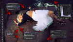
In a soon to be released edit I did for RGG EDU, the crew had matching outfits that included red hats and neon orange shoes. I color matched these items and used it as a tone for the shape colors. In the frames below, note the color reference in the first screenshot, then the subsequent graphics I made based off of that color sample.


In the edit below, I initially wanted to use a mardi gras color pallete (since the shoot took place in New Orleans) but it looked too gaudy. So, I used a color combination from a local sports team, the Saints.

Want to animate your graphics? The possibilities are endless, but here is what I look to.
Do a slider move… on your text
Add two position keyframes on your text and make it move slowly in one direction. It’s an easy way to add a nice touch of movement, which activates the frame much more than just having a static block of text.
Templates and pre-loaded motions
After Effects and Motion both have pre-made animations specifically for text graphics. They aren’t designs, but rather creative ways to transition your text on and off the screen. Some are silly, some are obnoxious, but others can add that slight touch of complexity or elegance that can sometimes be perfect. If you own either of those programs, look through the animations and see what you like.
You can also buy templates if needed. These are elaborate animated pieces, but often they have a nice aesthetic to the text style and layout. Purchasing these templates will provide you with the text file as well the project files to extract and use just the parts you want. Here are some places to check out for those:
Build your graphics in a smart way
Some software will allow you to build your own templates (Motion 5 and FCX) so that all you need to do is plug in the name and title, and all of the other style parameters are set. When making 15-20 title graphics, this can be a time saver.
Premiere can make its own text templates, so that you don’t have to set the style each and every time, so for simple text graphics where I will be making more than four or five lower thirds, I’ll make a custom name template for that project.
As much as I like After Effects, I’ve found it more useful to create titles in Motion. I create each title in separate group/layers, that way if my client decides they don’t like the font or color I’ve chosen, I can select all of them text layers and make one change to affect them all. I will still need to export each one, but I still find that to be faster than changing styles in After Effects to each layer, one at a time.
When all else fails, use the KISS method
Keep it simple, stupid. In many cases I don’t have the time (meaning clients don’t have the budget or I have a quickly approaching deadline) to experiment with different graphic styles for the text and create elaborate motions.
I would guess that more than half of the text graphics I create end up being lower thirds with very simple white text, with the name about twice as large as the title. I stack them, left align them, and I’m done. I'll add add a few of the video adjustments noted above, and maybe a slight move to add a bit more energy into it, but generally speaking it is efficient and the client is fine with it. For most documentary and promotional videos, the goal should be to inform and enhance if possible, while never distracting.
What have some of you found to be helpful for you when making text graphics? Do them yourself? Hire them out? Share your tips with others in the comments below.


Steve Zissou hats make everything better.
lovely