
Generally speaking, losing detail in your image is a bad thing. However, there is a creative way to do so that is most commonly employed in cinematography, known as "crushing the blacks." I alluded to this technique in my recent article on creating your first Photoshop actions and I received a number of queries about this technique. This article will give you a brief overview of what the effect is used for, why you would use it, and how.
What Is It and Why Would I Use It?
There are only really a few constants in elucidating this technique, and that is you're making the image flatter and you're altering the shadows. There's variations in how this process is performed and to what extent, but you will always lose detail in your shadows. This has many drawbacks and it certainly doesn't fit every image, but it can overcome obstacles and has worth in other areas too. For example, in cinematography it is often used to remove unwanted noise in the shadows; this applies to photography too. By removing the contrast in the shadows you're reducing the noise as well as the detail. This is a consideration of mine, but my primary motivation for using it when I choose to is that it can help your subject "pop" from the background. It is also part of, if not the entirety of, a look that has been popularized by Instagram, old film, and VSCO to name a few. Many of the filters and action sets that mimic any sort of film will crush the blacks to some degree or another. Let's get to some examples and how to use the technique in Photoshop (though this is achievable in Lightroom and other editing software). It is particularly effective in low-key images or images with a large dynamic range or high contrast.
How Do I Use It?
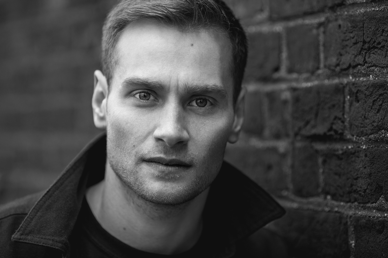
Although it depends on the image, I tend to crush the blacks in two different ways. The first, I create a curves adjustment layer, I click the shadow point in the bottom left and I change the values of the input and output to 15 each. This is the lighter and less invasive method. The alternative is a little more heavy-handed and I almost never leave the opacity at 100% when I employ it. You raise the shadows to whatever output value suits you; I tend to find 15 again to be in the right region. You then create a new point along the curve in the slightly brighter shadows and lower it, again until you find the look you're after. This is almost always then followed by raising the midtones back to their original state or marginally darker. It may be to some people's tastes as it is darker and moodier, but it rare fits my editing aims. Let's use a quick headshot I took of actor Joe Hughes as an example. Here's before any curves adjustment layers have been applied:

Here are the two different methods I use for crushing the blacks, side by side.


In this case I would (and did) opt for the lighter method and then almost always mask out the subject of the image. Whether I'm working on products or people, a loss of detail and contrast is unwanted. Here is a larger resolution version of before crushing the blacks and after.

The shadows in this image were not at all problematic because the original straight-out-of-camera file was well-lit, but even here you can see it removes some of the ugliness that hides in the darkest parts of images:


Crushing the blacks could be used for noise reduction in the shadows, stylistic purposes, or even to lower the detail of the shadows in horror films, but for me its greatest application is the separation it can offer between your subject and the background. Huge amounts of my work features this technique followed by the careful masking out of the subject and if performed correctly, it can add subtle pop to your images. This is prevalent in my product imagery in particular and below are some real-world examples, so to speak.


If you have any uses for this technique, or any additional comments, please leave them below.


Very interesting read...thank you.
Crushing blacks in video was an unavoidable result of using film in the film only era, for there was no way to maximize highlights and shadows at the same time, which is why the opposite of crushing the blacks, blowing the highlights, was also common. Even with still film trying to get the best range required a lot of time and skill in dodging, burning and masking, which is why when we look at prints from the film era they have blown highlights or crushed blacks under contrasty scenes.
Now I know you are talking about the purposeful use of crushing blacks, but it's nice to see the promotion of something that not only emphasizes the subject but reminds me of the look of film as opposed to the common look with digital where shadows and highlights are often well exposed. While that gets us closer to the way our eyes see things, paradoxically it is more often than not less attractive.
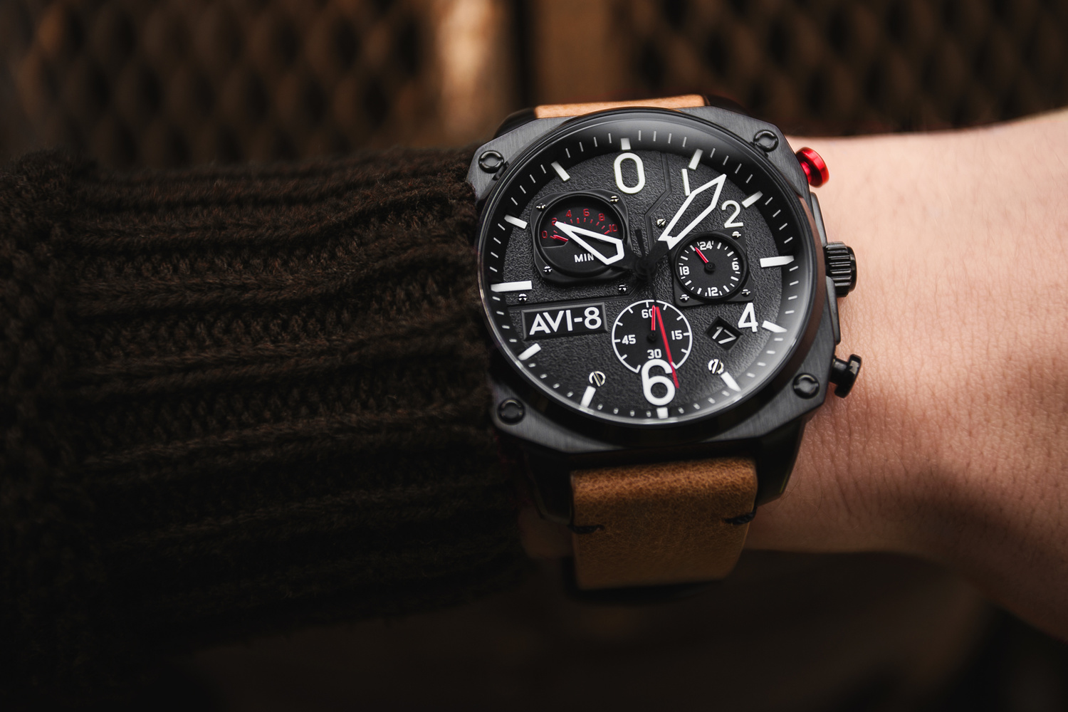
Nice write up. Can you tell me what model AVI-8 watch that is, I really like it but can't find it.
Photographers have been crushing blacks for decades. It has nothing to do with cinematography.
See:
Greg Gorman
Albert Watson
Irving Penn
Jeanloup Sieff
And so on, and so on...
Great for a high contrast punchy look.
Gorgeous photos. I wonder how much of the 'crushing the blacks' increased use has to do that our displays are getting better at displaying pure black. I remember old CRT monitors, would never really go that black, even when the monitor was off. I think that spec is called contrast ratio.
It didn't matter Daniel as our eyes still perceived that less than black black as black.
As for displays getting better at displaying pure black, there is only one type of display capable of doing that, and those are OLEDs, where individual pixels provide the light source and those displaying black are not turned on at all.
The only problem with this is when you go to print...
What happens then?
I've found that most printers (even really good ones like BayPhoto and Miller's) will mush the dark details with the pure blacks. Even with the right ICC profile and calibrated monitor. For this reason, I always try to keep print images slightly less dark than I want... and it turns out better (as I want) every time. I feel like it's a contrast issue... like you'll get better results if you can have lower contrast on the dark side of the histogram.
I wish I had a more precise answer or a specific rule like "increase your gamma level to 1.xx", but every image is different. The best guideline is this: drop your darks to where you want them, then bring them back up just a bit.
Interesting. Maybe we see contrast a little differently on a backlit display to a physical print?
Its like you are almost exposing for the highlights only. This is on my many techniques i like to use.
Long before digital, the concept of exposing for the highlights was a "known" with transparency film...as digital became the new holy grail, the highlights were still the chief concern, since the sensors tended to "bloom" on the high exposure (blowing out highlights, plus) On neg film-particularly black and white, the concept of exposing for the shadow, processing for the highlight, and exposing for the mid-tone was how we held detail as best as possible for newsprint (dot gain on that sponge paper was like playing roulette with the ROP ads). The output to print can be effected by so many variables and the best thing to do is to test and calibrate...everything. Human vision has such a broad latitude of tone...whereas film naturally crushed that tonal range, and paper even more-so. The digital image looks flat...and I believe someone ahead of me on this thread mentioned the consideration that if we could reproduce the human visual range as an image, it would look too flat to us. I think that's one reason why HDR work sometimes looks to false (not including the tendency to make it too crunchy on color values or sharpening)