
Saint Patrick's Day celebrations in the United Stated revolve around one thing: lots of green booze. In working with a recipe developer for a St. Patrick's Day beverage, we both wanted to steer clear of the common green beer and food coloring based cocktails. The result was a beautiful green sangria. Here is more on how I created this subtly St. Patrick's Day themed shot.
So the theme for this recipe was a St. Patrick's Day cocktail that wasn't green beer. The recipe was designed for the person who wanted to partake in a St. Patrick's Day party, but wanted something a little more sophisticated than green food coloring added to a pint of beer or mixed into a vodka tonic. With the emphasis on the green color of the sangria, I wanted a background that wouldn't distract and take away from the subject. At the same time, I didn't want the background to be a boring blank white. The solution was something that may surprise you? Take a look at a set shot below. Can you tell what I was shooting on?
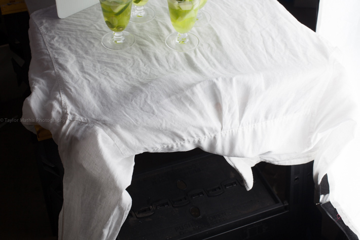
If you guessed a wrinkled white linen shirt you are correct. The wrinkled texture of the linen brought some interest to the image without taking away from the green beverage. Here are a few shots showing the process of arriving at the final shot.

First, I tested out different glass options. With this being a recipe that made about a gallon of sangria and a St. Patrick's Day party as the theme of the picture, I decided on multiple glasses. I went with four in the image. I knew that I wanted to light the glasses from behind and use a white fill card to fill back in the shadows. In shots 2 and 3, you can see different camera angles and compositions that I tried. Shot 4 shows the final image that I ended up using.
Here is a look at the lighting diagram for this final shot.

There are many different holidays that have certain colors associated with them. A few examples are red and pink on Valentine's Day, red and green for Christmas, or orange and black on Halloween. When choosing your props and background for these holiday assignments keep the colors of the food in mind. Either use a neutral color background, like white, grey, or black, that won't distract from the holiday specific color of your subject. If want to have color in your background, choose one of the holiday colors but with a different texture of shade than your subject. If you are interested in the recipe for this sangria, you can find it here.
Want to learn how to create mouthwatering food images? Check out issues 1-8 of photographing FOOD!


Whenever I feather light, I always feel like I'm wasting it in some odd way.
The drinks look good and I love the lighting, but the background is really distracting to me. It just looks like they were set down on a wrinkly tablecloth. There appears to be no motivation or reasoning behind the choice of backdrop.
The wrinkled background doesn't look like an intentional artistic choice...it just looks like a wrinkled background. The lighting is nice, though.
I thought we left wrinkled bed sheet backgrounds to GWCs? :)
I like the idea of a texture added to it, but I dont feel this one works. Still, very nice shots.
One word.
Iron.