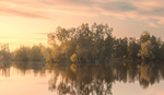
Pastel color grading is a subtle yet powerful way to make your photos stand out, and you can achieve it easily with some simple tweaks in Lightroom. If you’ve ever wanted to experiment with color grading but felt overwhelmed, this method offers an approachable way to elevate your work.
Coming to you from Christian Möhrle with The Phlog Photography, this practical video demonstrates how to achieve pastel-like tones using basic adjustments in Lightroom. Möhrle starts by explaining how contrast plays a major role in this style. To achieve a pastel look, lowering contrast is key. He shifts the profile from Adobe Color to Adobe Standard right away, which immediately softens the image. From there, he tweaks the white balance, warming the image significantly by raising the temperature. This step is crucial, especially if you’re working with sunrise or sunset shots where warmth complements the pastel tones.
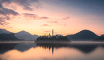
Möhrle emphasizes the importance of balancing exposure. He pulls down highlights to bring out detail in the sky and raises the shadows to brighten the darker parts of the image. The balance is maintained by increasing the whites, which helps to retain some contrast without overdoing it. These small adjustments are essential in creating the soft, pastel vibe while keeping the image balanced and visually engaging.
In addition to basic exposure adjustments, Möhrle highlights the significance of clarity, texture, and dehaze settings. By carefully increasing the texture and clarity, he enhances the midtones without adding harsh contrast. A touch of dehaze is used to bring out the details in distant elements like mountains, without sacrificing the softness of the pastel look. These subtle tweaks make a big difference in the final outcome, ensuring the image retains both detail and a soft atmosphere.
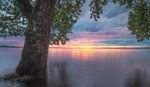
Color grading is the next major focus. Möhrle targets the hues of orange, yellow, and blue, tweaking each slightly to bring out that characteristic pastel feel. He lowers the saturation of certain colors, particularly green, which can clash with the desired tones. By reducing the saturation, the focus stays on the warmer and softer colors. In the hue panel, he makes the oranges more pinkish and the blues closer to cyan, further contributing to the pastel aesthetic.
Möhrle finishes with a look at the color calibration tab, which allows for even finer adjustments to the blue primary hue. This shift towards cyan and magenta tones completes the pastel transformation. He emphasizes that while these changes might seem small, they make a significant impact on the overall mood and color balance of the image. Check out the video above for the full rundown from Möhrle.
And if you really want to dive into landscape photography, check out our latest tutorial, "Photographing the World: Japan With Elia Locardi!"