
About six months ago, I wrote a piece comparing flash techniques to HDR and ambient-only techniques when shooting for architecture and interiors clients. There was some great discussion involved and many valid points raised, and I'd like to take a few minutes to bring up another scenario that really shows the benefits of using flash whenever possible when dealing with interior or architectural situations. We'll be looking at how flash can add mood and control color, something we didn't touch on in too much depth in the last iteration of this article.
Every week, I get a ton of questions from photographers looking to get into architecture and interiors photography, something I've been working hard on for years now (here's my portfolio, if you don't trust me), and one of the more common questions is how to deal with color casts and how to use light when shooting interiors. While there are literally hundreds, if not thousands of ways to shoot any space, today we're going to focus on the benefits granted by using off-camera lighting when faced with a very tricky lighting situation, one that HDR simply could not realistically handle on its own.
I was recently commissioned to shoot this fantastic interior space for one of my clients, and upon meeting with the client, we discussed possible options for shooting this space. She really wanted to show the relation of the design to the large windows and how the design played off of the large amounts of natural light afforded by them. The couch was situated to take advantage of the natural light, and show views to the attached guesthouse and pool, which were not seen in this shot. Her biggest insistence was that we show how the room feels on a summer afternoon when everything is basking in natural light and there was a real 'lemonade and a good book' vibe to the whole thing. Challenge accepted!
The first and most obvious problem was that we were shooting this at the total wrong time of year and due to scheduling, we had to shoot it at a less than optimal time of day, and the sun hadn't quite been able to get in the exact position that the client had in mind. Not a problem, I say. The second problem that immediately popped up as soon as I took a test shot was the incredible green cast that washed over everything. Even though those giant windows are really awesome and we want to show them in all their glory, we have got to do something about that green cast. Because there was a lot of shrubbery right outside of the window, the sunlight was hitting those shrubs and picking up the green color from them, and then it was bouncing inside and coating the floors, ceilings, and everything in between with a sickly green cast. So after taking our initial test shot, seen here:

I had to figure out just how I wanted to tame that green cast and start to show this room in the mood that the designer intended.
So, first things first. I'm going to increase my shutter speed to kill most of the ambient light, which is mostly that green vomit light coming in from those windows. And that leaves us with this:
Test shot without ambient, faster shutter speed

Which is admittedly pretty terrible. We managed to get rid of most of the green light coming in the window (there's still a bit left, but not to worry) and reign in those blown out windowsills. The next thing we have to do is of course add some light to the interior to properly expose it. Remember, our client was insistent that we showcase the mood of this space as if were a sunny morning or afternoon with light streaming in the windows. We want it to look like you could walk in here and relax with a book and lemonade (or adult beverage of your choice) so the first thing I KNOW I am going to want to do is fake some sunlight by putting a light out the window. I also know that I'm going to have to add some more light to the interior from the other direction to balance out the dark interior - we're definitely going to need more than one light here. So the first thing I did was head outside and start getting my 'fake' sunlight set up, and after that I threw some lights inside. My initial test setup was one light out the windows, a light through an umbrella camera right, and a couple bounced lights in the kitchen. I then started firing off some test frames:
More ambient, little bit of flash in window, check the shadows on the couch from that light outside starting to form:

More flash in window:
Even less ambient:

EVEN LESS ambient because why not, let's test it out:
More ambient for a more natural feel:
Starting to find some semblance of a balance, but the dark kitchen...yeck!
First attempt at light in kitchen windows...not really working for me...I'll have to adjust...

These test shots are also pretty weak in every way, because they are, well, test shots. I'm trying to find the right balance between interior light and exterior light, softness of light, amount of light, and the relation between ambient and flash. I don't really have a set system here - it's very much a 'wing it until it looks good' seat of the pants type of thing. You'll notice as you look at the shots that I'm playing with my shutter speed and lighting setup - as I decide to remove more color cast or ambient light, I'll increase the shutter speed and add more flash accordingly. I also play with the positioning of the lights. Sometimes it works and I keep it, and sometimes it looks awful and I'll toss it. It's all a game of trial and error. You'll also notice that the designer is moving through the room and playing with objects slightly. We're both sort of taking our time getting everything perfect, my lighting and her design relative to the camera. This is one of those times where it's so critical to be able to shoot tethered and be able to show the client what is going on so you can collaborate and bounce ideas off of one another. For this shoot and most of my shoots I'm using a CamRanger, which if you'd like to learn more about, you can check out my review here.
Anyway, you can see our shot sort of coming together. After I confer with the client that she likes the direction we're heading in, I go back to adding some more light to the kitchen to bring it up to speed with the rest of the image. Here are a few more attempts at that - I'm just going around back there with my iPad and trying out different modifiers until I was happy with what I was getting. Umbrellas, grids, bare lights, in the windows, bounced, I'm just kind of throwing some light around until I'm satisfied with what I'm getting. Total time? One or two minutes. Don't need to overthink it, as it isn't the focal point of the shot, but we do need to have some light back there so we can tell what's going on.
Kitchen test shots...

Note the changing lighting in the kitchen in each shot...
Hotspot on ceiling
Too bright...
Hotspot on left...
As you can see, I'm just kind of improvising: Too much, too little, different modifiers, different angles, existing lights on, existing lights off.
At this point, I think you guys understand what's going on here. I'm just trying to add and remove light until I'm happy with the result. You can see me playing with lights and adding light that wasn't there - something you can't (realistically) do in Photoshop. At this point I've added a light coming in the window to simulate sunlight, and I've added some soft light from camera right for the foreground and also in the kitchen to fill it up. It's about now that I'm getting pretty close to where I want the picture to be, and I again go back and confer with the designer to make sure that we're on the same page. We go over any last minute edits to the design, and sign off on each other's work. It's very much a collaborative effort, so we're constantly cross-checking and working together to make sure that I don't add some funky light where it shouldn't be or that she doesn't accidentally put an enormous potted plant in the way of the entire composition.
Before I show you the finished shot, I want to show you how this scene would look as shot without flash. I'm going to try my hardest here to make it look pretty good without using ANY flash frames. In order to give my non-flashed images as much dog in this fight as possible, I've even gone as far as to turn off the existing lighting in the scene (sconces, lamps, chandeliers etc) to mitigate any additional color casts that we'd have to contend with.
So first up to the plate - we've got an HDR Tonemapped image created with Photomatix, which is pretty well known across the industry and by far the most used HDR application. This was run through the program with pretty basic edits, again, I tried to get it to look as good as possible. Here's what I came up with:

I don't really know what needs to be said here other than the fact that I regret that this image ever existed. The colors are way off, the window frames are all gross, and it looks like there's smoke damage throughout the interior due to the program struggling to separate out the lights and darks. Midtones are very muddy, as well. I highly recommend you steer far clear of HDR Tonemapping for all interiors work for this reason. HDR Fusion provides a much better engine, and comes bundled with Photomatix HDR software. Here's what the fusion version looks like:

It's quite a bit better, but still falls short in my eyes. I actually took this into Photoshop and locally adjusted color and saturation in an effort to tame that green cast, which has been slightly mitigated. The problem is that there is no real way to just 'fix' a cast like this. You could select the greens with a hue/saturation adjustment layer or the eyedropper tool and pull them down (either in Photoshop, Lightroom, or Aperture) but what happens is that you not only kill the greens and yellows that we want to kill, but we also kill those that we want to keep, such as in the potted plants and the exterior. For this image, I did a quick job of masking out the exterior but lets get realistic for a moment. Nobody wants to sit around masking out individual leaves of a potted plant to ensure that the greens there are true to life, but that the greens on the wall are gone. By using the ambient frames to make an HDR blend, we basically guarantee that we are going to have an ugly color cast in the room in a situation like this. No amount of white balance or levels can fix it, because as I said, you're going to have a hell of a time masking around all the objects that should be green when you try to clean up the objects that shouldn't. Catch my drift?
Again, let's revisit the ambient only frame to see how this looks. I did the same thing here - ran it through Photoshop for a bit of color correction, but the same problem are evident. Blown out windows, highlights way gone, and color casts throughout. But, to be frank, I honestly prefer this to either HDR version.

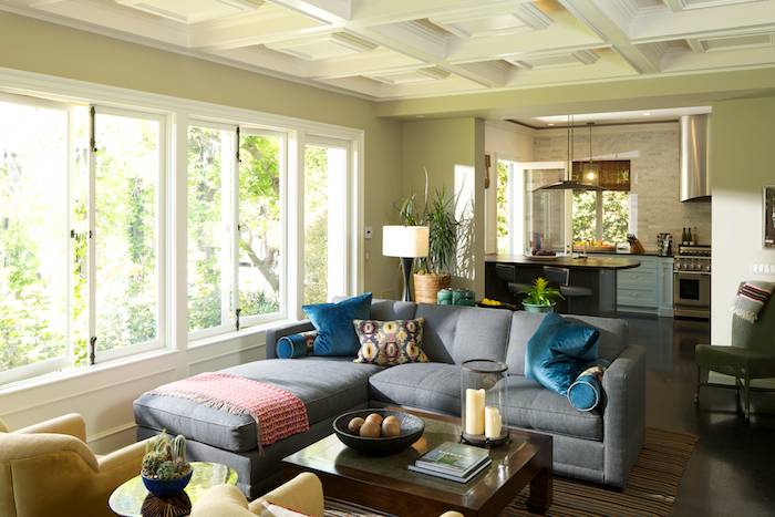
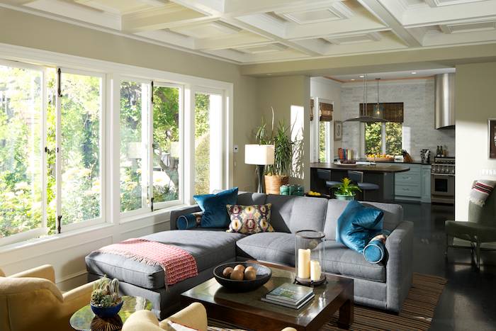
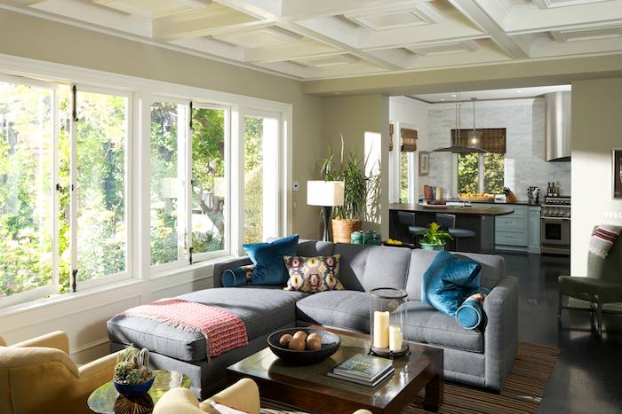
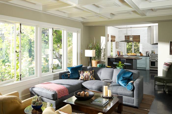
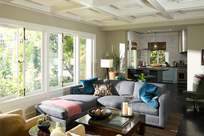
Now I want to show you the final image that I delivered to my client. This is more or less straight out of camera - the only adjustments were some selective dodging and burning, and shadow/highlight adjustments. I didn't spend any time correcting color casts because I didn't have to. My shutter speed was fast enough to kill the green ambient light that was bouncing in the window from the shrubs, and it still properly exposed the interior.
Final flashed image

As you can see, the colors are true to life and the interior is properly exposed with shadows and highlights just where I want them to create mood. The window view is crystal clear and there's no smoke damage. Cool. Let's check out a straight out of camera ambient exposure so we can compare the difference again:
Ambient straight out of camera

To further hammer this point home, I've made a comparison image for you that's split down the middle showing the straight-out-of-camera exposure and the final flashed image. The difference is REALLY clear here! Look at the color cast, it's completely gone, and the furniture, wall colors, paints, and decor are the true colors that the designer had in mind when she put all of this together. For obvious reasons, we want to represent the designer's work as true-to-life as we can in terms of colors and feel, because they get paid a hell of a lot to make sure it all looks good and color is such an important part of that.
Comparison

But really...let's just disregard all of that for a second. Forget the color casts, forget the proper exposure, forget my technical mumbo jumbo up top about balance interior light and exterior light and flash levels and blah blah blah. What does the final flashed image have that NONE of the others have?
Mood. Yep, it's got mood. By using flash, we are able to convey a feeling. We're able to CONTROL the scene in front of us. What good is it going to be to take photos where you're completely out of control? You wouldn't want to shoot a portrait without being able to move your subject or add and control light, would you? By having control, we're able to make a scene that says "Hey you, yeah you, viewer! Check this out. I'm a living room that's washed in early morning or afternoon sunlight, and I know you want to grab your iPad and coffee and come sit over here while the golden retriever curls up at your feet." By using flash, we are able to control so much more than if we were to just shoot it as is. I could take this in SO many directions. I could add a softbox to my light outside, and create a cloudy, filtered sunlight mood. I could gel that light and create a sunset mood. I could get rid of the light outside altogether and just shoot a bright, clean, properly exposed interior with no color casts if that's what the client wanted.
So if you want to take your inteiors photography to the next level, start using lights in your workflow. If a client comes to you and says "I designed this space with this mood in mind" you'll be able to deliver exactly what they want. I don't make Xeroxes of rooms, and I don't want you to, either. I want you to be able to create a mood that the client had in mind when they designed the space, and I want you to make photos so good that the client will be thrilled with them for years to come.
So to wrap it up, here are a few facts:
Time spent adding light outside: 5 minutes, one light (bare on a tall stand)
Time spent lighting foreground: 2 minutes, one light (through large umbrella camera right)
Time spent lighting kitchen: 5 minutes, 2 lights (one bounced from the right, one shot through window from the left)
Time spent in post: 3 minutes at most
Total time lighting; 12-15 minutes. Add some chimping and re-arranging. Another ten minutes. Total time? 30 minutes. That doesn't count what the designer did on her own time, but I want to show you that this can be done quickly and efficiently with practice.
I hope you learn something from these tutorials, and that you're able to put this stuff into practice in your own photography. I've teamed up with the Fstoppers crew to create something big that's going to come out in the next few months, so be sure to keep your eyes peeled for that, as I'll be giving away tons of tips and insights.
-Mike Kelley
mpkelley.com


![[BTS] The Anatomy of a Luxury Interior Shot](https://cdn.fstoppers.com/styles/small-16-9/s3/wp-content/uploads/2012/04/Featured-Image-Mike-Kelley-Anatomy.jpg)


I can't believe you could do all this in such a short time. I can't even begin to imagine what light modifiers work best for work like this. Totally out of my element.
Thanks, Mark...truth be told I could probably do it faster if I didn't have the article in mind! Once you get the hang of it it becomes second nature.
Hi Mike,
I was just wondering if you are going to come up with a video like Scott Hargis?
Craig
lovely, detailed ..
would love to know the lights used ... speedlights? stronger?
Hi Greg,
All lights were Canon speedlites and a PCB Einstein out the window at about half power if I remember correctly. In hindsight I think the Einstein was cranked a little too strong, I might have been able to get away with going a stop down on power to make that sunlight not so harsh.
Do you think you would have been able to get away with using a speedlite out the window?
Maybe. I think if I were to push it to ISO 800 or so, I could get away with it, though I wouldn't feel comfortable putting a modifier on it.
Where was the outside light placed? Was it really high up, or level with the top of the window?
also, was it a speedlight or stronger light?
I thought this may of caused a very sharp shadow with no modifier?
great result!
Thanks Mike...light outside was on a lightstand about 10 feet high, you can see the gentle slant of the shadows which gives that away. It was a PCB Einstein at about half power. The only modifier was the reflector dish that PCB makes - it's a pretty hard-edged shadow but not that bad. I think the edges of the window panes and the glass diffused it ever so slightly, but really not all that much in the grand scheme of things.
This is fantastic! Could you go over your gear a little bit? What are you using for flashes/modifiers, triggers, etc? I assume you're basically standing at a light with an ipad and triggering the camera remotely and then checking the result and moving/adjusting the light?
Thanks Spike, that is more or less exactly correct. The lights inside are all Canon speedlites (430 EXII, 580EX, 550EX, etc) with PocketWizard Flex TT5s on them. The light outside is a PCB Einstein with a Pocketwizard MC2 and AC3 Zone controller on the camera so I can adjust the power without walking back and forth to the light outside. I think the only modifiers were an umbrella for the light camera right and a grid for the kitchen window light.
Awesome thanks! so bare bulb or basic reflector is all on the main window light? i'm using the exact same setup just with nikon stuff (tt5s etc). Are you triggering your camera with relay mode on the tt5s or just shooting at camera? Relay mode on the nikon versions is basically unusable, so just curious if it's better on the canons
Yep, that's right. For triggering I'm using the CamRanger/iPad combo.
Mike,
Impressive results for only 30 minutes invested. Have you ever tried merging to HDR Pro from Lightroom working in 32bit mode? If not its worth looking into. It doesn't work for every application, but it can produce some very nice results without the mess of that hideous tonemap thing. The beauty of 32 bit mode is that you can import your merged image back into Lightroom and work on it in the develop module as if it was a raw image. The dynamic range you can achieve with the sliders is quite surprising. In situations with very strong highlights (windows, lights, glare) its not perfect, but its something that can very easily be blended in Photoshop. I think HDR is starting to turn the corner from the disastrous images you see on flickr.
I think the biggest advantage to your method is dealing with color cast, and I agree that would save a ton of time in Photoshop. I do however think a little bit of the color cast helps the overall mood of the image, giving it a bit more of a natural feel. To me the kitchen looks a bit over flashed in comparison to the foreground and the windows in the kitchen are a little blown out compared to the living room windows. Again, very impressive that you only spent 3 minutes in post.
Thanks for the detailed article and the wealth of content, I look forward to your posts!
-Tim
I was wondering about a 32-bit tiff myself, at least having it to use as a smart object or something.
As far as masking for the green cast, and this isn't a suggestion masked as a question, but what do you think about duplicating the image, converting to Lab color and using an inverted a channel as the start of a mask for a channel mixer adj layer on the original file? I'd think running a curve on the mask would let you isolate that green ambient pretty quickly, and then you could just add a folder mask covering the window. I've found Lab to be insanely powerful when it comes to selecting ambient casts like that.
I'm a fan of flash, but I feel like when it comes to HDR, if you really want it to look good, you have to do it yourself with layer masks. I'm not a fan of those HDR plugins.
I agree. As time consuming as masking can be, it really give you total control of every aspect of the image.
Agreed! Manual masking is a huge part of my workflow.
Did you gel at all (CTO?)? Do you usually like to shoot with interior lights, like cans and lamps, off?
No gels anywhere. Definitely depends on the mood I'm going for, the client, or the intended usage of the photo. A lot of the time, I don't think it makes sense to have every single light on in a home in broad daylight. You can pick up any of the more popular shelter mags (dwell, elle decor, etc) to get a feel for current styles and trends and how they effect the mood and feel of an image. Some places have great sexy lighting, some places look great with all the lights off, too. Definitely a judgment call.
What a surprise, another flash vs HDR comparison on fstoppers where the photographer has every idea how to use flash and then produces some hideous example of an HDR image to compare it to. Give me the bracketed TIFFs and ill show you what it could have looked like. I think HDR is definitely the go here as the light coming in those nice large windows are producing some pretty awkwardly harsh/direct shadows on that couch, call it mood if you want though.
Chris,
The point that I'm trying to make isn't that HDR is entirely useless. I was trying to provide a situation in which it would be useful to not have to rely on HDR. As I noted, the client wanted a natural, sunlit look at early morning or late afternoon. The light streaming in the windows is a definite defining character of that time of day, something that HDR alone could not provide us with. In addition, the room provided a great situation to point out that using flash and increasing shutter speed to kill the ambient is one such way to mitigate color casts. I thought it was a pertinent case study for those reasons.
It is interesting to note the divide in the comments. Some people love the hard sunlight look, some people hate it. Isn't it great that we live in a world where people are able to have such varied tastes? Art is a pretty cool thing. There are many situations where you would walk into a room and see hard sunlight casting shadows, and many situations where the sun would not be streaming in the window at all. Being able to control the light is just another tool that we should all have in our bag if we want to call ourselves professional photographers.
Chris, I would LOVE to see what you can do with some bracketed TIFFs. I'm dead serious. I like to make HDR/Fusion 360/Panoramas so the use of flash just isn't possible. I've spent dozens of hours trying different techniques and I just can't get the outside to look clear. It's always a little overblown and the interior a little muddy even with 11 bracketed images. The use of Flash is great for still photography but when you are stitching 360 degrees there's no way to make the lights from a flash look natural in every image. If you have any tips I will gladly share notes.
I'm about to cover 110 condos in Florida and plan to use a very similar technique to avoid HDR'ing the images. The client had HDR images before and is gun shy due to someones poor execution. I think it's a fine balancing of light and provides a solid image that reads well.
Hey Mike, great stuff. I definitely appreciate the flash work here, but I have a question: Does Lab color work have a place in your workflow? I don't do architecture work at all, but I've found that to be the best way to work with ambient casts. I hope you don't mind, but I grabbed your final and ran two curves in Lab using an altered b channel as a mask on the first curve, and then just used the second to restore some color separation. I think any improvement, of course, is a matter of taste here, but It was really easy to use the b channel to grab exactly what I wanted, and use the a channel to make sure the greens cleaned up nice, without having to do any manual masks. Let me know what you think. (there's a hint of magenta creep, but this is me tooling around for a only a minute or two.)
Graham, this looks pretty good! Thanks for chiming in, I really appreciate it. I'm sure you could mask out the magenta relatively simply. I'll give this a play! Thanks so much again for this, it's really cool to see how other photographers would approach the same problem.
Glad you like the tweaks. Lab is, imo, woefully underutilized. It's a bit funky at first look, but my primary uses are to use the channels to create accurate, fast masks for color correction, and the curves. The power of the color space is that it totally separates luminosity from color information, so it needs far less compensating moves than rgb or cmyk. Imagine the WB/tint sliders combined with the flexibility and precision of curves and masks and I think the value of the space is pretty self evident.
Thank Graham Marley, I am just getting more into PS & Workflow. I don't really understand everything that you mentioned yet :-( Would you mind sharing a little more about the LAB workflow that you mentioned. Would you be willing to share you .psd file so I could have a look at the curves etc you mentioned?
Well, and don't take this as being condescending, but if you're just starting out, don't worry much about lab. Part of using it is getting a good feel when to use it, and that comes from learning the limits of the basic tools. Because it's not a cure-all, and getting invested in it without learning the basics of workflow first would just get frustrating. Eventually, pick up Dan Margulis's book on LAB called The Canyon Conundrum. It's probably in the top 3 or 4 books on photoshop out there.
Thanks Graham for the info. I ordered the book and will have a look at it. Maybe I understated my PS skill. I am not totally an newbie, I have doing color correction by the numbers and have been using the LAB space in some occasions. Just would like to have a look at the image or LAB correction you made to put it in place with you comment.
Maybe the book will explain it to me. Again thanks got your reply.
Awesome. You're seriously going to love that book. I'd send that PSD but I don't have it anymore just because it was kind of a one-off quicky to try an experiment. Cheers!
Excellent article. I have found a piece of software Oloneo Photoengine that allows tweaking the lights to different levels . Might be worth a look.
Interesting article, and I appreciate that it was very difficult to light. So I wonder why you put the very directional flash outside, because it created so many unnatural shadows and hard edges on the inside (in your final image), e.g. the wall on the right, the wall in the middle behind the plant, on the sofa and on the pillows. I guess I would have started with a big softbox on camera-left to balance out the ambient. Just saying. :)
It is, of course, a matter of taste. The light outside was carefully positioned to highlight certain things in the scene, for example the potted plant, throw on the couch, and the green wicker chair and throw on the right. I wouldn't quite call them 'unnatural' but rather quite natural, as I tried to mimic the sun, which would have given us a sharp, hard light, much like the bare flash outside.
I'm a firm believer in working with natural light and preserving it whenever possible. But in the real world when things are out of our control you just have to work with what you have. I think the author did an amazing job with so many things working against him. I particularly like the strong rectangular highlights along that back wall and in the kitchen. The only thing I would have done differently is created a little brighter scene out that window (it's too perfectly exposed for me) Thats miner and totally subjective.
I can't believe I learned so much from the comments. I just purchased Oloneo Photoengine and I never thought to use the LAB color space as a masking tool. Thank you so much for that post!
Agreed on all counts, and thanks for the kind words, Jeff. I agree that natural light is a great thing in many cases, but sometimes, what the client wants, the natural light just can't provide! It's great to have both tools in your bag when the time or need arises.
Mike - I just discovered this site and your articles. They are very detailed and thoughtfully written. You're helping a lot of people including myself. Thanks so much.
An article that gives detailed process WITH photo progress. More stuff like this :)
Fantastic work Mike. I've been watching your technique for a while now and have learned so much. Thank you for sharing your knowledge.
Did you try gelling the inside lights with a green tint to get the color closer together?
I'd be curious to see if you could have used the sun as a main and geled speedlights as accent lights.
Thanks for sharing Mike, it gave a lot of insight!
Suppose I took a PhaseOne P65+ mounted on a nice ArTec body, and crafted an amazing architectural interior image. And let’s say that I then took a DSLR in Program mode with the wrong white balance, backfocusing, a crooked tripod, and one hotshoe-mounted flash in Auto mode, and took a crappy shot. And let’s say I then posted on fstoppers how that crappy shot proves that DSLRs just aren’t any good for architectural interiors. You’d probably shake
your head and think I was foolish to say that. But that’s exactly what you’re doing with HDR.
You got terrible results with HDR. Understandable—the HDR shots you’ve shown have glaring, obnoxious, burn-my-eyeballs technical errors. I wish you’d listen to your respondents like Chris Johnson and Anders Peterson and myself when we tell you you’re doing it wrong. It’s not supposed to look like that. Stop it. Now.
Your multistrobe shot is strong. You were ferret-on-caffeine quick. Your result surely pleased your client. Posting about just that part would have made a nice post. But…if done properly, that HDR shot could easily have been a solid 8/10 accomplished in 3 minutes, not the horrid example you show next to your 9/10 multistrobe shot that took 30 minutes and $2500 more equipment. There’s a place in the market for a technique that is finished in one tenth the time using far less equipment and giving almost-as-good results. It’s quite inaccurate to say
HDR can’t show mood or control color. You’re just not giving it a fair shake.
As much as I enjoy Mikes work, and learned more than one thing on his post, I have to agree with everything you just said (sans the 2500$ remark thats irrelevant and not necessarily true).
Hello Mike,
I just read your great article! It was really helpful for me to understand difference between HDR and flash light shooting.
Do you use any filters on your camera? I mean UV/polarising filter?
Thanks in advance for answer!
Pretty amazing. You did all that in less time than it took me to take it all in. Fantastic work and a great lesson when considering HDR over lighting. Very cool thanks!!
Great read. I really enjoy your work. It is superb, that said I am baffled at your output of "color corrected" HDR or Fusion images. I took a screen shot of your HDR into photoshop and spent about 90 seconds on it to get this (attached). I am not an expert in HDR, I don't really know how to use it, but that image you put up was pretty poor rendition of color and I felt that some basic adjustments made it usable. Looking at your work I see you have an experts grasp on color correction, pretty curious what you did to "finish" off with what was displayed as the HDR image.
Best,
Michael
Hello Mike, Great Article. For someone who is a bit new at interiors I found that step by step images showing how you make you desisions really helpful. For me I cannot afford all the Lights and PocketWizards, so would you recommend using a speed light with different modifiers and then use masks in post to create a similar effect?
Have you got any more interior tutorials coming out, I'd be interested to view more too.
The best thing to avoid when when searching realism is hdri with photomatix.
Please try with LR enfuse! There's no sign of hdr look at all
Do you mind sharing the 2 raw shots with no flashes? I can combine them in LR/enfuse and show up the result?
Hi Mike,
As a hobbyist photographer for the past decade and a half, I was recently approached by a company about being their principal photographer for residential interiors. I've never shot professionally, but I have a lot of professional equipment that I've acquired over the years.
I thought residential interiors would be easier than portrait photography so I said I would take on this new opportunity. Boy was I wrong! Balancing natural light with ambient light, especially on sunny days where the owner wants to capture their incredible Chicago views, is considerably challenging. As many articles as I've read, as many youtube videos as I've watched, and as much experience I have with how ISO, aperture and shutter speed play together, your article brought far more clarity to balancing these types of shots.
I never would have thought to add a monolight outside to imitate the natural sunlight that the room would normally get, and what our eyes would be able to perceive. Your final image is exactly what I would expect the naked eye to view in such a space. I also appreciated that, as a professional photographer, still have the challenges of the space and light. And you do what you think will make the shot better, even when it doesn't in the test shot. You portrayed in this article that it's ok to not know exactly what to do every single time and that the perfect shot doesn't come with the first click of the shutter. It takes thought, tests shots, rethinking and revising the plan, taking more test shots, and adjusting as you fine tune what works and what isn't.
To me, as a hobby photographer who loves the artistic outlet turning paid photographer, your approach and explanation of the process was comforting and inspiring. You understood how to adjust the lighting composition because of your experience, but you also were very understanding that you don't always get the perfect shot in the first try. And that portrayal of trial and error gave me confidence! I felt like I needed to know how to capture the perfect shot every time and I wasn't able to do so. I would go through 3-4 shots from one angle, and another 2-3 shots at another before I felt I had gotten a good one for the client.
You are also SO right about the ability to add light in photoshop. It's nearly impossible! Unless you spend hours masking an area and adding light post production. It's always far better to spend more time to get the optical shot than try to make a mediocre look ideal in post.
Thank you for sharing your experience. I know this comment is a couple years after but it is still making a difference to the novice photographers of 2016. Cheers!