
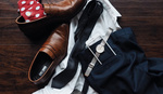
In the creative world, constant advancements in technology mean we have to keep up or risk being left behind. Clients looking to hire a photographer no longer seem to seek proof of physical qualifications, but rather insist on browsing a website of our previous work. Here’s why it’s important to have your own website, how I’ve found it best to organise your work, and what you can do to make it as appealing as possible to prospective clients.
Until recently, I thought it was a given that all photographers had a website. But I’ve been finding that increasingly larger numbers of my peers are yet to get around to putting one together. They either admit they can't motivate themselves to put the time in, or have instead been relying on social media as a means of portfolio. Don’t get me wrong, places like Instagram can be great for peer-to-peer experiences and sharing your most current work – even behind-the-scenes images that you’d never think of putting in your portfolio, just to show people what you’re up to. But should it really be used as a primary portfolio? Probably not. You need something that is your own – not a profile on a platform owned or created by another brand.
A Creative CV
Your website should be the hub of everything related to your brand. Aside from showcasing the best of your work, it should contain all of the information that anyone should need to know about you. Most creatives I meet - by their own admission - aren’t great with words. Especially when it comes to writing about themselves. Alas, it’s essential to have a detailed biography for prospective clients. Bear in mind these people will likely know nothing of your existence until they’ve landed on your website, so make sure you cover all the essentials. Don’t be afraid to sell yourself and really highlight your achievements. This is essentially your CV in the creative world, so don’t hold back. Sometimes it can feel like a shameless name-dropping list of everyone you’ve ever managed to work for, but it’s precisely this that will help set you apart from the competition. It also helps the client form an idea of the type of photographer you are, and whether you usually work on projects similar to what they’re looking for.
One thing I would say when writing a biography (be it on your site or a social media account) is to ALWAYS be clear about where you’re based. It’s such a basic piece of information, but surprisingly absent from so many photographers websites or social media accounts. If people can’t clearly see where it is you’re based, they’re unlikely to bother taking the time to email you and find out – they’ll just go elsewhere. Having details on your site of being, for example, a ‘London-based photographer’, can also enhance your search engine optimisation (SEO) – aka how likely you are to turn up when someone searches, in this case, ‘portrait photographer london’.
I recently had a stylist recommended to me, only to find that there was no available contact details on their site. No email address, no notable contact form - nothing! I was still keen to work with this particular stylist because her work was good, but many companies and clients won’t be so forgiving, and again, will simply head back to their Google results page and click on the website of the next person in line. It feels like such an obvious thing to note, but is seemingly a mistake that is made. Make sure a point of contact is easily available to anyone who may be browsing your site!

Instagram's a great platform... although it's perhaps not best used as a primary portfolio.
Organisation is Key
Displaying your work in categories is important. Some of us have a niche within photography, while others like to specialise in a multitude of different types. Personally, I stick largely with portraits. But even within portraits, there are many varieties. It’s helpful for clients to be able to differentiate between what is personal work that you shot purely for fun, to what has been commissioned by paying clients. I’ve seen photographers do it in plenty of different ways, and as always there is no right or wrong answer. Experiment and see what works best for you. 5 years into having a website, I still play around with my layout, Since your creative vision is ever-changing, the website it's presented on will be too. The same applies to your biography – try to keep the list of your advertising clients separate to your music clients; your wedding clients should be apart from your corporate clients etc. I see many fashion photographers dividing different editorials up into viewable options on their sidebar menu. This makes it as easy as possible for those browsing your site to find the images that are relevant to the job for which they’re seeking to hire a photographer.
Similarly, there should be clear links to all of the social media pages you run. I’ll be the first to admit I underestimated Instagram for years, dismissing it as an amateur’s playground, or for those who just wanted somewhere to document their day-to-day lives. Now I’ve seen the light and can appreciate it’s a tool every professional or aspiring photographer can use to engage with a new audience. As a free means of advertising, it should be utilised and you should jump at the chance to provide those browsing your site with the option to see more about what you do. Sites like Twitter and Instagram can really help to show off a little more personality than the formalities an official website does.
Make It Your Own
There are so many helpful, hassle-free website builders out there that enable you to host an online portfolio. I used to be a big fan of Carbonmade when I started out. It was simple and effective and meant I had one singular place I could direct people to get an idea about the type of photos I was taking. To this day I see lots of people using Format (previously 4ormat) – understandable thanks to the clean layouts they offer. These sites are great and should definitely be taken advantage of. If you're unsure of what you want from your website, or aren't great with the technical side, use these and do what you can to get some collection of your work online, even if it’s just to send to people you potentially want to practice new shots on. But what I must stress is the professionalism that comes with having your own URL - to have your own domain, that is entirely yours and doesn’t feature any extensions - it's invaluable. Some of these free sites leave you no choice but to have their URL tagged onto the end of yours, such as ‘jackalexander.weebly.com’. Purchasing your own URL is a very small, relatively cheap step that can make the difference between appearing an amateur and looking like an industry professional.
Another great way to achieve this is to try out some of the themes on offer at Wordpress. If, like me, you aren’t blessed with the knowledge or skills to build a website of your own accord, sites like Wordpress have got you covered. You can purchase domains through the likes of GoDaddy, who offer an all-in package for you to start a beginner website builder. This makes it pretty easy to get something up and running that feels like your own. My own website is a Wordpress template – one that I’ve customised and ended up sticking with due to a generally positive consensus. When it comes to selecting layouts, you’ll need to test whether your site's layout is compatible with phones and tablets. Any website statistics will tell you that many of those viewing your site are doing so from one of the two, so it’s important to make sure everything lines up correctly on handheld devices as well as desktop and laptop computers.
The Image Selection Process
Selecting images for our portfolio is an age-old problem. I’m often finding that my personal favourite images from a shoot are the ones that, frustratingly, never seem to receive the warmest reception when posted anywhere public. Sharing images on platforms like Facebook and Instagram can be a fun experience, but it can also leave you second-guessing in regards to which images you should be placing at the forefront of your portfolio. Try to settle on a fair mix of the two – you of course want to include the images that you know will appeal to potential clients, but you should also be including the images that are your favourites – the images that you instinctively go to shoot.
Over the years I’ve really tried to whittle my selection down when it comes to what makes the cut. It’s easy to get excited about a set of new images you've freshly shot, and naturally we find ourselves wanting to include the whole set. But the reality is that the average viewer won’t spend enough time on your site to check out everything on there, so keeping a variety of images that were shot at different times helps show diversity and illustrates your experience in a precise manner.

Having a blog - separate to my website - means I can share more images. I also find it liberates me to take pictures that aren't necessarily perfect in terms of composition, because the full set can all be displayed together in a blog post. The good, the bad and the experimental.
One way I found to satisfy my desire for sharing more images was to begin a blog. With a link clearly positioned in the sidebar of my main website, it’s easy enough for those who wish to view more of my images to do just that. Having a blog is great for two reasons: it’s a platform to share more of your work, and it allows you to have more creative freedom. Social media can leave you feeling pressure to post only the best work, in order to draw in the best engagement. Having a blog relieves some of the pressure, meaning that I now happily shoot any image I wish to, even in the knowledge that they’re not necessarily the strongest or most commercially viable of the set. Having a blog post featuring all of the images from a given shoot means I can diversify the set and include every photo to create a ‘story’ rather than feeling the need to only shoot images I feel are typically the best.
Whatever you decide works best for you, spend the time creating a quality website and you will see the results. Remember, this is the first impression many people will have of you as a professional and as a person. And first impressions count.


Another solid post. Cant tell you how many people in our network over here in New England have solid work, but their website is in shambles, or their IG looks like junk posts, or their FB page hasn't been updated since 2012, or their logo looks awful and everything from page to page is a disorganized mess.
Oh, and P.S. to any photographers out there who cling to "Artists are suppose to be messy", it's not an excuse if you are running a legit business. It's called "laziness" in the business world.
Cheers, Travis :)
It can be really hard figuring out what to say about ones self though - The point about being a name dropper or self promotional is usually counter intuitive from the mentality of most creatives. I wrote a post about how to write a bio as an elevator pitch. http://www.digitalcamerabaghq.com/how-to-write-a-photographers-bio-page/ Like you said: Don’t be afraid to sell yourself and really highlight your achievements. -- as well as showcase your best work (and share your contact info!). Great post and good points.
I'd love some feedback on my website EdwardPages.com
Hi Edward,
You have some really great content on your site. I might suggest the following:
1) For all of your photo galleries I'd say have them open in grid mode off the bat rather than clicking the "show in thumbnail button". On my 27" iMac I didn't immediately see that option and thought you only had one image per gallery.
2) I would rename your "Projects" page to "Videos"
3) For your videos and your reel might I suggest you write up some descriptions for each.
4) I'd consider getting rid of the Inspiration page
5) Your contact page should perhaps be a form people fill out rather than the large image and tiny email that are currently on there. Or the email itself should be clickable so it opens a new email automatically for your clients.
6) I don't know if you're using some sort of template but if you can set your content (images and such) to show up in the centre, rather than the left that's be nice. Again this is because I'm on a 27" iMac and there's so much negative space to the right.
7) Lastly since your home page and about me page use the exact same photo I'd consider swapping one of them out for another image, or better yet perhaps use text on your home page inviting people to explore your site, what they'll find, what your passionate about, and how you can help your clients realize their vision.
Hope that helps.
Cheers,
@Adamski
I cant thank you enough for taking the time out to do this. I'm really grateful that there are people like you in this community.
Hi Edward,
your site made me chuckle,
out of the million design options out there, you and i are very similar :)
www.leeramsden.com
Love your site have some amazing images!
one of the self portraits is incorrect, as is of a lady on the stairs.
and on the blog/shop talk the description box on the right is the default gibberish example text and requires updating.
Keep up the good work
Lee, What are the odds that we'd have such similar sites? Thank you so much for your kind words. I'm inspired by your breathtaking pregnancy images. Thank you for pointing out those errors. I've fixed them now. Keep up the great photography sir.
Nice article and so true. Too bad the author's website doesn't really do so well on my iPhone/iPad (tiny navigation menu) ;)
Jack, great post. Very helpful.
Thanks Matt!
I would also love some feedback on my new website. Its in Norwegian tho, but i've tried to keep it as simple as possible.
www.retusjert.no
Looks good Tom, though I can't read a word of it haha.
Only thing that caught my eye was on your KOMMERSIELT page there's an error at the bottom, which I've attached a screen shot of.
Also I'm unsure if you have an "About Me" page, if not you may want to make one.
Cheers,
@Adamski
I'm going to have to disagree here. I had website for many years. I did everything imaginable to promote it. Built it myself in wordpress. It got very little attention and I never sold anything thru it. Other artists have told me about having the same experience. It's expensive when no one out there gives a crap anymore. I gave up and I now have a free blog.
The points made regarding image selection and what to keep on your site vs posted to social media are extremely valid. Having worked in the industry for quite some time at a portfolio website builder (https://www.clickbooq.com), I think the biggest mistake photographers make with their website is trying to cram too many images into their site or from a single assignment, with a belief that more is better. Approach your site like a resume - it should exhibit your best work and highlight the types of projects you want to do more of. It should also have a distinctive look and feel to your body of work - this is your personal brand and what clients will want you to be able to replicate when they hire you. Take a look at our showcase for examples of sites that have tightly focused portfolios and a signature style:
https://www.clickbooq.com/showcase.html
Hi you all!
Here is a link to my webpage. I would like to get some feedback too how to make it more comfortable to use and navigate. I'm going to make it less colorful probably and secondly I'm going to make gallery more fluent grid like...
http://studiofenkoli.fi/
Wow, very nice post! Thanks for the info and your side to this!
In the last couple of months I put quite a lot of time in updating and optimising our business homepage over at www.i-imagine-werbestudio.de (yes, its in german) to promote our hollow-man photography better.
Maybe somebody cares to take a look at it.
Keep writing these wonderful articles! I'll read them all and thank you!
Thanks so much David
www.smithshotphotography.com
thoughts
Some real nice images chris,
obviously its only an opinion,
Your about me page i feel is way to much depth,
all the part of not shooting images, being in the military, using your uncles camera etc
The top image is all friendly and makes me want to hire chris the friendly guy, i read all this and then meet the pee'd off Chris at the bottom :)
some great head shots and like your work dude!
Lee
Thanks man...As for happy me then pissed off me, I was trying to show range in a headshot lol.
Jack, amazing article. I use Pixieset. And am happy. but damn does Format look amazing. I began by getting my own domain and then linking it to Pixieset. Thanks for the time, passion and dedication. www.allofthelights.co
Thanks so much Seth! Loving the blog-esque feel to your site, by the way. And the simple and clean layout. Nice one
Thanks for you blog. I will surely look forward the steps you have mentioned. Good website designing is always very important as it helps in gaining new customer interests. Good website designing always gives the new way of getting customer interest.
Great article!! As this is a few years old, I would add that along with Instagram, Snapchat is a definite must! A website is definitely something every photographer needs so I hope 3 years after this article was written, most have seen the light. You also have to keep up with the times. Many photographers that I know, see platforms like Instagram or Snapchat as a fad and dismiss it. While they dismiss it, they are losing out on opportunity. I also like your point about a blog. I'm a Denver photographer, and there is a ton of competition so my local search rankings are super important. I believe that we need to be cognizant of SEO practices. To Google, content is king. The more useful content you have, the better your ranking with Google. Photography is just as much an art as a business. Keep up with the times!! Anyway, just my 2 cents :) Thanks for the great content!
Pablo
https://pureelementsphotography.com