
Talk to a photographer long enough and the question of screen calibration will be brought up. Often many will say it's an incredibly important tool in your post production workflow, and often many more disregard it all together. So what is screen calibration? Is it still a viable issue within photography today, or is it becoming more and more obsolete, like sync cables and light meters? I'm here to explain it to you.
First, I stand on the "It's exceptionally important" side of the coin. For the first 3 years of my photography career, I was working on an uncalibrated monitor. I wasn't printing my work, so I had really no idea how my photos looked to others. It wasn't until I finally borrowed a screen calibration system that I learned how important the tool really was. Suddenly all of my photos that I thought were beautiful turned out to be really dark, and really orange in color.
There are two main brands of screen calibration software - The Datacolor Spyder system and the X-Rite ColorMunki. While both of these system do virtually the same thing, I've never had experience with the ColorMunki personally. The general use of these systems is to attach them to your monitor, and run a series of diagnostic software. This will read the output from your monitor based on color and brightness, and adjust them when needed. What you're left with is accurate colors and brightness to insure your prints look just like your monitor output.
However, another incredible and important feature among these systems is the ambient light readout. Essentially, these systems also have a sensor built into the front of the unit, and will adjust your monitor's brightness depending on your environment. So whether you're working in a cave-like room like I do, or in front of some ceiling to floor windows with sun shining through, you can be confident that your monitor is accurately displaying brightness and colors.
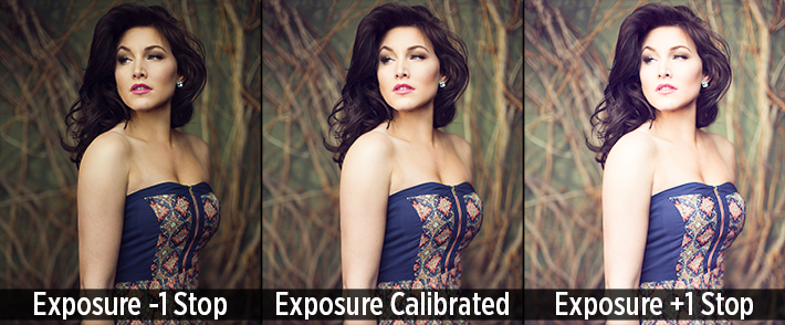
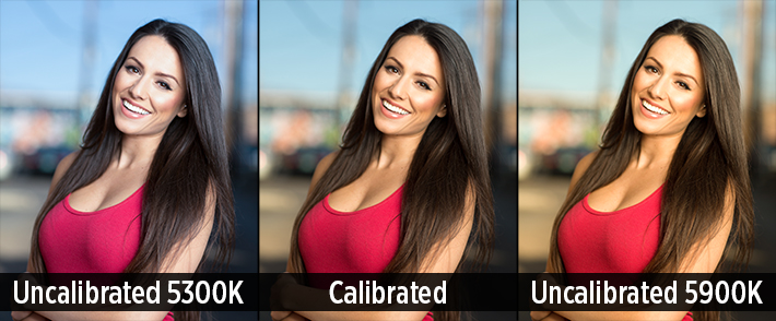
And color and brightness are the bread and butter to these machines. For the sake of making this simpler, lets instead think of them as white balance and exposure. With the default settings on your monitor, you're likely over exposed by about 1/2 to a full stop of light. This means your images are going to appear much darker to those with a calibrated monitor, and in print. In terms of your white balance, monitors aim for 6500K, but often miss the mark by up to 200K in each direction for their default settings. So while a photo might look great on your monitor, it could be much cooler or warmer in tone to those with a calibrated monitor.
Misconceptions About Calibration
Apple Monitors Don't Need Calibrated
This simply is not true. While Apple (and many other brands) do calibrate all of their monitors in factory, this does not mean that stay calibrated, or are calibrated correctly. Most calibration software suggest that you calibrate your monitor(s) every 2-6 weeks to insure that everything is accurate. This is because color temperature and screen brightness will gradually change over time. So while the screen may be calibrated at 6500K white balance upon purchasing, it may be at 6300K after just a few weeks, resulting in incorrect color temperatures.
IPS Monitors Don't Need Calibration
IPS monitors are exceptional, and most preferred for graphic design and photography. However, they still need color calibration on the regular. The most important part of an IPS monitor is actually it's viewing angle. Most IPS monitors get their name for the ability to view them at wide angles without any color or contrast shifts, like you might see in an LED or LCD monitor. This just means more accurate color readings, even if you're a little off axis with the monitor. For an exceptional breakdown of monitor types, check out Pye Jirsa's article over at our friends from SLRLounge. With this said, color temperatures and brightness will still shift on IPS monitors over time, so calibration is still very necessary.
Calibrate To Your Phone/Tablet
Many people foolishly believe that a smartphone or tablet will have correct color temperature readings, and suggest that when in doubt, to calibrate to your phone's screen. However, more often than not, your phone actually has more color inconsistency than the average computer monitor. Aside from that, you're more than likely adjusting the brightness of your phone/tablet screen multiple times during that day, so how will you know what the correct brightness setting is for your monitor?
Why Bother Calibrating If I Don't Print/My Clients Don't Calibrate
The reason is simple, because it will result in better photos on both your screen, theirs, and look great in print if you choose to do so. The general idea is that all monitors try to get 6500K temperature and about 100 cd/m² (brightness) for their default settings. However, due to making manufacturing as efficient and cheap as possible, they often miss the mark slightly. So your monitor may be 5300K (cooler color cast), and your clients may be 6750K (warmer color cast). If your monitor is uncalibrated, the photos will look significantly cooler in color temperature to your clients, which may make the photo less appealing. By calibrating your monitor, you're assuring your settings are correct to what the manufacturer is aiming for.
When printing, a calibration system is essential, regardless of you are printing at home or through a lab. Often, calibration system will also supply you with a calibration file that you're able to send with your print order to insure all the colors and brightness will look as accurate as they did on your monitor. Tools such as this insures higher print quality, and less overseeing of the print process (No longer do I have to send my print orders to me to double check before sending them to clients).

Truly, there is no alternative to just purchasing a calibration system for your monitor. Web applications might be able to help slightly, but it still doesn't correct any color issues your monitor may be experiencing. For about $100, you can purchase a basic calibration system for your monitor(s) to insure that all of your photos are correctly exposed and toned.
However, any sort of calibration is better than no calibration. If you're curious on where your monitor stands and not interested in buying a calibrator, I recommend you getting a photo of yours printed from a major print lab, without any color corrections done to it. When it arrives, compare it to your monitor's viewing of the image and adjust your monitor to best match the print brightness and color calibration. Certainly this isn't the best method, but it'll get the job done in a pinch.


The color temp for the sRGB spec is d6500K not 5600k.
calibrating display doesn't mean automatically photoshop will display calibrated result. You must select menu View, Proof Setup, Monitor RGB. If not you will get different result if the same picture open with Color Managed Browser like Firefox.
You are correct, but you are mistaking output profiles for viewing profiles. This unnecessarily complicates the concepts and will confuse people who are reading this article (people calibrating their monitors for the first time). Everything most photographers need to know is in this article.
As far as i know not every photographers doing calibration know that. Actually we're not calibrating display ONLY but creating display profile so both hardware and software can show calibrated result properly.
The hardware (monitor) itself cannot show 100% calibrated result by doing this procedure so if there is change by reinstalling OS we must recalibrate.
Calibrated display also need color managed software to show calibrated result.
PLEASE READ THIS, why we should do that while working on Photoshop.
http://help.adobe.com/en_US/creativesuite/cs/using/WS3F71DA01-0962-4b2e-...
"Monitor RGB (Photoshop and Illustrator)
Creates a soft proof of RGB colors using your current monitor
profile as the proof profile."
Noted: current monitor profile is a result from display calibration hardware (such as Spyder, ColorMunki)
Again, you are mistaking output profiles (what you should be soft proofing) and viewing profiles (the result of calibrating —how your monitor displays the image you are working on no matter what soft proofing profile you choose).
Both calibration and soft proofing use color profiles, but soft
proofing has nothing to do with calibration (other than it is useless if
your monitor isn't calibrated first). The thing to remember is that the image is a set of numbers that is sent from the computer to the video card where the video card translates them into a signal the monitor can read, then the monitor interprets that signal into lights for your eyes.
Once you calibrate your monitor, your calibrated monitor profile is already loaded into the video
card and makes an adjustment to ALL video data so that what you are seeing is not distorted by an
anomaly in the video card or monitor. It is passive for the user— you do not need to do anything because it usually loads on start up. Essentially, each monitor/video card interprets data and signals slightly differently, and your monitor profile makes adjustments to the data from your computer to monitor so what you see is what the numbers are supposed to show.
Soft proofing is so you can see how other devices will interpret the file at the end of editing it, whether that is a a custom profile your lab uses for printing or simply sRGB, which most web software uses to display your photo on another monitor. Soft proofing is just a way to mimic how a different medium will display your photo so that you are not surprised when you get your prints back. It does this by changing the image data before it goes to the video card.
This is where they differ. At it's most basic, soft proofing changes what numbers are sent to the video output device/video card (to mimic another medium) then those numbers are adjusted by the video card (using your calibrated profile) to compensate for monitor inaccuracies.
If you soft proof with your monitor profile, the image is adjusted as it is output to the video card and again at the video card. You have adjusted it twice and made it less accurate for no reason.
I'm not trying to be an ass about this, but this is a very complicated subject, and you are giving out wrong information that will only make it more confusing. 95% of photographers only need the information in this article and a basic knowledge of Photoshop to be able to color correct their own images.
There is nothing ultimate about this guide, especially for a topic like this one :/
What exactly would you like to see added? The software and process of calibration itself is exceptionally painless and easy to do. I suppose 1100 words of free content is never enough, eh?
Wide gammut management, profils, differences between OS, advice about bulb choices and work environment. Then remove the part explaining what is calibration and the one about misconceptions then it remains very few for a "guide".
And btw, the article is essentially about monitor profiling, not calibration. And yes, it's miles away from ultimate.
Seriously, you wanna play the "never good enough" card? I'm sure your trying to do a good and helpful thing here, but your article are missing a few important parts + there are a few things that are directly wrong. Maybe you should ask a color expert the next time you would like to write about color management. Or at lest, don't get med when people comment your work :)
It's not automatically worth something even if it's given for free.
Anyone could have gather as much info on a wiki page and the spyder pro home page.
Your justification that calibration is easy, and that it's 1100 words of free content are hardly reasoning to prove Fabien is wrong. What does free have to do with anything? Nobody is arguing the free part, they're arguing your click-bait title.
In your heart of hearts, would you call this an "Ultimate Screen Calibration Guide"? Seriously. I'd like to know if you genuinely would consider this an ultimate guide.
If you were looking for information about calibration, a title like that would suggest that this is THE guide. A one stop shop, if you will. You basically just outline some basics of why we need to calibrate. That's all. To get defensive on this when the vast majority of commenters on here (many who seem to have at least a decent grasp on the subject) disagree with you comes across as just plain petulant. If you are right, then back it up with reasoned arguments, or just stay silent. As the poster, you're held to a higher comment standard than anybody else because you're supposed to be the wise teacher, and we're the students.
Great Julia !!! I 'd like to add that, It is very important to have a camera calibration as input and we can do it with a colorchecker card . by this way tha camera take the real colors and make it easy to with balance our photos.
It works perfectly with a calibrated monitor and printer.
Good advice, though my name is Zach...not Julia :-)
ULTIMATE guide? Boy, if that's your idea of an ultimate guide, I'd hate to see one of your more basic guides!
While it might not be the ultimate - I still find it to be informative. It's an excellent starting point and especially useful for getting to the bare bones.
I would buy into a bit of this information had I not started about 7 years back with a profiled workflow, using XRite's products and suffering through really poor upgrade, support and issues with their products. Maybe the company has changed in the last 4 or 5 years. I don't care at this point. You only get one kick at the can with me when I'm spending upwards of $300.00 on a flow component and then offer the type and style of support I recieved
I'll wing it and detail out any instructions to the lab as to whether correct, or not to correct an image sent in.. This company is dead to me.
Agreed, useless company and the support was terrible for years.
I third this. I own a Xrite device and their idea of supporting OSX is this.. boot to a device with 10.6 on it color calibrate and switch back to your original OS.
The X-rite i1 Display Pro is better than either the ColorMunki Display or the Datacolorversion Spyder 4, especially if you use multiple displays. And if you douse multiple displays each needs its own video processor otherwise you end up apply othe profile for one display to the others aswell. Even if the displays are make & model identical the reality is, they are not. Each display is a unique instrument.
I suggest that Mr. Sutton start by reading Andrew Rodney's book "Color Management for Photographers" if he wants to write about the subject of calibration and profiling displays before he writes about the subject again.
And yes there are two steps to the process although ever you decent and high quality display profiling software has long treated it as a single process. The first step, Calibration, is where you set the parameters you want the video system (graphics guard and display) to try and match, and profiling is what the colorimeter is used for. A series of known values for colors are sent through the video pipeline, the colorimeter sees what appears on the screen, and that value is compared to the original values and for each color if necessary a value is added to the signal to correct for the error.
The i1 Display Pro has the exact same hardware as the Colormunki Display, made by the same company. The only difference is the software.
Awks.
Yes I know that. I have both - Also the Spyder 4, ColorMunki Photo (not the same hardware, a photo spectrometer) , and the XRite i1 Pro 2 photo spectrometer.
The i1 Profiler software is faster and more capable than the ColorMunki Display software. If you only own one Display, the ColorMunki Display kit (colorimeter + software ) works just fine.
But if you use more than one display, the ColorMunki is crippled compared to the i1 Display Pro package.
Spyder let's you create and load a profile for each monitor individually. There is a bit of work around on certain systems, but it can be done.
Hi Jim,
So if you are using two displays connected tto one computer that only has a single video card, and the displays are not the high-end Eizo CG and NEC monitors which have their own built-in video cards, the system will know which display needs which profile?
Can you explain to me how that works or point me to some information about how that works?
As long as each display has it's own port (ie. you are not using a splitter between the computer and the monitors), you can assign a profile to each.
I can't tell you exactly how to do it because each machine and calibration software works slightly differently, but with the spyder software on Windows, you can switch off the second monitor (the one you are not calibrating) in the graphics properties. Then, once calibrate the monitor, you can either assign the profile to the monitor in that same dialog or in the colorvision start up dialog. Just make sure you give each profile a different name (ie. LeftMonitor or RightMonitor).
That is how I have my machine running two monitors.
Actually, from my understanding, the ColorMunki and i1 are the same hardware, but the software is what is actually different. However, for calibrating an HDTV you can use a free, open source software available on AVS Forum called HCFR. It is very highly regarded, but requires you read the in depth tutorials so you can dial in all of your advanced picture settings. The software included with the X-rite's will be more user friendly though, but the point is you can use HCFR with a ColorMunki and achieve identical results if you know what you are doing, and want to save some cash too.
Yes I would like to agree on this although I am a great fan of your site (fstoppers) I do really agree that this is not a guide at all.
I work as a part time teacher in both post and the technical aspects of digital photography and a part of that is color management and I am afraid that you are not in any way clarifying the subject.
The subject then gets more confused by other posters addressing issues they feel is missing.
It is important to get the concept of what is what as to 1. "input" profiles i.e. camera, scanner profiles 2. display profiles i.e. screen, monitor or projector and then 3. the output profile i.e. printer profiles (CMYK) or in that case using srgb for web display.
This in turn needs to be separated from "work" profiles such as Adobe RGB, ColorMatch RGB, srgb or ProPhoto RGB in the sense as they allow the gamut ( which basically means the amounts of colour information and its relationships to each other that is contained in your RGB file) of you digital image file.
Is it very good that you are attempting to make it easier to understand but you also have to explain the difference between calibration and the profiling of the monitor and the importance of using standardised calibration settings and the create the profile on those calibration settings.
If anyone wants to know my recommendation it has always been the use a L-gamma if available in the software ( in the two above this is an option but has to be selected as it is not a default setting)
native white point unless you can afford the top of the range screens (2000$ plus) and 120 candela unless you are working i print specific workflow where a setting of 100-110 candela might be better.
I am aware not everyone will agree with me but this is basically my setting developed for the biggest common user base and to avoid as many pitfalls as possible.
You can then create the profile specific for you screen and any crap screen with a correct profile is way better then the best EIZO without a profile.
I dont agree that you will have to read Rodney´s book before you have a go at this but it sure would help since it is one of the better books to get a good start in understanding in what colour management is all about and then if you want you can go crazy and get really nerdy about the subject.
I am in no way trying to disrespectful about what you are doing but this is a very complicated subject and is very difficult to simplify mainly because the application of this is not fully matured and there is a ton of misconceptions about how to work it to your advantage and for a control of you output.
I would be happy to continue this but now I have to prepare for tomorrows teaching ;-)
The Ultimate Guide to Why You Might Want To Calibrate Your Screen But We Won't Actually Tell You How Because That's Another Ultimate Guide
Sorry Fstoppers, even Datacolor disagrees with you about Apple monitors: http://blog.datacolor.com/cdtobie-the-new-apple-imac-may-be-your-next-im...
That just says that it has great color reproduction of the sRGB gamut. It doesn't mean that it doesn't need to be calibrated. Infact, it was only a couple days ago that I was talking to Datacolor directly about this at WPPI...they said all monitors need to be calibrated, regardless of the brand
The sRGB gamut is really all that matters! Why? That's all we can display. That's also what major online printers use. My new 27" iMac monitor matches my MBP monitor, my iPhone, and iPads. I think if you buy quality gear that's already calibrated, you're good to go. Printing opens up a whole new can of worms. Honestly, most of what people shoot nowadays goes online anyways.
Just because it can display a broad range of the sRGB gamut doesn't mean that it's correctly displaying it. The GIF above is from an IPS monitor that can display 99% of the gamut...Also, as stated above, your iPad and iPhone aren't as calibrated as you might think they are. Just because they're all producing roughly the same colors doesn't mean they're all correct.
However, if you're going to remain stubborn, then there is no sense in discussing this with you.
I get what you're saying. There's technical and practical applications for this. Zach, you're a pro and need perfect colors in everything you do. Most of the readers are people like me. Heck, many professional photographers never even mess with this stuff. If your goal is to display pics on the web, then you can get too involved with the minute details.
The majority of our readers are semipro-pro photographers, and this actually applies to everyone. If you're getting a warm cast from your monitor, it's going to look drastically different to someone with a correctly calibrated monitor. This is going to result in you showing off subpar or incorrectly displayed work.
There is no excuse for laziness.
I agree there are several pro photographers that don't mess with this and it almost always ends with a disaster. As soon as they are using a printer that is not used to their "look" or send to a new publisher or a graphic designer not used to them they will deliver sub par work because someone did not fix their problem for them.
This business has changed since the advent of digital files but that is not an excuse to hide your head in the sand and hope for the problem to go away.
I think the basic misconception here is that if we can't see the problem it does not exist. There are Adobe RGB able monitors out there and we certainly can see difference in printing from a srgb and an Adobe RGB and a ProPhoto RGB files even though the CMYK profile has a smaller gamut then the RGB profile but that does not change the fact that the rendering alters the files to sometimes a disastrous result.
The quality of displays and the increase of gamut display is taking huge steps each year and if you don't have problem today you will surely have it tomorrow.
"The sRGB gamut is really all that matters! Why? That's all we can display."
Well that's simply not true. For example: The display on a 27" iMac has a gamut that is over all, slightly larger than sRGB and for some colors distinctly larger.
" That's also what major online printers use. ".
That is because sRGB is the smallest common denominator color space. It was designed that way on purpose in 1990/91: Before the internet, before Photoshop. Before digital photography really had made it out of the lab.
Not much a guide. More like an advertisement for Spyder Pro. Datacolor is a terrible company. They rarely update drivers for calibrators that are a few years old. You have to buy a new one if want it to work with the latest drivers and operating systems.
Not sure about this. I'm using a Spyder 2 on a Windows 8.1 machine. Works fine.
I'm afraid I have to agree with the other commentators; this is far from "ultimate" and would be better titled as monitor profiling.
When people say calibrated, I always wonder, calibrated to what? To whatever settings you just so happen to decide, or are you calibrating it to a known standard like ISO 12646? And what of viewing environment? I don't see anything in your guide about that.
As another commenter suggested, I would read Andrew Rodney's book as well as ISO 12646 and 12647. Reiterate the information from those sources and you'll have a solid guide.
I use a 32" HD Tv monitor for editing, have never worried about color calibration. Should I do? My prints get correct colors (depending on where I print them) Everybody talks about mac monitor but an HD tv is way cheaper and practical, am I missing something? Maybe I'm wrong?
My god, get a real monitor and calibrator. A 27 inch 1440p monitor that covers 99% of sRGB color space can be had for 300-600 on newegg.com. That's leaps and bounds ahead of an HDtv and about the same price.
So, should I buy a real monitor and calibrator because the colors are not the same? I'm seriously asking because I have never seen or researched this subject. I have been printing most of my pictures and they look ok. I just thought that been my screen an HDTV it'll have better quality.
So you convinced me that I need to calibrate, but where is the actual guide?
Thanks so much for the info!.. Once again, your insight has helped me learn.. I am personally not so concerned about it's title as some seem to be..
Calibrated display = calibrated hardware (monitor) + calibrated monitor profile (software). Then all of this will be less useful if you ignore the use of color managed application like using Firefox or Photoshop with proofing setup set to Monitor RGB.
http://help.adobe.com/en_US/creativesuite/cs/using/WS3F71DA01-0962-4b2e-...
"Monitor RGB (Photoshop and Illustrator)
Creates a soft proof of RGB colors using your current monitor
profile as the proof profile."
This is going to sound petty, BUT: ensure is to do or have what is necessary for success.
Insure is to cover with an insurance policy.
This is a helpful article, but fstoppers, like other websites, has difficulty restraining itself from sensational and over-hyped headlines that the stories rarely live up to.
By the way, this is by far the greatest comment ever submitted.
Its also a pity that no one has mentioned Coloreyes and Basicolor applications at all here. I am well aware they are only software and will need any of the below (or other) hardware (colorimeter or spectrophotometer) but they are way superior applications (in my opinion) to the apps you get with the above mentioned hardware.
Not to mention if you're using multiple monitors, trying to eyeball them is simply impossible.