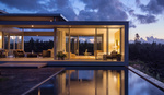
I recently challenged Mike Kelley to a photography competition. We both had two and a half hours to photograph the iconic "Dome House" in Charleston, South Carolina. Today, you will get to vote on your favorite photographs and choose a winner.
But there is a catch; we're not going to tell you who took each set of images, we're going to let you guess.
Below you will see two sets of three images. Mike photographed one set and I photographed the other. You can click on the images to view them full screen.
Images 1-3

Images 4-6

Now it's time for you to vote. First, try to guess who took each set of images. In the second poll simply choose your favorite set of images.
In the comments below let us know why you voted the way you did and which images are your favorite and why. In a few days, we will release the entire behind the scenes video that covers the photoshoot and how Mike and I actually captured each of these shots.


4-6 win for me. So much drama is captured in an elegant way.
I like both 3 & 6. They compliment each other nicely.
Image 1. The color balance on the green is bothering me, the coldness works for me, but I feel like it needs just a little more saturation in the green. It feels like the photographer has tried to make the house feel warm, but if that is the intent, I feel that the light from the window should be a little warmer. I'm not sure whether the eye being dragged to the side of the frame bothers me or not, I could go either way on that.
Image 2. I like the idea of this image, as something that is intended to show a living/working space; however, it seems a little cluttered, and perhaps simply removing the blanket would have altered that. Also, the fact that the bottom of the lounge and the right of the stair case have been cropped are bugging me (sorta like cutting the top off a person's head), I really do think this treatment deserves more breathing space.
Image 3. Others have commented on the telegraph pole and other house, and these also bother me. I also find the foreground distracting and messy, and the sky is a little bright for my liking (but this is entirely subjective). And the foliage is a little yellow for my liking, but again, this is a subjective aesthetic choice. I really like the birds, I think that is a really lovely touch.
4 through 6. I really like all of these, and think 6 is particularly well visualised and executed.
Re 6, I love the lighting on the foliage in the foreground; I love the fact that the building is internally lit, which makes it feel inviting, and this works well with the pathway leading up to the stairs as a leading line. The fact that the clouds are dark and dramatic and the fact that this draws the viewer's attention to the building, further adding to the inviting aspect of the building. I love this image so much.
I believe Mike took pictures 4-6 since they look similar in style to what I've seen from some of the tutorials.
That being said, I voted for 1-3 as my preference. I think images 1 and 3 do a much better job "selling" the appeal of the house than the equivalents from the other set. Personally, I think a large part of the appeal and feel from the house is the proximity to the beach and ocean. I just don't get the same feeling from the images in the other set. Only thing I'd debate changing if those were my photos is in image 3 the telephone pole and the edge of the other house. However, that does become an ethical problem if these photos are being used to sell the property.
Even though I like the 1-3 set better I believe that image 4 blows image 2 out of the water in terms of the interior shots.
I'm guessing Mike did 4-6. This is purely based on the composition. I really like photo 3 and while I would think that was a Mike shot, I am guessing that one is Patrick. (will be fun to find out)
I didn’t take any of these photos 🤦🏻♂️
Opps,I meant Lee
I couldn't care less who made the images, but 4-6 are "better".
1-3 are more flat and lifeless than 4-6.
For great Arch work, may I suggest you challenge a Hedrich-Blessing photographer?
Image #4 was the one that makes the difference here, made the #4-6 winner (with a little help of #6) but also clearly shows that classic mood that Mike's uses in his photos.
I'm not for sure who took what, but I like the richer colors of 4-6. Thats how I like my colors to look.
The colors of 4-6 are the way I like them.
4-6 are Mike’s images. Just small mistakes in 1-3 that practised architectural photographers wouldn’t make. I like 4-6 best, but I prefer 3 to 6. This is personal preference as I prefer a softer look.
This was fun. What a rad house!
personally I like the sixth exterior photo than the third one, because in the third photo there are so many elements like grass that is distracting the viewers eye. I'm in doubt for the interior shots, I think lee might be the one who took the fourth photo because in the video Lee set the camera on portrait orientation, but in the other hand I'm pretty sure that the sixth photo is captured by mike. I like the second photo because I think it's more informative than the fourth one but if I was the one who took the second Image, I would move the towel or kind of fabric that sitting on the sofa.
I think what drew me to images 4-6 is the use of light and shadow...the contrast in the images and the way the subject is balanced in the overall image. 1-3 are by no means bad, but stylistically I was more drawn to 4-6. For example in comparing image 2 and 4 I feel a bit lost and wandering in image 2, but image 4 it invites me in to sit down and be part of that space.
Image 6 is an awesome click.. One can imagine the dream house seeing at it... <3 (y)
The blues and greens seem a little over saturated, I might of added a fire in the fireplace on 2 & 4... :)
Funny video guys, I guess Mike took the 4 to 6 set, just because of the pole on the exterior shot, I think Mike will never leave this on a pic. I took my decision from there.
Then, the interior shot (2) is way too wide unless it's real estate photography, on the 4th the shadows are reinforcing the shape of the interior and give a real mood of a sunday's end of the afternoon moment (excuse my french)
For the balcony shot, The 1st got a color cast problem, I think he won't let that too, the 5th is just perfect on purple/pink/red cast and it fits perfectly with the green (someone definitely knows his color wheel).
Maybe I am wrong, and if it's so, Mike you should stop sooting next to Lee and Lee you should plan a tutorial video "When Lee meets architecture" (I will normally get royalties on that, don't forget me)
Final word : 1-3 Lee Morris 4-6 Mike Kelley
Can't wait to see the BTS video!
At first glance I was thinking the first set for whoever was able to train the birds to frame the dome on command, but on looking closer had to go with the second set. Although I did feel that #2 gave be a better idea of what the interior space was really like.
If the aim of the pictures is to sell/rent the house prefer the 4-6 set. It blends nicely the interior with the exterior taking advantage of the best views of both while concealing the less attractive ones. The first set has dull colors, simpler composition and #3 is a great example of architectural photography at its worst.
The graphic composition of picture 4 and the mix of artificial light and blue hour ambient light in picture 6 tell me that Mike was the photographer.
I'm strongly convinced that Lee Morris took the first set of pictures, while the second is by Mike Kelley. They do indeed look almost similar to untrained eye, but the devil is in the details. While the first set shows good composition and lighting, some small things betray non-architectural photographer behind them, such as distracting blues on the 1st image (post-processing done wrong), unflattering sandy beach on the 3rd pic etc. And the second set is ready to go to some real estate magazine right away.
I personally like the first set more, it kinda speaks to me and I love the mood. But from the architectural or commercial standpoint, the second set is done way more professionally.
Unless it is all some elaborate ruse and I am being completely wrong now :)
I like 3,4 & 6. Both of you should win.
It’s obvious, first 3 are not from mike Kelley.
Although there are a few things I don’t like in his images also. Blue overcast skies with overly exaggerated details in #6.
And lee had a good chance to incorporate flack of birds. But vignette in his images are pretty horrifying. And the interior shot #2 incorporates hdr imaging for the windows but he over washed the scene with flash and lost the 3 dimensional look Mike was able to get at #4.
This would have been great opportunity to join you guys in this competition for any of us. We all could apply what we have learned from Mike and compare the notes and results.
Mike's images normally have a buzzy energy to them, which 4-6 seem to have.
Images 4 to 6 have better composition and color. Power pole in image 3 and the untidy area to the front spoil this shot.
The birds in first set are like Mike's planes.
Either Lee want to confuse us and copy Mike's planes or Mike made mistake and did it in "anonymous" challenge :)
Second set has better composition and colours and overall postprocessing by my opinion, but first set may be more colour accurate or realistic and probably closer to real life minus the birds.
I do like more the second set which I think is Lee's job well done based on birds in the first set, but as previously stated that could be intentional trick in order for us to think that Mike took them.
(sorry on bad English if there is some)
Image 2 is good and I thought it could be Mike's on a day when he didn't try hard, but image 4 stuck out - clearly a far more compelling shot and a killer comp. Image 1 - again a pretty good image, although looks like it hasn't been edited very well, and image 5 is a much better comp with better tones and colours, although the slight halo around the roof stands out a bit. I love image 3 apart from one thing - the house doesn't stand out enough. Image 6 is superb and surely taken by the experienced architectural photographer. I'd bet a grand on 4-6 being MK's.
In the balcony shot, 1 made the balcony seem small and for a real estate photo I’d assume you’d want the balcony to look as big as possible like shot 5. The interior in 4 looks a lot moodier with more shadows and it focused on the part of the room that makes it different and cut out the left part of the space that seems more conventional and less necessary to highlight. And the exterior shot 6 has the classic “Mike Kelley” look with the balanced interior exterior lighting. This could all be Lee replicating Mike’s style from what he’s learned shooting with him but my guess is Mike is 4-6
I prefer 1-3 and I believe the Pro arch shooter took them. The 4-6 seem a bit more saturated and almost fantasy (HDR?) which is totally fine. But I think that 1-3 capture more of a realism as well as showcasing more of the captivating lines and curves particularly in image 2 where you can see parts of the exterior as well. I am judging these images in the context of "House for Sale" and also considering how it may be more suitable to portray homes as in images 1-3....just my opinion and what do I know anyway...but those're my thoughts
Both are great! So great job Lee! :)
I absolutely love #4. This for me is the standout overall best image.
Lee Morris Took Images 1-3 and Mike Kelley Took 4-6
I really struggled to find out which set i find better. But comparing the balcony shots I found them more or less equally good. comparing the interior shots i found picture #4 stronger compared to pic #2. The reason is pic #2 has too many elements in the picture and I thought it difficult to find harmony in the picture. and for the outside shot I really had to struggle which picture i consider stronger. but decided for #6. The reason the picture has more contrast and the house pops out of the landscape. All in all I voted for set 4-6 as the better pictures.
I actually prefer the internal shot form 1-3 but I like the outside shots from 4-6.
I voted for the first set just because 2 of my favs were in there and one in the last. I say 1,2, and 6
Mike never shoot vertical for an exterior main composition. ;)
I love 1, 2, 3 because they not only show the house architectually, but also give a powerful sense of the environment. The house is all about its location and the threat from the ocean. These photos dramatize that. The sky, sand, sea grass and pelicans in 3 put you right there. And I think Lee should let his hair grow back.
From the colors and crop it feels like Image 2 and 4 switched sets. My favorite is #6 it gives me the feeling this should be my home ;)
I like images 4,5,3. At first glance, I thought images 4-6 were done by Mike Kelley because he loves taking the exterior shots at night with the entire building lit up. I love the composition of image 5 rather than image 1, because of the way its cropped and the fact that you can see a better view of the ocean and greenery. I love all the shadows on image 4; it gives a homey relaxed feel. Image 2 looks too busy. I would have moved some of the furniture and fixed the throw on the couch. Between Image 3 and 6 (exterior images). I like image 6, but I would have made it less dark/contrasty. It seems like the house is located in the forest rather than on a beach. I love Image 3, better than 6, but I would have brightened the image more, turned on the building lights and brought the sky color out more(if that makes any sense).
Overall, you both did a great job! I really enjoyed this article a lot. I had fun trying to compare the two. You guys should do more of these type of articles again!
Now, I can't wait to see the results!
3 was my favourite because the unique home was landed on a cool beach with a lovely cloudy sky, and the flock of birds are holding it down. Frankly, I missed the utility pole first time around but hey, the guy only had 2 hours!
It is obvious that Lee has clicked the first set of images the way they are. I mean, there is stuff just lying around in the frame. This wasn't a real competition. It was for marketing the tutorial. Nice one.
“This wasn’t a real competition. It was for marketing the tutorial.” Great comment. The full video will be released in 2 hours.
This is tough haha both great sets of photos. I also love both exterior shots, but knowing how long Mike has been doing architectural photography, I feel like the second set of images is his because the houses and telephone pole behind the dome are hidden by the angle it was shot at.
Not going to vote or guess who took what... there are only two pictures I like 1 and 6. Of those two, six is my favorite because it shows more of the house. My least favorite, one. The house blends in too much with both the sky and sand. If I did not know you were shooting the house, I would guess this was just a snapshot of a beach landscape with a house in it.
Exterior: Lee Morris hands-down. Balcony: both are extremely well but Lee's only a small bit better. You feel like you are in a chair looking at over the ocean and the greenery. The chairs lead my eyes out and gives you a feel of depth. Interior: I like the lighting on Lees (and windows) and I like the angle on Mike's. Draw on that one. So Lee wins this round. Either way, both did a great job and made you laugh along the way with them.