
White balance is drilled into our head as a particularly technical thing to adjust in our photography and not really something we can use creatively beyond "Warmer or cooler" but there are so many creative possibilities out there.
White balance is measured in four "directions" warm, cold, green, and magenta. The latter two are tint while the former two are warmth and with these four tones we can create all of the colors we need. It all goes back to the color wheel, what we all should remember is that the color wheel taught in art school is different than the color wheel we need to use for light in photography. Not a lot different, but different enough it should be mentioned. The color wheel used for painting is called the subtractive color wheel, and when dealing with light we use the additive color wheel — the name talks about what to do do get to white. When we merge all of the colors in an additive color wheel we get white, while if we add all of the colors in the subtractive color wheel together we get black.


In the above images you can see the difference between the images how you get black/white by combining them together. As you can see, the wheels are a little different, as in the subtractive color wheel red and cyan are opposite, while in the additive color wheel red and green are complimentary instead. This is important to know in things like the image below where I used complimentary colors to enhance the purples/pinks in the background and really make them pop.

Fuji XT1, RF60X, 1/30, F4, 50–140 2.8 @93mm
In this photo of Toronto musician Danny Dymond it doesn't look too unnatural, shot with a single Cactus RF60x firing into a reflective umbrella camera right which was removed in post. This image was shot right at sunset, with the sun behind the camera casting beautiful pink light onto the buildings. Danny wanted the photos to be neon glam so we wanted to make them even more pink without making him crazy super saturated which would have happened if I had just cranked the saturation slider so hitting him with a gel that was the opposite of the color I wanted to enhance really made things pop.

Lighting diagram of how the image of Danny Dymond was lit
Because I wanted the background to be pinkish/magenta I can look up at our additive color wheel and see that the opposite of that is a nice green color meaning that if I throw a green gel on the light hitting Danny the rest of the scene will be able to shift to that magenta/pinkish color I was looking for. If you look at the "before" image below you can see what the coloring without compensating for the gel looks like (Including a special appearance by a fantastic photographer, Giancarlo Pawelec, who assisted me on this shoot.)

A straight out of camera shot
This is a overt way to use this technique but you can also use it more subtly. Again, I used a single speed light, this time shooting through an umbrella. I used a 28mm 1.9 Vivitar series one lens again on my X-T1. Instead of a heavy green gel I used a 1/2CTO on the model, so that when the light hit her the background would be a little cooler, which I then pushed more green just because it felt right. If I knew I was going to do this, I would have used a 1/2CTO and a 1/2 magenta gel together.

You can also push this idea totally to the extreme using a whole load of orange gels so that the sun itself goes a near neon blue (or go really crazy and add a bunch of pink gels to make the sun go green). Learning about how the colors interact can give you limitless options on how to have different light sources interact with each other.

A photo of Denis Theriault shot with a single speed light firing through a snoot
As you can see these look impossibly blue — but it is actually just sunlight giving us that blue color and the other light is so orange that when I pull down to make it a bit more neutral — the sun goes electric blue without using a second light. Keeping in studio you can also use this a lot more subtly by knocking out your ambient light a bit (the sun) and keeping it just contained to the shadows

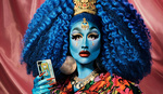
Toronto Drag Queen Silencia showing off a colored shadow due to relative light
As you can see in the above image, I have three key colors. Red from the suit and fill light, a neutral light hitting the model's face, and a teal-ish shadow on the wall behind Silencia. I used only two lights for this, and the teal shadow is just from the relative color of the sunlight outside filling in the shadows. The key light had no gel, just simply firing through a snoot straight into their face while my fill light was gelled red and firing through an umbrella to give the whole image a wash. What's most interesting about this shot is that the wall only looks green/teal, it's actually much more neutral colored but the proximity to the reds make it look colder than it actually is.
In conclusion, understanding how colors relate to each other and exploiting those relationships for creative twists rather than just using them for art direction or color correction can really give your work a nice spin and save you work in post and reduce the number of lights that you actually need. A great way to practice these techniques and wrap your head around how colors interact is to practice. Get a set of gels, throw them on your light and point that light at the wall. Color correct the wall to white and see how it interacts with the ambient — this will allow you to really understand, practically, how the lights react to each other and can be used to change the relative light around them.


Another thing to understand is that bright/clipped light is just white even if you color shift.
So you can have a backlight that produces color just as it falls off.
You can have warm or cool highlights with any skin color while maintaining white background. Basically saves gelled edge lights.
https://fstoppers.com/photo/254713
I hate to be the one to point this out to you David but you've got your colour wheels backwards in your before and after illustration. Of course, you are correct in the text where you say that the subtractive colour wheel is used for painting, (it's also used for inkjet and offset printing) and that the additive colour wheel is used when dealing with light (as in nature and photography: monitors, sensors etc. However, your before and after illustration is labeled backwards. In the additive colour wheel the primary colours are Red, Green and Blue and their compliments (opposite on the colour wheel) are Cyan Magenta and Yellow, respectively. Judging from your article, I'm sure you know that but I imagine that you didn't realize that your illustration was opposite of what it should be.
Cheers.
Oh dang! you were right! thak you! Updated the iamges!