
Monitor color calibration is a desperately boring activity to undergo, let alone discuss. However, if you're a photographer who wants to get serious about their work, it's utterly paramount.
Early on in my photographic endeavors, when I was armed with a Canon Rebel XT and a kit lens, I took a landscape which Flickr made their homepage image for a week. I maintain the image is unambiguously crap, but at the time I was pleased with the photograph and elated with the recognition. So much so, I decided to have it printed for my dear Mother who had told me how much she'd like it on her wall. I researched the best print company to go with and separated with my hard earned coins to have my artwork made. It arrived at my front door and I excitedly de-robed it to marvel at its beauty in physical form. It was underexposed by about a stop (a problem for another article), but worse, the foreground was green. That'd have been ideal had my foreground been grass, but it wasn't, it was rapeseed which is yellow. I furrowed my brow and debated a print error before dejectedly placing it in my loft, where it remains in the dark; a lonely relic of my days uncalibrated.
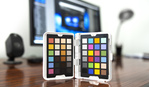
As the years rolled on, I realized the error of my ways and begrudgingly invested in a Datacolor Spyder5. I love Datacolor and their Spyder range is for all intents and purposes the industry standard for anyone working with colors on a monitor. Nevertheless, parting with my case to buy one of these little robots was neither exciting nor welcome. However, no purchase in my career has had a more important impact on my work.

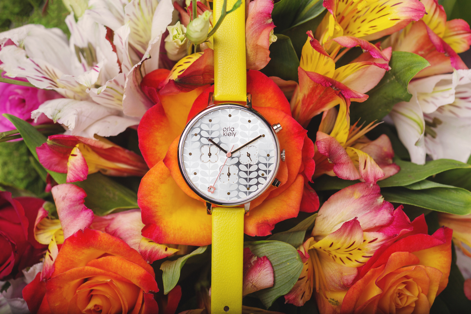
A large portion of my work for several years has been commercial photography, with a strong focus on watches. Anyone working with any sort of product photography will tell you of the essential nature of accurate colors; colors that have been very carefully chosen by the design team of that product. This is even more crucial when the product is in the fashion arena and the colors are not only carefully selected in the design phase, they are often thematic and part of a brand's identity. Needless to say, there is no room for inaccuracy, particularly when that inaccuracy is sheer laziness on the photographer's part.


Well, yes fine, product photography must have accurate colors, but it isn't crucial elsewhere in photography is it? I'm sorry figurative convenient questioner, but it is. Landscapes, architectural, sports... they all need true to life colors, but even portraiture. It goes without saying that fashion and beauty photography require perfect representation of all the colors on display and high-end retouchers take it very seriously indeed, but even photojournalistic or ordinary portraiture too. I believe it to still be true that one of the highest commendations for a photographer today is being printed in a respected publication. If your portraits have their colors off and your subjects have a slightly green tint to their skin, or a little too much magenta in the whites of their eyes, you've got little to no chance. Monitors and even printers can vary in how they display your images, but you have to make sure that your primary workstation is color true north.

Laura Mvula by Robert K Baggs
A Datacolor Spyder5PRO is such a small investment for such a crucial and large return and it will add a level of professionalism to your work that is essential for anyone working in the arts who is aiming high. Presently they have a sale on and if, like the younger and more naive me, you've been avoiding spending out on one, it's time to pull the trigger. The sale is only on until April 9th, 2018 and applies to a Spyder5PRO, camera calibration color passport, and two different bundles saving up to $200.


I've got a Spyder 4. Any reason to upgrade to a 5? I can't find any good arguments for it so far, unless someone here has one. I'm using a 24" Dell U series IPS monitor.
I won't pretend to know the nuances of the different versions, so here's what Datacolor say: http://www.datacolor.com/photography-design/why-upgrade-to-spyder5/
I've had both. The rumors surrounding the Spyder5 are accurate in that the color is much warmer than the 4 produced. As a result, I returned the 5 and switched altogether to the i1 Studio. The colors are much better; richer, deeper etc. The i1 studio is a bit pricier but you get to calibrate your monitor and printer. If you print on your canon/epson printer then you'll know why this is equally important to the process. The i1 is by X-Rite. Disclaimer: the software for the Spyder is user friendly compared to the i1 but there are tradeoffs with both.
Not really. The settings with the Spyder elite 5 were identical to the 4. I only bought because it was on sale.
I hate to disappoint, William, but I almost never use hand models. Well, never for men's watches anyway. As long as they have defined wrists and not overly hairy hands, that'll do really. Admittedly, women's jewellery require a bit more of a specific "look". Always happy for article suggestions though.
The Spyder 5 is by far the best piece of gear I have purchased over the past year. Takes all the drama out of printing, whether on my Canon Pro-100 or a third-party printer. Highly recommended.
What type of monitor do you use with it? Is it designed to be color accurate or just a regular consumer monitor?
The Spyder line of products (all of them up to the Spyder 5) are NOT accurate. Don't use them. Buy the the X-Rite i1Display Pro--which actually works.
If you buy two Spyder 5s and compare the two calibrations of the exact same monitor the results will be different from each Spyder 5--this is just horrible quality control or just an instrument that doesn't work. I can't comment about the items they just released this week (mid February 2019), but I assume they will work on the same horrible technology and/or poor quality control)
--By the way, I bought the Spyder 5 first and learned the hard way :(
Do photographers need a Spyder if all their clients only use social media ? If all their clients use iPhones and Andriods to share their home made creations ?
I purchased my Spyder 3/4 and 5, but some clients kept bugging me about how some photos are either too warm or too cool (Yes not all of them dont publish or print). Once i stopped using calibrators this issue went away and gained more posotive comments for Social media focused client work.
Its always best to ask your client what they plan to do with the content you will create.
But happy to hear other peoples thoughts regarding that.
🙌🏽
Some people may be viewing on different types of screens and that is what may or may not be the culprit.
The new iPhone X is known to be warmer than normal due to the OLED technology and I personally wanted to throw my phone out of the window after a week of wondering about the yellow tint on it.
I’d personally suggest a spyder because you screen’s accuracy is the most important part. If your client asks for prints or prints photos themselves, they will come out exactly how you intended and not how they are being projected from grandma’s Windows 98 desktop all-in-one.
I get you ! But here is the other issue, If they print them themselves, Their printer might not be calibrated, so either way its an issue waiting to happen. If they are taken tp a print shop then It might be a different case.
I get why its important to calibrate some jobs, But i am not sure that its what everyone “needs”. All depends on type of work and client.
The only time i dont mess around is when i am working with fashion brands that are looking for accurate exposures and colors.
I’m with you on it. I only calibrate for large scale prints and then I don’t mess with it until the next.
For clients that want to print their own photos I just ensure they use a reputable printer.
I’m not one to force clients to buy from me to print and then make more money on top but it is money flying out of the door.
Its like you just wrote down my experience. Haha !
Get the X-Rite i1Display Pro. It actually works, not like the Spyder 5 which doesn't (and which I unfortunately bought first)
This is a tricky one and I'm not sure how best to advise you; it has never happened to me. You can't really cater for people viewing your images with inaccurate colours so I would always opt to use the Spyder. That said, if a client wants an image to be warmer or colder, they'll get a warmer or colder image, even if it looks wrong to my eye. I'd just advise them that they might not be seeing the colours as they really are.
Calibrating monitors reminds me of people shooting video vertically. We all know the smart phone industry has some kind of influence on the finished product these days
That's a good point Mokhtar. Then there's the whole issue with colour grading. For example, you may have a particular shot that you think would look great with desaturated colours and muted tones but your client might think the colours are off.
There are so many different ways to retouch an image and the end result may not look accurate to some viewers. Sometimes I will upload a photo to facebook and it looks perfect, but on Instagram it looks over saturated because Im viewing it on my phone.
Exactly, People often switch camera brands because of "color science", haha...But what is color science if the sensors are not calibrated ? if the screen on the camera is not calibrated ? if the optics are not calibrated to produce accurate colors, i can go on forever.
Then you will have those that talk about color science and calibration yet they create their own preset system or use presets.
That is something that I feel we can not win due to so many different devices and monitor/printing profiles out there.
I always ask clients for end usage as well as if printed outcome than if they could provide a printer profile as every print factories has their own set ups. Than I can calibrate my monitor for the particular project to work on, than when its done, just change back to my normal setting or whatever the project profile I'm working on. I often work on CMYK side and colours are not vivid as RGB which makes some clients complains , than I have to explain the process.
For the digital out come, I just do as best i can do on my side and wait for client's feed back.
Just going to add these thoughts. Do what you will with them.
I had purchased into this company and their line of color workflow products going back for some time now. During their initial rollout of this product and alike, there was no reason to contact them, get support etc. But when that time came, the response in as much as my issues went were a complete 100% fail.
When I purchase products over the last 35+ years, I not only judge a company/their goods by performance of that product, but where are they if and when something goes awry. So given my remarks as stated... I'm out.
You only get ONE crack at my business and your product/service/warranty/quality of warranty service is all part-and-parcel of what I was sold, and bought into. If you fail me.. you're dead to me.
R.I.P Datacolor.
I mean, customer service is paramount, but I'm not about to throw the baby out with the bath water. Imagine the person on the service desk had just handed in their notice and was now completely uninterested. For that reason I err on the side of giving companies a few chances, but if your cut-throat system works for you, then keep slaying those giants, John!
dont buy a Spyder they are not accurate at all..
This is very true. Even two different spyders do not keep the same calibration. It is very rare to see any measurements how accurate calibrators are. Once you see Spyder’s result you will gonna regret you have bought one.
Do you recommend another brand ?
Try i1 from X-Rite. Their new i1Studio is a game changer for me as it gives me an all in one solution from capture through edit and printing (which I am doing a lot of these days) The fact that I can even calibrate my mobile devices using their ColorTrue app with my i1 device is incredible.
I have used both brands in my color critical workflow and i1 from X-Rite blows DataColor away.
I have not experienced that at all. My results are deadly accurate and my prints are brilliant.
I am using Spyder 5, BUT with Display cal software, so buy Spyder 5 express, and use free Display cal for calibrating ;)
Nice
Achieving colour accuracy from capture to view is an extremely complex task requiring expertise and time to get spot on. Expecting any one device to profile extremely accurately with no editing of the profile is optimistic. Close yes.
The idea is to produce an image file in a defined, device independent, colour space like Adobe RGB. When displayed the file is modified using a device (monitor, printer etc.) profile to compensate for the characteristics of the device and possibly the environmental factors, light & colour in the room, as well.
When you consider the complex variations in this workflow and the organic variations of the viewer it's no wonder that some experience a less than optimal outcome.
My thoughts are that it is better to profile than not. At least you start from a consistent baseline, tonal and colour, and if you find this to be inaccurate then edit the profile to compensate. I have on more than one occasion been thankful for running a calibrated workflow when I have had a client raise colour issues.
I do see the benefits of your workflow. I like it.
The real differences in experience are from the various monitors being used by the viewer. Each manufacturer of monitors sets them up to display color differently, cell phone manufacturers do the same.
An example. I am sure everyone has gone into a TV store and seen a bank of TVs all playing the same show, but the colors of the show look (really really) different on each TV even though they are displaying the same exact image. Some look really red while some look very blue or green. This is because the TVs have been set up to display the colors differently. It is the same thing with monitors, cell phones, laptops etc. You never know how your photo will appear on different devices because all the devices have been set by their manufacturer's to show colors differently--usually more vivid and warmer than the original image was.
The only real way around this is to calibrate your own monitor so that you have a "standard" and repeatable output and that will appear the same way on another monitor that has also been calibrated. Since most (I would bet it is over 99.9%) monitors are not calibrated there is not much hope that you will be able to control what your image looks like "in the wild".
More importantly, if a client indicates that an image doesn't look right on their monitor, you know what you need to do to change it--except that when they go to their bosses monitor it will look different again.
Also your image will look correct if you have calibrated your monitor when you or a print-shop print it out (if you also calibrate the printer/paper).
The bottom line is that if you don't calibrate your own monitor to accurately depict colors then when you edit colors and tones in the images in Lightroom you are really at the mercy of how crappy your own monitor displays colors. With an un-calibrated monitor you don't know if the image you are seeing on the screen is bluer, redder, greener, etc than the actual image you took.
Pity the sale is for customers in the US and Europe. Does not cover Canada!