I always say, once you have the core foundations of Photoshop down you are pretty much set. There are plenty of neat tricks to learn, but most of the time the tricks are one-offs. It's the core foundation where you should put your focus and master. So what are the foundational tools? Things like Layers, Layer Masks, Curves, Gradient Map, and Selective Colors. Today we are going to focus on the latter two and show you how to quickly color grade your images like a boss. The Gradient map mixed with selective color is pretty much my go-to color grading technique for final (global) color.
The gradient map is an adjustment and is a powerful tool for creating black and whites. It applies a gradient to your image depending on the tones. You can manipulate the tones by selectively grading your darks, mid-tones, highlights, and anything in between. The color control is huge.
Selective color is another adjustment that lets you cross blend individual color channels in Photoshop using sliders. I use it to add color to my shadows. Why? Next time you check you are lucky enough to get close to a painting by one of the greats, take a look at the blacks. Painters would mix colors to get their darks, it wouldn't be just pitch black. We take that technique and apply it to photography and the results can be spectacular. When you see painterly photographs online, I can guarantee you they have probably added color to their shadows.
If you mix the gradient map with selective color then you have the perfect technique to grade your images for cinematic or painterly styling. So let's jump straight in. Open up your image in Photoshop.
The gradient map tool can be found in the adjustments panel, right next to selective color.

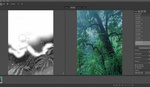
Click on it and the Properties box should pop up. Your image usually will turn to black and white, don't worry.

Double click on the gradient in the properties bob and the Gradient editor should now pop up.

We will be making our adjustments on the gradient at the bottom. You will see it has two boxes, left and right at the bottom. This is where we select the colors for our lights and our darks. Click on the dark box once and the color picker should pop up.

Select your desired color, preferably a dark if you want it to be your shadows.

Your gradient should now be colorized. We now need to create a mid-tone color. There is no box for this, but if click under the gradient about halfway, one will appear. Click on this and again the color picker should appear.


Choose a mid-tone color now. Something lighter and more saturated, usually around the middle. Press ok.

My personal preference is to leave the highlights white, so for this example that is what we shall do. But in the future, you can add color to the whites by using the same process as the mid-tones and shadows.

Click ok and our image now should be colorized. But this is way over the top. What we need to do is lower the opacity to zero and then gradually bring in the color until we are happy. Usually for me it's around fifteen to thirty percent.

You have a choice of having you gradient map on either normal blend mode or color. There isn't a lot of difference but normal usually has a more washed-out feel and the color is a little more contrasty.
![]()
So we have our gradient map. Let us add some color to the shadows. Again in the adjustments panel click on selective color.

Up will pop the properties box. Where it says colors in the dialogue box, switch it to blacks. We are now only adding colors to the blacks (shadows).

For this image, I want to add some blues to the blacks. To do this I move the yellow slider a little to the left. Confused? Well, the selective color adjustment works in the CMYK color profile. The opposite of CMYK is RGB, so when you pull the yellow slider left you are moving from yellow into the blue.

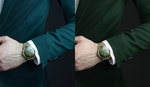
With a brown gradient map and blues in the shadows, you should have a pretty cool looking color grade on your image. But remember, every image is different. The color scheme I used worked for this image but it may not work for yours. If it doesn't go through the steps I just taught you and pick out your colors.

Experiment, practice, and soon you will be able to color grade your images.


Very nice. It's always a good thing to have another skill at your disposal.
Thanks Daniel
Good job but the music is distracting. Cheers
The music is barely hear-able. You must have the ears of a superhero! :)
Thank you for putting the tutorial in here. I'm not using PS anymore, but I'm pretty sure I can adapt it to Affinity Photo.
No problem. Thanks man.
I've watched a bunch of your videos and they're great but you REALLY need better audio. A 50 dollar microphone and level adjustments so that the intro isn't blasting my face off followed by me barely being able to hear your voice would make your videos WAY more professional.
If you need help with audio stuff let me know.
The grading showcased isnt that good.... ?
I like it. It's subtle. If you don't like it, it'd be more helpful to share some thoughts instead of posting a passive-aggressive comment.
Exactly. A classic looking style like this needs subtle.
It depends on what you are going for.......I was going for subtle, all you have to do the strengthen the effect is to push the opacity higher. If you push it further you would more than likely over-saturate the image. Which is what I did not want. The best thing to do is take what I taught you and experiment.
Just popping in to say thanks for the write-up! The captions are sometimes a little hard to decipher.
First ... I know nothing about color grading, so if it's a dumb question don't laugh too hard. But in watching this I had to wonder if you couldn't simplify the process down to a single step instead of a two step process? What I have in mind is, your first gradient map you mapped dark brown, medium brown and white. Why not map dark blue, medium brown and white and the adjust the points on the gradient scale to get the effect you want? Won't that get you to the same result in a single step versus coloring brown first and then putting blue on top of it?
Because it wouldn't look the same.......The effect would be different. I was putting blue on top of the color grade. Again, experiment and see what you come up with?