Adobe just released the latest version of Lightroom that removes the split toning module and replaces it with an updated version, "Color Grading." In this article and video, I quickly go over how to use the new tool, and I even edit a few photos along the way!
After completing my last article that touched on how to use tone curves to add a look or style to your image, Adobe released an update to Lightroom that revamps the split-tone module to give us even more options for creating a style within our photos. Also within this update are a few minor changes, including live tethering with specific Canon cameras, adding a couple of new cameras to their support list, improved graphics processing acceleration, and improved zoom feature within Lightroom. I touch on all of these briefly and go into a bit of detail about the new "scrubby" zoom in the video, so be sure to check those out if you are interested.
For this article, I want to focus on the highlighted feature of this update, color grading.
What Is Color Grading?

Color Grading in Adobe Premiere
If you've ever done any video work, you'll know this terminology already, but keep in mind it's not exactly the same in regards to photos. Typically, in the professional world of color, whether it's Hollywood cinema or all the way down to little YouTubers like myself, color grading typically refers to any form of adjustments you do to a moving image. This could be color correction, adjusting white balance, or toning (stylizing) an entire scene — all of this is typically handled by a colorist.

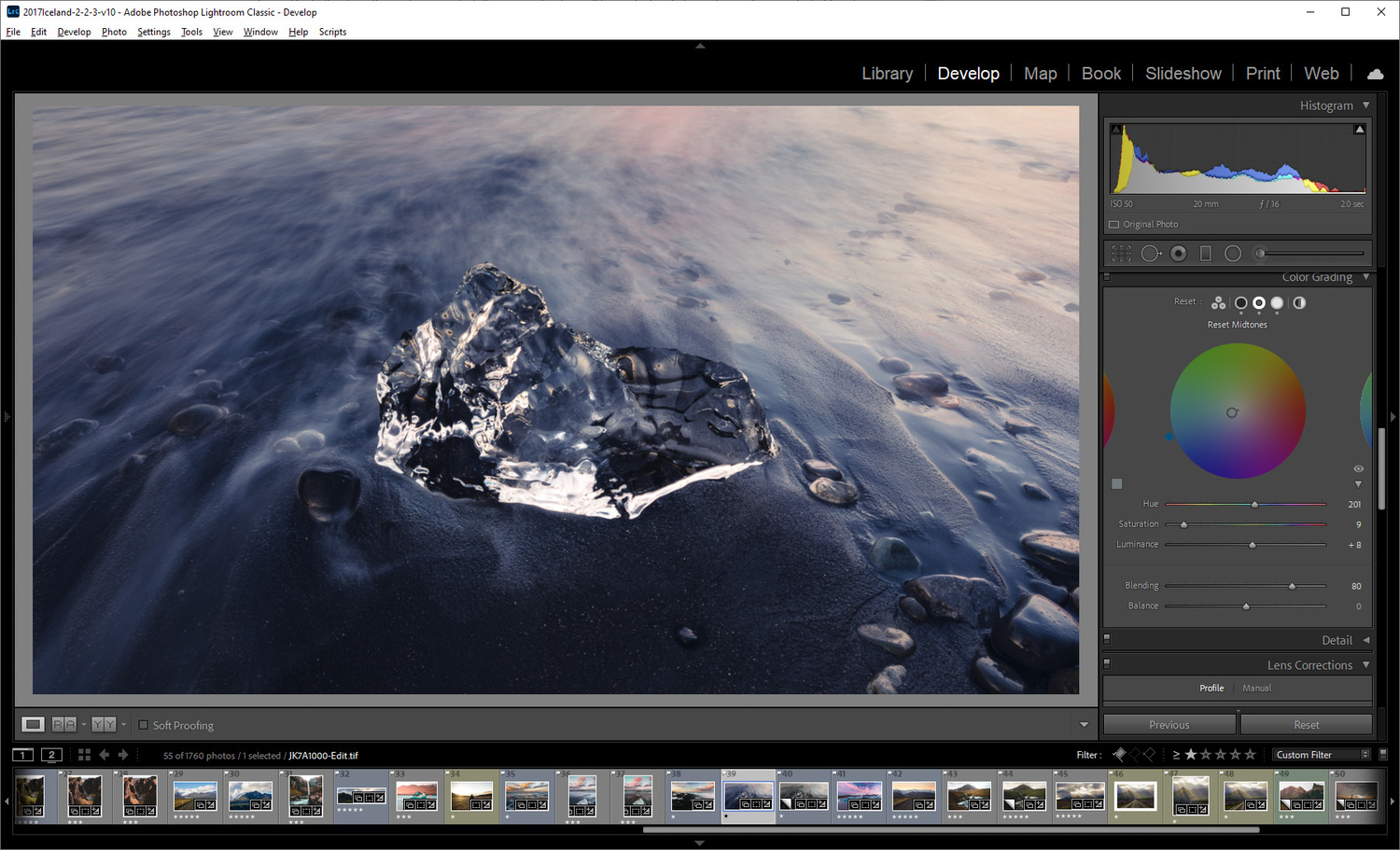
Main Color Grading Menu
Lightroom has adopted this terminology to replace what we knew as split toning. Any previous photos you had that may have had split toning applied will still be there and function the same way. This new module is more of an expansion to split toning rather than a complete revamp. It gives us more control and personally is much more intuitive visually, but also references familiarity to similar tools you may be used in programs like Da Vinci Resolve or Premiere. It also introduces photographers who may be editing their first photos to a color wheel, which might be useful in the future if they ever dive into the world of color theory.
The Color Grading Panel

Overall - Shadows - Midtones - Highlights
First, let's quickly go over the entire panel and what everything does. The first panel you'll see is the one on the left of the photo, which shows you all three color wheels in one place. To select the individual tones, use the adjust panel at the top, which I've highlighted with a red box. Personally, anytime I'm editing, I use the individual adjustment panels, because you just get more precision and control. On the very right-hand side, you'll see an icon that I didn't highlight, which is a global adjustment. I didn't include this one, because it's not something I see being highly useful, as I tend to like more control over my images; however, everything explained below would still apply to it as well.

The Color Wheel
Let's take a look at what these controls do. For this, I'll be using the shadows, but these are exactly the same for each tone range you choose. Make sure to click the arrow you see in the panel so you can bring up the hue and saturation sliders. If you ever used the split toning tool before, this should look familiar, as it's exactly what that tool used. The color wheel simply represents what those sliders do in a more visual way. The further from the center you select, the more saturation will be applied, and obviously, your hue is selected by where you click within the color wheel.

Make sure to click and drag the dropper tool to select a color
You can also select a color using a color dropper that can be found on the left side of the window. I actually use this in my video for one of my edits to select a color in the sky. After you've selected color, you can change the luminance value of that color, which basically just darkens or brightens how that color applies to the image.
Last, you'll see two sliders at the bottom for blending and balancing; note these are global and remain the same for each color wheel. Basically, the blending slider determines how much separation there is in your colors between the shadows, midtones, and highlights. The balance slider changes how much highlights or shadows you want in your image by moving right or left, respectively. This is a hard thing to show in a picture, and I highly suggest you just try it for yourself or watch my video for an in-depth explanation.
Editing a Photo

Pre-color Grade
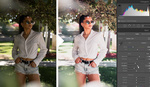
Alright, with that out of the way, let's actually put this tool to some use! My first suggestion when using this tool is to make sure your photo is pretty much already edited and corrected. I tend to want to apply my stylization, the color grade, as the very last step in my editing process.

Shadows Added
I tend to start in the shadows when I'm using this tool, so let's start there. I've applied a subtle amount of blue in the shadows of my image and also brought up the luminance a little bit. This is helpful, because sometimes, after you've done your entire edit and you adjust your final look, adding specific colors may darken or brighten your image more than you want, so you can tone it down right here if need be.

Highlights Added
Next up is adding a little color to the highlights. I'm choosing a very light amount here to give the feeling of sunset light in the water. This is the tool I typically use the most in day-to-day editing if I want to add a hint of color.

Midtones Added
I tend to save the midtones for last, as sometimes, they don't really add to the photo. In this case, I'm adding just a hint of teal/blue to my midtones to create a slightly better blend into those shadows. It might be hard to see throughout these images, but I promise it is there.
Blending Our Tones Together
Speaking of blending, let's blend and balance our adjustments. I increased the blend setting to give a smoother color shift between the shadows and midtones, somewhat making my edit a bit more subtle. I didn't change my balance, as I basically already balanced the photo by how much saturation I selected in our edit. That's pretty much it!
Final Image and Conclusion

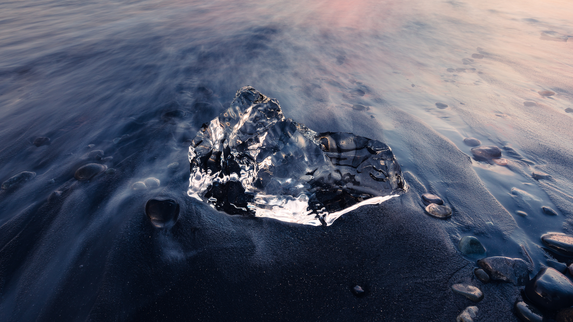
Here is our before and after! I went quite light-handed with this edit, because I wanted my final photo to stand on its own. I wasn't trying to style this image to look similar to other images; I just wanted to add a little color to what nearly appeared to be a black and white image. With that said, the color grading tool will be crucial in adding your own look or style to your images, which is mostly what it is intended to do. If what it produces is the type of style you like, it will make applying it to all of your photos a lot easier.
As I state in my video, sometimes, you visit a place like Iceland and the weather (lighting conditions) remains exactly the same the entire time you're there, or the scenery all tends to blend in together. In a case like that, you might create a calendar, a portfolio, or simply a look for your social feeds that ties everything together.
As always, I hope this was easy to understand and helped all levels of photographers that might be reading this. I would love to hear what you think or even some example images of your own down below using the color grading tool. Thanks for reading and watching!


They should've left the split tone tool and added this rather than swap. Sliders were easier than trying to be precise with color wheels.
The sliders are still there on the drop down arrow and function exactly the same way. Unless you just mean you want their own panel still.
Saw a video where someone shared that secret dropdown but I don't see it.
It only shows up in the individual controls under shadows/highlights/midtones.
Another great video...keep them coming!!
Excellent video! Keep them coming and get out and meet people!