
I’m a big fan of getting images right in camera, and it's something that strive to do. I think there is something to be said for the skill that it takes, especially when shooting an event like a wedding. Getting the perfect light, the perfect composition, and the perfect moment while dealing with all the different variables of the day is quite a feat. The main image I’m going to be talking about today, though, does not fit into this category, but it still manages to be one of my favorite and most "liked” images.
How It Was Shot
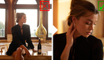
The first thing I’ll do is explain how I shot this. Most people think it was a posed image taken in a studio, but it is actually a candid image of the bride dancing at the reception. The main light is coming from my Nikon SB910 with a Magmod grid attached. The light was held in my hand and was triggered with some Yongnuo TTL triggers. I prefer to hold the flash in my hand, because it allows me to keep the flash off camera, while still being mobile and not tied down to the specific area in which my light stand is set up. While I shoot like this, I hold the flash in my left hand and shoot with my camera in my right hand. During the reception, I saw the bride dancing alone, twirling and hopping around the dance floor, so I jumped at the opportunity to grab some shots. Starting out, I was taking some slower shutter speed images, like I normally do in order to show movement as the bride danced around. For the image below, my settings were at 1/15th of a second, f/5.6 and ISO 100. The light from the flash is enough to freeze the bride, while the longer exposure allows the objects only lit by ambient lights to streak as the camera moves.

I liked what I was getting, but I wanted something a little more dramatic, so I decided to try and kill the ambient light more, but I still wanted to keep some of the motion I was getting. This is where things went wrong. Instead of raising my flash power and then raising my aperture to match the change, I just raised my flash power, giving me the overexposed mess you see below.

The Edit
The above image is the unprocessed raw, without any work done to it. There are some blown highlights, but nothing so bad that they can't be recovered. So, I applied my custom preset and fixed the exposure. I ended up needing to drop my exposure by almost a full stop to fix the issue, which isn't as bad as I initially thought it was going to be. As for my custom preset, it really is nothing too crazy: simply some slight adjustments to the highlights, shadows, blacks, and clarity sliders, as well as some split toning and a curves adjustment for contrast (I try to stay away from the contrast slider, because it doesn't allow for the ability to fine tune like with a curves adjustment).


Now, this is where I’m starting to see some real potential. I love the motion, and the color of the dress, as well as the slight smile on the bride's face. However, the guest on the left side of the image pointing at me is very distracting. I also don't care for items sticking out of my subject, so the arm sticking out of the bride's shoulder has to go. My first thought was to use the brush tool to bring down the shadows in the background to try to minimize the distractions without having to completely remove them.


This was better, but not quite what I was looking for. I tried using the exposure slider in combination with the shadows slider to get a more drastic result, but doing this was just too obvious and still didn't get me to where I wanted to be. It was time for the heavy hitter. I took the image into Photoshop and just cloned out everything that was distracting me. After about five minutes, I ended up removing everything but the bride.


Once I was done cloning, I saved the image and was back in Lightroom. At this point, I liked the image enough that I knew it would be a portfolio image for me, but I also thought that it needed something a little more before I could move on. I liked the color on the bottom of the dress, but I couldn't decide if it was too much or not enough. So, what I did next was create a virtual copy in Lightroom, and then, I used the brush tool to take away the color on one, and add and saturate color on the other.


I ended up delivering both images to the client because I couldn’t quite decide which I thought was best. However, after seeing the bride and groom’s reaction to the colored version, I knew that was the keeper (I am curious which you prefer and why you are drawn to that image over the other, though).
Conclusion
My main point to all of this is not only to just share how I took and edited the image, but also to show you that not every good image starts off that way. Some images need to be pushed and pulled. Some images need things taken out, and some images need things added. Does this image make me more of an editor rather than a photographer? Maybe. I would like to think it's at least a combination of the two, but that’s one of the great benefits of shooting in this day and age. We have the ability to get the results we truly want, even if the images don’t start off that way.
Do you have a favorite image that didn't start off looking so great? What did you do to get it to your liking?


I've had a ton of images that started off not looking so great. Sometimes it all comes together, sometimes an image takes a little more work. It's almost like sculpting, you know start with this hunk of stone, you know there's something beautiful there, but you have to sculpt it to bring it out.
For me, I like the color graded version better. I like the complimentary colors and the contrast, plus it has a more artistic approach. Good article man
What I take away from this is: The moment and composition is more important than the technical aspect of a picture.
You would have never been able to get a great end result like this if you didn't get the smile, the flow of the dress, etc...
Great shot!
Honestly, even with the people in the background, it's a great image IMO. Retains the ambiance of a wedding reception.
Great article!!
I do get the point. But I have thought about this "beauty" of the photos we take as a photographer. Our minds are influenced by the work of other photographers and perceive that they have "better" images produced. In reality, most photographers would be most likely envious at each other.
So technically, your the first few edit of your shot versus the last one are basically the same. It would be up to the viewers eyes if it's better or not.
Killer post. I wish I had this much patients with individual wedding pics
patience even ;)
I don't think it's necessary to erase everything in the background. It looks very good after 1st or 2nd step. But I have to admit the grading is really nice, love the colors on dress.
Fantastic shot!! I bet all the top photographers have these in their portfolio. One of my favorite shots I took was a wide test shot (with model) with color checker sitting on her bike (lifestyle for local magazine). The reflector, lighting, everything were all off. The shot was included in the proof page, by accident, for client to choose. The client wanted THAT shot. after cropping, removing colorchecker and bringing down highlights, it turned into one of my favorite shots. For these instances, dynamic range is your friend.
Nice work! I'll vote for the coloured version - it adds some visual information. The total absence of surrounding image detail seems to make the image a bit strange and unsettling. Maybe just clone out the people and darken down the background elements? It might be good to have a hint of the dance floor and her shadow on the dance floor below.
very nice, good to have skills on both sides of the camera. great photo.
I swear that dress is black/gold... but thanks for skewing my perception of reality /s :D
This is a fantastic example of taking an image and really running with it to turn it into something great. Editing images is a huge identity representation and it's an instance like this that really puts your individuality onto your work.
Side note: Love the colors in the edit
Wow that's a really cool shot, I might have even culled it out at first glance
I prefer the colour one, great image!
After catches the moment and the emotion.
Great article!
You made it magical, Fantastic thought process. You know you're doing it right when it becomes art!!!