
We've all heard of saving less than perfect images by turning them black and white, but when should you really do it? Here's how I decide.
I want to start by saying this article is aimed primarily at newer photographers. Then, the usual caveat for articles pertaining to rules and guidelines: everything in this article can be broken and with great effect, but it's rare and discounting examples of extreme good fortune, it requires knowledge of the rules to begin with to be able to set up an image in opposition. In fact, it's the set up that often distinguishes experienced photographers from those at the beginning of their journey with a camera. That is, black and white images ought to have been shot with the express intention of editing the image to black and white. That's not to say that on occasion you don't look at an image after the fact and realize it has numerous tell-tale signs of a good black and white photograph, but generally speaking, it's unlikely without forethought.
Texture

Texture is ordinarily something I notice first and it acts as a trigger for considering black and white. With the removal of color, all other elements of an image become more important and central to the success of the image. This isn't to say that color and texture can't work hand in hand — they can — but depending on the mood of the image, I will often seek to shoot for black and white. So one of the first questions to ask, is does my image have a strong texture that's important to the final photograph?
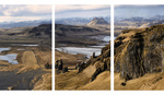
Contrast

Image courtesy of Nino Batista.
To many, this is the most obvious, but it's the one overlooked regularly by non-photographers. If an image has strong contrast between lights and darks, particularly in the case of subject and background separation, it's worth considering black and white. Many of the most beautiful and striking black and white images of all time have fantastic contrast to them. Contrast lends itself to the guidance of the viewer's eyes, ensuring they explore your image how you intend, and that your subject is the primary draw. Many black and white images that have a "washed out" feel to them mislead non-photographers in to thinking any shot will look good in black and white. But the best images, even with the in vogue faded effect, have all the staples necessary to begin with.
Focus

Image courtesy of Anete Lūsiņa.
Speaking of guiding the viewer's eyes, now we move on to focus, which I mean in a compositional sense, as opposed to the literal focus of the camera. The removal of color, particularly in conjunction with strong contrast, can serve to divert attention away from elements not core to the image's focus. One genre of photography that often employs this method is wedding portraiture, as well as many similar busy events. The scenes are generally crowded with people, decorations, and other distracting clutter. Colors have a habit of drawing the eye, and so a way of ensuring the subject remains the focal point for the image, is to remove the color. If either or both of the above "rules" are in place, it can yield a fantastically powerful shot.
Reasons You Ought to Avoid
There are lots of reasons for people to lean on black and white imagery in an inappropriate and ineffective way. Black and white photography is part of the destination and not a crutch to hold an image higher than it would otherwise be considered. With that in mind, here are three of the most common reasons people make an image black and white through a sense of necessity, rather than desire.
Colors Aren't Important
Not every image is going to have complementary colors, or a subject in bold, bright colors. In my time behind a camera, there has been many an occasion in which I wished the colors had been more appealing. This can often be fixed by changing what you are in control of, be that the outfit, the setting, or just the post-production (i.e color grading). Turning the image black and white just because the colors aren't playing a key role will not improve the image.
Image Technically Poor
This is almost a satirical photographic cliché: "ah, the image is rubbish; turn it black and white and add some grain," or words to that effect. This will almost always fail to save your image. One of the first professional photographers I ever met when I was first starting out gave me some advice that has never failed to be true for me: "sh*t in, sh*t out." That is, if the image is poor before you edit it, it'll almost always come out poor when you've finished. There are a few Photoshop wizards who buck this trend, but it's no less true. After all, their image would have been even better with a higher quality image going in.
Make the Image More Impactful
A byproduct of a black and white image is that it can dramatically alter the image's mood and overall impact. The problem a lot of newer photographers suffer from is borne out of the misapprehension that the impact is derived from the removal of color. It is instead the case that the removal of color accentuates the mood or impact the image already has. Sometimes, an image becoming black and white can be transformative in that it brings out a feeling or power an image has, tenfold. This can lead to the illusionary conclusions that the power was given to the image by turning it black and white, rather than unveiled by the process.
Conclusion and Inspiration
I've always had a love for black and white photography and the evocative and powerful results it can aid in creating. Understanding the ways in which it can enhance an image leads to not only better black and white images, but better images as a whole. The conversion of a photograph to black and white ought not be an arbitrary decision, or one made out of desperation to rejuvenate or recover a lackluster image. Take the time to appreciate the constituent parts that make up a strong black and white photograph, and then apply it to your own work.
Rather than reiterating points I've already made as is standard practice for a conclusion, I will instead offer some great black and white images from a few of our writers as inspiration. Please share your best black and white images in the comments, as well as any rules or guidelines you use for success in that venture.


Images courtesy of Anete Lūsiņa, Burak Erzincanli, Hans Rosemond, Jack Alexander, Jason Vinson, Jordana Wright, Nicole York, Nino Batista, Robert Baggs, and Usman Dawood.
Lead image courtesy of Anete Lūsiņa


Nice article. Many years ago I used to load and develop B&W film and then print 8 x10s as a hobby. I quit when I had to raise a family but with the advent of digital my enthusiasm has been renewed. I think your discussion on texture and contrast is something I unconsciously must envision when I choose a subject for B&W. Here are couple of my B&W. One of Denali and one in Yosemite.
Love those. I think a lot of us unconsciously appreciate these "rules" just from seeing images in black and white that we like. I went to a few exhibitions (particularly one by Sebastião Salgado) where I just loved the images, but wasn't 100% sure all the reasons why.
Great article which inspired me to think about B&W. And I reached the point where it become obvious to me that if colors do not bring anything to a pictures, this picture shall be B&W. And then there is a statement in the article: "Turning the image black and white just because the colors aren't playing a key role will not improve the image". Isn't it a good reason?
Side note: James Cochran's Denali picture is for me one of the best examples of B&W. Thank you for sharing. Lack of visible clouds' shading is big plus here in my opinion.
It's not that it's a bad reason, it's that (in my opinion) you need to come at the capturing of that image differently. Shooting a colour photograph where the colours add nothing to the image's merit (and may even subtract from it) does suggest that shooting black and white instead would be a good idea, yes. But we ought to approach the shooting phase differently to get the most out of the black and white processing instead.
It's always interesting to see how different people approach the choice of color or black and white. It seems for me that in my personal photography, it comes down to the primary source of contrast in an image. If the contrast is primarily in the color, I go with color. But if the contrast is primarily in the light, I go with black and white. It's not a hard and fast rule, but that's typically my starting block when making decisions.