
When I was a kid I thought I was stupid. No one could figure out why I couldn’t remember the colors of all the crayons. My teachers thought I had a learning disability. I remember having to pick up a crayon over and over to read the name so I knew what color it was. That was the earliest I can remember having issues with color, but it really didn’t hit home until I was a teenager. I was walking to the river with a friend when I saw a raft sitting unattended. I said to my friend “let’s go grab that gray raft and go for a ride”, to which friend replied “dude, that’s pink”. That was the first time I realized I was color blind. To this day I still make mistakes. I recently bought an “orange” shirt, but turns out it wasn’t orange.
What is Colorblindness?
When it comes to photography I get asked all the time, how can I be a photographer if I’m colorblind? Sometimes I joke that Beethoven was deaf and his music was “ok” (insert sarcasm). People often think when someone is colorblind it means they only see in black and white. As it turns out, colorblindness is on a spectrum.

Being fully black and white colorblind is an extreme and rare occurrence. More commonly people fall into one of these categories: Protanopia, Deuteranopia, or Tritanopia. I fall into the Deuteranopia category. I have a type of red-green color blindness in which the green cones in my eyes do not detect enough green and are too sensitive to yellows, oranges, and reds. This results in greens, yellows, oranges, reds, and browns appearing similar, especially in extreme lighting (both bright and dark). It can also be difficult to tell the difference between blues and purples, or pinks and grays.
Where Things Get Tricky
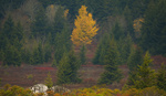
Since being colorblind will affect different hues or colors based on the deficiency you have, there are times where it is easier to work through it and times that it is harder. The biggest struggle for me is seeing the subtle color shift and color changes on location. I remember standing at Lake Louise one morning surrounded by other photographers that were already shooting and I could not understand why. I finally turned to the photographer next to me and asked, “Am I missing something?” They responded, “You can’t see that? The sky is full of pink”.
The struggle is not just in the field but also back home when I’m editing. There are times where I have trouble trying to separate or distinguishing the different tones in the sky. When the sky has pinks, reds, oranges, and yellows it becomes difficult to determine where the one color stops and other begins (or even if there are certain colors in the sky at all). Now this is not necessarily a bad thing while shooting, however it does pose a challenge while editing.


Since my eyes basically have trouble seeing every color that landscapes are made up from, it can be difficult to edit images in a realistic way. It is common for me to over saturate or introduce unwanted noise and blemishes into an image. Thus results in a shot that looks “overcooked” and unrealistic. So how do I make it work then?
How to Work Around it on Location
I get it! Every article out there will tell you to get to your location early, but it is for a good reason. And in my case it is no different. Getting on location and setting up early (well before sunset or sunrise) gives you the chance to catch the light before it starts to change. That way if something starts earlier than expected you are ready to go. This also means typhoon should stay later than usual, just in case there are any moments of “after burn” in the sky.
Working on location I’ve learned to start snapping away as soon as I see the brightness shift in the clouds. Once the clouds start to shift their brightness or intensity, that is when I know that there could be color up.


When you are out there, don’t be afraid to ask other people what they see. Other photographers or even just other sightseers. Ask them what they see and they will often have no troubles letting you know. It can also spark some interesting conversations.
Tips for Editing
The best advice I can give to anyone colorblind or not is to make sure your computer displays are calibrated. This will ensure that the colors on the screen will match what the camera captured. If you don’t do this your display can introduce cold or warm color to your shot and once you share it elsewhere it will look totally off from what you wanted. As for being color blind, this will ensure that you are not over correcting your image to get back a color that is being suppressed by the display.
When I start editing I often open a file and start moving the color adjustments very drastically in order to see what colors are predominant, where the colors are, and just how strong or weak they are in the image. Luckily shooting in raw will allow you to use the camera raw suite in Photoshop to adjust individual colors with great control. For example, crank the saturation slider for an individual color really far to one side so that you can see a change. If nothing changes, goes black and white, or goes over the top saturated, then that color is not in the image. However if something changes, then you know that color is present. Now you can make your adjustments. Be sure not to over do it though. Remember if it is increased enough for you to see it then people with normal color vision will see it as over saturated.

You will begin to see how often, when you edit, that you change the same sliders. Creating a workflow can help manage the time you spend editing and can help you keep it consistent. Over the years I have found I am adjusting certain colors by the same values, therefore I memorize these or create presets to load when I am working.
If all else fails a second pair of eyes is always helpful. You can send your images to a friend or family member to get their opinion on the shot. I usually take my computer to my family members and have them look at it as I make adjustments.
There have been some great accomplishments made with software to help people that are color blind. Even in some smart phones there are settings to help adjust for each variation of color deficiency. There are also companies dedicated to creating glasses that help correct the effects of being color blind.

Final Thoughts
My best advice to anyone in a creative field is this: it doesn’t matter if you are colorblind. With enough persistence and dedication you can overcome just about anything. Continue to practice your craft, continue to push, and you will find ways to make it work.
You often hear that anything worth doing can be hard. As cliché or anecdotal as that sounds, it is true. I love photography. I love being able to travel the world to see beautiful places. I love meeting amazing people and capturing once in s lifetime moments. If it was easy it wouldn’t be special. So don’t be discouraged by being colorblind! Be motivated! Let it be the fuel behind working harder and going further, proving to yourself that you can do it.


it can be an advantage in color photography. i say this for people with single channel colorblindness, as it can help with eliminating distracting elements or even with better perception of contrast. and even for those with complete colorblindness, the only problem i can see (pun intended) is with post processing if they shoot with a first gen Sony camera, but even then, higher acuity for contrast mostly makes that moot. with years of adaptation, even white balance correction can be overcome for someone with complete colorblindness.
we did a lot of testing on this in the 90's as we gradually moved from monochrome tube multifunction displays to full color LCD and helmet mounted cueing systems in aircraft at Lockheed. in fact, based on my experience from that, i'll occasionally shoot with 2-channel color glasses to simulate single-channel colorblindness to give me a better view of a scene when landscape shooting. it helps with exposure by knocking down the green channel. i also used it highly for trap and skeet shooting when i was younger, to bring up the contrast on the clays by knocking down the background color, but didnt really understand the science behind it until i liaised with Lockheed.
and here's a bit of trivia: the Joint Helmet Mounted Cueing System used in our fifth-gen fighters purposely dampen a single color channel to increase contrast and situational awareness for wearers. for ground-pounders, Oakley developed and provides single channel glasses and goggles to enhance night ops, IR and laser targeting for soldiers and TACP/FAC for SEAD and DEAD targeting systems.
Very cool. There have been studies that show people with colourblindness actually detect movement quicker. So I imagine it does come with other advantages. Thank you for your comment!!!
Joel Grimes is also colorblind.
Did not know that. Thank you for sharing!
NP
You can watch him discuss it here: https://youtu.be/xHUR09U8lcM
Cool video. I like that we use the same hack to find if a colour is in the shot or not.
I'm glad that you enjoyed it. Y'all are pretty amazing!
Nathan Elson is another colorblind photographer.
https://www.youtube.com/watch?v=C-wp9IJ2GEk
I remember seeing this video but never got around to watching it. Thanks for the share. I’ll check it out.
Very impressive photos and even more impressive is the way you handle color blindness.
Will be an inspiration for many with similar issues.
Thank you for the kind words. I hope it helps others who are stuck find ways to keep their creativity flowing!
Great article David! I've been following you on Instagram for a little while now.
I am also colorblind (deuteranopia) and you are totally right about the editing process. Its easily the hardest part.
I have started using a similar process when editing; drag the color sliders to the max so I can actually see what is changing. Then knowing what the colors should look like in the final image, I drag them to my best guess. I also have friends/family proof my final image.
Thank you! It’s way more common than I originally thought and it just goes to show you can still make it work. Thanks again!!
Thank you for sharing how you work around your limitations!
As someone who relies on my histogram in the post production, fixing white balance for real estate photography, I try to crush yellows and reds as much as possible when other lights are on in the room and affecting the the ambient lighting. I know in landscape you don't have to worry about lighting too much outside of ambient, but are you able to tell when you have a heavy amount of reds or yellows in your highlights? Your photos look incredible, so I'm just curious what it looks like for you?
Thank you for the kind words. It can be such a challenge with portrait work for sure. I often give people too much red and they look like they have some sort of sickness or a sunburn. Haha
I tried to make the before and after sliders represent what I see but of course that might even be off a little bit because my eyes are off to begin with.
It is such an interesting think to ponder how we all see the world slightly different.
Great articulation of the subject David. My eldest has the same challenges. Labelled colored pencils are a non negotiable with him! With his consent of sharing his personal situation, I am currently working on some pieces that help share his and your 'vision' of landscape imagery. I won't go into the particulars here, however if your interested in some of the looks or the process send me a note. Thanks again for the article, I look forward to sharing it with him.
Thank you for the kind words. I hope your son gets to see that even with being colourblind anything is possible with this article. Sounds like a great idea. Looking forward to seeing it.
Very informative, I've always asked myself what's it like and to what extend affected people can actually tackle the challenges that come with it, editing in particular. Thanks for the inspiring article and shots.
Thank you for the kind words. I often wonder what it is like to see the true colours and if I am way off with my edits. Haha
The world is such an amazing thing and it is so wild how we can all see it differently.
I am color blind as well, I have the same type of color blindness you have. I shoot mainly portraits and headshots nowadays, and I still have trouble editing. It appears to me that some of my pictures (some posted here) have this yellowish tone to the skin, which does not look that good. The problem is that I do not see that :S. It can be painful sometimes.
I hear you mate! I have similar troubles with portraits. I often over do it with skin tone because I can’t see the pink in the skin. So often my portraits are over done with the first pass. So I get a friend or family to check for me.
I have moderate to severe Deuteranopia myself and find that it can be challenging to know what I'm shooting, color-wise. When people ask me what it's like to be colorblind, I tell them that it's not that I can't see color, it's more like I do not have the correct word-association with color. What I see as green is not what someone else sees as green. I've been told often enough that a certain thing is green that I'll call it green, just because I know better even if I don't really see it that way. Where I fall afoul of the color spectrum most often is when there just isn't enough of a certain color for me to tell what it is. I can tell red from green, for example, but only if there's enough of it for me to be certain. It's challenging for sure and in my amateur level photo editing I have tended to shy away from any major modifications to color unless it's a color I am certain of it in the image. Alternatively, there's a special place in my heart for black and white photography, though I know that color science can impact how black and white images are rendered as well (think color filters for B&W film photography).
I can totally relate. I started off in the early years of my photography (15 years or more ago) shooting only for black and white. Heck even all of my tattoos (I’ve got a lot haha) are all black and white because of it.
I find though colour photography can be enjoyed, seeing it the way I do. I’ve come to accept what I see and I still love it.
Maybe colorblind people are seeing things correctly. Who says the colorblind test inventors were not colorblind. Of course I an joking...
Hahaha hey you never know, I often tell people this to blow their mind... a colour is only the colour we say it is because someone a very long time ago decided to call it that colour.
For example when the person who named the colour red, “red” they could have just as easily given it another name like blue.
Let that one sink in for a sec. haha
Thank you for sharing your personal story. And as you say, there are parallels with deafness. I now have serious hearing loss and as with colour blindness, the effect is uneven across the spectrum. Most people lose high pitch hearing first.
Analysis of Beethoven's music reveals that he used fewer notes as he got older, quite likely because he became less sensitive to them. This is similar to the palette used by Van Gogh, who had an increasing fondness for yellows in his later years. That may have been the epilepsy treatment, digitalis, or perhaps absinthe.
Given my hearing loss this also personal, and you've hit a nerve because it's the topic of my book about sound and hearing.
I’m glad you enjoyed the article. I think it’s important for people to have stories like this to refer to. It helps us understand each other more and understand that our perspective on life can be different depending on how we experience it.
Your book sounds very interesting. I hope it does well or has done well!!
I needed a lot fewer crayons as a kid too, and I could never figure out why the color blurple had so many other names... It's anomalous trichromasy, meaning both my red and green perception is weaker than normal. I have a pair of Enchroma "colorblind glasses" which are nice to wear occasionally in ample light in the right surroundings, but I never wear them while shooting.
I'm glad that others are talking about this, but myself having a similar color blindness like the author of this article, it really creates a hassle for me since I work mostly with Interior designers. Thank god my fiancee is an interior designer as well and she often crosschecks my photos before I send them to clients and almost always finds inconsistencies like some green casting, slightly different temperatures, furniture colors in different pictures. I am getting better each time by making sure to use consistent camera settings and using LR settings as well, but I still I can never be 100% sure and have this paranoia that the client will come back saying that something's wrong with colors on the furniture. The problem is, I don't see any issues before somebody points it out to me, and when I do notice it I think I might see something slightly, but not as obvious as to a person with a normal vision. Thanks for the tips though!
And yes I do have a drivers licence. :)
I'll never forget getting my driver's license either... I failed the color test, and they stood around looking dumb-founded like it had never happened before! :-) I told them my uncle had a license and he has black\white color vision (actually I'm told it's technically blue/yellow, but the afflicted don't know the difference), and they stood around and jawed about it some more. Then I said the order of the lights is Red>Yellow>Green, of which I only have trouble telling the difference between the red and yellow on some models, and when there's only a single blinking light over the intersection, I just treat it as red (I lied there - only treat it as red when there's an accompanying stop sign without issues so far) - more talking and head shaking... Finally one genius points to the Washington flag and says "what color is that" - Green. And another points at a Red Cross patch on his uniform (they had uniforms back then), and I answered "red". Good to go :-)
I feel you. Hey, what's that colour over there?! What about there? Wow you are so weird
Anyway, I imagine somehow that other people see colours with like +25 Saturation or something.
Any of y'all tried this test? https://xritephoto.com/ph_cooltools.aspx (where 0=perfect color acuity, 99=lousy color acuity, mine was 132... ;-) Most of my trouble seems to be with the colors blurple and gred!
I know this was a long time ago but I like creating photographs and I have NVLD. So it's really difficult. It is interesting what makes us all different. (It stands for Non-verbal learning disorder very underdiagnosed so it's hard to talk about.) Takes me a long time to choose photos to edit it is a bit tiring sometimes.