
I'm no painter. In fact, if we ever play Pictionary together, do your best to get on the other team. So, when I wanted to make my own custom backdrops, I knew I was way out of my depth. Like many photographers, I've drooled over Sarah Oliphant's hand painted backdrops for years. When I saw Jeremy Cowart draw his own backdrop on an iPad Pro, I thought I may have something within reach. While I continued trying to decide exactly what Oliphant backdrop I want to start with, I thought maybe I could experiment with some digital painting of my own.
So, I fired up Photoshop, gave myself a nice big canvas, and quickly realized that I had no idea what I was doing. What colors do you use? How do you get them to blend and look good? Frustration mounted as I kept finding more and more things I didn't know about. If there has been one constant in my career, it's that frustration is a catalyst, not a roadblock. So, rather than rage-quitting (okay, after rage-quitting a few times and slinking back hours later), I found some useful resources to help me along.
Color Palettes
If there's one thing I know, it's that there are other people that know way more than I do, and I'm not one to reinvent a perfectly good wheel. In my quest to create backdrops with interesting color combinations, I began by googling makeup palettes and sampling colors from there. But, I wanted more, and while diving down the rabbit hole of color theory research, I was constantly bombarded by the incredible work done by Hollywood's color grading technicians. These guys know color! I'd also just read "Steal Like an Artist" by Austin Kleon, so I was in a particularly sticky-fingered mood when it came to sources of inspiration.

The light palette of a "The Walking Dead" scene on Movies in Color
Now, there are ways to extract color palettes from still images, but again, I'm all about working smarter, not harder. Another quick search lead me to an incredible resource for delicious movie color references: Movies in Color. Page after page of TV and movie scenes broken down into light, medium, dark, and full spectrum color schemes. Mission accomplished.
Setting up Your Canvas
I started with a small, easily manageable canvas size in Photoshop of 2400 x 3600 pixels. It's big enough to have some detail, but small enough to not slow me down while my iMac works out my brush strokes. Before you get too up-in-arms about how bad it will look in print, remember that it's a backdrop, not a focal point in an image. It's okay if it's a little blurry back there. But, if you're a pixel peeper and have a machine that can keep up, the sky is the limit.
My next step is to pick colors. From any of the movie palettes, I take a screen shot, drop it into my document as the top layer (hiding it as I work), and use the eyedropper tool as I paint to sample the colors I want to use.

Ready to paint!
Creating Your Brush
I had a good idea of the kind of messy brush work I wanted to do, but my mind works in a very logical, patterned way. Luckily, Photoshop can handle the randomization for you with brush presets. I chose the "Watercolor Loaded Wet Flat Tip" brush (now in Legacy Brushes > Default Brushes for Photoshop CC 2018), though I'm sure many other brushes would work well. Again, I'm not a painter.

1000px is a good starting size.
Next, I opened up the Brush Settings and did as follows:
- Shape Dynamics - Size Jitter: 40% (Control: Pen Pressure, for those of us using tablets), Minimum Diameter: 25%, Angle Jitter: 40% (Control: Off - let Photoshop handle that), Roundness Jitter: 30% (Control: Off), Minimum Roundness: 25%
- Scattering - Scatter: 120%, Count: 1, Count Jitter: 0%, (Control: Off for everything)
- Transfer - Flow Jitter: 0% (Control: Pen Pressure - the lighter you press, the lighter you paint. If you aren't using a tablet, you can manually adjust the flow for each brush stroke if you wish)

A good, scattered brush will give you the randomness you need.
All of this makes for a brush that acts somewhat erratically, but provides a nice, mottled look that's perfect for our purposes. If you'd like, save it as a preset so you don't have to do this every time you want to make a backdrop.
That's it! Now we're ready to paint.
Painting in Layers
Your base layer will set the tone for your backdrop. You've already chosen your palette of colors, so grab the darkest one and fill your background layer with it.
Now, select another color from your palette and with your new custom brush, start building color lightly around the canvas. Use a large brush size to cover a lot of area quickly; this is not the time to be detailed. You'll want to adjust your overall flow down to 20-40% to add color more gently.

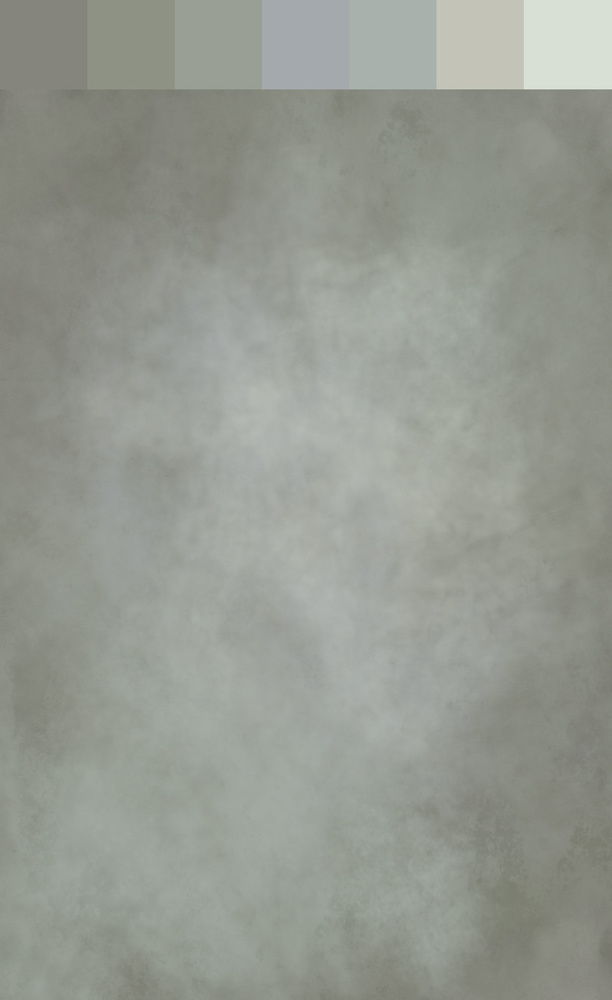
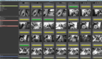
Start to finish of creating this backdrop, one layer at a time. Every layer is subtle and builds slowly. For the last layer, I went back and added a little of the bluish tone back in.
Repeat this process with all of your colors, adding splashes of accent colors and larger swaths of your main hues. A lot of custom backdrops leave a nice highlight in the middle with a darker vignette around the edges.
I like to work from dark to light as I build color layers, but play with it and see what you like. If there are any actual painters out there, feel free to chime in on the proper way to layer color. I'd value your insight!
Continue adding layers and blending colors until you've got a masterpiece on your hands. Every backdrop you make this way will be completely unique!
For a finishing touch, and to give it a more painted look, I like to throw on a texture (like the ones from Shadowhouse) set to either Overlay or Soft Light and something around a 50% opacity. Adjust to your own taste. In this example, I used their "Blotched" texture — desaturated so it wouldn't affect my colors — set to Overlay at 45%.
Save it out as a jpeg (quality 10), and you're done!
Finished, with original palette for reference.
Real World Use
There are two ways to use these digital backdrops: enhancing a neutral backdrop in Photoshop or printing them and using them as actual backdrops in your studio. The digital method is a tutorial for another day, but it can give portraits a whole new look in a matter of minutes.
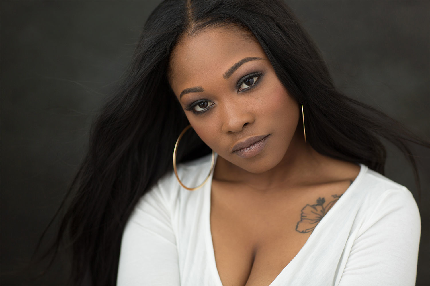
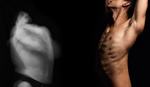
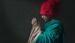
Using this freshly painted backdrop on a portrait with a darker, neutral background.
Digital is great, but being able to hold something you created is far more satisfying. Fortunately, printing is easy!
Every city has a print and sign shop, and I'd encourage you to shop local and make connections in your area. Call a few places and see who will print on canvas (or a matte fabric) in the size you're wanting. Tell them it's for a photo backdrop and it needs to have no glare or shine to the material (a lot of canvas made for banners has a glossy finish). Take your files in, tell them what size you want, and let them do the rest!
They may question your image's resolution, depending on how big you want to go, but just remind them that it's a backdrop and sharpness isn't the goal.
Sure, there are online sources for canvas printing, but if you want to be sure your colors reproduce the way you want, there's no better way to go than local. Most shops will even print you a small sample (say 8"x12") for a few bucks so you can see what it will look like before investing in a big one.
There's nothing like the real thing, and some day I'll have the Oliphant backdrops of my dreams, but in the meantime it's pretty fun to play around with creating your own!
Happy painting.
Lead image made from "Sherlock Holmes: Game of Shadows" medium color palette.

Well done.
and that looks damn nice!
Thanks! I'd try it with an actual brush and paint, but I think I'll quit while I'm ahead.
Since 1826! Haha :)
Photographers are getting back at painters for the years of using a camera obscura to trace their paintings...before photography was ever invented... ;-)
😂
Follow your tutorial to detail (brush, serting etc.). Here is my attempt at creating a background and a photo I edited (rather a bit too quickly)
Nice! Aren't they fun to make? Great job.
Indeed, they are fun and I am already on my second one. Now I just have to refresh my skills at separating objects in Photoshop. I do it sporadically and the last time was a while ago. I know Photoshop has some new tools now. Thanks for a great tutorial.
Beautifully done article man!! I have yet to see one that breaks down the color theory of backdrops like this. Amazing!!!
Thank you, Gabrielle! There are color combinations I'd have never thought of - that site was a gem of a find :)
This is so cool!! :O
Thanks, Emily! :)
Why didn't I thought of this before! Now i have to try this. I use textures all the time. Thank you for this article!
Gave it a try and it works wonder in Photoshop. Now i want to print one, how much did it cost you ? Do you have a closeup picture of your canvas itself ?
Great article and idea.
I don't, but if I find some time, I'll take one. Canvas printing from sign shops typically starts at around $5/sqft. It can add up, but depending on how big you go, it's not prohibitively expensive.
Thanks for the input, I'll try to find the right shop for the job
Thanks brother! Awesome article!
Thanks Agustin!
This is a great article.
Thank you for sharing your method.
I think I might go back on some old sessions and giving this technique a go. 😃
Awesome! Post some results :)
This is pretty wicked. Just as I was wondering what kind of photo would complement that painted background, I saw the girl with the background.