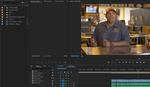
The "Orange and Teal" look is immensely popular for videos of all shapes and sizes, from YouTube travel videos to Hollywood blockbusters. It not only adds depth and color contrast to a shot but also gives footage a pleasing, warm golden hour look and feel. In this video, PremiereGal demonstrates how you can easily add this color grade to your video in Adobe Premiere Pro without plugins or look up tables (LUTs).
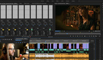
Orange and teal (a shade of blue) are complementary colors and thus, go well together. By using the Lumetri Color Panel, you can quickly apply this color grade by adding blue to the shadows and orange to the highlights and midtones. Further adjustments include hue and saturation, contrast, and black and white points. Voila! Your footage now has a beautiful cinematic, timeless look to it.
After you're happy with the final result, you can quickly create a preset and use it on future projects. Of course, after applying the preset, you always retain the ability to further tweak the settings as needed for a particular video clip.
What are your thoughts on this particular color grade? Do you think it's overdone or is it so popular for a reason?


GREAT ONE
Glad you enjoyed it!