
Lightroom's color brush is an odd tool, but paired with a range mask, it can be a fantastic means of making water look far more appealing. Here's how I transformed the muddy brown of this lake into water so blue that you'll want to jump in and go for a swim.
Range masks have been an excellent addition to Lightroom Classic and have opened up powerful means of making local adjustments to images. Tweaking water is one of my favorite reasons to use the color brush — a tool you might not use too often — in combination with a Range Mask.
I talk through most of my editing process, but I've added subheadings if you want to skip straight to the water.
Straight Out of Camera
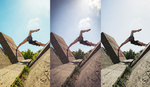
This photograph was shot during golden hour, giving the scene a warm glow that's definitely missing from the SOOC (straight out of camera) file. This is what I was starting with:

One crude means of bringing some blue to the water is to drag the Color Temperature slider way to the left, but this would leave the model's skin looking strange. A lower color temperature brings out the blues of the sky and the water, but it also kills off the warm feel of golden hour. Of course, you could then use an adjustment brush to paint the model with different color temperatures, but this struck me as an odd way of doing things. The clumsiness also gives you less control over specific hues.
A Graduated Filter for the Sky
After lifting the exposure and adding a preset to squash the highlights and lift the shadows, my first task was to bring a touch more color to the sky. A Graduated Filter (M) with the exposure and highlights knocked down slightly brought more blue. This was too clumsy, though: the vignette of the lens and the natural gradation of the sky was becoming exaggerated by the filter, so I needed to refine it.
This is where the Range Mask option becomes useful, as it allows you to target a filter so that it only affects certain parts of the image. If you choose Luminance, you are presented with a slider that's different from most of the others in Lightroom: rather than a single tab in the center, there is one at either end. If you draw these tabs towards one another, the tones affected in the image are narrowed, allowing you to target the tones that you want.
In short, sliding the tab on the left towards the right prevents the filter from affecting the shadows. Sliding the tab on the right towards the left prevents the filter from affecting the highlights. The further you drag, the stronger the restriction.
To stop the Graduated Filter from affecting the darker parts of the sky, the reeds, and the model's head, I dragged the left tab towards the right — 73/100.

If you need to check what's being affected, click "Show Luminance Mask." This switches the view to black and white and shows the mask in red in order to help you identify how the filter is working.

Making the Water Blue
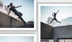
Next was the water itself. I hit K to create a new Adjustment Brush, made sure that everything was set to zero (double-click on the word "Effect"), and clicked on the white rectangle with a cross inside that sits next to the word "Color." I chose a bright blue hue and began painting over the water.
Instagram would have us believe that all lakes are radioactive.
Now, if I were an Instagram influencer and wanted to give the impression that my wife was swimming in a poisonous lake full of aluminum, I could leave it here. Instead, I wanted to lessen the effect of my blue brushing, and I had two options. The first would be to reduce the saturation of the blue down to around 25%. The results are ok, but the intensity is lost from the darker areas of water, leaving them a bit grey:

The second option to reduce the blue is to use a Range Mask with luminance selected. This time, instead of eliminating the adjustment from the shadows, I wanted to remove it from the highlights. I slid the tab on the right across to the left to give 0/36. This takes the blue out of the highlights and midtones but keeps them further into the shadows. It's a subtle difference, but the depth of the color in the shadows in contrast with the whiter highlights made the water more appealing to me:

This was much closer to what I wanted to achieve. To tweak it further, I added a second Graduated Filter, this time dragging in from the bottom, in order to darken the water in the foreground and emphasize the blue. One subtle tweak was to bring the color temperature to -10, further intensifying the blue very slightly.

Removing the Green
For reasons I can't explain, I don't like the color green when it's juxtaposed with a lot of blue. Because of this, the reeds on the left were annoying me, particularly their reflection, so I decided to find a means of reducing their intensity. Using the Color/HSL panel, I made some dramatic changes to the greens, dropping the saturation to -100 and the luminance to -70 and shifting any remaining greens towards yellow (a color that's much more complementary to the blue in the image) by dragging the hue to -98.

You'll also notice that I shifted the blues in the image towards aqua: hue -10.
The reflections of the reeds were still bugging me — they still felt very green. Somehow, I wanted to remove this green and replace it with yellow. I created a new Adjustment Brush, set the saturation to -100, added a lot of yellow to the brush, and started painting.

I then refined the brush by setting the Range Mask to Color and using the dropper tool to choose areas of green in the reflected reeds. This would mean that my brushing would only affect green tones, ignoring others. The dropper tool is quite versatile, but it would be helpful to have a pop-up to show you exactly which colors you have selected — I probably added more points than I needed, but it's hard to know. To add multiple points, hold Shift, and keep clicking. To choose a range, click and drag (again, hold Shift to add a range if you already have colors selected).

As it turns out, the Range Mask was unnecessary for the reflection, but it made me confident to be quite loose with my brushing, safe in the knowledge that I wasn't killing any of the blues that I'd added earlier. It then proved useful when I decided to add to the mask to remove some of the green left remaining in the reeds themselves, as I could brush quite freely.
Even though the brush is set to completely desaturate the greens of the reflected reeds, the yellow color added to the brush still gets laid down, creating something quite natural.
Finishing Touches
There were a few other small tweaks, such as adding some warmth to the reeds in the center of the shot, lifting shadows on the model, and tidying up the skin. Finally, I jumped into Photoshop to sort out the strands of hair sitting in front of the model's face.


If you have any suggestions or questions, leave a comment below.
If you'd like to learn how to use Adobe Lightroom more efficiently on any device, make sure to check out our Mastering Adobe Lightroom course with Pye Jirsa. The content Pye covers will appeal to every level of photographer and will save you an incredible amount of time on your image editing. Save 15% by using "ARTICLE" at checkout.


Nice natural result. I might have left the shadows alone on the model, I find her to be nicely lit and the hidden areas create more mystique. But that’s just personal, and you didn’t ruin it with what you did. Good tutorial!
Thanks Jeremy, glad you enjoyed it. And yes, I like your idea regarding the model. I'll revisit my edit. 😊
Thanks Greg!
I never knew that tip about desaturating with added color (the yellow), interesting, I will have to try that. These non-video technique/tutorial articles are great, thanks for posting!
I only discovered this recently. I assumed it would do nothing but it seems that the desaturation and the addition of color are separate from one another. Makes sense, I guess..! Glad you enjoyed the article. 😊
Very nice. That was tastefully done.
Thanks Tony! 😊
Thanks Alison! Much appreciated. 😊