There's a tool in Lightroom you have likely never touched or maybe just don't understand its purpose. The calibration panel is something I use in nearly every single photo I edit; let me show you why.
Last week I went over Lightroom's new color grading module and the week before that I took an in-depth look at using tone curves for more than just contrast. This time around we are going to be using a panel many of you have likely never touched, "Calibration". If you're like me a few years ago you simply just never touched the setting because of its name. Why would I need to calibrate the image out of my camera? And if I did need to, how do I even do that?
Well, the truth is I’ve never used it to actually calibrate the color coming from my camera using a color chart or anything of that nature but I continually use it to add a bit of magic to my images. It's hard to describe in words what it does to your images so I'm going to use three different examples in this article and even more in the video above to show just how versatile it can be. With that said, let's get started!
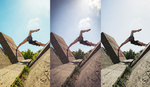
The Standard
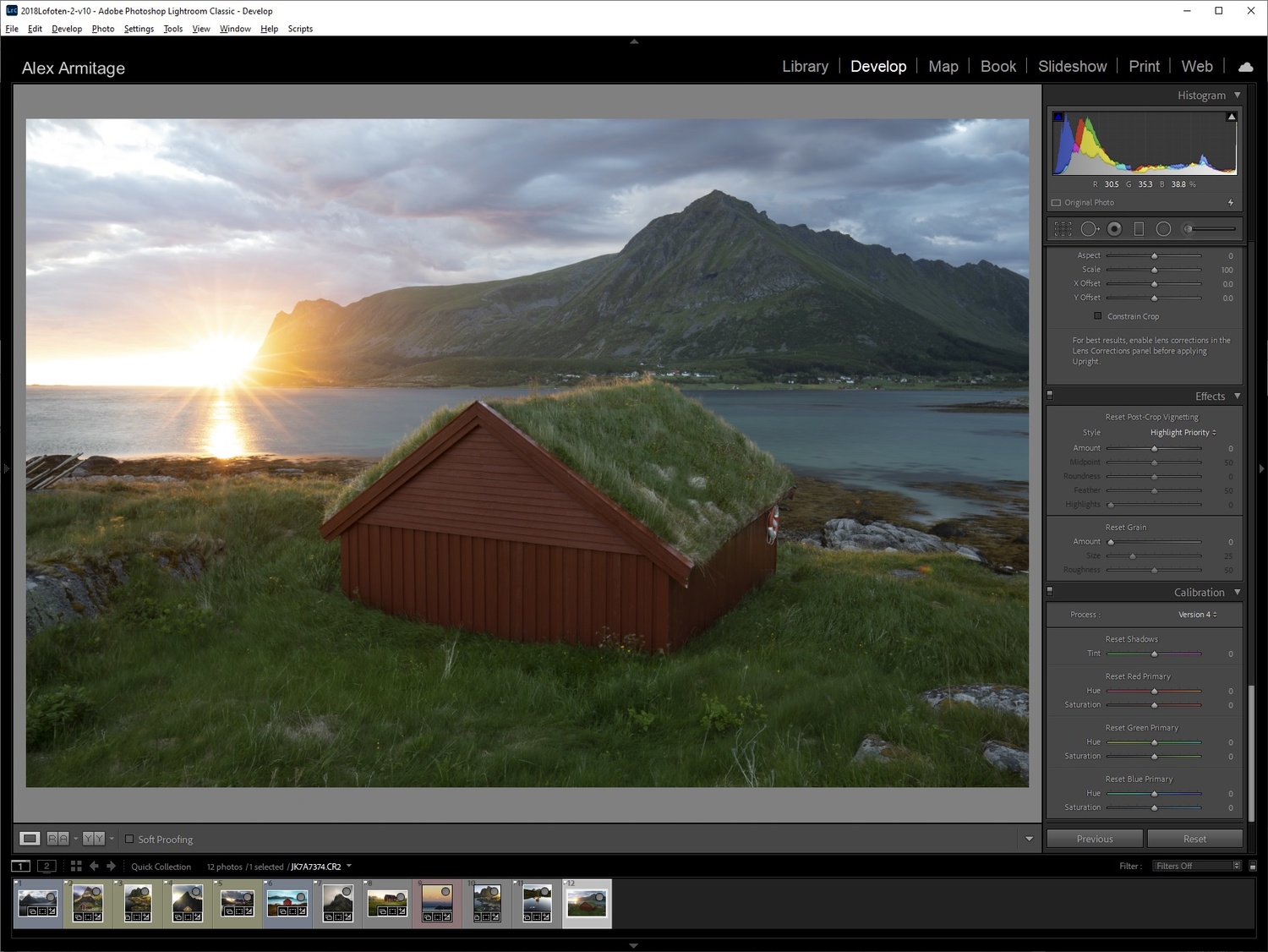
Untouched Image
I'm going to start by using a blank canvas: a photo I have not touched and I will go through how I use this tool 95% of the time. One of the first things ill do when I edit an image is set its white balance and then scroll all the way to the bottom to adjust my calibration.
Pay Close Attention to Those Golden Highlights and Colored Shadows
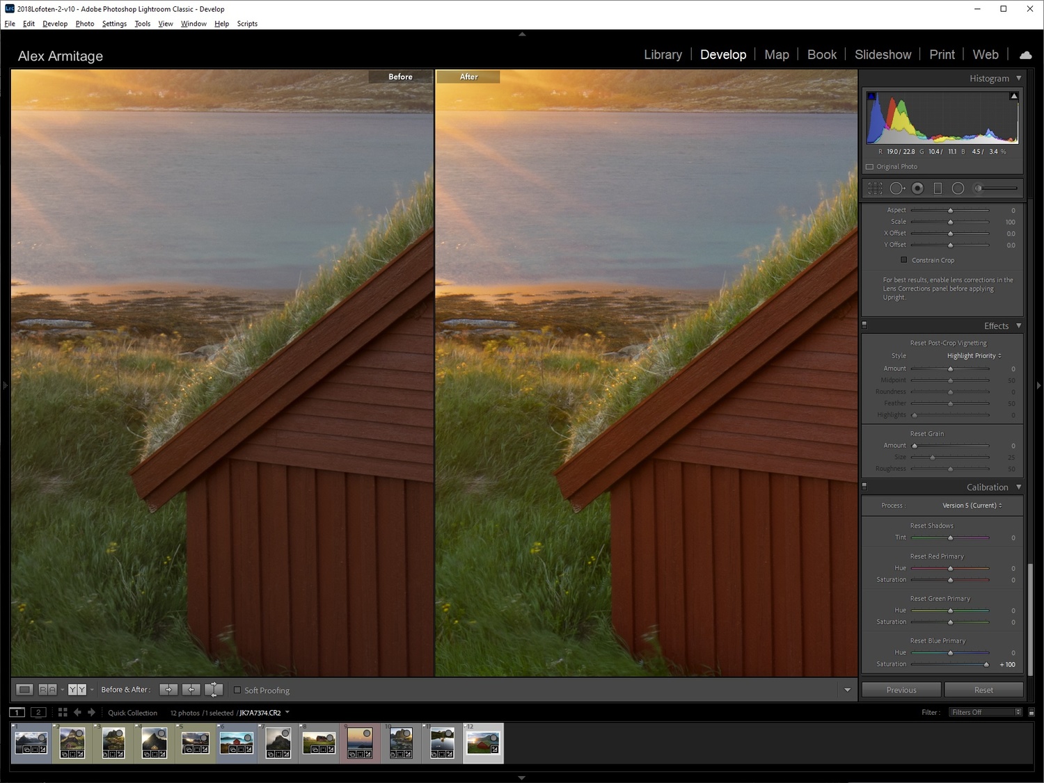
The majority of the time I simply boost my "Blue Primary" saturation to 100. I do this for basically every photo I publish. Above I've made that change and zoomed in to show exactly why I do this. Notice those golden highlights in the grass but also pay attention to the shadow areas in the bottom left of the frame, see how it almost brings that area to life in such a subtle yet beautiful way? This is without any other edits.
Left - Blue Saturation / Right - Red Saturation
You might be asking why I'm using the blue saturation slider rather than the green or red. In the image above you'll see on the left the image with blue saturation set to 100 and on the right, you see the red saturation set to 100. Notice how crunchy and just a tad overdone the red handles the sun's colors. Green acts in the same way but is slightly less intense. What you can do is only increase your red or green values to a comfortable amount like +40 for this image, however in my experience simply using the blue saturation slider yields the best results for these types of scenes. If it's hard to see in these images you can jump to around 4:50 in the video to see it in more detail.

Fixing oversaturated blues
It gives me the most punch and enhancements to the colors I want while still having a nice roll-off in the majority of the colors in my scene. The one problem you will run into is that it pushes your blues into oversaturated territory. To fix this simply go into your HSL panel and decrease your blue saturation by about 20. This will vary based on how much blue is in your scene and how much editing you push your final image.

Above is a photo with very light editing that wouldn't be possible without using the calibration setting directly in Lightroom. If it didn't exist I would have to go into Photoshop and use masking techniques to get the vibrance and light that it creates in this image. Sometimes that is something I will do but on many photos not only does it save me time, but it also creates great results. It's that simple. As I said before, this is something I use on the majority of the photos I publish and I absolutely love the results. However, we can use this for much more.
The Look

Edited without calibration
Next up I'm going to start with an image I've already edited. My recommendation when editing is to adjust your calibration settings before you do basically anything else but white balance or basic adjustments. However, for example's sake I wanted to show just how powerful this tool can be and it honestly might enhance images you've already edited as well. Take note in the above image how dull the red hut looks yet the grass in the foreground looks brighter and more saturated which isn't a balanced look.

Shifting green hues
Sometimes I want the greens in my image to be less yellow and more of a muted green, to do this I'll adjust the calibration hue of green to the right which will remove yellow and add more blue into the image.

Adding life back into the image
Last I want to make the image, especially the hut, pop just a bit more. By simply pushing the green saturation slider up not only do we add a little life into the image, the red in the hut comes alive. Also, interestingly enough, the intensity in the green areas doesn't change all the much if you compare the before and after. I love this tool! Again if it's hard to see the color shifts in the pictures jump to around 8:40 in the video for an even more detailed look.
The Style
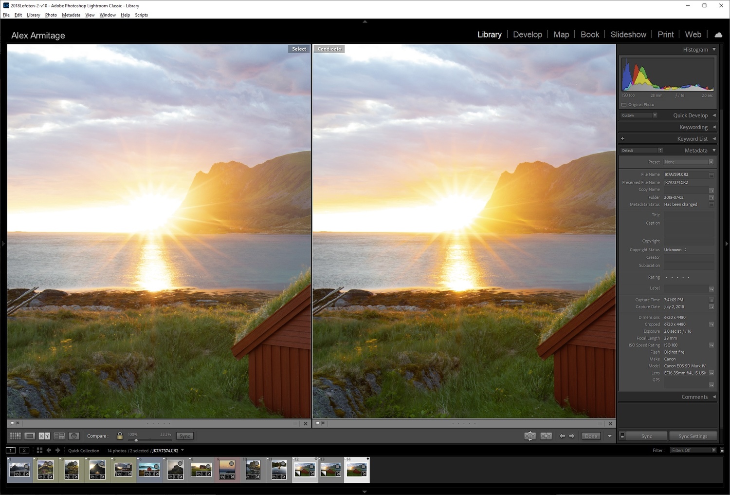
Lightroom Version 10 Loading Screen
Last but not least let's talk about stylizing your image. Long ago I wrote an article about posting to Instagram everyday for a month using a very stylized type of image throughout those posts. While my feelings on Instagram are far different than they were then, I actually used the calibration tool to make the stylization I used for every image. Coincidentally when I opened my catalog to find this next image, I noticed Lightroom's new loading screen is using an image taken with an infrared filter applied, which looks vaguely close to our image.

A classic look in cinematography is orange and teal. This might not be quite that but it's in the same ballpark and it's really simple to do with calibration. In nearly every photo if you push the blue hue to the left you'll result in that style. Now I'm not saying to rush out and turn all your photos teal and orange, it's definitely very specific and can be quite extreme. It might not even be to your taste but there is no harm in learning just what a tool can do for you, even if you don't plan on using it. As I just learned while writing this article, it could even replicate an infrared look!
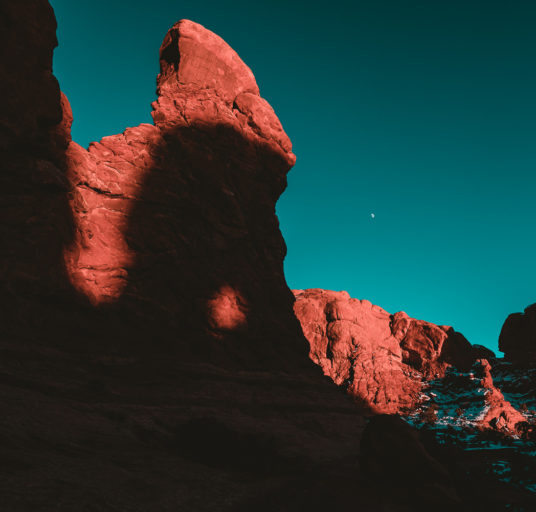
Teal and Orange
Conclusion
I hope after three completely different styles of images you'll go out and try this on some of your photos or future edits. As I said before I typically stick with using this to put a bit of life into my images, but it can also come in quite handy to get creative with your images as well. As I mentioned a few times throughout the article if it's hard to see the color differences through the pictures within this article be sure to check out the video as it should do a better job showing those differences. The calibration on your monitor or phone while looking at the images through a web browser will vary.
As always I would love to hear what you think below, if you've ever used this tool before or if this is your first time even knowing it exists. Thanks for reading and watching!
If you'd like to learn how to use Adobe Lightroom more efficiently on any device, make sure to check out our Mastering Adobe Lightroom course with Pye Jirsa. The content Pye covers will appeal to every level of photographer and will save you an incredible amount of time on your image editing. Save 15% by using "ARTICLE" at checkout.


Yeah I tried to emphasize in both the article and video to make this adjustment before you do basically anything else knowing it will effect how you edit your photos. Don't get me wrong, my intention was to never show you how to use this to calibrate your camera(s), just show you how I use it creatively.
Perhaps your intention should have been to show people how to use it for color correction instead of color grading.
There's a panel for that now.
I even did an article on Color Grading! That said I haven't found anything to replicate what this does to my images, so I just keep doing that :)
Watch the video, your alleged complaint that it is the first thing you should do is exactly what he says! "Your not using this panel correctly at all is the most LOL thing I have heard in a long time. If it works and ads some elements you like to your photo why wouldn't you use it. I have a Canon camera also, and I am already finding it to be helpful with the tones of my foliage. And here's the crazy part, I can use it when I like it, and not use it if I don't, it just another tool in the toolbox!
See nothing has changed on fstoppers and why so many go away. The article and video are informative. Taking the time to share is an art, thank you.
Yeah the same morons are the ones bemoaning the fact there is not enough photography content or websites left to form a community, when its them that have driven everyone away from these sites. And some of the others are just plain old sad little trolls.
You're quite welcome! Thank you.
Great tips, thanks for sharing.
Nice tip, I appreciate you going to the effort of doing this with writing and samples. There are many ways of achieving results and I'm happy to add this one.
A very lengthy video. But you start out with a color wheel without showing us where did you find that? Did you create the three overlapping colors? Is that a standard? A major assumption.
Hey Philip! Yes I created the color diagram. I wouldn't say it's "standard" but it is used to teach and show the basic of color theory. Red/Green/Blue are how most camera sensors absorb light creating a combination of images that only use those 3 colors. You'll notice the middle colors are Cyan, Magenta, and Yellow. If you've ever done any print work, those are the colors printers typically use to create images.
Overall it was simply there to show you the different effects each tool in Lightroom has and I hope it did just that, if it didn't make a lot of sense I'll try harder next time around to do so.
Many thanks for this tip Alex. I have tried it on a couple of landscapes that didnt convey the feeling I had when I was there, and it helped.
A useful tool to have available, and you were right, I hadnt used the calibration panel previously!
Thanks Ken and I'm glad it helped, mission accomplished!
Thank you for this video. Perfect for what i'm working on now.
Really helpful and informative article. Also, thank you for including actual text and images so we can read it and reference it instead of just posting the video and telling us to watch it. I'd love to see more content like this on FS.
I'm trying my best to stick with this formula but will admit some weeks I just might not have the time. Thanks for the kind words!
Alex, thanks a lot for sharing this wonderful tip! I applied to one of my fall color images, the yellows just popped without looking oversaturated, It brightened the image and brought it to life! I need to understand what is happening in terms of the histogram, but it just works! Thanks again!
Anytime!
Thanks for sharing, I learnt something new!
As with everything in PS and LR, there are many ways to accomplish the same result. That said Alex, I liked how you demonstrated the LR calibration tool and the subtle results. And you're correct - I was not aware of it either nor have I used it before. Now I will give it a try.
I also admired your soft yet engaging sound track in the background. Just the right level. Who was the artist please and what was your source?
Thanks again for an informative video and article.
Bookmarked for future reference.
Cheers,
Frederic in Montréal.
First thanks for such lovely words and thank you. I hope the little nugget of info does help, it certainly has changed my editing.
This song is actually just from a subscription based website you can use for youtube channels to license music. The website is epidemicsound.com and the song is "Samadhi (Alpha 10 hz) - Syntropy" Not exactly what you were probably expecting but I hope that answers your question!
Thanks again.
Lightroom was cleverly designed with the develop panels and the tools within them to be used in a top down order as a guide to is a good workflow. With one exception, the calibration panel. Which by being dumped at bottom by default gets overlooked by most users, probably because it got added after LRv1. To follow LR's original design ethos, it should be the top panel. Because it's the starting point for your image.
But at least you can place it there yourself now.
This article shows how to use panel is a slightly different way, later in processing workflow or for creative looks. All such tweaks could be made as presets if you use them regularly. Even applied on import.
Really nice video! I've played with color calibration in LR before but usually trying to correct color hues, and I always found I liked PS color balance better so I never touched LR color calibration after that. Never realized how powerful that saturation tool was!
Yeah I still don't know what magic it's exactly doing but the results work haha.
Just tried it on the image I was about to edit before watching the video and it worked really well. Still went in and did some color balancing and played with the HSL a bit but that blue saturation in color calibration really did give it some pop! I subscribed to your channel by the way, excited to see what kind of magic you can teach next lol
Hey thanks for the sub! I'm not sure I have anything else quite like this that's as easy an unknown, but I will continue to try :)
“and isn't a complete train wreck of a sentence.”
Ok, then what is it?
Do you see how vague your writing is?
Colorful but vague.
“and isn't a complete train wreck of a sentence.”
Ok, then what is it?
Do you see how vague your writing is?
Colorful but vague.