
Photography is an art, and like all art forms, seven basic elements comprise our images. Although, I challenge that number, I think there are eight. Understanding these elements helps us to take our creativity to the next level.
The first of these elements is the line. Most of our photographs consist of lines. We use them to guide our eyes around the image, those we call leading lines. They are often confused with lead-in lines that lead us to a subject within the frame.

Lead in lines draw the viewer into the picture towards a subject.
Lines can also act as blockers, inhibiting the viewer’s eye from traveling beyond a certain point. Horizontal lines across the frame can do just that, and that is typically seen as a bad thing. However, when used intentionally, it can delay the viewer from noticing a feature beyond the line, thus adding an element of surprise to the photograph. Such pictures are less comfortable to look at. Personally, though, I like photographs that are challenging and need a bit of thought to understand.

Horizontal lines can block the viewer's eye traveling into the frame. They can also be used to slow the recognition of something else in the frame.
Shapes are formed by the borders of enclosed two-dimensional spaces created by one or more lines. We probably learned the basic ones – circles, triangles, squares – when we were toddlers. As an aside, my favorite name for a shape is the chiliagon, which has a thousand sides. It’s not the named shape with the most sides; the myriagon has ten thousand sides, and the megagon a million. However, most of us would probably only recognize up to an octagon without having to count the sides.
Shapes can give meaning to an image. For example, the circle can be used to represent equality and unity, as well as the ideas of wholeness and infinity. Triangles, on the other hand, are sometimes used to represent strength. That is why triangles are used a lot in construction.
Lines forming shapes
In photography, we can use shapes for symbolism, as artists and designers have done throughout the ages. However, the meaning of shapes can be swayed by cultural differences. Both the five- and six-pointed stars will have very different meanings in different cultures, depending upon one’s nationality, ethnic background, and political or religious beliefs. Go back in time to before the 1920s and there was a shape that had been used for millennia by Buddhists, Hindus, Jains. In Sanskrit, the ancient Indian language, that shape was synonymous with well-being. Then it was irrevocably hijacked by the evilest regime in humanity’s history. That was, of course, the swastika.
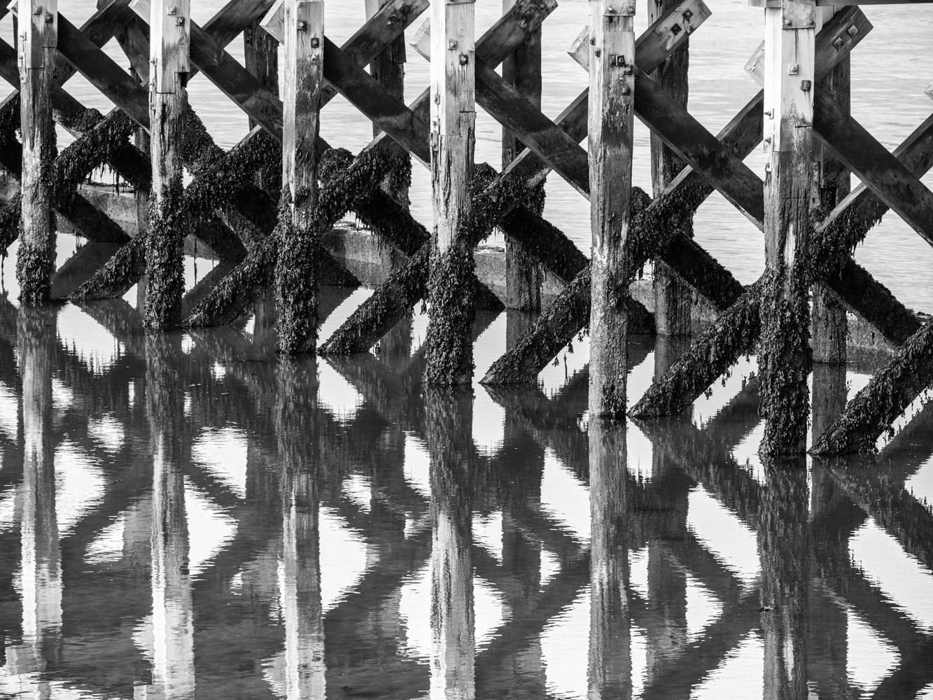
Form refers to a three-dimensional shape. To depict form within a photograph, which is two-dimensional, we are very much relying on the nature of the light and its ability to both illuminate and cast shadows. Therefore, we refer to the light on a gray, overcast day as being flat, as everything within a photo seems to have no depth due to that even lighting. Under flat light, form reverts to shape, and so separation of subjects can be lost.


In the photos above, it can be seen that even a little diffused light adds form to the posts in the second image. The first is shot in even light and the image whole image appears flatter. Compare that with the very first photo at the top of this article. There, the light is even stronger and more lowly angled. Consequently, the posts on the left of the frame show more form.
The lightness and darkness of subjects are very much at the forefront of most photographers’ minds. This element is known in the art as value, but in photography, we usually refer to it as luminosity. We give luminosity numbers, with black being 0 and white being 255. Mid-gray is 127. Contrast happens when areas of the photo have different luminosities.

The low contrast and brighter background behind the high contrast and low luminosity of the wreck in the foreground gives a feeling of depth.
You will see the luminosities applied to the letters RGB, which represent the colors red, green, and blue.
So, color is the next element. By mixing red, green, and blue together in different proportions and with all the available luminosities, we get a wide range, or gamut, of colors. 256 (reds) x 256 (greens) x 256 (blues) = 16,777,216 possible combinations, or hues. We’ve named only a little over 9,000 of those, far too many for me to remember, so using precise numerical numbers is essential.
Colors can also vary in intensity or saturation. Hence, the HSL (hue, saturation, and luminosity) adjustments are available when we are developing and editing photos.
Like shapes, colors can have symbolic meanings too, and sometimes those can be conflicting.
Red can be the color of both love and war. Red lips and red eyes evoke very different feelings. A red-letter day is very different from the letter you receive in red for an unpaid invoice. We can be green with envy, but we want businesses to have strong green credentials. Then, the emotions evoked by a blue sea and sky are not what we would associate with having the blues.
Let's boldly go to the element of space. That is split into two categories: positive and negative.
Photographers talk about negative space a lot, that is, the space that is around and between the subject. Sometimes, the negative space forms a more interesting shape than the subject itself. Therefore, it can be used to challenge the understanding of a photograph and, like blocking lines I mentioned earlier, can be used to delay the realization of the purpose of the image. It can also be used to juxtapose two different ideas within a single photo.
Positive space is the opposite of negative space and is where the area of interest is within the photograph.
Together, positive and negative spaces are usually positioned in a way that coheres with one of the many rules of composition. Unwarranted criticism is sometimes aimed at photos with too much negative space. However, used correctly, that can be a powerful compositional tool.

The large negative space around the subjects shows isolation, while the unnaturally wide personal space between the parent and the child might suggest negative connotations to the viewer. Note the composition of the water's texture contrasting with the forms of the people.
The final recognized artistic element is texture. In our mind’s eye, we can conceive of how an object feels by its texture. Smoothness reflects light evenly, whereas rough textures do the opposite and scatter reflected light. In between those two are matte surfaces.
All these elements often work in photos best when contrasts are found within them: light and dark, complementary colors such as orange and blue, curved and straight lines, simple and complex shapes, small and large forms, positive and negative space, and rough and smooth textures. These are just a few of the contrasts proposed by Johannes Itten, the celebrated tutor of the Bauhaus school, whom I wrote about in an article last May.

This image has the contrasts of the orange lifebuoy against the complementary color blue, the stand's straight lines and the circle of the buoy, the neatness and mess of the rope, plus the different textures within the image. The picture could also be interpreted as having religious symbolism.
But what of the other artistic element that I think has been wrongly excluded from the list. That is the single point. That is the basis of all visual elements, a singularity in space and, geometrically, the place where two lines meet. It is something that sits alone within its category and therefore cannot contrast with other points in the way that lines, shapes, and forms can. Nevertheless, it can create contrasts with any of the other elements.
The single point of red light draws the eye because it contrasts with everything else in this photo.
As usual, this is only a brief introduction, just lightly touching the surface of this topic. If you are left wondering about the use of this knowledge, embedding the ideas of these elements into our subconscious will help us to discover new compositions. For achieving that, I would encourage students of photography to treat each element as a topic for a practice photoshoot. That will help you become aware of how the elements of art can impact the structure of photographs.
I hope you found that useful, and I will be expanding this further in a future article. It would be great to hear your thoughts on this topic below.


First off, I want to say that I love articles of this nature - that are all about the art and the theory and principles behind it, rather than about gear. Thanks, Ivor, for writing content of this nature.
I was a little surprised to read the entire article and not see a section about symmetry. In fact, I could be wrong, but I don't think the word "symmetry" appeared at all in the article. How is that even possible?! I don't say that to find fault with the article, as I think it is a great bit of writing. I am just a bit surprised that symmetry wasn't covered as a foundational element of the art of photography.
One note about negative space ... it is of tremendous importance to those of us who sell our images to the advertising industry. If your images don't have a good deal of negative space in them, then you are leaving sales to ad agencies on the table. Sure, the Art Directors can "add" negative space to almost any image via Photoshop, but most of the time they are going to pick the image that requires less work. If you have sufficient amounts of negative space in your photos, that makes the Art Director's jobs easier, and in turn will result in greater sales volume for the photographer.
Don't take this the wrong way, but if your note about negative space ever enters my mind while I'm composing a photograph, I will certainly sell all of my equipment and just shoot family snaps with my phone from that point foreward. I'm sure it's great advice, but I'm also sure that it isn't at all what this article is about, or what it is trying to convey (which seems to be a crash course in visual *art* in general).
I am a sucker for great symmetry in a photograph, but since the author was discussing Elements of Art and not Principles of Design (which symmetry is), perhaps that's why it isn't mentioned?
Hi Sarah, we were typing at the same time. Yes, exactly. Thank you.
Thanks for those great comments, Tom and Rodney. The elements of art are well established principles. Composition in its entirety isn't included in the elements and not just symmetry. This is pre-empting a future article, so I'll keep you in suspense because I don't want to leave spoilers. But, as for symmetry, does that not imply a line or lines. It may not be physically drawn, but it is suggested in our minds.
Yes, for the likes of magazine covers empty space is important for the reason you give, although I see negative space as more than just an empty area, but an empty area that interacts with the positive space.
I've had exactly that dictated in briefs from publisher clients. But when that is filled with header text, artistically, that text becomes positive space, and the reduced area around and between the letters becomes the negative. So compositionally, the finished product, e.g. the magazine cover, is quite different from the image we send to the publisher. Rodney, unless you are photographing with that in mind, there is little to be concerned about.
Thanks again.
Great article and very helpful. Thank you.
Thank you for saying so Sarah. I am glad you enjoyed it and found it useful.
Thank you Ivor for explaining with clarity- i just read your 2022 article; that was the "leading line " that brought me here.
Thank you, Ayokunle. That's very kind of you to say so. I'm glad you found it helpful.
Having just read your article in 2024, i now feel I can refresh my approach to my photography through adding consideration of these (art) elements to my basic compositional and exposure skills when prepping for a shot.
Your article has also helped me expand my understanding in relation to why some photos take my interest far more than others and I will now endeavour to consciously build in some of these elements that I seem to have been missing in the past to hopefully return a higher “keeper” rate of my own photos than current.
It may also help me in better understanding the “what and why” about my “style” when it comes to photography.
Sometimes it’s very easy to get caught up in the basics of exposure and composition and not take into consideration or at least in a conscious manner, the “elements of art” that have been around for centuries. Thanks again.
Thank you, Brian.