
No, this is not yet another article about the rule of thirds. Rather, it's about a simple composition technique I've used consistently over the years to maximize the impact of my images. Best of all, it's easy to duplicate.
When you're first starting out with photography, there's so much information to take in. It seems laughable now when I look back, but I distinctly remember the hours I spent tying myself up in knots trying to remember if a low f-stop meant more focus or less. Whether it's endeavoring to understand all the controls and menus on your camera, how to work with filters, or learn which way to turn all the knobs on your tripod, photography is a steep learning curve for the uninitiated.
And it's no different when it comes to composition. Different people might have a contrasting point of view, but for me, composition is everything. You might be the master of your tools and have the ability to talk underwater with a mouth full of marbles about the latest sensor developments, but if your compositions are lousy, you won't attract my attention. But what makes a good composition? There are so many ideas out there and tutorials available that you could probably watch uninterrupted for the next year on YouTube and still not get through a third of them. I went that route and got frustrated really quickly.
Dividing Your Frame
So, what did I do? I simply started saving all the images I liked (landscape and surfing were my interests) and comparing them. I'm a rather scientific type of fellow, so I like to see repeatable patterns that I can quickly identify. I don't like random things that have no consistent, relatable connections. So, when I put my collection of images together, I started going through all of them and making little notes about what I consistently saw with them. And one thing kept standing out again and again and again. So, that's what I want to share with you today so that you might introduce it to your photography.
The one thing I kept seeing consistently was an unused or free sort of space in the central areas of the frame. Sure, it might be a cousin of the rule of thirds, but it's not as direct as saying "put your subject on an intersecting gridline in the top left third," for example. It was more about placing elements of interest in the bottom part of the frame and placing elements in the top part of the frame, then leaving the central part of the frame largely bare and uninterrupted. Let me give you a few examples to make my point.
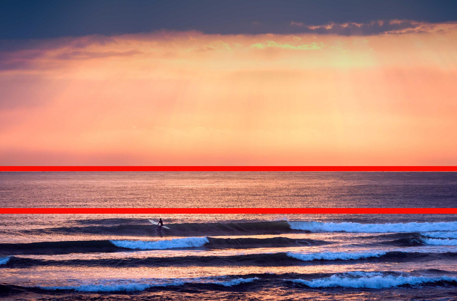
In this image below, you might say it's a classic example of following the rule of thirds: the surfer is on an intersecting right line at the bottom, and the sun is close enough to an intersecting point in the top left of the frame. But what was more important to me when I constructed this composition was leaving the central part of the frame largely empty or simply filled with flat ocean.

You can see how I've divided the frame here by the black lines I've added to make my point more clear. The center part of the frame clearly shows that there's not much going on at all.

Here is another example below to further illustrate my point. Again, you can see that the surfer and the waves occupy the bottom section of the frame and the sky and beams of sun occupy the top part of the frame. As you can see here, it doesn't have to be an equal division. I simply try to have some empty space between the top and bottom elements of my frame. One thing to note is that if you're trying this at the ocean, like these shots here, it's much easier if you're shooting from a higher vantage point looking down slightly at the water or the surfers.
Of course, this technique isn't exclusively reserved for seascapes or ocean scenes. You can adapt it to pretty much anything you want. Below is a scene of a little swimming hole just a few miles from my home here in the south of Japan. The first shot is the final image, and the second shot is the scene with dividers.

As I said previously, there's no exact science to where you put your uninterrupted spaces. They don't even need to go across the whole part of the frame. However, I always make a conscious effort of trying to find some kind of flat or "dead" space to put in-between my top and bottom elements of interest, as you can see below.

Just to further expand, it can be used in color or black and white images.

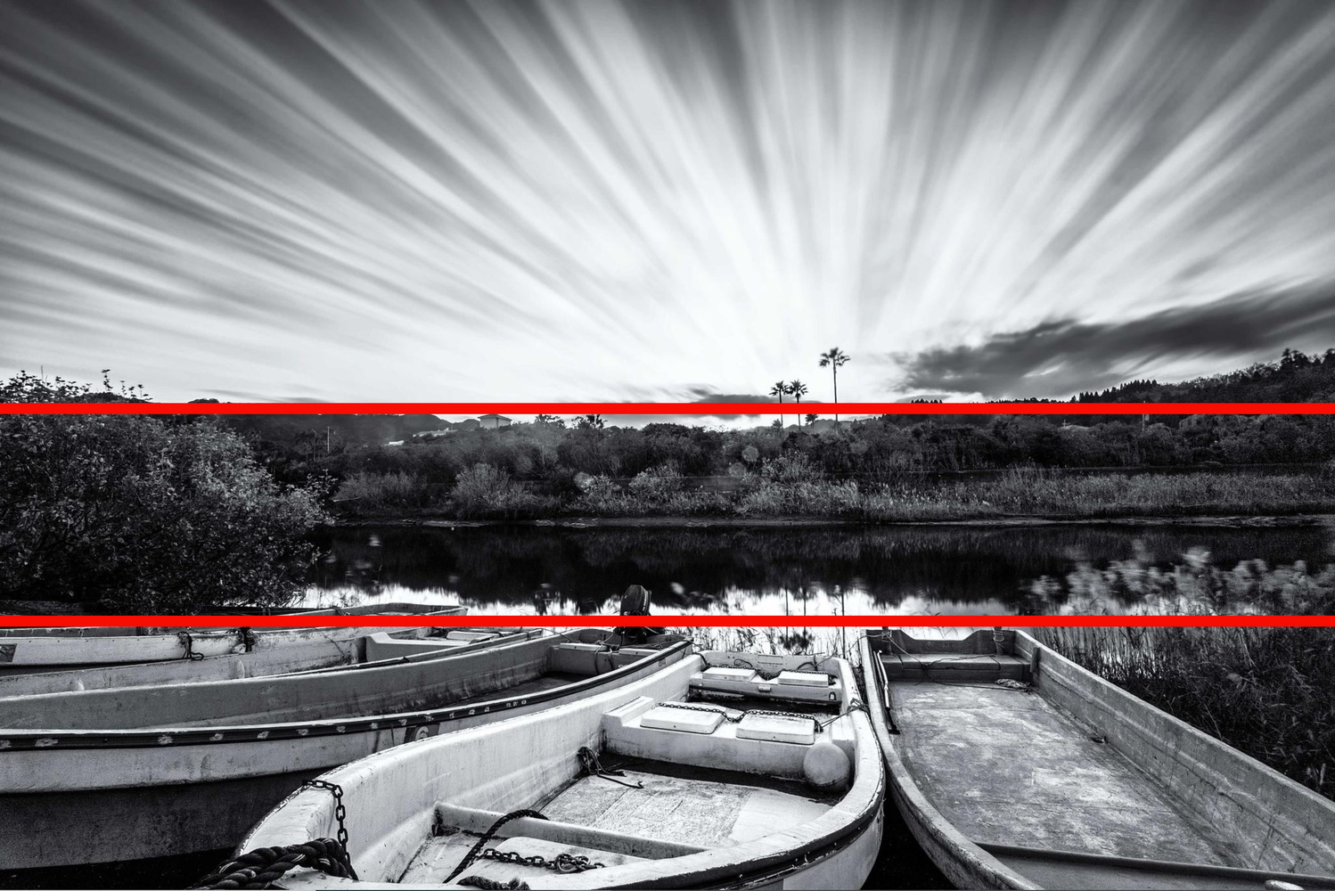
Obviously, the boats are the elements of interest in the bottom part of the frame here and the sky is the point of interest in the top. The central bushes and trees are my "dead space," which is why I didn't light them up too much in post-production.
To end, it goes without saying that you're not always going to do this with your compositions. Sometimes, your frame will have parts through the central areas that are vital to keep, like this surfing shot below.

However, if you have a camera with a high pixel count that allows you to crop and maintain high resolution images, then you can really play around with your compositions and still find areas of uninterrupted space that can do wonders for your compositional choices. I like the balance of this photo above, but for Instagram, square images or portrait-style images tend to look better than those with landscape orientations. So, even for this image, I cropped it to get that unobstructed space in the middle.

Why Would You Do This?
As I said, I'm a rather scientific type of person who likes to know why things are as they are. So, my first step was seeing that almost all of the images I had liked and saved had this uninterrupted space in the middle. But that wasn't good enough for my inquisitive soul. I wanted to know why I had liked those images and why I had habitually picked out similarly composed images. Thus, my digging continued. What I found was most interesting.
It seems that when the eyes are presented with visual stimuli, different parts of the brain are activated. Without going all Einstein on you, the movements of eyes tend to revolve around two fields: the frontal eye fields (FEF) and the parietal eye fields (PEF). Reduced down to its most basic, simple form, when the parts of the brain related to the FEF are activated, the eyes tend to travel top down. And when the parts of the brain associated with the PEF are activated, the eyes mostly move from bottom up.
Studies of this nature have been used in all sorts of fields from marketing, to advertising, to font-setting, to graphic design. But what that means for us in relation to composition and photography is that the eyes will either start at the top and dart down to the bottom or start at the bottom and dart up to the top. As long as you have some kind of interesting element in the top part of the frame and the bottom part of the frame, the eyes will very often find them both quickly and gloss over anything in the center. Heat maps and eye maps have proven this time and time again. Things in the center often work as distractions, as eye maps have shown that the eyes keep going back to those center things, but never stay there for long.
Summing Up
It's important to understand why you like certain photos and why the compositions of those images tend to resonate with you more. I found that I always liked a certain type of composition, then deduced that images with uninterrupted central areas of the frame often held my interest and attraction much longer than other images. So, I introduced this to my own compositional techniques, and it's something I still use every single time I go out shooting. Try it yourself next time and see if it improves your work.
I'd love to hear your thoughts in the comments below, and if you have any other simple tips for improving composition that might not be so well known, please share them.


Photos with blank space in the middle are over-rated.
.
.
.
.
.
.
.
.
Just kidding.
Haha
.
.
.
.
.
.
.
Nice!!
I would say it’s a good bit more interesting than that. The take home message is different than the rule of thirds, even if a similar configuration comes into play, and, more importantly, the explanation provides an answer to the question of “why”! Very cool!
Cool explanation! Didn’t know that. Great article Iain!
Cheers mate. I’m glad your scientific mind enjoyed it. Merry Xmas!
Nice idea. Generally, it seems like paying attention to the blank parts of a picture is a step that gets overlooked in guides to composition. It reminds me of the advice to musicians to pay attention to the silences as much as the notes.
Excellent comparison. It’s a bit different from negative space but yeah, space is often overlooked.
Reminds me of the title of that documentary on Diana Vreeland, "the eye has to travel". One aspect of composition is the dramatic effect of placing two areas of interest in the same frame rather than one, whether in balance or in conflict, so not only does the eye need to travel between two points, it creates a sort of synthesis between the two points. Often those sorts of compositions are deep focus rather than shallow focus.
The eye is very interesting. Often we talk about resting points for the eyes in compositions and we assume those resting points should be our subjects. But very often distracting elements can inadvertently become resting points too. Understanding what the eyes like to do is very important for compositions and inclusion/exclusion
A great article, thank you. Coming from the same direction: scientific and been having a brother coming from the "opposite": artistic, I discovered that this is two different worlds with very different approaches to the matter of what it is, that fascinates us when we look at art. Your approach I can understand very well, my brother's approach, what he considers artistic, still gives me much work do to. Albeit I for some time began to understand it.
I think it is not just how the brain works but moreover how it has been trained. There have always been times, when artists were not understood for a long time. But years, decades or even centuries later we, the people, learned how much in advance of their time some artists were and now do praise their work.
What you did is training your skills by finding a method of how to do so which is a great thing. And therefore the photos of yours do work very well. Congratulations!
But now maybe begins the hardest part if you continue. What methods and approaches of understanding do have (skilled) other people? To visit art classes could be a way to learn and an other to read articles like this. So, thanks again.
I got a photo of mine here I think it works with the opposite: no empty space in the centre. (The vignetting is from the lens, no cropping, no editing except minor overall exposure adjustment for print done.)
MOMA, NYC, May 18, D800E, 20mm f/3.5 AI @ f/4, 1/60s, ISO 3200)
Great thoughts and thanks for your image. Nice composition :)
Interesting - the first stage of your approach is analagous to the training of artificicial neural networks otherwise know as machine learning (or if you are looking to promote your image processing app Artificial Intelligence). A limitation of machine learning is that it quantifies relationships without understanding them (yet - I hope). This does not prevent these techniques from being highly effective tools but they do not provide an insight into the underlying causal effects. In the second stage of your approach you seek to obtain such an understanding based on visual perception studies. While this rigorous approach is ideal I wonder to what extent you believe that your initial analysis of images you like and dislike can be used to train your subconscious without a fundamental understanding of the underlying principles?
Hmmm not sure on the second point. One thing I do consciously think about is where I might hang an image in my home. Last week I wrote about how much I love printing - it’s clear (probably obvious) that if you’re travelling down stairs, you want an image with a stronger top portion of the frame. And if you’re going up stairs, a stronger bottom part of the frame. I certainly am consciously aware now of what my eyes are doing when I’m looking at images