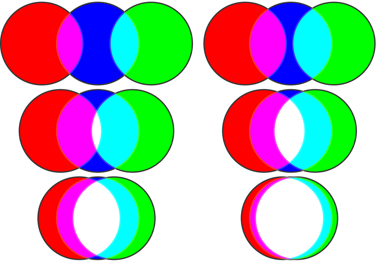
Our industries rely heavily on color, which most of us know as a wavelength of light that our eyes and brains perceive as ..well color. But we don’t always think about how or why this is happening. You can go a long way just knowing what looks nice, but if you want to optimize the potential of your finished product, knowing the physics involved is very beneficial.
Additive Color

Additive Color Overlay GIF
If additive color is the adding wavelengths of light to create new colors, subtractive refers to the process of removing wavelengths to create other colors. This is what’s happening when you add ink, paint, etc. to a physical display medium such as photo paper. Alternatively to additive color where white is the combination of all wavelengths, in subtractive theory, white is what you have without the introduction of any colors. Adding red ink acts as a filter which subtracts all but its own wavelength (the longest in the observable spectrum) from the white light, allowing the observer to see it by itself. I tried my best to demonstrate this in the image below.
When I first learned color theory I assumed that subtractive was just the exact opposite of additive, however this isn’t the case, and the achievable color gamut of subtractive is much more limited.
Just as additive is represented by the primary colors of RGB, subtractive, uses CMYK - Cyan, Magenta, Yellow, and Black (K). The reason black is included is because adding all of the colors created with CMY together makes a muddy brown, they don’t filter all wavelengths entirely (as a side note, it’s represented by K for ‘key’ which is the name for the black plate used in the printing process, and because blue already took B in RGB).
Compared to sRGB (the smaller RGB gamut seen in the additive section), this is standard CMYK:
This varies slightly based on your printer, inks, and paper/print surface. Some printer manufacturers have increased their achievable colors by adding different shades that can’t be created with normal combinations.
When printing any work, it’s a good idea to contact the print shop and ask for their printer profile, which is a custom profile for you to download and install into your editing software to ensure that all of the colors in your image can be created with the printer and paper you’re using. Most high volume print shops will have it already on their website, and some smaller high end specialty shops will require you to be a registered customer before they’ll give it to you.
Of course, none of this matters if your display isn’t calibrated, since you won’t be seeing colors properly anyway. To find out how to do this, check out Zach Sutton’s Ultimate Screen Calibration Guide from earlier this year.


.
There's a program called ColorThink made by CHROMiX. It allows you to compare color profiles and map conversions with different images using different rendering intents. It is the best thing I've found for getting a handle on color theory.
No, I'm not selling it. I just think anyone interested in this topic would have fun checking it out. I sure did.
As far as I can tell I have an 100% sRGB and 89% Adobe RGB screen. Costed me a kidney (fooling around, but still it was expensive). And still I can't see most colors, i have huge problems perceiving magenta in skin tones and correcting it, let's face it, i'm about 15% color blind xD .
The gamut helps a lot, but like you said here, when you print the thing most color info will disapear due to printing limitations.