Sometimes, photography is too easy. After churning out perfect images left and right, I really felt I like I needed a challenge that would put my God-like skills to the test. Of course, that’s complete crap, but occasionally I do see the need to challenge myself and alternative processes are a great way to learn about the craft of photography while having a bit of fun floundering in failure. To that end, I’ve learned my first alternative process: the kallitype.
What Is a Kallitype?
A kallitype is an iron salt-based photographic process that converts a sensitizer (in this case a mix of ferric oxalate and silver nitrate) into a visible print. Because the sensitizer is only responsive to ultraviolet light, you can prepare your prints in dim light or under tungsten-based artificial lighting. However, because the process is UV sensitive only, you can’t use an enlarger to make the print. It’s exclusively a contact printing solution.

The chemical brothers: ferric oxalate, silver nitrate, and tween 20 (An optional additive)
OK, So What’s a Contact Print?
A contact print is a photographic process in which a negative is pressed directly against an emulsion and then exposed to a light source to make a positive print. Before photographic enlargers, most processes were contact print based. A suitable negative is traditionally produced by a large-format film camera, although smaller formats can be used as well. Negatives that have fairly high contrast work best. However, technology being what it is, we can now create perfectly useable negatives from digital sources. So, you don’t have to let a lack of large-format gear stop you from trying your hand. You can use your favorite digital camera to print to a transparency. I like Pictorico transparencies.

Placing a transparency on the paper.
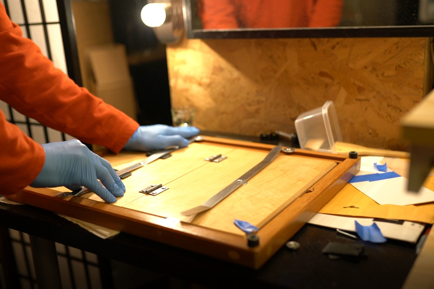
Loading the contact printing frame. I used little rubber wedges to get more pressure on the print.
Don’t Be Scared By the Chemistry
Alternative processes, in general, are full of big-word chemicals. Don’t be intimidated by them. For the most part, you’ll be simply mixing powders or crystals with distilled water, putting it into bottles, and labeling them. You don’t need to break out a Bunsen burner and a periodic table. That said, if you really get into any of these processes, refinements to the recipes can be made that may require a bit of sleuthing. Either way, one of the cool things about the processes are that most of them are old. People have been doing them for many, many years, and there has already been a ton of research done for you. You don’t have to reinvent the wheel. Google is your friend. Trust me.
What’s the Process Like?
Although the process may sound complicated when describing it, in practice it’s pretty simple:
- Sensitize your paper
- Mix your sensitizers together. In an ordinary shot glass, you’ll mix equal portions of ferric oxalate and silver nitrate.
- Spread the sensitizer on your paper using a brush or glass/acrylic rod.
- Allow paper to dry.
- Apply your negative
- Take a negative or transparency that you like, press it against the sensitized paper, emulsion side down.
- Put it in a contact printing frame or between heavy pieces of glass.
- Tightly press the negative and paper together using clamps or a high-quality frame.
- Expose your paper
- Using either sunlight or an artificial UV source, expose your image to light. You want a sort of ghost image on the paper when it’s done. Time varies depending on the light source. I built my own UV exposure unit because I'm too obsessive about repeatable results.
- Develop using your choice of developer (mine is sodium citrate)
- Clear the print of residual iron salts (I use citric acid)
- Tone the print (I use gold because I’m cheap and it sounds cool to have a gold print. Bling bling!)
- Fix the print (I use sodium thiosulfate)
- Rinse
Simple, right? Hey, stop running! Seriously, don’t let the chemicals get you scared. It’s not so bad and it can all be done in a single developing tray. Remember when f-stop, shutter speed, and ISO may as well have been words from a foreign language? This is no different. You'll be speaking chemical-ese in no time.
I’m being purposefully vague here describing the process because, like anything to do with photography, once you get past the basics it can be as simple or complicated as you make it. Some people like different chemicals. Some people prefer different papers. Some introduce additives to their developer or sensitizer to get an effect they want. You can really get deep into the process, but for now, I’m just having fun with it.

I use a UV printer that I built, but you can use the sun if you're on a budget!
What Are the Images Like?
Kallitypes vary greatly in their appearance depending on many different variables. Probably the biggest influencer of your final image will be the paper you choose. Kallitype is a very finicky process, and only high-quality papers will give a result that pleases. Low-quality papers can be problematic in the clearing stages and have issues with staining. Also, some papers are rougher than others and will produce grainier looking prints or absorb the sensitizer differently. I’ve been using Stonehenge paper, but I’m not sure I like it yet. I hear good things about COT 320 and Arches Platine. Papers can get pretty expensive, however, so try a few sheets of each first if you can.

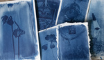
Notice the brush strokes where I laid the emulsion on the paper. Also notice the unevenness! I need practice! Made from a 4x5 negative.

A print made from a 4x5 negative. a touch of swing is applied for a sweet falloff. There's a bit more graininess than I'd like. Going to try other papers soon.
Prior to toning, prints will usually have an orange-ish hue that many photographers love. It has a lovely, old-time feel. However, most experts agree that a kallitype should be toned to ensure longevity. A kallitype that isn’t toned will eventually break down due to latent iron in the print. So, if you like that warm hue, perhaps toning with a noble metal that produces something similar is the best way to go.
Toning
Toning a kallitype is the process of introducing a noble metal to replace the silver in the print. Because the metals are more inert than silver, they last longer in the fibers of the paper. Traditionally, gold is the go-to metal for toning a kallitype, although you can also tone with platinum, palladium, and selenium. Platinum yields an image with more neutral black and white tones, palladium is warmer, and gold is cooler. An image toned with platinum will last hundreds of years if treated right. That said, platinum is very expensive and the prints I’ve made so far don’t justify that kind of expense. Gold it is!
Why on Earth Would You Do All This?
Simply, it’s fun. I enjoy getting my hands dirty in the process. I enjoy printing in the darkroom, as well. Now, make no mistake, I’m all for normal digital printing as well, and I wouldn’t recommend that all prints be given this treatment. For me, there’s a certain look it imparts that just works. The prints do have a much different feel than regular prints simply because of the way they bond with the paper. Contact print processes have emulsions that sit in the paper instead of on it, so there’s a certain depth and richness that’s difficult to obtain on inkjet prints where the image sits on the surface. That said, the images also are not as technically pure as digital prints. They’re not as sharp. They have inconsistencies due to hand application of the emulsion. They just aren’t as clinically true to the original as other printing methods.
But I’m OK with that because I like the look and it’s nice to be so intimately involved in the making of a print. You really do put a bit of yourself into the print instead of having a computer do the work for you.

A print made from a Sony a7R II printed on Pictorico transparency as a negative. Excuse the bulges. I ran out of time and couldn't flatten the print.
Next Steps
My journey in this process is just beginning and I’m starting to churn out prints that I can be proud of. I need to get better at applying the sensitizer evenly on the paper and I may switch up my paper choice as well. The images are a tad too grainy for my tastes. I’ll also be experimenting with double coating the images. I hear that it helps with shadow depth.
If you’re interested in the process, I’d highly recommend you read Sandy King’s guide to kallitypes online. It is chock full of free information on the process and tips to get started.
You can buy an all-in-one kallitype kit with everything you need except for paper and a contact printing solution at B&H.


This is so freaking cool...I'm going to have to give it a go!
It’s a lot of fun! And you really get obsessed with tinkering with the process.
Quick, into the Batmobile, and ... back to the past?
Great article and killer prints! You mentioned having trouble sensitizing the paper (I think they look great) try a big wad of cotton batting. Make a ball in your hand, spread it out so it's flat on one side, put your silver solution on a plate, dip the cotton and spread on the paper. The batting does a super good job of applying the silver evenly.
Hmm...sounds really interesting! I’ll have to give it a shot. I have a friend that does wet plate so I bet he’d have some insight as well. Thanks for the tip!
Thank you, sir!