
Sony cameras have long been criticized for their color science. The notion is that Sony cameras produce unflattering colors, especially for skin tones. This claim seems to be leaning towards raw files processed in Lightroom. Capture One is generally recommended, so, let's find out which of the two software is the better option for Sony raw files.
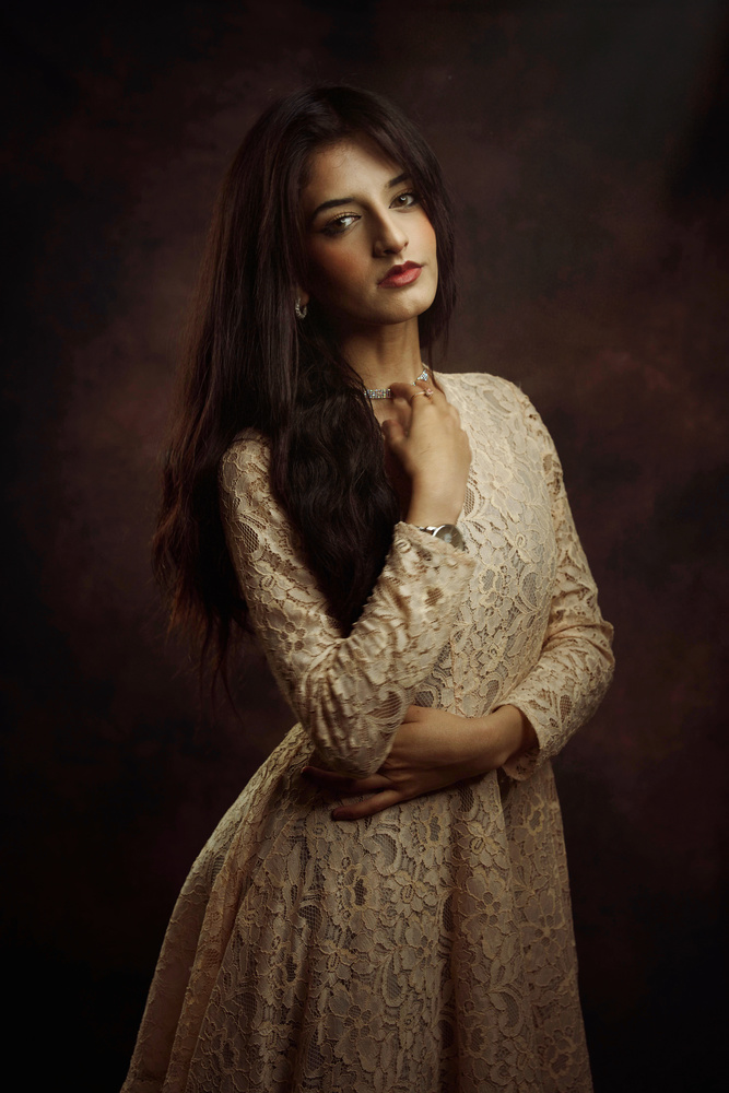
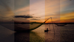
In a previous article, we compared Canon raw files processed in Lightroom and Capture One. For this second article in the series, we will be focussing on raw files from Sony cameras. The key image in this comparison was shot with the Sony a7R III with the Sigma 65mm f/2.0 lens.

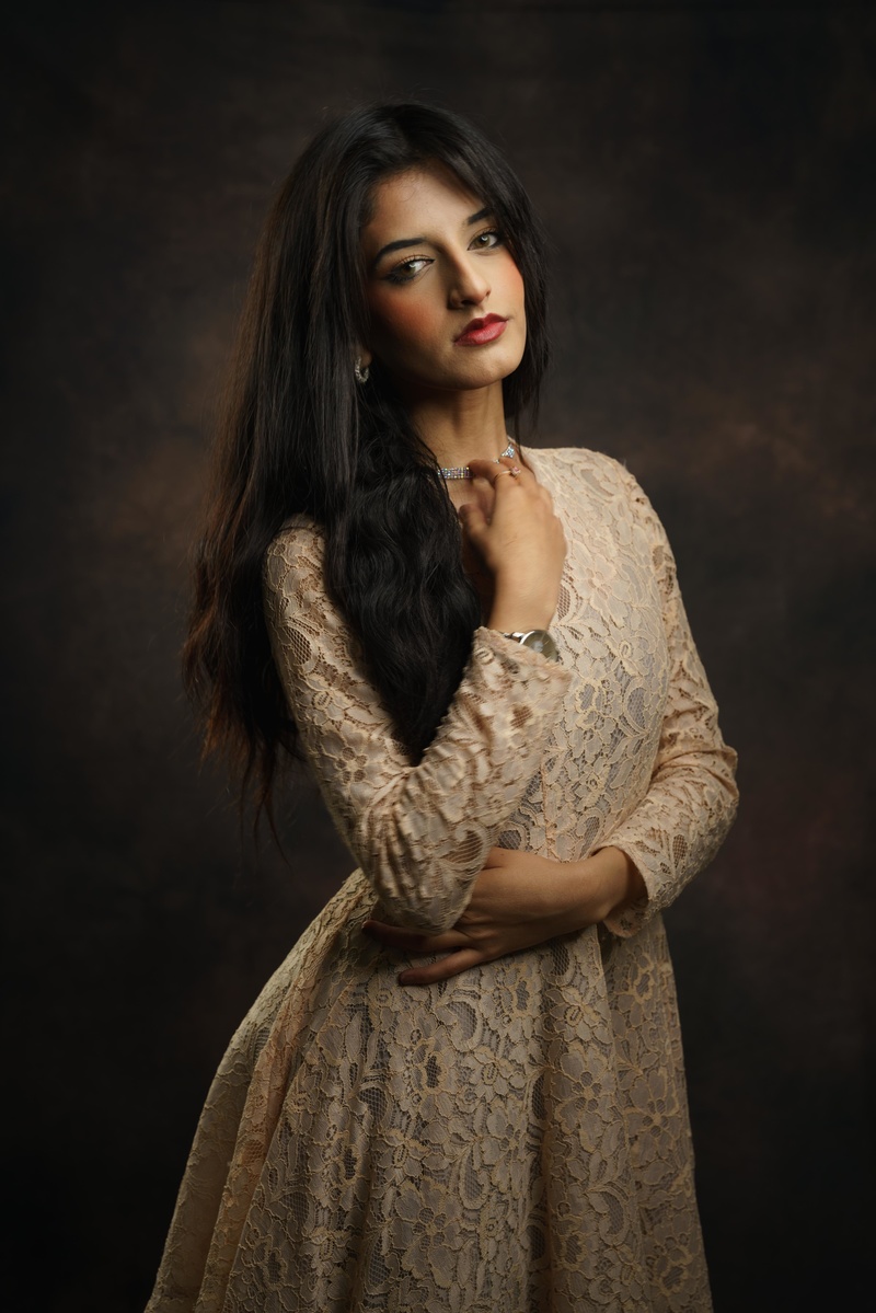
This first image above is a JPEG file taken straight out of the camera without any processing from any software. The straight out of camera image above will serve as a point of reference only and does not necessarily serve as a benchmark in this comparison. We can now start this comparison by looking at how images look from each software.
For Lightroom I used the Sony Camera Standard profile and the in Capture One, I used the Pro Standard profile.

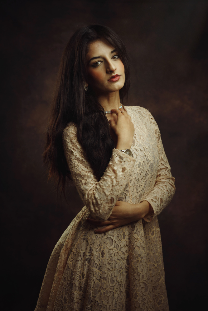
Capture One
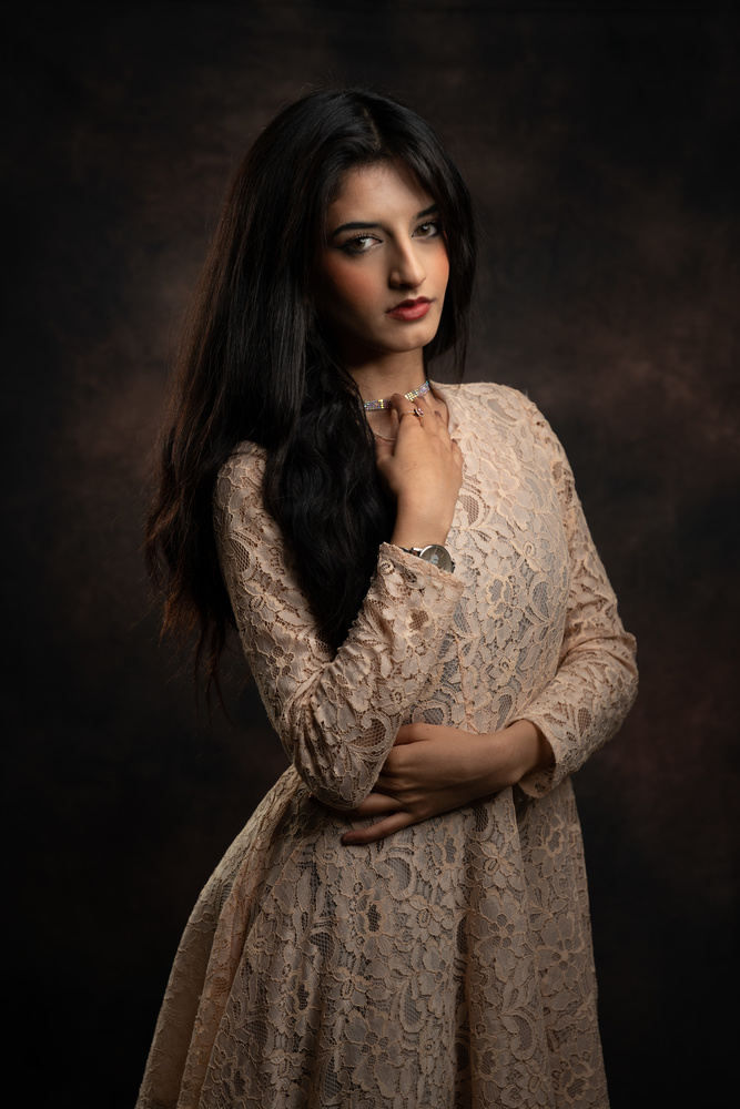
Capture One Close-up
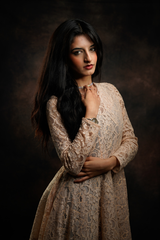
Lightroom
Lightroom Close-up


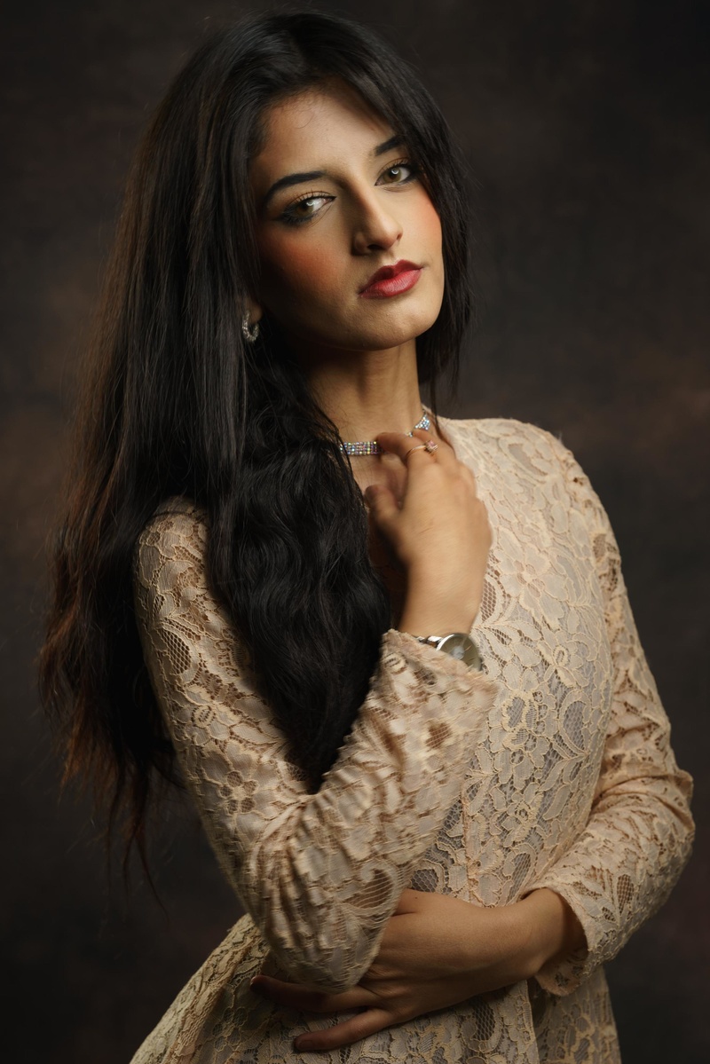
The main differences between the two are that Capture One leans more into the magenta tones and has more contrast. The Lightroom image is a little warmer with a slight bias towards the green tones along with a little less contrast. Neither image matches the JPEG that came straight out of the camera, although that's not a measure of performance.
Having said that, if you are looking for a more consistent workflow there is quite an easy way to do this in Lightroom. When you use the standard Adobe default profile, it matches the out-of-camera JPEG relatively well.
The difference is that the out-of-camera image from Sony has more contrast and saturation. The fact that the Lightroom default image has less contrast and saturation may prove useful if you're planning on editing and color grading your image. This consistency may end up offering a lot of value to your workflow. Essentially, what you see on the back of your screen will be close to what you see on your computer screen when you sit down to edit.
On the other hand, in Capture One the colors and the overall look won't match the manufacturer's profile the way that Lightroom does. Capture One in general uses its own theory for color and this is by no means a bad thing because plenty of photographers prefer the way Capture One processes raw files. The results from Capture One may not be as consistent, however, for many creatives, this is actually a feature.
The only downside to Capture One is that it tends to be highly aggressive when applying sharpening. On the surface this makes images from the software look crisp and offers an illusion of more detail. In practice, the sharpening in Capture One can result in a few unwanted issues.


As you can see in the comparison above, the Capture One image looks sharper. It appears to have more detail due to how it's processing the files. However, images can end up looking harsh. This is especially the case when it comes to skin texture and tones.
As you start to edit the image with a little more meaning in applications such as Photoshop, the extra sharpening applied in Capture One may end up being a hindrance. This is one of the reasons I prefer to completely switch off the sharpening in Capture One. Any sharpening that I do apply tends to be applied in Photoshop through more dedicated software such as Sharpen AI from Topaz Labs
With Lightroom, however, the sharpening is relatively benign. I've never had a situation where the default sharpening settings have come in the way of my workflow. The sharpening in Lightroom has a positive effect on the image because it enhances the detail without damaging the integrity of the file. I can quite comfortably leave the sharpening settings on in Lightroom, and apply further sharpening in Photoshop without it becoming excessive of details looking harsh.
Having said that, this isn't by any means a major problem in Capture One. It takes very little effort to switch off the sharpening features in Capture One, therefore, it's not really an issue The only reason I'm discussing this is simply to highlight the differences between the two software.
Finally, we have a comparison below that demonstrates images from both software once they have been color graded.
Both images in the above comparison were processed with the default settings in their respective software. Then they were taken into Photoshop where each image received the exact same treatment. Several layers of exposure, color, and texture were applied to the files and exported.
Interestingly, despite the fact that each had the same treatment, the results are noticeably different. The Capture One image has a brighter background and leans a little more into the red and magenta tones. Lightroom on the other hand has a slightly faded look to it. It also leans more towards earthy and green tones. The background also appears darker and less saturated in comparison.
What's most curious is the fact that neither result looks wrong. There's no doubt that the images look different, however, neither of the two results appear displeasing. Essentially, it comes down to personal preference and depends on what you think looks better.
Final Thoughts
Despite the fact that I use Capture One for more meaningful projects, the idea that Lightroom is bad or that it doesn't produce good-looking results isn't true. There are clear differences between the two software, however, it's entirely based on preference. Capture One operates using its own color theory, which I enjoy and prefer to use for my work. Lightroom, on the other hand, leans more towards what the camera manufacturers intended. And the results look great from each.
It's important to remember that how the images are presented in each software, will undoubtedly change the way you perceive the end result. Although I applied the same treatments to the images in the final comparison, this is obviously not how someone would work in real-world conditions. Nonetheless, highlighting the differences between the two software may help you decide which one works best for you. Fortunately, what you can be certain of is the fact that either of the two options will produce great-looking results.
Which do you prefer, Lightroom or Capture One?
If you'd like to learn how to use Adobe Lightroom more efficiently on any device, make sure to check out our Mastering Adobe Lightroom course with Pye Jirsa. We also have the Complete Capture One Editing Guide if you prefer Capture One over Lightroom. Save 15% by using "ARTICLE" at checkout.


The way I usually handle sharpening in C1 is I set it to be pretty low, but I also make use of the "Halo Suppression" feature which helps make the results look a little more natural.
Still ignoring DxO PhotoLab, which trounces both with high-ISO files.
Not ignoring, i just dont have enough experience with the software just yet. Working on it, but might take a little time.
Shouldn't take long to figure it out. The adjustments you're applying are very simple. FWIW, I don't apply any USM at all in PhotoLab, in part because the automatic lens corrections (which include sharpening as well as CA and geometric correction) for custom-profiled lens/camera combinations do a magnificent job of extracting detail. Even more amazing is how much detail is squeezed out of an ISO 25,600 RAW file processed with DeepPRIME noise reduction. I use LRC as my DAM, but I would never consider processing my high-ISO event work with it. They're not even close.
Ill give it another look. Thank you for the suggestion.
I was messing with the trial version for about an hour. Not too shabby, I must admit. It's pretty fast for something that doesn't need to generate previews. However, when it comes to color rendering, it's far below C1 standards. C1 just trounces it
Below is a cropped raw rendered in jpg at 100% quality comparison between the two with no adjustments/corrections. Notice the nasty green gradation on the side of her face on the DXO file.
Higher res for pixel peeping:
-- https://tinyurl.com/dxo-v-c1-0114
Where? All I see is a slightly contrastier and cooler rendition. Needs about +200 degrees Kelvin and +4 magenta shift in WB. Did you shoot a ColorChecker and set WB with it in post? Perhaps you just need to "mess with" PL a bit more until you know how to make it do your bidding. The blocked up shadows in her hair on the left side of the image indicate to me that you really haven't come to grips with PhotoLab yet. Also, if customizing color response is important to you, PL supports .dcp custom camera profiles. I like PL's default color rendering with my Sony files, but it's good to have access to custom profiles, too, especially when shooting in artificial ambient light.
At the cheek area. I went ahead and took a look with my laptop and phone, it's somewhat subtle. But, on my main monitor, it clearly shows a difference. No doubt almost anything can be corrected/adjusted. This exercise was more to show out of the box.
Which cheek? There are lots of clear differences here. Most of them seem to me to arise from the cooler/greener WB and the higher contrast. FYI, I'm viewing on a calibrated 32" NEC PA322.
It's pretty unusual for PhotoLab to block up shadows as badly as seen above, at least with my basic, automatic custom preset (which includes Smart Lighting), so it's my strong suspicion that the differences I see here result from your choices and not from any inherent limitations or characteristics of the apps themselves.
1. Like I told you already, I didn't do any adjustments to PL. I disabled the stupid automatic crap that it does on every single image: Smart Lighting, Vignetting, Color Rendering, Denoise, CA. This way it's like for like as far as out of box since I didn't do any adjustments to C1 either.
2. I'm only referring to the skin color.
Below is the zoomed in version of the cheek.
"I disabled the stupid automatic crap"
It's only stupid if you don't know how to use it. I use these automatic adjustments to great effect. I tweak them to suit my tastes, though, and save a customized preset that is applied to all my images on import. This greatly minimizes my need for user intervention in post. For example, I dial down Smart Lighting to 10 (instead of 25) and DeepPRIME noise reduction to 30 (instead of 40), as I find these settings serve the vast bulk of my images better. It's a set-and-forget operation that took me maybe an hour last year to create, and I haven't had to think of it again since.
Also, the auto adjustments you're complaining about are applied as part of DxO's default set of presets, but you are free to assign different presets, or none at all, by default, either on import or afterward. In short, you're complaining that PL doesn't do what you want automatically and perfectly with no user intervention. I've never seen ANY RAW processor that does that, and I've tried pretty much all of the major ones.
I'm not seeing green in the area you outlined. Like I said, it looks like a simple matter of contrast and WB, one that I could fix in a nanosecond. It's also not something that I encounter in my portrait images.
I appears to me that you're cherry picking one image where DxO didn't provide the result you wanted with no input from you, and you haven't bothered to learn how to make DxO do your bidding. Hardly an exhaustive critique. It says more about you and your testing methodology than about PhotoLab's capabilities.
Sigh, if I've said 3 times, I've said 3 millions times. It's supposed to be out of box without the childish amateurish crap DXO loves to fake folks with. Which, I suppose worked on some of you.
So, circling back to your original question, "Still ignoring DxO PhotoLab", DXO PL will never be a standard. No self respecting professional, or hobbyist, is going to push this BS. It's $219. LOL!
Petulant hyperbole = zero credibility. Bye.
Considering my old copy of Lightroom couldn’t open the files from my Sony and the fact I don’t want to pay for a subscription, I decided to give Capture One a go. I have been blown away by the results and the sheer number of customisable options. Having layers is also extremely useful. Personally, I don’t like to sharpen my images as I like to see the lens’ natural characteristics in the final image.
We moved long ago to C1 (except for the Hasselblad). Not only because of the tethering which is indispensable in studio work, but their color editing is fantastic. As a fashion and make-up portrait photographer, you can't do without it. Modern cameras and default software settings tend to over-sharpen everything due to the obsession with highest sharpness. In my experience the best way to start is to reduce in-camera sharpening (when the brand allows you to do that for raw files) and start very moderate in both C1 and LR or Phocus.
Capture One for sure. And, yeah, I don't like how they over sharpen by default. I changed the default to 100, then adjust if/as needed.
Rawtherapee definitely.
I don’t know any different as I’ve never used LR but I find capture one to be more than sufficient for my RAW processing needs.
Slightly off topic...Why is it that your comparisons, with the slider, only call out Lightroom with a label and not Capture 1 as well? Is it possible Adobe is making some sort of contribution here?
Its the left side of the comparison that only seems to come up. So any image on the left seems to have the label but not the right. Might be a fault.
So after reading this article which goes back and forth between Lightroom and C1, it all comes down to personal preference. In the end, the point is that there is a distinction without a difference.
Headline is a little misleading, isn't it? The software isn't going to render an a1 or a7r4 like it would an a7r3. The R3's own onboard color science is a few generations out of date.
And for what it's worth I prefer C1 in this instance, but it's nothing I couldn't fix in one second with the grading tool.
I just bought Sony A7 4 and the Tamron 28-75mmn F/2.8. My first shoot is tomorrow. I will check out what you posted. Any suggestion of what color profile to use the first time?
You started all wrong!! First the in camera jpeg is affected by creative styles you select that do not affect raw also the many WB settings and DRO/HDR settings in DRO 1 to 5 all are in camera processing. Also you can use a grey card or dome (I prefer) to get the colors in camera. C1 also has a thick white plastic tool that you place in front of lens for calibration of lens and white balance and dust removal that you compare to all images taken at a certain time, light changes by the second so use each capture. Also there is the DataColor SpyderCube not only for color but correct exposure/whites/darks that you can use in compare in Lr in post.
I read where a National Geographic Photographer took both jpeg set with a DRO setting and raw, sent the jpegs ahead and raws later and wanted the raw to look like the jpeg and the home post processors good not do it!
You are comparing apples and oranges AND not using all tools available. Yes a lot of time and tools for a capture.
My A7s using AWB captured gas glow color at high altitudes above and inside a Milky Way Capture as well as the ground amber lights with a baby blue sky at 30" and comparing raw and jpeg could not tell the difference.
I use the SpyderCube even in night capture of milky way and have you ever really looked at all the city lights and different colors the new LED's are blue but with correction they are pure white.
As far a people most just color pick the whites of the eyes.
As far as Lr and C1 their profiles they are best guesses to the camera profiles they have and each style and WB you can adjust to your liking anyway!
Oh and is your monitor/printer a sRGB or Adobe RGB or ProPhoto you save digitally sRGB but a print shop has their own way. How many colors and shades can a human see anyway, will what you post digitally be what others see on their monitors.
It is a deep hole of questions and many thick books!!!
Thank you for the comparison.
Don’t forget that sonys In-camera settings will effect you raw file in Lightroom at lest. :p just a
head’s up!!
If that's true, it's another minus on the ledger for LR. PhotoLab's rendering is entirely independent of the in-camera settings that should rightly apply only to JPEGs.
https://fstoppers.com/gear/proof-sony-picture-profiles-do-affect-raw-pho...