
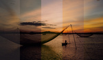
Aerochrome film is an incredibly rare infrared film, famous for its otherworldly color palette. Can RNI’s Aerochrome profile pack really deliver the same unique results from a regular digital image?
RNI’s Aerochrome preset is intended to replicate the color palette of Aerochrome — a cult classic from Kodak that was originally developed for infrared foliage surveying. What made that film stock unique was the vibrant, alien-hued color palette it gave images, shifting the green trees into bright reds, pinks, and purples. Unfortunately, that film is incredibly difficult to find now, as well as being very difficult to process. Some expired stock can pop up on eBay, but typically sells for $100 a roll.
The Profiles
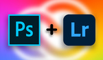
RNI’s profiles, however, work with Lightroom and Adobe Camera Raw, and are compatible with any color image. It can be synced for use in Lightroom Mobile too. What’s really exciting about this preset is the ability to replicate that color palette in any shot — no need to add filters to your lenses or convert your camera to infrared. An important caveat is that since it doesn’t have that infrared information, the product instead works off the colors present in the shot. That makes this more a replica of Aerochrome’s color palette, rather than actually replicating the film stock’s effects exactly.
The product comes with 18 profiles, which make for a variety of color shifts, as well as some variations in contrast. You can end up with red, purple, pink, or orange replacements for greens and yellows, while blue skies end up various shades of cyan. Other colors outside of those two target ranges can end up a bit desaturated, and may be a bit blue shifted. 
All of the looks are massive adjustments to the color palette of the image. When applied as profiles, you can modify the effect by adjusting the amount slider. Since these are hue shifts, however, setting an intermediate amount doesn’t typically give a great result. For instance, a value of 50 might leave the trees looking brown and dead, rather than the original green or full-effect red. Values over 100 further increase the saturation of the shifted colors, which can be useful when the original image has low levels of saturation. I found the profiles to be well calibrated by default and the flexibility to adjust them should just be considered a bonus.
All variations also come in a “grainy” variant, but due to ACR's implementation of grain size, you might be better off setting this yourself, as you’d have to tweak it anyway for best results. I’m not personally a fan of added grain to a digital image to begin with, but it’s nice to see it available as an option.
In Use
I’ve included a variety of raw shots from my D810 and Z 7, but they could work with any color photo. I had the best results from a subject that has a lot of green — think forests, landscapes, and jungle, but even some desert shots worked. While the product causes a significant shift in the colors of the image, it’s not hard to get a feel for shots that would work well. After just a few minutes in my catalog, I found that I was quickly able to recognize the images that would show the effects well.
What could take a little longer to develop is a sense of how to use the profiles for the best aesthetic effect, rather than just straight impact. In most shots, the huge shifts in color can drastically change the feel of the image, and if I were shooting with this style in mind, I’d consider different exposure and composition choices right in the field. It's definitely a very specific look, requiring the right subject and lighting to really shine.
Fortunately, it does a very good job of retaining the luminance and contrast characteristics of any shot. I didn’t find that any of the images I applied it to were suddenly blown out or adversely impacted. The look itself might not have always worked for that image, but it wasn’t because of unwelcome shifts in exposure or contrast. 
The only issue I found was when working with some shots of darker trees — it seems like the color range doesn’t stretch quite far enough to shift the tones in this Alaska image, for instance. While these are trees and by the logic of the film this is based on, they should be shifting colors, they aren’t. As currently implemented, I couldn’t find a way to meaningfully expand the color shift into those trees. Tweaking the HSL sliders let me bring a bit of color into that area, but it wasn’t really enough to fully impart the effect.
In these samples from RNI, you can see that the skin tones have been preserved to various degrees. Each look can alter those tones in different ways, so working with the live preview in Lightroom’s preset panel can be a big help. The previews were quite responsive on my computer and I found them essential to quickly checking which of the variations worked best with the image.
One of the biggest surprises when working with this product was just how much I liked it for some of the southwestern images I already had. The warmer tones of the rocks in this shot of Zion worked well, giving it an autumn-on-acid vibe. Overall, I'm really surprised by how natural these changes came out to be. By natural, I mean that they don't have artifacts, banding, or other issues from the huge color shifts going on — they look like they could have come from an IR-sensitive camera.
Conclusion
I think this product is very well executed from a technical standpoint. It’s definitely one of the most unique I’ve seen and one of the first profile packs I've been excited to review. Now this isn’t an effect I could see adding to every image, but I certainly see creative value in it. There’s a good variety of variations on the theme and the added tool-kit is a nice touch. One last thing to consider is the very unique value this product offers. For less than the cost of 1 roll of actual Aerochome, you can imitate the effect on any image you want. It’s also far cheaper than getting an IR camera setup, although again, it’s not the exact same results. Overall, if you’re looking for a creative option to add to your toolbox, I'd definitely recommend this package. It's currently available for purchase directly from RNI's website. It's also available as part of their flagship All Films 5 package.
What I Liked
- Replicates a variety of unique color palettes
- Doesn't require special preparation of images, as it preserves exposure characteristics well
- Integrates easily to Lightroom, Photoshop, and Lightroom Mobile
- Easy to install
What Could Be Improved
- Names could be more descriptive or similar color palettes could be grouped to make it easier to find desired looks
- In rare cases the effect may not have a wide enough range, without an easy way to adjust the effect


I'm so jaded. I saw "film simulation" and had already checked out, but good lord, those images are beautiful! I want that panoramic of those trees with the red carpeted forest floor on my wall. Great stuff, Alex.
If you're looking for infrared chrome that's not a simulation, you need a camera modified for full spectrum and a specific filter made by kolarivision
Thanks Robert!
I agree it looks pretty good except for some of the green foliage doesn't pop as it should. I use a full spectrum converted camera with a Kolarivision IR Chrome filter and I'm very pleased with the results. If I didn't have that camera and filter but wanted to get the look of Aerochrome film, this would be the answer. Thanks for the review.
Yeah, I think with a little manual adjustment you can bring out the foliage more, but I'm still impressed by the quality of the results for just being a hue based adjustment.
Yeah, you can purchase them right here:https://reallyniceimages.com/products/aerochrome-lightroom.html
I used the Aerochrome look myself on a variety of images (https://fabienb.blog/portfolio-item/aerochrome/ and on my Instagram @fabienb) and I absolutely love it. In fact, my Aerochrome photo of the Golden Temple in Kyoto is among my favourite photos ever!
I have not tried the RNI version though, but I can see by the photos in this article that it is a beautiful rendition indeed.
I'm going to check that, chaers!