
Separation is a powerful tool we can use in compositions, and there is much more to it than preventing subjects from touching.
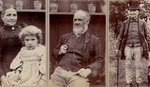
One of the earliest photographic lessons I learned as a boy was when I saw a photo with a lamppost growing out of the top of someone’s head. Then, there was a picture of my older brother lying down with what appeared to be enormous boots pointing to the camera; it had a wide-angle lens exaggerating his seemingly gigantic feet that appeared to be detached from his body.
With photography, we are usually trying to create order out of the chaotic world. I wrote before about minimalism, and such simplicity frequently works well, and there are various other methods that we can use to strip a scene down to its bones. Separation is one such compositional tool that is often forgotten by photographers.
I should start by saying this is not a prescriptive rule in photography. It’s not something that we must strictly follow to make our composition good. But, like all the so-called rules, it is a technique we can employ because it can have a satisfying effect upon the viewer.

Do you consider there to be sufficient separation in this image?
Sometimes a photo can be ruined by two items being in transit. Typically, it’s worthwhile moving your position, or waiting for the right moment, for subjects to be out of alignment. Hence, the best landscape photographers will always survey a site, looking at how to frame a shot before positioning their camera. This process involves separating objects, so they do not clash with one another in the picture. Street photographers also find that space between people can give more pleasing results than if one is partially obscured by the other.
Nevertheless, it isn’t just positioning that can separate objects within a frame. Using different textures is another method of adding separation. Typically, we are looking for rough texture in front of a smooth one, as achieved by a shallow depth of field, or when using a plain backdrop. Having a repeating pattern in the background that is broken by a foreground subject can similarly add differentiation too.
Changes in tone can also create separation, such as the dark horizon in the following image acting as a clear divider between the sky and its reflection in the wet sand.

Careful use of depth of field can help separate subjects from each other. Wildlife and portrait photography typically employ this technique, though sometimes it is overused to the extent that it has become a cliché. The current craze for attractive bokeh has produced a surfeit of images of birds perched on sticks, and models in front of completely plain backgrounds. This is all fine for shots for a bird identification book and fashion catalogs, but the images can become more interesting if they include some extra information that gives context. Doing that well requires far more skill than just shooting with a long lens and a wide aperture. The great Annie Leibovitz often includes backgrounds to her shots that add to the story she is creating. Yet, she does it subtly, so separations still exist.
Use of color can add separation too. Looking for complementary colors, i.e. those on opposite sides of the color wheel, make the subject stand out from the background. I talked more about increasing the illusion of greater distance between the subject and its background in my previous article.
Especially important for black and white photography is tonal separation. Novices to monochrome sometimes decry that their images look like gray mush. This is because they have not yet grasped the idea of seeing without color, and that different luminosities are needed to disconnect subjects within the frame. One way of learning to see in black and white is to switch the camera to the monochrome mode. With an electronic viewfinder, you can preview how the image will look in real-time.
Take the following image as an example of how not all color photos work in black and white. The complementary colours of red and green stand out against each other. But the berries and the leaves are approximately the same brightness, so in black and white the berries start to become lost against the background.


Tonal separation can be seen in the histogram. A strong peak indicates an area of a particular brightness. However, we cannot just rely on that. The primary subject must usually be severed from what is immediately around it, and although the histogram shows the amount of different lighting in the image, it does not show where in the image it is distributed. But U, M, N, and W-shaped histograms are a good indication that the image might make a good black and white photo.
Although it is possible to separate the original colors in black and white photos by using adjustments in processing and development software, these should be applied with care, as heavy-handed changes to the sliders create ugly artefacts in the image. However, they can be used gently to accentuate tonal separation that already exists.
Contrasting elements within an image, such as tones, complementary colors and textures, were what was proposed by the artist, designer, and writer, Johannes Itten, who taught the basic course at Bauhaus. His entire approach to composition was about identifying contrasts, not just of light and dark, but points and lines, much and little, light and heavy, sweet and sour, one and many, liquid and solid, loud and soft, young and old, and so on. Any physical characteristic you can think of that has a contrasting opposite can be used to help create separation.
The more complexity there is in a photograph, the harder it becomes to find ways of separating an individual subject. Of course, this may be the effect we are trying to achieve; I reiterate that separation is not a rule to be strictly followed.
Separation is often blatant, because there is a trend forcing photographers to make their image’s subjects obvious. I’ve seen photo competition entries marked down because they required studying before grasping what is happening. But instead, we could consider delaying the understanding of an image, requiring the viewer to examine it harder before realizing what it is about. Take, for example, the following photograph. At first look, the subject is obvious: a young woman in bright red on roller blades, separated from the relatively drab colors in the background. She is small and the statue behind her is huge.

It takes a short moment though to realize that there is actually an additional separation that isn’t immediately evident, something that would probably be missed as people scroll past on Instagram.
If you examine the photographs of Henri Cartier-Bresson and his study into the decisive moment, much of what he was illustrating was about separation and the moment it occurs. His most famous image “Place de l'Europe, Gare Saint Lazare, Paris”, is a perfect example. Sports and street photographers typically seek the same.

What examples of separation capture your imagination? Is it something you deliberately include in your photography? Please share your thoughts and images in the comments. It would be great to hear if you have any other methods of adding separation to your pictures.


I am using those techniques you mentioned for quite some time. Tonal contrast, color contrast, depth of field. Different structure is basically describing the use of long exposure where smooth weather is separated by rocks in foreground with nice details on them. Breaking composition down to simple geometrical objects and finding balance in composition is the next step I care for... To many things on one site and not enough on the other is just not looking good enough and feels incomplete
My word, those are fantastic images; you have it mastered. Thanks for sharing both them and your observations. It would be great to see more of the same.
Really great article. Thanks!
Thanks, Jake. Glad you enjoyed it.
A great comprehensive article here Ivor. The Bauhaus...I'm impressed!
Thank you so much. That's very kind.
Well done, well reasoned. Thank you.
Thanks Johan