
ACDsee's Photo Studio Ultimate 2021 is packed with a significant deal of new features.
The editing platform offers a lot of solutions that span from file management, raw processing, color management, and even creating composites and layouts. By that alone, I absolutely appreciate the fact that this software brings together most of what I often use on Adobe's Lightroom classic, camera raw, and Photoshop into one seamless software with multiple modules for every step of the process.

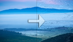
On this article, I'll be taking a look at the entirety of the software in terms of how convenient it would be in executing the usual steps that I take in processing my images on other platforms (mainly Adobe Lightroom) and take a look at the potential benefits that the ACDsee Photo Ultimate 2021 can offer. I mainly shoot landscapes and travel photos which is why for this trial I chose to process this particularly tricky image I shot very recently with my Sony a7R III and 12-24mm f/2.8 G Master lens. It's particularly tricky to deal with the colors of this shot because of the less than pleasant mix of tones found on the foliage and the absence of any vibrant light due to the unfortunate weather condition at the time. I'm particularly interested in the versatility that the different color management modules can offer in coming up with a more pleasant treatment but I will also run through the major parts of this process to better test out the applications of the software.
Initial Corrections

Adjusting aspect ratio and geometry
First I switched over to the Geometry tab to make my initial corrections. Essentially, I want to eliminate any empty spaces on the sides which is why I opted for a square crop. I do appreciate that the crop and geometry adjustments were placed in the same tab since I personally prefer to make these adjustments from the get-go and virtually take out any parts of the frame that I don't want to mind as I move forward. Since this image was shot with an extremely wide lens, I felt the need to correct the perspective even minimally to eliminate the perspective distortion applied to the human element in the frame.

Tone Curve Adjustment
Next, I chose to make very subtle adjustments on the tone curve to achieve a mild matte finish. The fact that the scene is almost exploding with detail and was shot with a very sharp lens, there can be a bit of unwanted detail in the shot. Add that to the fact that since the ambient light softened by the thick clouds were peering through the trees, a lot of really dark patches would have to deal with and I personally wouldn't want those portions to be clipping in blacks.
Balancing Exposure
Here are the pretty standard parts of the workflow that are generally similar to other editing software. To achieve a bit more balance in the frame, I first apply local adjustments on the lower-left portion of the frame where most of the dark patches are, and try to bring out more detail. With the use of a radial gradient tool, I selected a specific portion on which the adjustment will apply and used significant feathering to keep the margins barely noticeable. I then recovered details in the dark patches by adjusting the "fill light" slider which evened out the luminosity with the rest of the frame. In consequence, there were also subtle effects on the highlights on the selected area which became beneficial and gave a bit more emphasis on the human elements in the frame.

 The Light EQ (Equalizer) tab also offers a more precise interface for dealing with the tones. Definitely more precise than adjustments on individual sliders in general or on the histogram. This allowed me to selectively adjust the highlights on the waterfalls to bring out more detail of the stream of the water. (disclaimer: this part was actually done later on but placed on this part for the purpose of keeping the adjustments organized)
At this point, only global adjustments were left to be made through the general tab to recover some more details in the shadows as well as the initially overexposed waterfalls.

Color Management
This is where I am particularly impressed with this software. Not that it offers to do anything that one can't achieve with Lightroom or camera raw, but because it offers a wider selection of ways to do so. In effect, it seems to offer a more precise way of making adjustments through the basic white balance sliders, (selective) color wheel, and the tone wheel. Much of what I think has to be done to this image lie in the colors. However, I aim not to achieve the actual colors in frame, but instead to render a bit of a striking and moody output which is why I prefer the term "management" over color "correction."

White balance adjustment
First, I made a very minimal shift on the white balance to achieve a cooler palette. I felt that this was more accurate to the actual scene given that there wasn't any source of warm light at the time. This, however, created a problem with the midtones wherein it turned what was initially a subtle blue tone into purple which in my taste, doesn't blend well with the rest of the frame. This is where the selective color wheel came in very handy.

Selectively editing the purple hues
The (selective) color wheel allowed me to neutralize this outlying tone into something that went better with the foliage. However, another challenge was the fact that the vegetation in the scene had so many differing tones that (in my opinion) were clashing with each other and could potentially be distracting in the image. Another layer of selective color adjustments was applied on the green and yellow hues to virtually unify and mute down their tones.

Managing the foliage colors
Finishing Touches

Cleaning up with the blended clone tool
After making the crucial adjustments in color, only minor adjustments and corrections had to be made. I used the "Repair" module with the particularly impressive "Blended Clone" tool to clean up and clone out any unwanted clutter in the scene, with special attention to any bright elements on the edges of the frame. Instead of just the usual heal or clone method with feathering, this tool actually applies a clone stamp of a selected area and blends it quite well with the surrounding pixels. I'm particularly pleased with how the resulting image had a more subtle but at the same time, brilliant finish and was quite close to how I envisioned it.


Interesting write up, thanks.
I think that I should give ACDSee a other chance with a couple of challenging RAW files from my Fuji camera that RawTherapee couldn't handle well.
The colour correction tools of ACDSee are quite interesting.
True. There are various ways to approach your envisioned end and their color management tools are quite extensive