
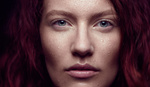
Adding to or accentuating the color tones in an image is a very effective way of telling a story, eliciting an emotion, or strengthening the aesthetic. In this short walkthrough, I'll explain how I can speedily color grade my images.
Color grading an image is usually one of the last steps in my workflow as I only want to do it after I've blended exposures (if necessary), applied any contrast adjustments, etc. The reason I prefer to do it after all other major adjustments is because increasing or reducing contrast will affect the vibrancy and saturation of an image. Sometimes, after experimenting with the overall and local contrast of an image for a while, I will notice a hitherto unseen color tone or palette; this will usually greatly influence how I proceed with my color adjustments.
Because I'm predominantly a landscape photographer, I'm often drawn to the naturally occurring complementary colors of yellow and blue. It is neither right nor wrong to choose these colors to accentuate or manipulate, it's just that for the time being, that's where my images take me. And, when I say, "yellow and blue," I mean the general tonal range of those areas of the color wheel including orange and aqua, etc.
The Process
First, I create a Color Balance adjustment layer (I usually start with the highlights). I could start with the midtones or shadows — it doesn't matter. As I'm usually dealing with the light from a sunset or sunrise, I like to add a brown or reddish tone, but I must be careful here not to push the colors too far, as I could wind up with artifacts or banding.
After I've applied the tone that I want, I like to refine it more. The simple way to do this is to invert the mask and paint in the effect with a white brush, but this is too inaccurate for photos with hard edges and greater dynamic range, so I use the Apply Image tool. In an article from last December, fellow Fstoppers writer Nicole York, gave a very handy example of how she uses the Apply Image tool, which is well worth checking out.

With the Color Balance mask selected, go to: Image > Apply Image
Using the Apply Image tool, I can very quickly add what is essentially a luminosity mask to my adjustment layer. For the highlights, I make sure to leave "Invert" un-checked, set the blend mode to "Normal," and the layer to "Merged" (this uses the sum of the pixels from all the layers underneath to calculate the range of the mask). Then, I will usually lower the opacity for a more subtle effect.
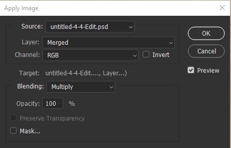
Apply Image control window.

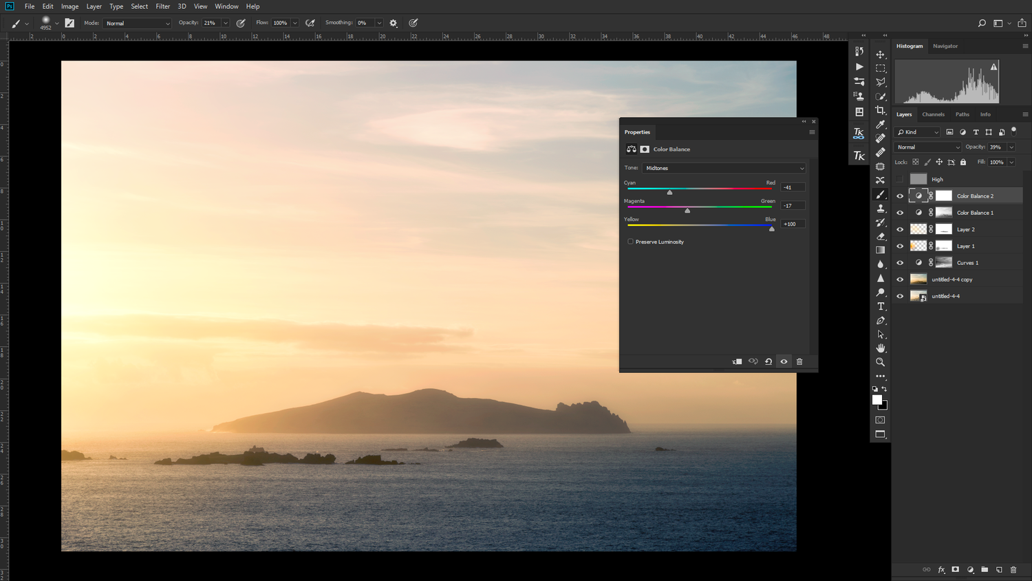
Alt Click the Color Balance mask after using Apply Image to see what areas your mask is affecting.
After I've finished applying a color grade to the highlights, I create a separate Color Balance adjustment layer, but this time I select either the midtones or the shadows (I don't notice a huge difference between the two most of the time, but it depends on the image). For the shadow areas, as with the highlights, I prefer to accentuate the color that's already there. With naturally occurring shadows, that usually means some shade of blue; however, this is really down to one's own vision or preference. More often than not, I will play with the blues, but other times I like to complement the color of the highlights by subtly mimicking them in the shadows. Doing this correctly can really tie an image together. For the purposes of this walkthrough, though, I'm sticking with the most cliché color combination in the history of cinema posters.
What the photo looks like after color grading the midtones/shadows but before I used Apply Image.
After I've made the adjustments that I want in the Color Balance control panel, I again make sure that the mask is selected before I click Apply Image. All the settings are the same as before, except this time I make sure to check "Invert," which tells Photoshop to mask out the highlights, only revealing the shadow areas.
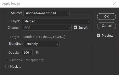
Make sure to tick "Invert" to mask the effect from the highlights.

What the image looks like after applying color grading to the shadows/midtones.
If I want to refine it more I can just click Apply Image again, and Photoshop will do that same thing, except on the mask that it has already created. Sometimes the effect bleeds into areas I might not want it to, and in this case, I can put the adjustment layer into a group, add a layer mask to the group, and paint out the areas where I don't want it with a black brush. This method of adjusting the mask ensures a non-destructive workflow, as I can always go back to the original mask made by the Apply Image tool. After all that, I may reduce the opacity again, if needed. Just to note, the reason I create two different Color Balance layers is so that I can control their opacities and refine their masks separately.


Above is a before-and-after of my color grading. Just to note, I've exaggerated the effect for the purposes of this article. On another side note, the example photo is a shot I took of an island off the west coast of Ireland, known locally as An Fear Marbh: Irish Gaelic for "The Dead Man." No prizes for guessing why.
How Would You Do It?
As with everything else in Photoshop, there's more than one way to skin a cat, and this is just one quick way to color grade an image. Another way to do this would be to use a Selective Color adjustment layer instead of Color Balance like Nicole York did in her article, mentioned earlier, or using a gradient map. A quick but rather broad way to color grade an image would be to use Solid Color and play around with the blending modes and opacity. This can be very effective in tying an image together and making it more cohesive. I would love to hear how our readers go about color grading their images. Would you change anything in this particular workflow?


Article says blend mode "Normal", pictures show "Multiply". Suppose it's meant to be "Multiply"?
It does not matter whether you chose "normal", "multiply", "darken" or "darker color". They all do the same to a white background. Since it is only BW information that defines the mask you could even use "luminosity".