Color is one of the most important aspects in photography. If you've read any of my previous articles, color is the thing that I'm frequently yapping on about, because it really is crucial. It's what gives many images that emotional connection that we feel and that connection can make or break an image.
For the last year or so, I've been testing out a number of different versions of ACDSee software. One of the things that remained consistently true with all the different versions, was that ACDSee always did a great job in reading color from files. With the latest version for the software, ACDSee has taken this a huge leap forward by adding a number of features that I think will be popular.
The first feature is the color wheel which was covered by Jordana in her article. A color wheel is obviously useful for a numbers reasons. To add to that, ACDSee now also offers Tone Wheels in its latest version. In my mind, features like these are must haves for an editing suite and for that reason, I'm pleased to see them added into the 2021 version
Speed and Performance Improvements
Before I get into the meat of the article, I just want to quickly cover some improvements I noticed. The speed and overall pace of the software feels a great deal faster than the 2020 version. Not to say the previous was slow, but compared to the latest version, it feels that way.
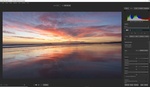
Even importing large, high resolution files and panoramas, took pretty much no time at all. Once the import had finished, navigating the software had this snappiness to it that is very pleasing. The software definitely feels a whole lot more responsive. This is especially useful when applying edits to a file. Once again, this is not to say that the previous version was slow, it's just that the latest version is much faster.
I enjoy working quickly and if software or hardware doesn't keep up with me, I find it frustrating. For this reason, I'm happy to see continued improvements coming from ACDSee, especially in the areas of performance.
What are Tone Wheels?

In the video linked above, Alec briefly describes what tone wheels are and what they can be used for. Essentially, tone wheels allow you to control the color and tones in your image. In most images, you have your highlights, midtones, and shadows. What tone wheels do is allow you to control the different colors in each of those three segments.
When it comes to color grading your images, understanding complementary colors is helpful. For this reason, having a color wheel is more effective than standard sliders, because you can see the complementary colors. For example, the color that generally complements blue well is yellow. On the color wheel in the software, yellow sits on the opposite side to blue which helps you see complementary colors more effectively. As a general rule, colors that sit on opposite sides on color wheels work well together.
A brilliant way to get a better understanding of complementary colors is by using the tool Adobe has on its website. If you click on this link here, it will take you to a site which gives you clear visual understanding of complementary colors. With that information you can start to develop more complex color grades.
Ultimately, tone wheels are one of the preferred ways to color grade an image, because the visual aspects offer a more intuitive experience.
How Tone Wheels Can Help You Color Grade
In the latest version of ACDSee's software, Photo Studio Ultimate 2021, the develop panel is where you will find the tone wheels. The overall layout is pretty straight forward and in my view, pretty easy to understand. There are three wheels, one to to manage colors in the highlights, one for the shadows, and one for the midtones in your image. This separation allows you to focus and pin point your color grade, but also make use of complementary colors more effectively.
The easiest way to make use of complementary colors with tone wheels is to have opposite colors in the highlights and shadows. As you can see in the example below, I've increased the blue tones in the highlights and warmer colors in the midtones and shadows.


With the use of the three tone wheels, I was able to make few minor adjustments that make quite a dramatic change to the overall feel of the image. A good portion of the image above sits in the highlights section. By pushing that wheel into the blues I was able to maintain its color to some extent and also bring down some of the overexposed parts to the left of the image.
The majority of the building sits in the midtones and this is where I wanted to bring back some of the warm tones from the late afternoon sun. As you can see the midtones and the shadows have been pushed in that warmer direction; although in the shadows, I've only applied a slight touch.
It's very easy to over do it when it comes to grading files and this why I prefer to take a light touch. In the example below, you'll notice that even though I haven't pushed the wheels to their respective extremes, the color grade looks a little too much; especially because I'm trying to go for a more natural look.

As mentioned above, colors can really change the way the image looks and feels and that emotional connection you can develop with the use of the tone wheels is an extremely powerful thing. Minor changes can have a drastic impact on your images, however once again, a light touch is generally a good idea.


For this second example, I also made use of the sliders to the right of the tone wheels. These sliders allow you to control the brightness of the selected color in your images. As you can see with the highlights and midtones sliders, I've dropped the exposure and this has produced a less harsh looking and more balanced image.
These exposure sliders combined with the tone wheels allows you to have far greater control and goes a long way in helping you produce a more pleasing look. Due to drop in the highlights, the building looks more balanced both in terms of color and brightness. The sunlight that's being reflected onto the building now blends a whole lot better with the rest of the rest of the elements in the image.
Final Thoughts
Color is something I'm constantly talking about, because I appreciate how important it is and how much of an impact it has on your images. Having the right tools for the job can sometimes make all the difference and I think ACDSee has done fine work with its latest updates. The new color wheels and tone wheels are powerful tools that can help you dramatically change the feel of your images.
You can purchase your lifetime license for $149.00 or opt for a monthly subscription for $8.90 a month using this link here.


I’m now using it on a trial and didn’t yet fully appreciate how the colour / tone wheels work, I shall give that another go!
This is an exact copy of a feature that Capture One has had for years...