
There are not a lot of people who are photographing landscapes in black and white. Most of us prefer a nice color presentation of a landscape. Nevertheless, black and white conversion can help a lot when processing a color photo.
Most landscape photos are presented in color. That is understandable, because a sunrise or sunset often comes with a nice palette of colors. It is also one of the reasons why we like to shoot landscapes during the golden hour or twilight. Most of the landscape photographers I speak, find black and white not suitable for landscapes, even when they mention the legendary Ansel Adams as one of their favorite photographers. You could wonder if Adams would have chosen color if he had the possibility.

Landscapes in black and white is something most of us ignore. We love to see colors in our landscape photography, showing us the beautiful colors of a sunrise or sunset. Even if we prefer colors, a black and white conversion can help when processing the photos.
Even when we make a choice for landscapes in color, a black and white conversion can be helpful. As I have mentioned in a previous article, colors can be distracting. By removing all color information, a landscape will have a very different look. It is much easier to see the contrast in a photo, to find out where the points of interest are.
When we look at a photo, the first thing that attracts our attention is the lightest part. At least, most of the times. A subject has to be in the lightest part of the photo. That way it gets all of our attention. It does not necessarily mean the subject has to be the brightest. You can also place a dark subject in front of the lightest part as a silhouette. This way it stands out from the photo due to the contrast. When a photo does not have a bright spot, if there is almost no contrast, the viewer will keep on wondering through the photo in search of a point of interest.

When colors are removed the photo will have a completely different look. It shows us light and dark, not influenced by color hues. The contrast can help us determine which parts of the image will receive the most attention. Often it is the lightest part.
We often mistake color with brightness. The color red is a good example. It can stand out from the surroundings but is does not necessarily the most bright color. By transferring colors into black and white, just in the example below, you can see how bright the color red is, compared to other colors. If there is a real bright spot in the photo, it will receive a lot of attention also.

Colors have not much to do with brightness. This can be seen when colors are converted to black and white. Just look at the color red, it has the same brightness as the color green. Also yellow and cyan have the same brightness.
Let’s return to our color landscape photo. When we remove all color information during post-processing, we will remove any possible distraction from those colors. The image only consists out of brightness, contrasts, light, and dark. This way it becomes much easier to find the points of attention in the picture. It can be used to determine how the post-processing can be done. Dodge and burn can be used to guide the attention, and a vignette can be added to capture ones attention. Any distracting bright spots can be removed completely, if needed. If the contrast is to our liking, we can add color again, and continue post processing the colors if necessary.

Looking at the color landscape photo, the small waterfall is something that catches our eye. But the bright reflections are also attracting attention. Somehow the photo does not have the impact it was expected when photographing the scenery. Finding out why may be tricky.
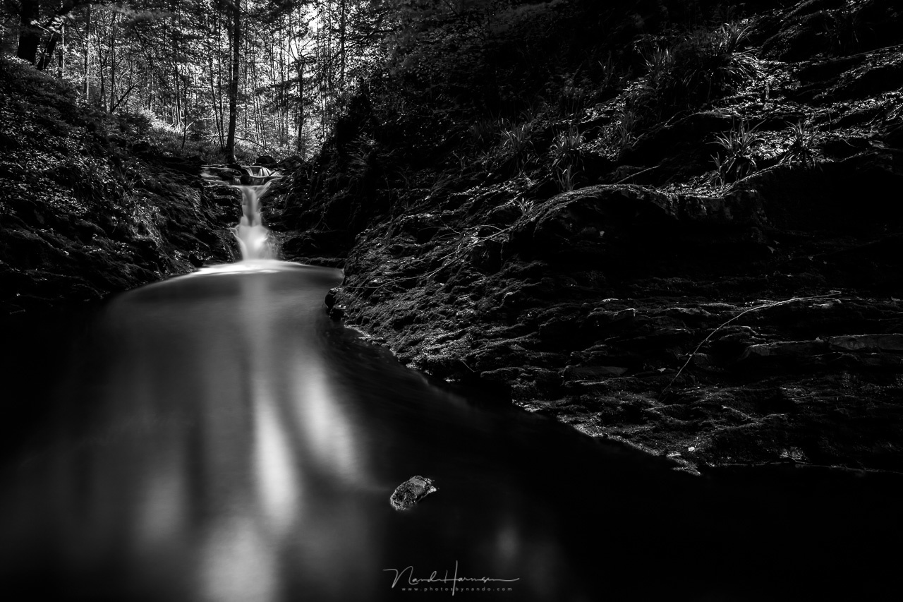
When the photo is temporary converted to black and white, it becomes clear how much attention the bright spots in the water gets. Removing color can help to see these things.

The color of this 27 meter waterfall does stand out from its surroundings, or so it seems. It is nearly impossible to see the difference in brightness, compared to the tree leaves. For that you need to convert the color photo into black and white.
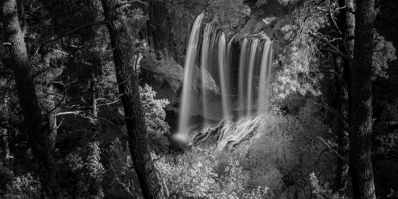
The brightness of the waterfall and leaves are almost the same, which becomes visible after the conversion to black and white. There are almost no bright areas in the picture. By darkening the leaves the contrast will become better. You could even brighten up the waterfall itself.
Using black and white is very easy with programs like Adobe Lightroom or Adobe Photoshop. With Lightroom it is just by clicking the Black & White button in the Basics panel. There is no need for adding special filters or profiles, because it is only temporary. The photo will be transferred back to color afterwards. For Photoshop it is possible to create a black and white layer on top of any consisting layers you already have created. The layer can be deleted again when you're done.

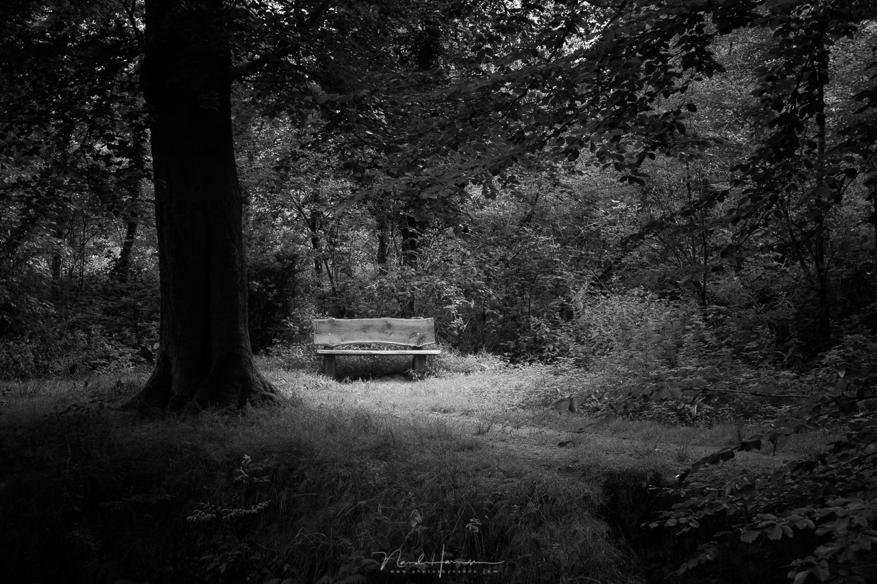
A simple bench in a forest. It has a different color, but it does not really stand out. You need to convert the photo to black and white to see how the brightness in the photo is.

When converted to black and white, we find out the brightness is almost the same as its surroundings. Except for the dark tree, there is nothing that attracts real attention.
With a circular gradient I darkened the surroundings. This way the bench becomes a point of interest. The photo has gained a lot of contrast.

When the photo is changed into a color photo again, you can see how the photo has changed. Now the bench is the thing that gets all the attention. Not only by its color, but it is also brighter than its surroundings.
This way of looking at the photo, and post processing the raw photo material, can also be used with other kinds of photography. It is not limited to landscape photography. Of course, it is mandatory to pay attention to the composition, and to play with light and dark when we are photographing. After all, this method is not a way to make a less interesting photo interesting. But using black and white in post processing can help to determine which part of the photo gets the most attention. And who knows, perhaps you find the black and white result much more attractive than the color version.

A sunrise at a beach. The sun is the brightest subject in the photo, and all attention is going to that bright spot. The patterns in the sand comes second. If black and white turns out to be very beautiful, you might consider keeping it black and white.
Have you ever considered using black and white in post processing your color photo? If you have never heard about this technique, would you consider it? Please let me know in the comments below.


I tend to convert a lot of my landscape photos into black and white, but it depends on my eye and if I feel the shot could benefit from it. You did well to point out a lot of those things that I look for in deciding if a scene could benefit from the conversion.
Since I shoot a Fujifilm X-T3, I also have the benefit of using the film simulations in the viewfinder. I’ve found it’s a lot easier for me to pick out elements in a scene and create a composition when I’ve got it set to Acros or Acros+R. The viewfinder gives me a monochrome output but since it records in RAW, I get a full color file to work with in post. This also allows me to revert to color if I choose.
In the end, my preference is for contrast over color, something easily spotted in my gallery photos with just a cursory glance. It may not do well with the Instagram crowd, but it appeals to my emotions more than color does. It may just be a consequence of my reduced color vision.
Do you think it would be possible to get the same shots using a different camera as opposed to the X-T3
Do you think it would be impossible to do this with another camera than the X-T3? Camera and camera brand is not important.
Most other photographers work the opposite way; shoot color and convert to B&W if they feel the need. I think it's great how you use this method.
You say, " You could wonder if [Ansel] Adams would have chosen color if he had the possibility."
"Had the possibility"? Color photography was available in his time and he did shoot in color also: https://www.smithsonianmag.com/arts-culture/ansel-adams-in-color-145315674/
and his color photos are also insanely good
hehe - I did not know he shot in color also. I wil look into it. THanks
Good post. I use BW post to work on my color shots. I make sure the dynamic range of the tones is interesting then make two base copies, BW and color. From the color then I check a range of color grading choices. The BW helps tons in finding where the range is boring or details are needlessly lost.
Thanks for that explanation, I've learned something and should think more about doing this.
In some of your examples I think we lose a bit too much in the dark areas, though the small format on screen does not do them justice.
I good future FS article would be the effect of viewing photos in different sizes. The amount of detail, contrast etc you choose for large or small presentation definitely makes a difference.
Indeed, looking at these photos I find some parts too dark also, although I thought differently back then.
Agreed. B&W works well for a lot of landscapes. I think the examples you used are better in B&W. Sometimes green in water does not look good to me, but converts well in B&W, and using filters (or color sliders in post) you can adjust the tonality. I shot some images during California's superbloom, which you would naturally associate with color, but used a lot of B&W instead. Take a look: https://fstoppers.com/groups/landscape-and-nature-photography/416285/cal...
Thank you.
I should use B&W more often, I think.
As a film photographer I remain a little bias when it comes to digital black and white . One must first start off with a good shot. Have seen many b/w digital conversions trying to make a poor shot look good. I would just hint to bare in mind that film and sensors record differently. If digital has a drawback or weakness it in low light situations where you are trying to caputue sutitles of contrast and shadow. Digital is binary ,its either on or off. Film can capture all ten zones where digital sensors only captue zone 3 to zone 7. Which makes your post work alot difficult than my N+1/N-1. Where you work in dynamic range, i work in EV. It is different . I have seen good b/w landscape digital conversion . But I also have wondered what the same shot would look like If properly shot,developed ,and printed using my 4X5 or 8X10 negatives.
I will not argue against your understanding of zonal interpretation, but I have always thought that I get a lot more information in shadows with digital than with film. I regularly expose for skies, then bring up the foreground in digital. With film, once the shadows are lost, they are gone (sometimes I can bring shadows up a bit). The problem with digital is clipping in the highlights more than loss of shadow detail. I am still learning, and much of my B&W is still film, but I do both film and digital.
Then you are exposing correctly for digital constraints . In b/w film zone exposure you would shoot for contrast and print for highlights . How I meter is to take a EV reading at zone 7 or 8 , Then a reading at zone 2 or 3 might even throw in a midtone zone 5 Then average out the EV & convert to F stop. I would then adjust for EV latitude to maintain a 3 stop difference as determined on what ASA setting I am shooting at and the overall light value of the scene. In general pulling increases contrast detail and pushing will control highlight detail. I rarely shoot film at rate and choose the ISO/ASA speed on the light conditions ,contrast filter used and film characteristics . I offer this as a little bit of help in understanding and improving the quality of your work . But you seem to be on the right track .
Thanks, Robert. Are you shooting sheet film? Shooting roll film limits your processing ability. That can be managed in medium format if you have interchangeable backs or with roll film with smaller rolls dedicated to a condition (or multiple cameras). Sheet film is the ultimate for Zone system, since you can document the situation for every shot. I never got into it for these practical reasons. With digital you can translate some of the concepts from the Zone System, or at least used some of the understanding as a guide.
My next article is about the zone-system. But I can tell you are right. Digital sensors work different concerning light and dark compared to analogue film. With digital, never over expose light areas. You cannot recover it. With analogue film it is opposite.
I look forward to it. A lot of film people say there is no such thing as Zone System for digital because the actual Zone System is about development, printing, etc. I think you can translate and use some of the ideas about the Zone System in trying to achieve a specific tonal response with digital.
Hmmm... comments were gone and came back
I have tried this technique but I usually switch my camera to B/W for the composition as the RAW file still gives me all possibilities afterwards.
That is what I mentioned in my previous article. Switch the camera to B&W during photography. :)
Not trying to pick on you from translating from Dutch, it's a fine article, with plenty of food for thought! I'm talking to the Fstoppers editors: It's harder to read an article with so many grammatical issues. You missed 9 copy editing/proofreading issues with this article that I would have corrected. I'm a Chicago-based photographer with proofreading/copy editing skills (I studied Journalism briefly at NYU). Let me know if you have work for me? Thanks!