The holiday season is the best time to buy a new monitor; with Black Friday right around the corner, now is the perfect time to update your most important tool for editing. But do you know what to look for? Let's discuss what important qualities you should be watching for and go over some highly rated monitors for photo editing.
Screen Size and Resolution
You may have heard resolution is so important, but do you know what you're looking for? Resolution determines the sharpness of screen. When it comes to editing, being able to see a clear, sharp image means you'll be seeing the true texture of your images. So, how do you know if what you have is good?
Resolution is important relative to screen size. If you have a 30" monitor, but it's only 1080p, your monitor won't be as sharp as a 24" 1080p monitor. You should be looking at these qualities together, as they determine your pixels per inch (PPI). That's the spec you should be looking for on the product page. A higher PPI means you will be seeing a sharper image. I would say a PPI >100 means you're getting good sharpness, but a 2K, 24" monitor has a PPI of 96, and I don't think that's too bad.
You can use this calculator to determine your potential monitor's PPI if you can't find it.
Don't Forget About Your Graphics Card
You can get an incredible monitor, but your graphics card might not be able to handle its maximum resolution. You need to make sure that your graphics card can handle your monitor by looking at the specifications of your it to see its maximum output. I had an issue with my Dell XPS where the display port on my dock wasn't using the onboard graphics card, and I had to use the Thunderbolt port to maximize the output for my monitor. It's not a huge issue; most likely, you will be fine, but not all graphics cards can handle 4K monitors.
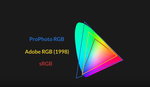
Color Space
This specification is important for telling you the variety of colors your monitor is capable of displaying relative to the sRGB and Adobe RGB color gamuts. Without getting too into the weeds, each color gamut (sRGB and Adobe RGB) is a standardized range of colors in the RGB spectrum. sRGB is a standard range that most consumer devices and web browsers use. AdobeRGB is a wider range of colors and used in more professional settings like high-quality printing.

Here is a quick look at the difference in color gamuts. sRGB is much smaller than Adobe RGB. By The original uploader was Cpesacreta at English Wikipedia. - Transferred from en.wikipedia to Commons by aboalbiss., CC BY 2.5, https://commons.wikimedia.org/w/index.php?curid=8359333
So now, let's talk about what you're looking for. In a perfect world, you want a monitor that covers 100% of the AdobeRGB spectrum and 100% of the sRGB spectrum. But I understand we don't live in that world. So, you should get something that has at least 100% sRGB coverage, as this will be what is most used in a digital consumer environment. Unless you plan on working on high-end digital productions, 100% sRGB is good enough for a lower-end monitor.
Contrast Ratio
This is basically the difference between the brightest whites and darkest blacks. This will always be displayed as a ratio like 1,000:1. The larger the number, the higher the contrast. This is important, because your monitor should be capable of showing details in the shadows and highlights, and your contrast ratio is important for this.
In terms of what you should be looking for, somewhere around 1,000:1 is good to strive for, but if you can go higher, then you're better off.
Bit Depth
Bit depth is the fancy way of saying how many colors your monitor is capable of producing. It refers to the shades of color that can be generated. So, there higher the bit depth, the more colors your monitor is able to produce. You should go for 10 bits if you can; that's 1.07 billion colors. Now that we live in a world of Retina displays, 8 bits just won't cut it anymore.
Watch out for Frame Rate Control (FRC)
FRC is something you might see next to a bit depth number. What this means is that the bit depth is actually lower, but the monitor is using a technique called dithering to simulate a color in a pixel between other pixels to make it look like your monitor is producing more colors than it is actually capable of producing. If you remember the controversy with frame interpolation, this is similar to that.
You want to avoid this, because it can be noticeable in gradations. So, tonal changes in the skin, in the sky, and on seamless backgrounds, you may notice this dithering taking place on your monitor that might not actually exist in the photo.

https://www.eizoglobal.com/library/basics/maximum_display_colors/
Look-up Table (LUT)
Simply put, an LUT is a table of internal calculation used to convert the colors your monitor wants to display with the colors your monitor actually displays. The more bits, the more specific each color will be. This is important for gradations. An 8-bit LUT will not give you as smooth of a gradient as a 14-bit LUT.
The higher the bits, the better your gradations are, simple as that. Below is a great example of a LUT difference.

https://color.viewsonic.com/explore/content/Advanced-14-bit-LUT-and-3D-LUT_1.html
Panel Type
There are three types of panels, but you only need to worry about IPS. This stands for In-Panel Switching. This panel type has the best viewing angles and produces the most accurate colors. They have poor refresh rates, which means they are not good for gaming, but you're not here for that. When it comes to photography, all professional monitors will be IPS.
So, now that you know what to look for in a monitor, here are some good options sourced from B&H that offer a high Bit-Depth and reasonable PPIs at different budget levels.
Good Budget Monitors (<$400)
 Dell U2718Q 27" 16:9 UltraSharp 4K IPS Monitor

LG 32UD59-B 32" 16:9 4K UHD FreeSync LCD Monitor
Good Mid-Range Monitors (<$700)

BenQ SW2700PT 27" 16:9 Photographer IPS Monitor

ViewSonic VP2768-4K 27" 16:9 4K UHD IPS Monitor
Great Monitors (>$700)
 BenQ PD2720U DesignVue Designer 27" 16:9 HDR 4K IPS Monitor

Eizo ColorEdge CG2420 24" 16:10 Hardware Calibration IPS Monitor

ASUS ProArt PA32UC 32" 16:9 Wide Gamut IPS Monitor

Eizo ColorEdge CG319X 31.1" 17:9 Hardware Calibration IPS Monitor
Conclusion
A good monitor can make all the difference in your post-processing workflow. Be sure to take the time to find the right one for you.