I find cinematic images to be particularly memorable. I'm sure there's some color theory and psychology behind that but ain't nobody got time for that. Here's PHLEARN's way of creating a cinematic look to your images in just two minutes.
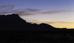
It doesn't matter what genre of photography you're particularly enamored with, cinematic color grading can turn most images in to something more dramatic. The general result is achieved by complementary colors in which the shadows and the highlights of an image take a color each. The most common combination is a teal in the shadows and a yellow in the highlights with variations like you see in this video, where a richer blue takes the role of the shadows. Through the “exclusion” adjustment layer, the complementary color of that blue is automatically selected and added to the highlights, which is somewhere between yellow and orange. There a number of different ways you can achieve proper color grading, some more thorough than others, but this has to be the fastest method I've come across.
Cold shadows and warm highlights are just about everywhere you look in cinema for the past few decades, with some films pushing the values harder than others. What's your favorite cinematic image? Share in the comments below.


I don't know why and this isn't a knock on it but, I really don't like the cinematic look in photos. Movies...yes. Photos? Not so much.
I know what you mean and I find it hit and miss. I do particularly like it in portraiture, but using it on landscapes is rather polarising for me. That said, I think it works in the example image they use in this video.
Great Post. I really enjoy his teaching style. I don’t use PS daily, so when I ant a style and color, his methods are helpful. Thanks FS.