
Color reproduction, loading color profiles and calibrating monitors & printers can become an endless tangled mess that leads to frustrating headaches.
Proper use of a color chart can get you a lot closer to actual colors and save you a lot of time dialing in your post production work by adding a simple step to your workflow.
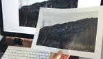
A couple years back I pickup the X-Rite ColorChecker Card and by doing so I have saved a ton of post processing time. During each and every shoot I take one frame before we begin, as a measure of the light temperature and proper exposure with a color checker chart. By doing so, I have saved countless hours of not having to wrestle with white balancing when sitting down at the computer to process after the shoot. It really is stupid simple how taking one photograph of the color chart at the beginning of the shoot will save you time in post. Once the photograph is captured on camera, the file can be loaded in Photoshop or Lightroom along with the rest of the batch and in a few clicks, your white balance is nailed down and can be synced to your other files.
Color charts come in all sizes, personally I prefer the larger card that measures out at 8.5 x 11" and since I primarily work with people, I like to have the larger squares in the frame. There are color charts that are smaller and some pack up which might be better for table top or on-location shooter to save space. There are also grey cards that will help with the same things being discussed here in the post but the added colors are helpful for video/motion (will discuss in another post.)
The two main things that this post will cover are Proper Exposure and White Balance using the color checker chart.
White Balance can be read across the entire board but for this post lets stick with the bottom grey squares. All that is needed to do to give your photographs a collective white balance is to load of the test shot in in your editor, select the white balance tool and click either one of the middle grey squares. The two squares are close in tone but vary from your light source so I typically bounce between the two looking at which represents the correct color. From here you can copy that setting to your photographs and head off to your next step of processing.

Proper exposure can be read all across the card, but more specifically (or what I aim to look at when doing a test shot) is a nice tonal range of all of the squares at the bottom of the chart. The grey squares represent white to black in the greyscale spectrum and details can be seen in either the highlight or shadow when in your preferred editor. The range of highlights and shadows can be tweaked to your specific need of lighter or darker, more contrast etc.

These color checkers have a lot more potential for color representation than what has been presented in this blog post, regardless of your level, picking one of these up and keeping it in your bag will save you a lot of time when balancing out your photographs.


Thanks for this useful article. Does this mean that, in the field, you always shoot with Auto White Balance and then do the correction in post-processing?
No, you should always shoot with the proper WB setting when in the field. The color checker card will take it that little step further to better, accurate color and tone. This is especially true if you're shooting JPEGs since the compression doesn't give you much leeway in post.
The color checker is also useful in situations where the scene's color temp isn't easily determined or when any of your WB presets don't work well. It will also let you know if you're blowing out the shadows or highlights on matte surfaces.
Finally, it's really useful in figuring out the color shift a light modifier or power-level causes. While your flash may be 5600K, using a softbox or the like usually introduces yellows and/or magenta along with a reduction in luminosity.
Great question, typically I try and get white balance as correct as I can in camera and use the chart to fine tune in post. Typically I am in cloudy but change that with each shoot.
Just to reconfirm, when shooting that first frame of the color checker passport, do we shoot in AWB or correct the WB as far as possible and then use the image for tuning the rest of them in post.
If shooting in RAW using AWB is perfectly fine. Providing you shoot your "Color Checker Passport" in every room and periodically taking another shot of it if lighting conditions change. You can group photos that are in the same room together and batch correct them. Your probably going to check this anyway and it is incredibly easy to correct in post. You need to spend your time worried about composition and exposure because these things cannot be fixed in post production. Everyone hold your pose while I set my white balance. . . . Dont move, hold on I almost got it! Ya right!
I've got one of those when it was call the Macbeth Color Checker.
Does anyone have a suggestion for a similar card in a smaller size? Sometimes Letter-sized is kind of cumbersome to be carrying around...
the X-Rite ColorChecker Passport: http://xritephoto.com/ph_product_overview.aspx?id=1257 can be used stand-alone or as part of your LR/PS workflow. In LR you can automatically export the shot of the Passport and it will create a colour balanced profile for that shoot. Simples.
Been keeping an eye on these on eBay - waiting for a cheap deal :)
I use the X-Rite Color Checker Passport and I find it so useful, so quick and easily fits in with my workflow. I would highly recommend it for any professional photographer.
One thing the article didn't mention is you shouldn't touch the color cells like they guy is doing in the photos.
I don't see the author using the other colors
This post was written as an intro to color charts, focusing on the simpler settings of the card seemed appropriate for those who have never used one before.
Why on earth would that card cost $69.00?
There are a few reasons. People expect the colors to be accurate, there is a mathematical description of each of the colors and they have to match or it messes up the conversion. People expect all each copy of the card to be identical. They expect that the card won't change color after only a short time. That sort of thing is expensive.
Everything you said is correct. People do expect accuracy and longevity out of anything they buy. BUT that still doesnt explain why it would cost $69.00. Lets be serious...its a card with colors which are mass produced.
And as far as color goes, its subjective. What you see is not what everyone else sees. So if the card color is off a fraction of a degree no one is going to notice.
I forgot the exact term, but effectively the ink reflects light across the spectrum evenly to achieve the correct color. e.g. you can combine RGB to get white but you'll miss out the colors in between.
So yeah the ink is high tech stuff that you can't print it on your printer. It might match in daylight but it won't match in florescent/tungsten/LED etc and the shifts can get significant.
Color is not subjective with this chart...that is the entire reason for it. This is a standard setting that when ship the file to a printer who then reads this knows exactly what color should look like. Look on your next package of chips or anything else, you will see 4-5 colors somewhere on the package usually in squares or blocks that represent the proper colors in the packaging. Same goes for magazines, fold them back at certain points and you will find these same things going on, they tell the printer what the correct color is.
I don't think people who have never held one of these properly understand what this card is or how it is constructed. It certainly is not made of paper or cardboard or any other cheap material, it can't be printed from an inkjet or laser printer. It is a firm plastic that has been coated with very specific colors which translate across from the card to the monitor to printer. It might be mass produced but the values on each card will remain constant.
Can't I just use a gray card?
You can't be lazy and just apply one white balance to the entire shoot. Often times you deal with mixed lighting as you move around in a building or even outdoors as the day progresses.
You can also use the ColorChecker Passport app with any of the ColorCheckers to create a calibration in Lightroom for your camera/lighting setup. You can download it free at Xrite.
http://xritephoto.com/ph_product_overview.aspx?Action=support&ID=1257
It uses all the squares and simplifies colour correction.
I'm curious as to how you then incorporate this image of the color checker in conjunction with correcting for your photo's (via Lightroom or Photoshop). What functions in Lightroom (specifically) are you using to accurately correct the other photo's in your sequence? Thanks again.
Nick, I am trying to follow the question and I hope this answers it. I don't work in LR that often, ACR is my preferred editor. Either way, once you get a good setting you can synch settings between the selected photos and copy all of what you do from one photo over to the others that you select. Not sure if that answers your question or not.
Thanks for your response. I guess simplified: I have this still of someone holding a chart and then the rest of my files that I'm working with. What tools are you using (in ACR) to use the information from the color chart still to sync up with the rest of your files? WB etc.? Sorry if I'm still confusing.
Using the white balance tool, select one image and dial in your settings to look accurate with the card in frame. From here, select all of the images that fit into the same lighting and click synchronize button at the top left and select white balance, from here click ok. That should add the same white balance you have set from the card image to your other images. Hope this helps answer that question for you.
I hoped for a more detailed review. What about monitor calibration, WB setting in field... half a post.
Are you using this card assuming that your lights are firing off the same degree kelvin everytime? Or does it compensate somehow afterward, this has always been a confusing subject for me.
Mark, in theory the lights should be firing in the same K each and every time. But...that can vary in small amounts to the build of the light and frankly speaking, to the brand. To answer your question, yes, synching and copying the settings are with the mindset that the K is equal across the board.
Has anyone used a color checker passport, whibal card, AND an expo disk? I'm trying to decide which is the best purchase since I lost my whibal card on my last shoot. I loved my whibal card but I am wondering if the color checker passport is more accurate? Often, I shoot with multiple types of light (a bride by a window, but there's fluorescent or tungsten light behind her....gets complicated when trying to get perfect white balance. Thanks!
I used the ColorChecker before, but they can be quite expensive. They are also not durable. You can get something to match colors like this (https://nixsensor.com/?ref=3). It connects to your phone and you can save the color for post-processing. It is portable and has many other uses.