I take photos to get them printed to either hang them in my apartment or sell them to customers. And while it's important for me that those prints appear sharp and detailed, it's crucial to get a correct representation of the colors and contrasts. To achieve this, a process called soft proofing should be used during print preparation whenever possible, and in this article, I show you how to do it.
Soft proofing is essential to get better prints because colors and contrasts usually look different from how they are displayed on screens when printed on paper. For some glossy papers, the difference can be subtle. But if you use matte paper or canvas, colors can shift significantly, and the image can look flat.
Prerequisites for Soft Proofing
Before I explain how to do soft proofing, let's talk about some requirements:
-
You need a monitor capable of displaying a large color gamut. Many labs require you to convert the files you deliver to them for printing to sRGB. So, you should at least invest in a monitor that can display the sRGB color space. But because wide-gamut displays have become more affordable these days, I suggest buying one of those, if you want to get serious about printing your photos.
-
Owning such a display is not enough. You also have to calibrate it, which I show in this monitor calibration guide.
-
Soft proofing should be performed in a properly lit room. As I explain in the monitor calibration guide, if your room is too dark, your photos will also end up too dark. It will become even more of a problem for prints because they already appear a bit darker than what you see on your calibrated monitor unless they are viewed under a very bright light source.
-
While soft proofing is possible in different photo-editing programs, we will focus on Adobe Photoshop and Lightroom. Either one of those two programs is a prerequisite to following along with this article. The basic concept is applicable in any editing software, which allows you to view your images with different color profiles applied. An example is Capture One, for which Todd Dominey has an excellent introduction to soft proofing available on his YouTube channel.
-
Last but not least, you also have to download the color profiles for the papers you want to print on from the lab of your choice and install them on your system. Under Windows, you can right-click on such an ICC file and select Install. Mac users must manually copy the profiles into the correct folder: ~/Library/ColorSync/Profiles.
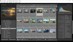
Soft Proofing in Lightroom
I like to use Lightroom for soft proofing because of how this feature is integrated into the software. The interface allows to create virtual copies, compare the proof against the original, and zoom and scroll in the side-by-side view in a synchronized fashion.
Before applying any adjustments to a photo to prepare it for print, you have to do some initial setup:
-
In the Develop module, toggle the Soft Proofing box.
-
Select the desired Profile from the drop-down on the right. By clicking on Other... you can add additional profiles.
-
Activate Simulate Paper & Ink.
-
Set the rendering intent to Relative.
-
Click on Create Proof Copy to generate a duplicate on which you will make adjustments.

-
Activate the side-by-side comparison view.
-
Set Before to display the Original Photo. It will show up in the Copy view of the side-by-side window.
-
You should also activate the Destination Gamut Warning. It will highlight areas where colors cannot be properly represented in print. It can happen if the saturation is too high, for example.


Now, everything is ready to start with the adjustments. The goal is to get the Proof Preview to look like the Copy. After some global adjustments for brightness and contrast, you might want to zoom in on individual areas and look at the colors. Try to match those as well as possible.
For most papers, it'll be sufficient to slightly change the white balance, increase the brightness, and add some contrast and clarity. But you might also have to use the HSL sliders and target individual colors.
Don't be shy to make the proof a bit brighter than the Copy to compensate for the light under which the print will be viewed. If you print for yourself, you'll know how bright the room is in which you plan to hang your print. If you print for a customer, it's hard to know beforehand, but adding some brightness usually doesn't hurt.
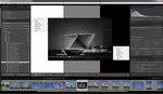
Soft Proofing in Photoshop
Now that you know how to do soft proofing in Lightroom, you might ask why do it in Photoshop? The reason is that some profiles don't work in Lightroom. I discovered this a while ago when I tried to prepare a canvas print. The profile didn't show up in Lightroom, although I had installed it correctly. It appears that profiles created in the CMYK color space don't work in Lightroom, which only supports RGB. In Photoshop, you can use all color profiles.

In the feature video, you'll learn how to prepare the workspace of Photoshop to get a similar soft proofing experience as in Lightroom. You must first duplicate the master file, tile the windows vertically, and activate proofing on the duplicate. It's also possible to zoom and scroll in the tiled view in synchronized fashion: Shift + Space + Right-Click and Mouse-Move moves both images, Shift + Ctrl / Cmd + Space + Right-Click zooms in, and Shift + Ctrl / Cmd + Alt + Space + Right-Click zooms out.
To get both images to match in terms of color and contrast, a mix of curves, the photo filter, and an HSL layer usually does the trick.
Hard Proof for Optimal Results
Even if you have a perfectly calibrated monitor, soft proofing might not yield perfect results. The brightness of a print is especially hard to get right. Although you'll be able to nail the adjustments more and more as you gain experience, you might want an additional check.
That's where hard proofs come in. If you print yourself, it's ideal because you can create a test print, compare it to what you see on the screen, and make further adjustments, if necessary. But what if you order from a lab? Good labs offer the option to create a proof print at a reduced price. If they don't, you can still order a test print on the paper of your choice in a small size. To judge colors, brightness, and contrast, you don't need to go big, and you can save a lot of money that way.
Once you are satisfied with the results, you can order your final prints. In the video above, I talk about this process. In 2020, I did an exhibition where I spent more than $600 on prints. Back then, I used soft proofing and test prints to ensure every photo looked as I wanted.


In my experience it makes a difference to soft-proof and adjust colors and contrasts for many of the fine-art papers (Hahnemühle for example). Even if I supply sRGB files to the lab. Some labs require me to directly convert the profile to the target color space (thePrintSpace for example), some labs will do it during the print process (Whitewall for example).
The outcome is the same: If I don't adjust the colors to compensate for color shifts that happen because of limitations of the paper and print process, then I'll not receive a print that looks like what I see on my calibrated display.
For the typical Fuji papers, the changes are minimal and you might not need to do soft-proofing. But I still prefer to check this to be on the safe side.
PS: I'll look into GraphiStudio