Congrats to our winners in the Wet critique! Please pick out which tutorial you want from the Fstoppers Store and David will reach out to you soon.
To be a part of the next critique you can upload any photo that fits your interpretation of the word "Moody." All images must be posted by Oct 31st before noon eastern time. Next week, 19 random images and the top rated image will be critiqued by the Fstoppers team.
Your submissions can be posted to this link: https://fstoppers.com/critique-community/submit-your-best-moody-image

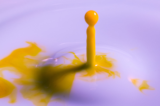
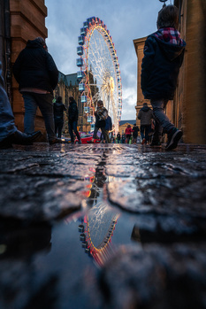
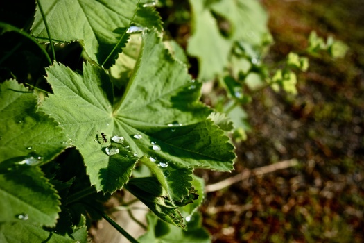
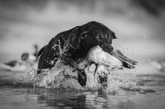




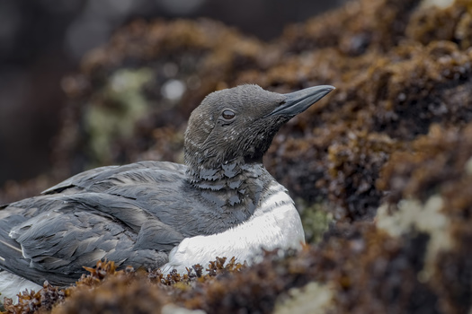
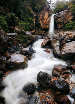




Haha the part with the bug made me crack up in a laugh! :D Sneak attack!
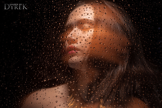
Great critique as usual and my comp entry is the thumbnail that you used for the video.
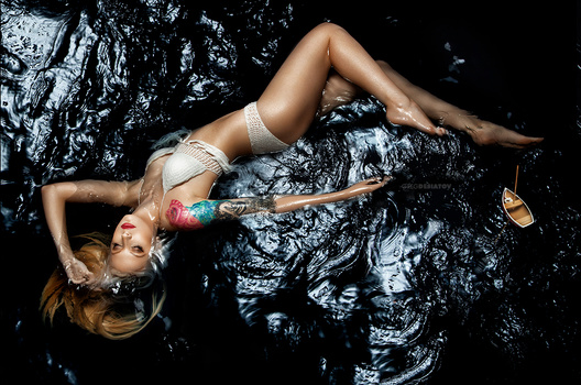
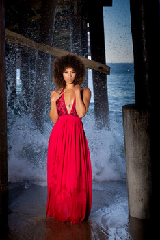
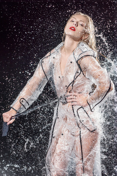
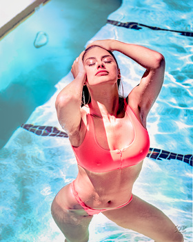
Just to answer your query, yes, she was in an inflatable pool in my studio with about 200-300mm of water. Pool was lined with black fabric
Lighting was a huge 2m octagonal softbox directly overhead
Great image.
Thanks Jeff
I thought your image was beautiful. I assumed it was a painted bottom of a "pool" you built. But the lighting and everything is quite nice. I don't even care for tattoos but hers didn't take me out of the moment. Great work!
Thanks Sean.
The tattoo obviously didn't bother me but since they mentioned it, it does now. LOL
This is your artistic vision and I actually thought the punch of color from it was cool. Art is subjective. You do your thing!
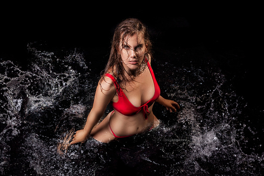
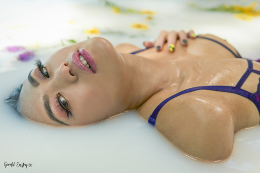
The other image I submitted was a 320 gallon inflatable pool in my studio lined with black plastic and filled with fake blood lit with a 36" umbrella and diffused window light
I really enjoy and appreciate your critiques. Can you guys have the description of the photos when you critique so you know what the photo is? I believe the second to last photo was described as landscape of Greenland or something and knowing what it is may help in your evaluation of the photo. I don't know if it would make sense to do that. Comments are totally welcome!
I really think having a linear rating system with nonlinear definitions attached to each star is flawed, and it's probably the real cause of low average community ratings (as opposed to purposefully rating an image lower to win the contest). If there's a great image but it has a small (maybe even subjective) issue, it could easily be a 4 or 5 star image under a normal 5-star system despite that one small thing. However, under your rating system, it's a 2 because it "needs work."
It's been admitted in this video and many past ones how there's different gaps between different numbers and that most images should be 2s and 3s just by definition - this is exactly why the images are always rated 2s and 3s. Furthermore, averaging the numerical rating system makes no sense if you're going to attach definitions to each star. What someone thinks is a 5-star image and another thinks is a 1-star image will average to 3 stars. This is fine if there are no other meanings to the stars, however, it's flawed because neither of them think it's a "solid" image because neither of them rated it "solid." You can particularly see the flaw in this system when you have someone on who isn't familiar with your rating system (like in this video) and they are shocked at how low the community rates it. The community rates the images pretty much perfectly in line with how the system is set up.
Thanks for the prize, everyone thanks for the ratings, the critiques, and the compliments! :-) It is indeed shot with flash, 8 pieces of SB800, shot with a D800 and a 200-400mm. It was a project which I spend a year on, preparing everything and improving each week with different photographic and non-photographic side-effects. I got a lot of these images, you can check these on my (dutch) websites about kingfishers: http://www.ijsvogels.nl.
However I'm still not completely satisfied about this setup and living near a lake since a year I'm busy with another year of shooting the same images, dreaming about this kind of shot in a winter setting.