
Color. Vivid green forests, melty brown chocolate, voluptuous red lips: color is the reason that compels so many of us to reach for our cameras. When I was approached about reviewing Datacolor's Spyder Checkr Photo, I was skeptical. Color is one of the most-often stated reasons clients approach me. Was this little device just another gimmick marketed to chroma junkies, or was it a tool that would fine tune my color-centric work? I gave it a try, and I’m here to share my findings with my fellow artists who love color as much as I do.
Getting this color grading software set up on is quick and simple. The step that proved less simple to me, was finding clear step-by-step directions on how to use the Spyder Checkr Photo. I spent over half an hour bouncing between the manufacturer's website, their YouTube channel, and videos created by photographers who like using unnecessarily technical jargon, which made me want to abort the entire project. I paused the frustrating process, grabbed a glass of Malbec, and finally made with through a tutorial with a German accent so heavy I had to turn on the captions to understand! Sometimes, photographers avoid learning new things because the way the information is presented is overwhelming or uses unnecessarily technical language, which intimidates learners. In this article, I will provide simple, clear, and straightforward directions so that you can see how simple the process actually is. I'll skip the inflated jargon and try to throw in some humor in case you don't have a bottle of Malbec on hand. Don't worry though, you won't need it, as this was so easy once I survived the German tutorial. If you don’t need directions at this time, you can scroll down to the usage, results, and review below.
Step-by-Step Directions on How to Use Spyder Checkr Photo
- Set up the software on your computer by visiting the manufacturer’s link provided in the boxing and register your device.
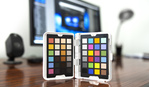
- Place the Spyder Checkr Photo in the scene you are photographing and take a shot. You can lay it flat, hang in by the lanyard, or hold it in hand. This shot will be your reference shot used for calibration. After taking this one reference shot, you can continue your shoot as you normally would. If your space/color changes notably, take a reference shot for any new locations or spaces you’re working in to correctly calibrate each space.

- Open your reference shot in Lightroom. Crop the image so that only the Checkr Photo is in the shot and rotated as shown below.

- Use the eyedropper and this 2nd box down to correct your white balance.

- Next, you will correct your Exposures/Whites. Hover your mouse over the top corner white box to check the percentages on your exposure. According to Datacolor, your pure white should read at 95-96% on your histogram. If it doesn’t, adjust your exposure until it does. In my example, I had to bring my exposure to +36 to hit the 95%.

- Your blacks should read around 5%. Hover over the black square in your photo and read your histogram. In my example, I had to bring my blacks to -68 to achieve the 5% reading.

- Once you have completed these three steps, right-click on the image and select “Edit in Spyder Checkr Editing.” It will open your image in the Datacolor software. Drag the color swatches to align them with your image. Choose one of the export options (I choose Colormetric) and name your preset.

- Restart Lightroom and Datacolor will have created the custom preset for you. You can use this preset to batch color-correct assuming that the color space is similar to your test shot.

Who Is This Tool Best Suited For?
Photoshoots Which Require Extreme Color Accuracy
In the realm of art, photographers use color subjectively as an element of creative interpretation. Color grading is an art form, and certain photographers are recognized by their post-processing. There are some scenarios though where color accuracy needs to be paramount. One example is in product photography for makeup, clothing, or anything where the color needs to match the product exactly. The Spyder Checkr Photo seems like the ideal tool to guarantee objective color accuracy.

Photoshoots With Environmental Color Cast
When photographing portraits, unless you’re working with a white backdrop, you will likely experience color cast. Whether it’s a vibrant mural on your city portrait, or the blue seamless paper on your studio backdrop, the surrounding color will affect your subject’s skin tones, hair, and everything else. Instead of spending unnecessary time dragging your sliders back and forth trying to come back to what your eye saw, the Spyder Checkr Photo can expediently do the job for you.
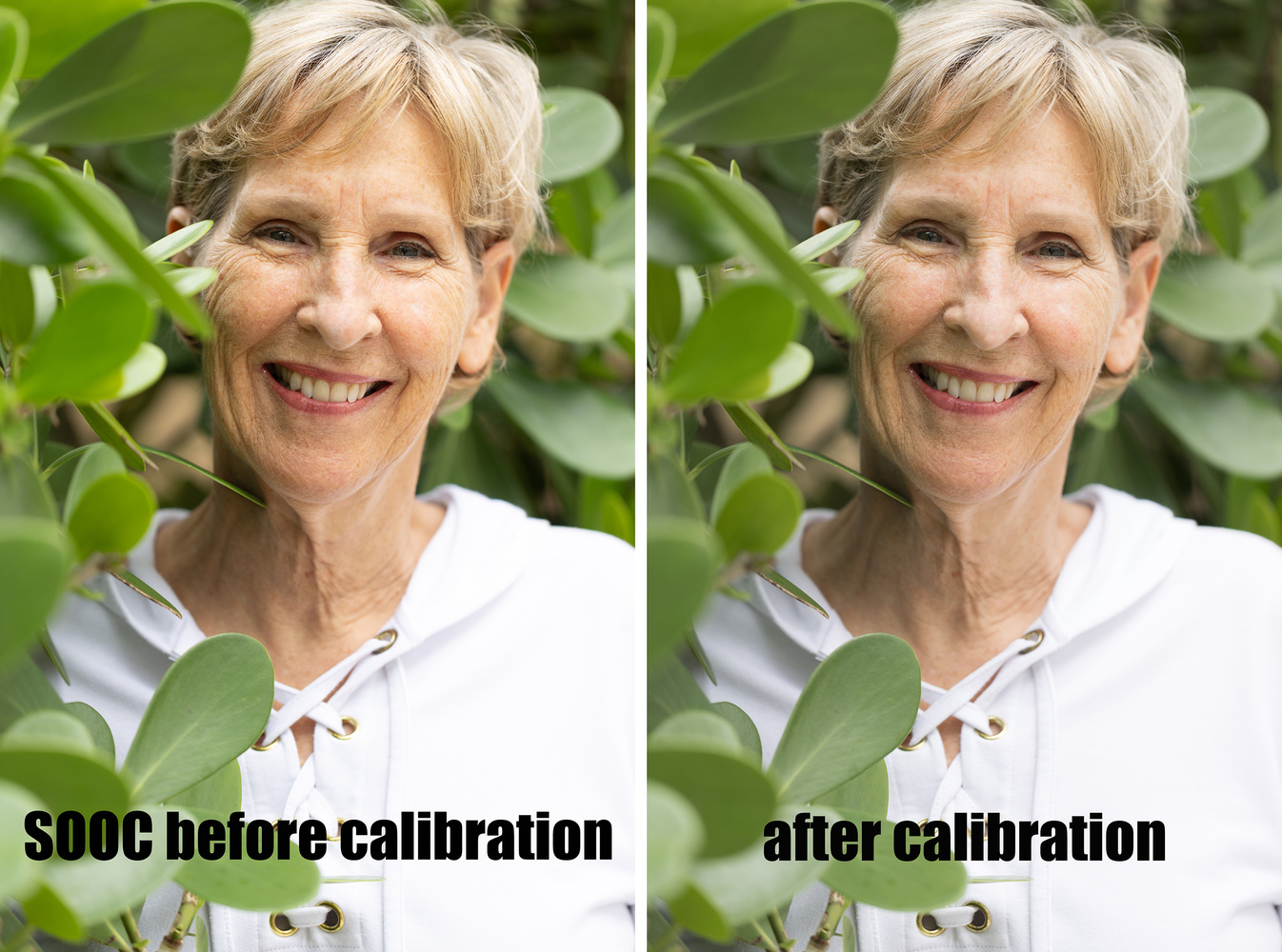
I don’t shoot natural light portraits, but for the purpose of this article, I kidnapped my mom and coerced her to stand near some bushes that would cast color combined with the outdoor blue light. I ran the image though the Spyder Checkr Photo for some test shots. (All results in the next section below.)

In reading the step-by-step instructions, it would be easy to assume that this is a very time-intensive process. I decided to time the color grading from start to finish. Can you guess how long the entire process took?

Less than three and a half minutes. Considering this process delivers color accuracy on your entire set of images, I think it’s three minutes well spent for this nifty little tool, which retails at $99.99.
One Thing That Threw Me Off at First
When I ran my pictures through the software initially, I have to confess I was slightly irked. My work is known for its vibrancy and bold colors is what I am expected to deliver. I had planned that the software would color correct the whites, blacks, and hues of each color, but I did not think that it would change the luminosity or saturation of the colors. Here is an example of the adjustments it made on one of my photos.

I was not a happy camper when I saw that it had pulled the luminosity and saturation down on so many sliders. My initial reaction was that the image looked duller, but I decided to keep going from that point and edit the image as I usually would with the Datacolor calibration. It turned out that it didn't affect me reaching my typical bold and vibrant look. Here is the finished image.

Here are some more before and after results.


Final Thoughts
 This tool was designed to be a resource to photographers who want a fast, easy way to ensure consistent, accurate color. Datacolor aimed to create a post-production workflow, which helped create consistency across a variety of cameras, lenses, and sensors. I found this to be a simple and useful tool, which took the guessing out of color correction and ensured consistent color accuracy. Although it made some changes in my studio work, I noticed the most helpful change to be in the environmental portrait. Shooting outside or on location leaves your image opened to a myriad of color casts, from the sky to the immediate surroundings. At this low price, and with it being a tool I could easily throw in my pocket at a location shoot, I think this is a helpful tool. I can also see this tool being particularly handy in situations where images originate from different camera brands but require a uniform appearance in the final output. For instance, in a wedding scenario with photographers using Canon and Sony cameras, having this reference shot would streamline the process of achieving uniform and accurate colors across all images.
Now, it's your turn. Have you ever used this tool? What were your results? What did you think of the before and after results shown above? Leave your comments. Let's discuss.


A user and happy to be. The one thing not mentioned is the datacolor spydercube, requires two shots one with and one without. I use on a Selfie stick, yes comes with a neck strap to dangle in front of camera. There is a need to watch a video on using, it takes a while to get things right. Like doing sunrises in the Grand Canyon, it is deep almost dark deep but the high points are bright and every layer of rocks are different colors. Next the exposure from top to bottom is varied. If you have ever been to one of the shops and looked at the post cards all have a blue hue down at the bottom but your eyes see more colors. It is a place where you want to capture what you see and get the proper exposure
I can see this being the PERFECT tool for that! I photographed the grand canyon with a film camera... hello color cast! Great contribution, thank you for sharing your images
So I'm required to register my personal information before I can use the device? No thanks.
I think we lost that battle a long time ago.
Lol. That's true!
Is this what used to be called a Color Checker? The old version had software.
Color checker passport is Xrite ( now Calibrate)... This one is from DataColor.. Same thing, different company
Color Checkrs are from Calibrite, which is a different company. The product concept is the same
It's a must have for every photographer with clients depending on color reproduction accuracy.. Clothing, product design, etc... Even people shooting Hasselblad and phase one are using it for simple reason 😉
I can see the benefit. Especially in the space I work in. In commercial photography colors have to be accurate. In other news, I clicked on your profile and your images are absolutely stunning!
Thank you so much Michelle!
I've used the Spyder Checkr for years and love it. They really do nail the color for you.
Looking at the examples, the Canon colors look much more pleasing, to be honest.
Thanks for the article, Michelle. That was an interesting and useful read, even for those who don't own one. It's a super tutorial too.