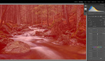
The tone curve in Lightroom is one of the less understood tools; nonetheless, it's one of the more powerful ones. It can be a bit tricky to figure out on your own, but this tutorial is a perfect way to get acquainted or further acquainted with the tool.
The tone curve is one of the more popular tools used in Lightroom for those out there creating and selling presets, because it's much harder to copy than the other controls, which are simply numeric sliders. Regardless what your motive is for learning, understanding, and using the tone curve, it helps to have it explained in such a way like how Julia Trotti does in this video. The tone curve can be an insane amount of fun once you get the hang of it. It can also be an incredibly deep rabbit hole, simply because it's more difficult to undo, redo, or replicate ways you've used it.
I have found myself, more than a few times, starting from scratch with it simply because my edit ends up being something that I don't like, and the curve is way too involved to attempt to reset it to a state where I actually liked it. I don't, however, see that as a bad thing. It's all part of my own learning process. Usually, if I fail with an edit, then my very next one is infinitely better, because I scaled back my approach to a much more reasonable process. Give it a shot if you haven't already; it's quite a lot of fun.


Great tutorial!
Would love to hear more from you!
Shout out to C1's Luma Curve!
Yes always been a good idea to use the curves to adjust the colors but very difficult in LR..Pulling the S curve like that for a portrait usually add way to much contrast. A mid-tone contrast adjustment layer in PS is much more effective.
LR curves tool is great for the internet pix though not for printing.
My issue with curves in LR is they're way too sensitive. It's too easy to go too far, but difficult to make subtle adjustments. It should really have numeric fields to input data points too.
If you hold ALT while you drag points they become much less sensitive, I would say about 1/4 as sensitive as just raw dragging.
Great tip.
OMG. Thank you! Now if they could fix the other issue I have where it's nearly impossible to place a point without adjusting the curve slightly, I would be a happy camper.
ALT click on the curve and it will add a point in the horizontal position of your mouse then jump the cursor to the vertical level of the curve and not change it :)
There's really nothing difficult about the Tone Curve in LR. The only thing that needs to be known is the ability to switch between the two adjustment modes.
The narrator also has the top end of the curve wrong. She has the highlights/white points reversed. This is so basic that mixing them up is difficult to understand.
The two - Ps Curves & Lr Tone Curve - affect contrast in basically the same way. Where the two differ is in the efrect on colour.
In Ps, the Curves tool changes overall saturation AND hue, as well as luminosity. This can be limited by changing the Blend Mode of a Curves adjustment layer to Luminosity.
Lr, on the other hand, offers no ability to isolate the adjustment to just brightness. It impacts colour, too. In Lr; however, the shift is mostly saturation. There are so-called 'hue locks' in the Lr tool. The result is that hue changes are minimal and saturation changes are less than in Ps. In other words, the Lr Tone Curve is more of a luminace control; although still not completely.
There is *nothing* about the Lr Tone Curve that limits its use for images that will be printed.
I've seen the video before, very helpful. But I struggle not with how to use the tone curve but when and why. I've fallen into using the tone curve for more general contrast adjustments, basically various shaped S-curves, then the sliders for more specific 'fixes'. Anyone else have different ways or suggestions for balancing tone curve with sliders? Is it even worth using the tone curve for anything but color curves?
Nicely done. Simple with great results.
Julia, please put an overly on the video noting when the whites and highlights end of the tone curve are misidentified. It's a simple mistake (we all make that kind of mistake from time to time) but it's not nice to leave it without corrective annotation. Some people are going to accept this definition which will create confusion when digging deeper into tone curves. Thank you.