
Pantone, one of the biggest authorities on the subject of color, has just declared its color of the year for 2020. Which did they choose, and why do photographers need to know it?
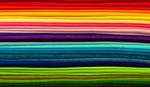
December always brings an announcement from Pantone regarding which color will be important for the following year. For over 20 years now, the company has consulted various forecasts from industry insiders to work out which particular shade will wear the crown for the next 12 months. If you thought 2019 had more than its fair share of pastel pinks tones, then you have Pantone to thank for choosing living coral as the color of the year for 2019. This pinkish tone will soon, however, make way to PANTONE 19-4052, Classic Blue.
While many may think this announcement is just a marketing ploy by the company, Pantone does use sophisticated trend analysis to work out what to choose, and many creative industries take note. For photographers, I think you at least need to know what the color of the year is. That way, you can either embrace or renounce it. For the photographers who want to stay ahead of the curve, now is the time to start planning shoots, changing branding, or producing relevant promotional material. The good thing about this year's color is that it's more timeless than some of their previous choices. This is good news for us, as it means it shouldn't date too quickly if we decide to use it.
Will you be actively using the new color of the year or not? We'd love to hear your thoughts in the comments below.
Lead image by Pixabay, used under Creative Commons.


Nope, or at the very least, not on purpose.
I'm more interested in the selection process.
Useful to the stylist, not the photographers they will work with, and instagramers (please stop teal and orange !)
I didn't really need Pantone to remind me that I can use blue! I was already well aware of its existence, and some of the possibilities it brings.
dude!!! you kept that secret all to yourself,. wtf man.!! but now the secret is out, let the world turn blue and make tail and orange look ancient.
Well, just by naming a colour - any colour - colour of the year, it will automatically be more popular. Ironic.
I never knew years had colors.
I guess it's like Chinese New Year. :-P
So because a commercial company says they have picked out a colour from their palette as colour of the year, we have to listen?
Yeah, whatever.
But... but... they're THE AUTHORITY... :O
AN authority. There are a myriad of other colour systems. Less hipster though. This is true.
You don't get many other systems selling coffee mugs with a reference colour swatch on them. :)
Not going to lie. I have their swatch books sitting on my shelf because it's just an easy (if ridiculously expensive) way to get a bunch of people in different places on the same page when it comes to colors. This whole "Color of the Year" thing is just ridiculous, though. :P
https://youtu.be/68ugkg9RePc
Haha a proper 90s cheese classic
Im colourblind so its irrelevant to me, wouldnt even know what Living Coral was anyway :)
Not too dissimilar to the Fstoppers accent colour. We're ahead of the curve I guess.
I will be looking for classic Blue toilet paper so I can wipe my ass with it.
And what is this Pantone stuff? Never heard of it.
You have now...
But is there a Lee or Rosco gel so I can make all my lights match this specific Pantone colour???