Fstoppers has teamed up with Western Digital to offer a new contest. Submit your best two headshots now for your chance to win a 1TB My Passport Wireless SSD and a 64 GB SanDisk Extreme SD Card.
This contest is limited to those with shipping addresses in the United States and Canada. Submissions must be entered before July 16th, 2018 at 11:45 PM EST.
Submissions will be judged by Fstoppers staff and the winner will be chosen based on the overall quality of headshot and it's ability to secure the viewers attention. We will also take into account the overall community ratings of the images so whether you enter the contest yourself or not, let us know which image you feel should be the winner by rating the entries below. The winner will be selected and announced by July 19th and will be contacted through their Fstoppers profile to claim their prize. If you are chosen as the winner, you will need to provide an address within the United States or Canada to be receive the prize.


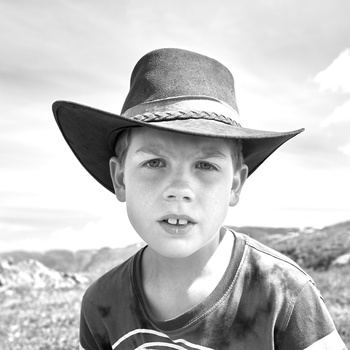
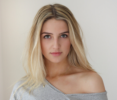


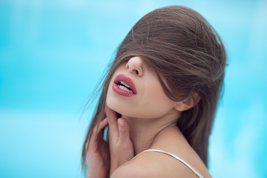


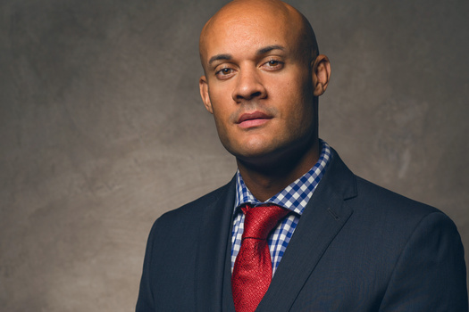
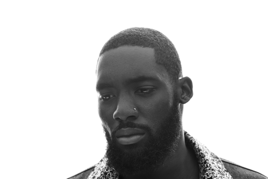


Good morning! When looking at other folks' images before submitting my own, I realized that many submissions are what I believe to be portraits, and not headshots. I'd appreciate some guidance here. Thanks!
Hahahaha
The line between head shot and portrait is blurry. Unless Fstopper is more definitive in their requirements, I don't believe the judging should be so critical.
Yes, monkeys or standing in a cucumber patch are not head shots. From the waist or sternum up should be.
Haha I'm afraid it's not THAT straightforward :)
I agree with Daniel, there seems to be some confusion regarding what separates a head shot from a portrait. There is some overlap in the definitions but I think they are different things and should be a little better defined when it comes to a contest.
Is this limited to people or would head shots of animals be acceptable?
To clear up any confusion, a headshot needs to focus on the persons face.
Pretty much every one of the current 20 highest rated shots is a headshot if you're looking for examples.
Hey David - is there a way of us listing them in ranking order!?
I fear I have no chance to win anything, since there are so many great images here. Amazing work everyone. I have a lot to learn. I sure hope the monkey picture doesn't beat me out.
Haha - I am finding this a bit laughable at the moment - I had submitted a photo with the subject cropped above the waist and it was scoring just over 3 points after 20 votes. But people were complaining about some of the shots not just being headshots. So I withdrew my shot and croppeď it as a proper headshot (including long hair) and now it is scoring only 1.83 after 12 votes - ho hum, at least it fits the brief better...
It is unbelievable how (on purpose) mean people are. I have seen great pictures, most of them under any other circumstance a solid 3, receiving 1 ratings. A suggestion to Fstoppers, since you are awarding 2 winners, 1 at random and 1 with the highest community rating; I suggest you award a random one and the best photograph according to the critiquers of each episode (Lee, Patrick, etc.). I believe the vast majority of the ratings are not correct.
In fact, I bet that if you guys (Fstoppers) publish images from the best, they would still be rated 3 or 2. Do it as an experiment, say the theme is Architectural Photography. Publish a great Mike Kelley photo and see what happens. Or Peter Hurley with headshots, etc.
I'm glad that I'm not the only one that noticed that. I just got here a couple days ago so I'm not really the best one to speak about it. In any case it is more than obvious that the amount of D.P.I. (douche per inch) is over the top.
I've made the suggestion before that the rating system is unhelpful at best; if you're going to rate someone poorly, you should have to provide some justification so the rating helps them with suggestions to improve.
The level over here is almost the same, as the cat in grass. Even the good pictures over here have the same lighting, same set ups, same pose, nothing unique, nothing to stand out. I already can guess, who will win. Their own photographer, D L....
Well headshot by definition is something that have as main subject the head. That doesn't mean that all the photo have to be the same, white background and smiling faces. You can play with lots of stuffs.
Where does it say corporate headshot? I agree animal photos are ridiculous in this genre, but headshots can be very interesting, as I have seen in this contest.
I can't speak for others, but I'll tell you that I rated some of the better images a 2. Some of the normally 4 star images are not headshots. They're not snapshots for sure, so no 1, but they are not headshots either. Perhaps other voters felt the same as me.
I did the same, I rated all shots that are not headshots low. The photo might be good but not a headshot.
I rated the shots on how I saw them. I used the Fstoppers criteria as a scoring. While my own submissions scored lower than I would have liked, after comparing them to others, I don't think I was robbed.
Judging art is a very subjective process. Most of us are looking for different elements and assigning different criteria to those elements. One element that was important in my scoring was the use of side lighting. Studio shots have no excuse for not using side light. Why? Because in my opinion, front lighting flattens the face while side light gives depth. Those outside a studio that managed good sidelight got recognized.
Your criteria will be different and only you can justify it.
Something I have always wondered with the contest submissions pages here is why are all the photos different sizes? I would think that the larger images get more attention and thus more votes/chances for higher ratings. I get that it makes the page look nice to have a mosaic type thing going but I think a lot of great photos go unnoticed because they are smaller than others near it.
It would be cool if Fstoppers uploaded something with all the fives they've rated, and with the highest rated images by the community of all time
Well , many not head-shot perhaps next time put a definition link;
Really surprized by the usage of what i will classify of wide angle too close effect on many (too many) pictures..
This being said i saw few cool ones
Very true! I also believe that people are incorporating ideas of model/actor headshots (I think there are small differences between those and corporate ones)