
South facing home in Australia
Hi everyone,
I would love some feedback please.
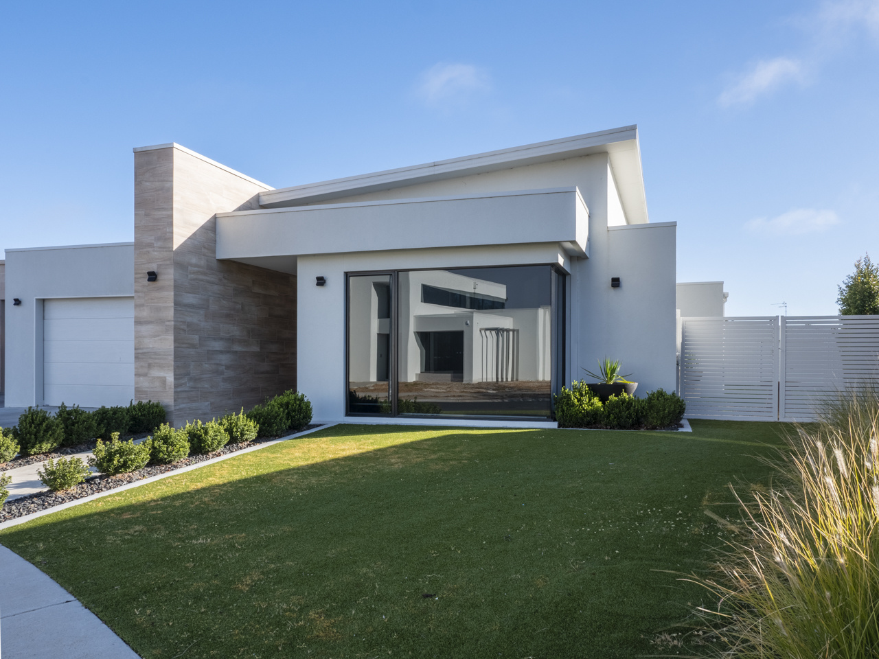
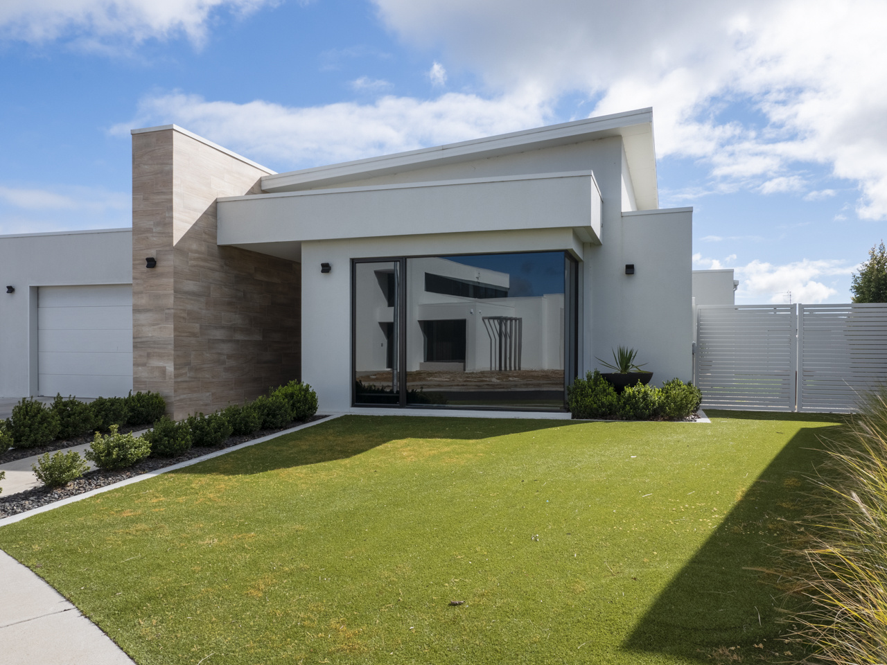
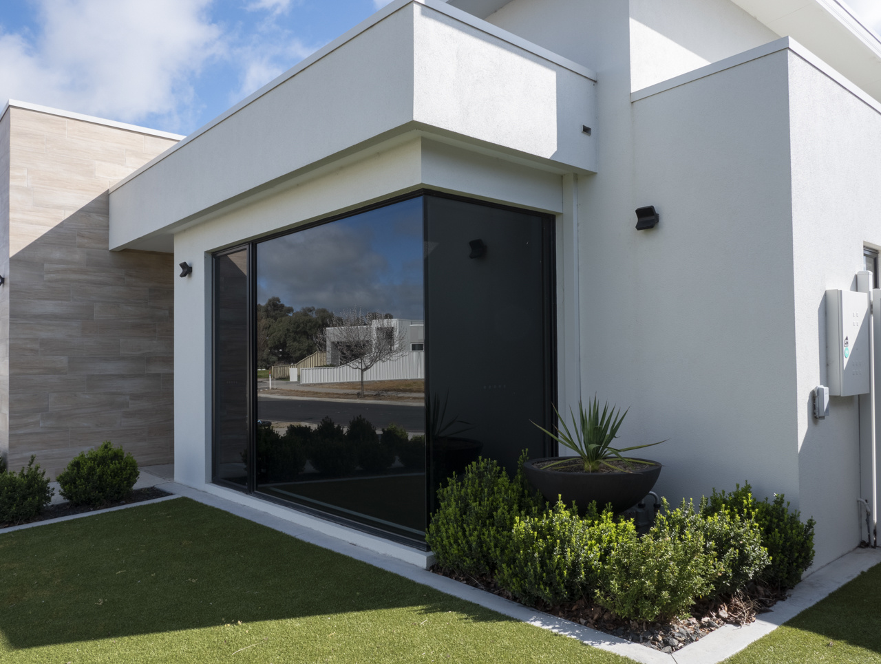
I am based in Australia so please bear that in mind when assessing these photos. This house is south-facing (the equivalent of north-facing in northern hemisphere) and with its position on the block it also gets a fair bit of shade from the neighbour's house on the east side. I shot it at two different times of day. First thing in the morning there was too much shade on the front lawn so I came back and shot it a couple of hours later but now I see a splodge on the tinted windows where there was none earlier. I am not sure if that is a grey cloud from behind the house in the reflection or it is an effect from the window tint.
I haven't spent too much time editing them yet. They're fresh baked and I'm just trying to get a handle on what I need to do next. I made sure my camera was level and I've straightened the verticals. I still have a bit of clone stamping to do over some of the surfaces (spider webs, rain dribble mark down a wall and get rid of debris on front lawn). In your honest opinion is there anything else I should be doing to this before it goes to client. It is going in a brochure that I am also writing up for them.
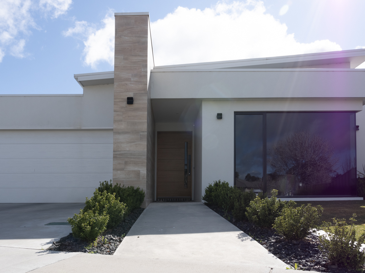
The last photo in the set is just to show you where the sun is in relation to the house. There's also a lighting pole on the nature strip behind the camera and just to the left of the front door so I shot from the left...the roofline was more interesting from this angle anyway.
Many thanks,
Anna


1 Comment
Anna,
I am new here and am just getting back into photography after a 20 year absence. So take what I'm say with a grain of salt.
The first pic looks a bit blue as the white balance is off, but I like the color of the grass and the lighting on the plants to the far right. The second pic has a better white balance but the grass is too yellow. I would cpmbine the two in photoshop, create a mask and blend both.
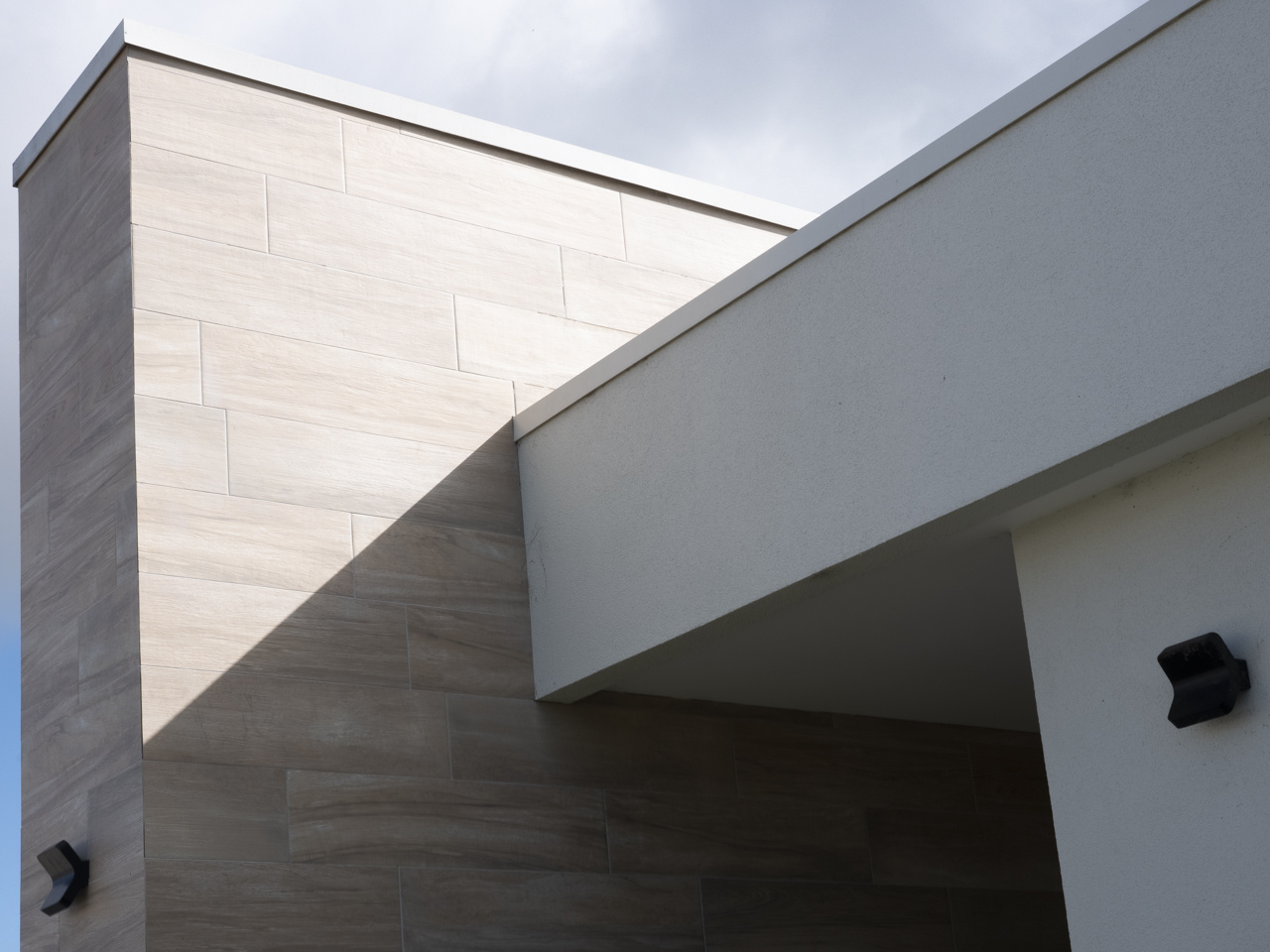
The third is alittle bland, I think and could possibly use a little warmth.
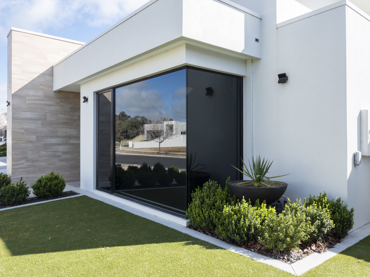
The next two are good, maybe crop out the power box on the right.
The last shot seems too close. The chimney is cut off as well as the roof. If it was taken further back showing the entire building, I think that would be better, unless you were going for a tight shot of the entry, in that case the door is too dark and lacks detail.
Like I said Anna, it's been a while so my advice may be off.
Dave