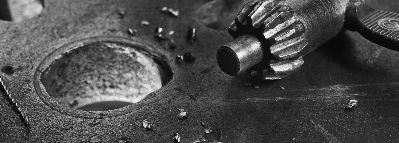
Which One do I Turn?
The velvety patina is just the icing on the cake of this beautiful and unintentional industrial sculpture.
Like good knives, an axe, or the Spitfire, if it looks right, it probably IS right, and if it's well designed, whether by thought and intent, or by gradual refinement and evolution, it's very likely to have a harmonious beauty.
Like this.
Well, that's my opinion, and if you don't like it you can sod off!


2 Comments
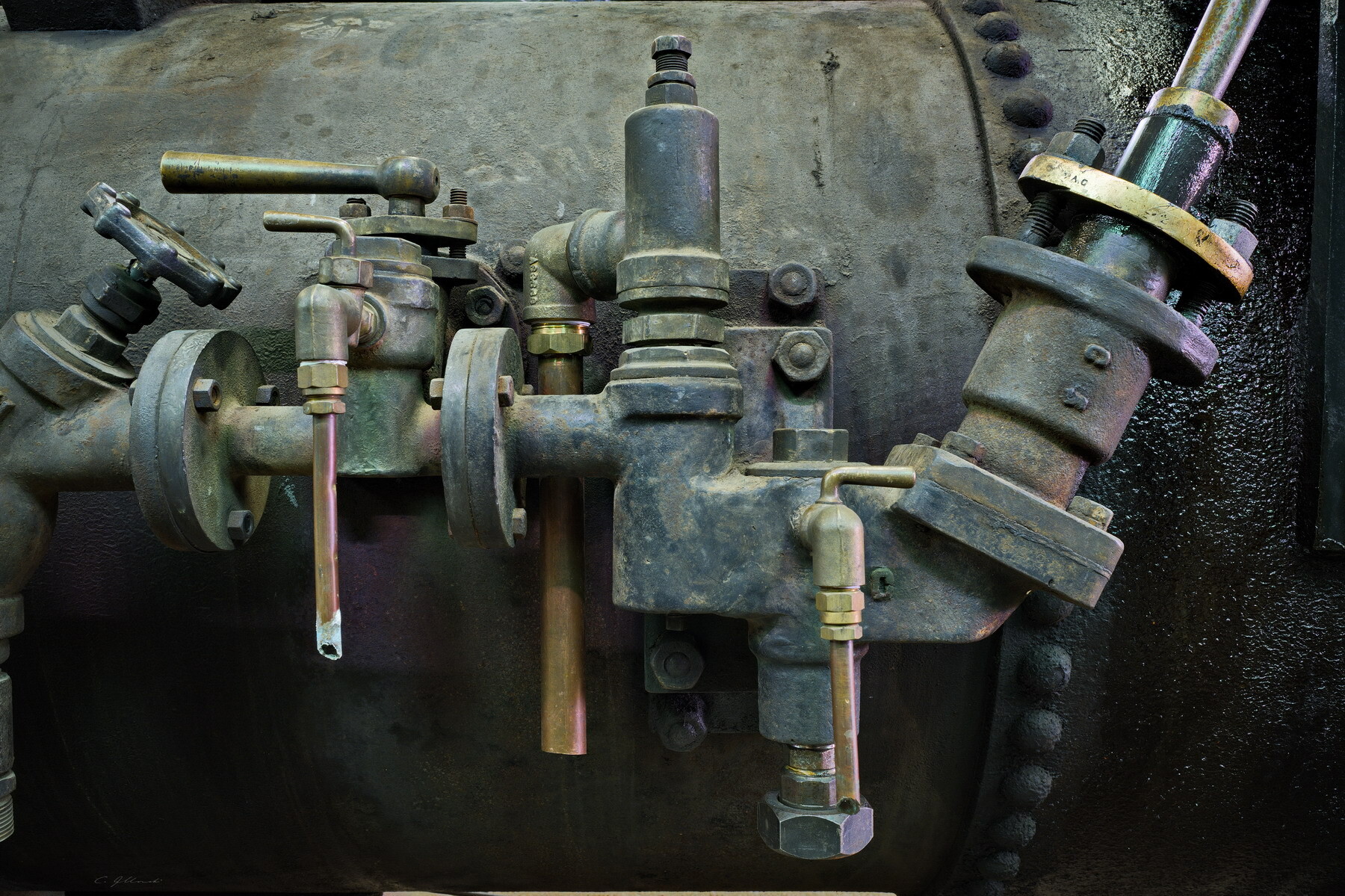
If I'm truthful Chris it's a bit busy for me an I find my eye wandering, eventually drawn to the light area upper right and out of the image. I also find the light areas right at the edge of the left and bottom frame distracting (easy fix....)
I do however like the documentary side of things, with the interest of age and time-worn patina.
As I'm so-so on this and didn't actually state I don't like it do I still have to sod off?
This sculpture has a smaller companion piece, Alan. I don't know if this study is different enough from the main image for you, but maybe you'll at least find it less busy. I am actually torn between the image at left and one showing more of the sculpture.
You're not the only one to comment on the lines at the edge. For me, they frame the image, but I did wonder whether others would react as you have.
I'll take it that you simply think my crappy photo doesn't do justice to an obvious artistic gem, so you're welcome to sod on, or whatever the alternative is to sodding off.