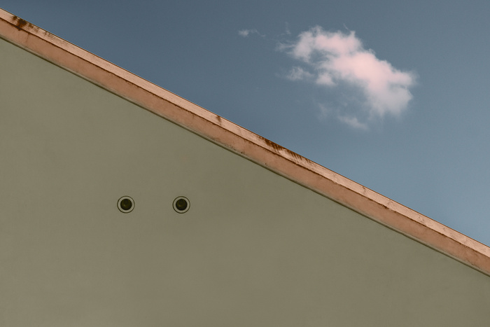
This image shows a very minor part of the 'Bundeskanzleramt' in Berlin.
The original photo was taken last year and heavily edited almost half a year later. I used a more graphical approach by pushing colors a bit the a unnatural feel, but also tried to kept the overall balance and didn't pushed them to hard. I also simplified the shapes by retouching some elements and dirt. But I didn't want to reduce the image just to shapes and colors, so a kept some of the weathering. And finally I composited the cloud into the final image.
So what do you think?
Thanks,
Peter

Interesting image - I would suggest cropping to create better balance and reduce some of the negative space.
Hi Alan, thanks for your suggestion. Good point, I think your version is working quite well, too. I personally would add some extra space with the sky if I going to crop the image this way. Maybe I'll give it a try.
Hi Peter, I agree with your suggestion of adding sky - I think this will improve the balance of elements even further and would love to see the result.
HI Peter - sorry for the late response! I've been away. I like where you are going with this. You have an excellent eye for composition. Balancing the two drain holes with the cloud was brilliant. I like the yin yang architecture thing you've got going here. This is really well done.
Without relation to the original and just in the vein of the experimental, I would love to see this in high contrast gray scale. Too often I see the suggestion of trying black and white on these boards but it this case, I think it is interesting as a second image - not as a replacement of the color one which I really like.
I love your eye for shape and balance!
PS - I do like Alan's crop suggestion.
PS - Please consider commenting on other work in the group. We seem to have a lot of posting and little commenting. It would be great to have your support for other members of group! Thanks!
Hi Ruth, I absolutely agree. There is too much 'passive' activity going on (all over the site). I've not so much time at the moment, but I want definitely add some comments in this group. I promise there will be some more soon. ;)
Hi Ruth, I've trouble writing comments within certain posts in fstoppers groups. I cannot save the comment, because the 'post' button doesn't appear, only in posts I created myself. It's weird and looks like a ugly bug. Let's see if the support can help this time.
Hi Ruth, many thanks for your works. I appropriate your response. I did so much high contrast minimalist work in the last couple of years, so I did need a different style for a change. ;) But yes, maybe I will add a monochrome version of this, especially together with the cropping suggestion Alan did above.
I also tried a high contrast color and that was cool too. I think it is the increased contrast that makes this pop. It is a great shot regardless!
Cool! The more I look at this image, the more it intrigues me. :)
(Is it unsophisticated of me to wish that maybe there was a little horizontal smudge of dirt a small distance below the two drain holes, right about where a mouth would be?)
Yes, it is, Evelyn, but that's OK. ;-)