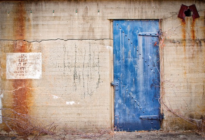
Friends here know that I can't pass up a decaying building. Walls with cracked paint, rust, crumbling cement .... heaven! This past weekend I was at Sandy Hook, a large old military base that is now s state park. I think I've documented most of the doors and windows there. Here is one of the blue doors. I love the colors and textures here.
Alan - I chose to post this one because of the 'level or not to level' comments on your recent post. The top of the door here is perfectly level however the ground is not and the rows of the concrete might not be either. The building is old and settled. I don't know if it would benefit straightening based on the ground which is a stronger line than the door top but the picture looks off when I tried it that way. So what do you think? Straight or crooked?
Feedback always welcome!

With level ground...
I know you didn't ask my opinion, Ruth, only Alan's, but that doesn't mean you should be deprived of it!
The second image looks terrible to me by comparison! The first looks OK at first glance, but closer inspection (OK, my software) suggests it's rotated about 0.7 degrees ACW. I've corrected it as best I could in this edit, which also uses -2 (out of 100) of horizontal convergence correction. It doesn't look quite right, as the bold dark line marking the top of the door slopes CW a bit. So I'd dial back the rotation until it looked the best compromise.
What do you think?
BTW your images of the windows and this door in the building leave a fair bit of chromatic aberration (colour fringing). If it's visible at this res...
But more importantly, I like this image a lot. Maybe a pendant with one of the window images. In your forthcoming Grimescape exhibition.
Your opinion is ALWAYS wanted my friend. Your leveling looks best. I thought this would be an interesting one because I like the composition but it is so out of whack! I also agree about the color issue. Thanks for pointing the out! More grime and decay to come.... :)
Ha, my kind of image! I love the character of old buildings and decay (not talking about you Chris.....).
I do thing that the verticals either need to be true or angled to such a degree that they don't simply look out oi whack.
I think Chris's edit does look best. I'm left wondering if there is another/additional version you should try, with a vintage/grungy feel to better support the decay.
Just a thought as I think this is great as-is.
I agree with Alan about the verticals being most important. Up and down are always up and down ie. vertical. Horizontal lines may or may not be horizontal and still look "normal" due to perspective shift. If the verticals are leaning over, it looks wrong unless there is a serious reason to do so. I recall the first time I saw Kazan's "East of Eden," which has the camera at an odd tilt a lot, and I found this visual effect quite disturbing. Of course, with Kazan, that was the point. I did not understand this until later.
great points Andrew! In retrospect, I think I have worried too much over the horizontal when it seems so obvious when you point out the "up/down" standard as you have. Thank you for your time and thoughts!