
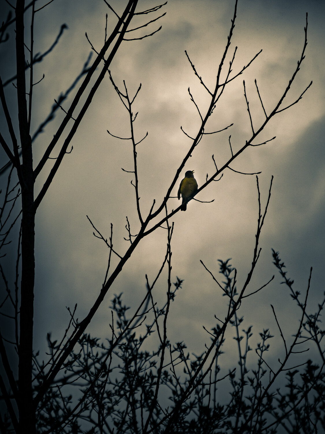
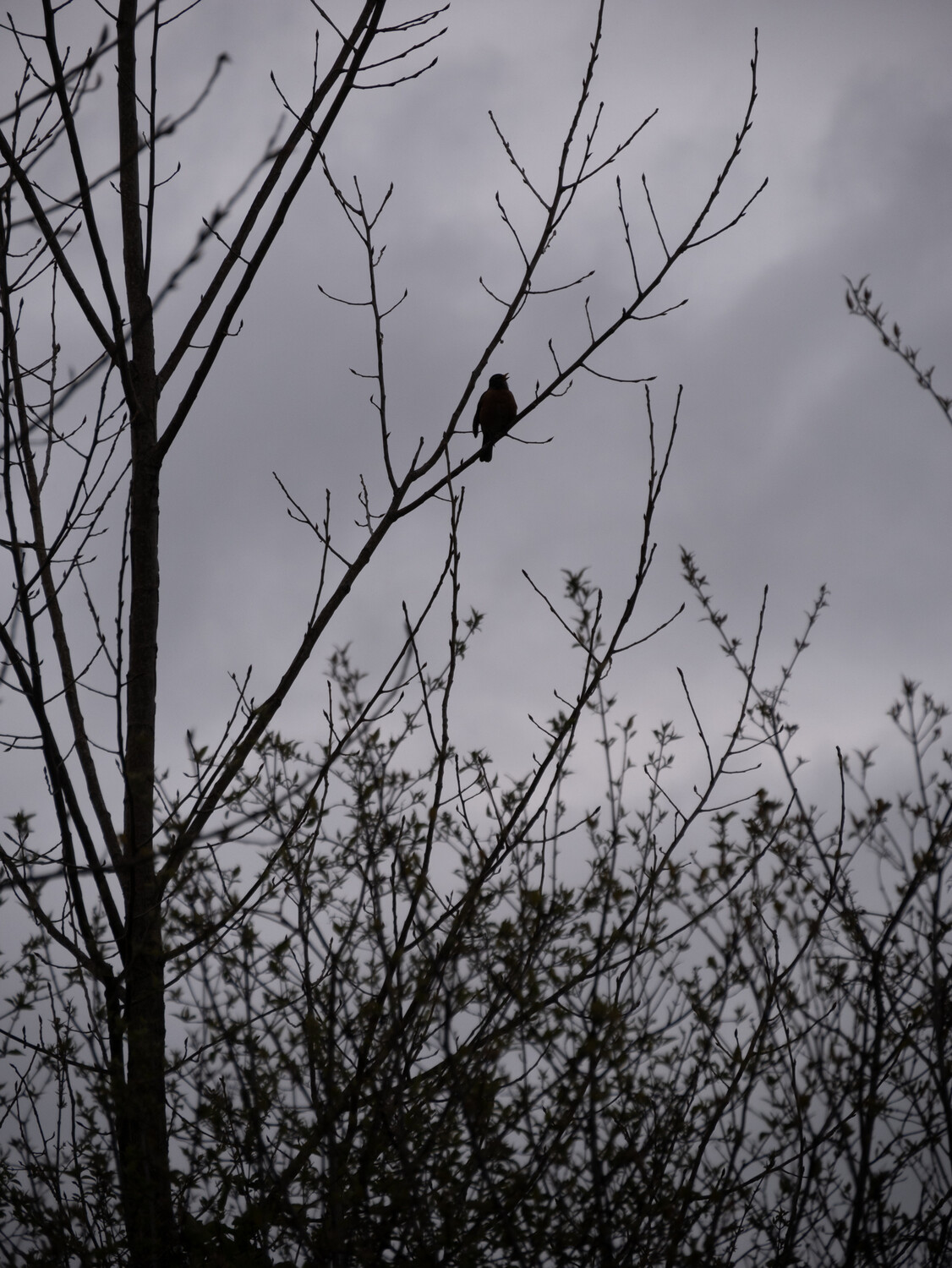
Singing in the rain
A shot of an american robin singing away on a cold, windy, drizzly morning. I went more heavy handed on my editing this one than I usually do. Playing around with tinting the highlights and shadows. Wanted to keep the shadows cold and blue, but tint the highlights orange and warm since it's a robin singing not a crow, raven or vulture lurking in the shadows . I've included my edit and the original out of camera shot. Looking for thoughts and input. Did I go too far, not far enough, the complete wrong direction? Thanks for you thoughts.
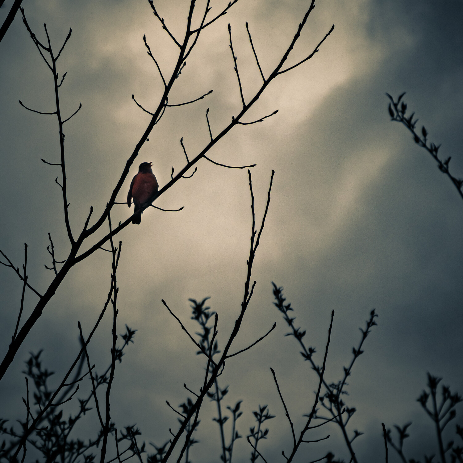
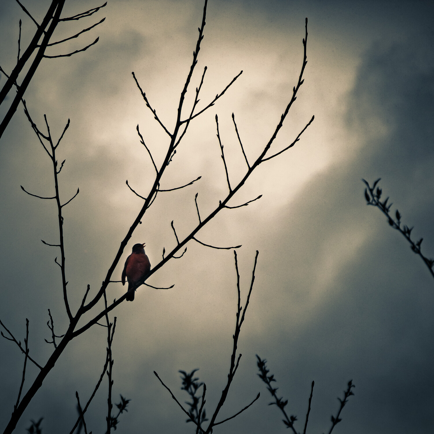
Edit I added a version with the robin changed to a more red orange tone than the yellowish I originally had. Also added a few off center cropped versions and an uncropped edited version.


11 Comments
I dig it, it's dark and moody.
My suggestion would be to try to bring back the color in the Robin. An "American Robin" has a Red/Orange'ish Chest, and the "Yellow-Bellied Robin", is well, Yellow. I only mention this as the edited version of the photos appears to be more a Yellow Bellied Variety.
Easy enough to fix if his belly is indeed Red. Bring the original file in as a layer and place it over the edited version, adjust size and scale to match by switching the top layer to "difference", once done place back to "Normal" overlay. Now just adjust the robin to color, switch the mode to "Color" overlay, add a mask (invert mask) then paint him back into the edited version.
Just my two cents, nothing more. I've been hooked on birds myself lately. :)
Thanks for the input! I had it a little more red orange, but it looked too much like spot color for what I was going for. I'll play around with it a little more and see what I can do.
How does this look to you.
I like this version, it doesn't read as 'spot styalized' to me. It's dark, moody, and feels vintage.
Thanks before I was trying to increase saturation, didn't realize what I needed was more of a color shift than more color.
Good job, Troy. I think your edit tells the story much more than the SOOC image. Your incorporation of Joe's idea completes it.
BTW as the original poster you can edit the left side, including adding more images, so you could post your re-edit there, enabling viewers to toggle directly between them. Just bear in mind that you might be wise to edit the text too; otherwise some of the early comments may no longer seem to make sense to new viewers.
I love the way you've edited this. So dramatic! I think this is terrific.
Normally I'm not a fan of centered subjects but there is a "star if the stage" vibe going on here that works. Just for fun, I'd love to see an off-center crop with your editing. There wasn't enough room on the right of the edited version to illustrate the suggestion. This might work or it might lose something without the tree trunk. Just a thought. Regardless - love what you did with this!!
Thanks Ruth! I'll try an off center crop later.
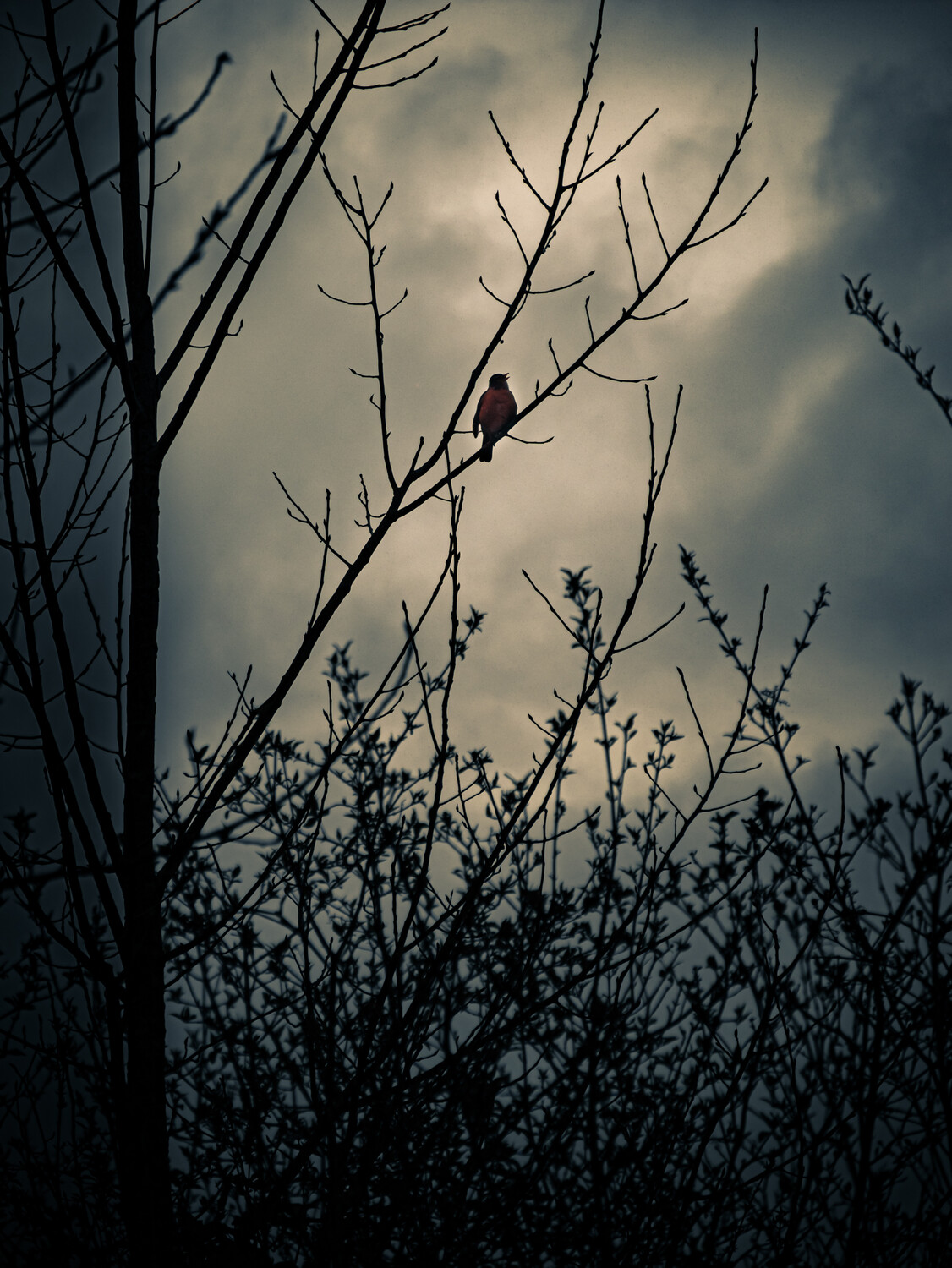
I added a couple off center crops and an uncropped edited shot. I think it loses something without the trunk though. I like the uncropped if it was printed large. On my screen the bird seems too small and /i cant really see the open mouth.
I don't know - that third one down is really nice. Because the bird is a larger in relation to the rest of the image, I get more of the story of him singing his heart out. And I like to red breast being more visible here too. :)
Thanks Ruth! Perhaps you're right. I do like it better today with fresh eyes than after I finished the edit.