
Color/BW
I have been thinking about the difference between color and B&W images, specifically about when one works better than the other.
Tonight I was listening to "Music for the Gift," a 1998 album by Terry Riley recorded in the mid-sixties. You've probably never heard of it. I had but never heard it until a friend gifted me with the MP3. Very weird stuff. It put me in the mood to experiment.
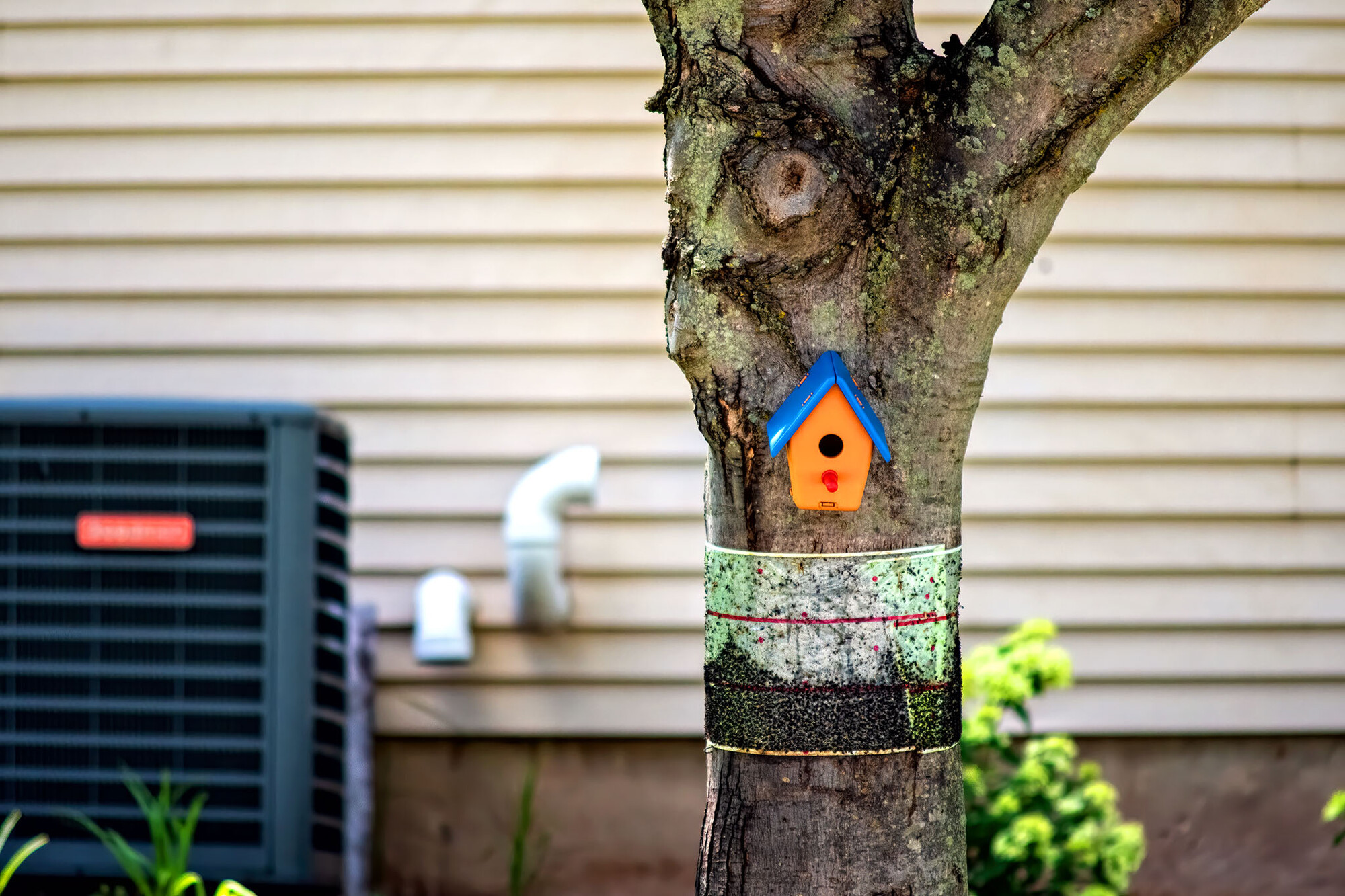
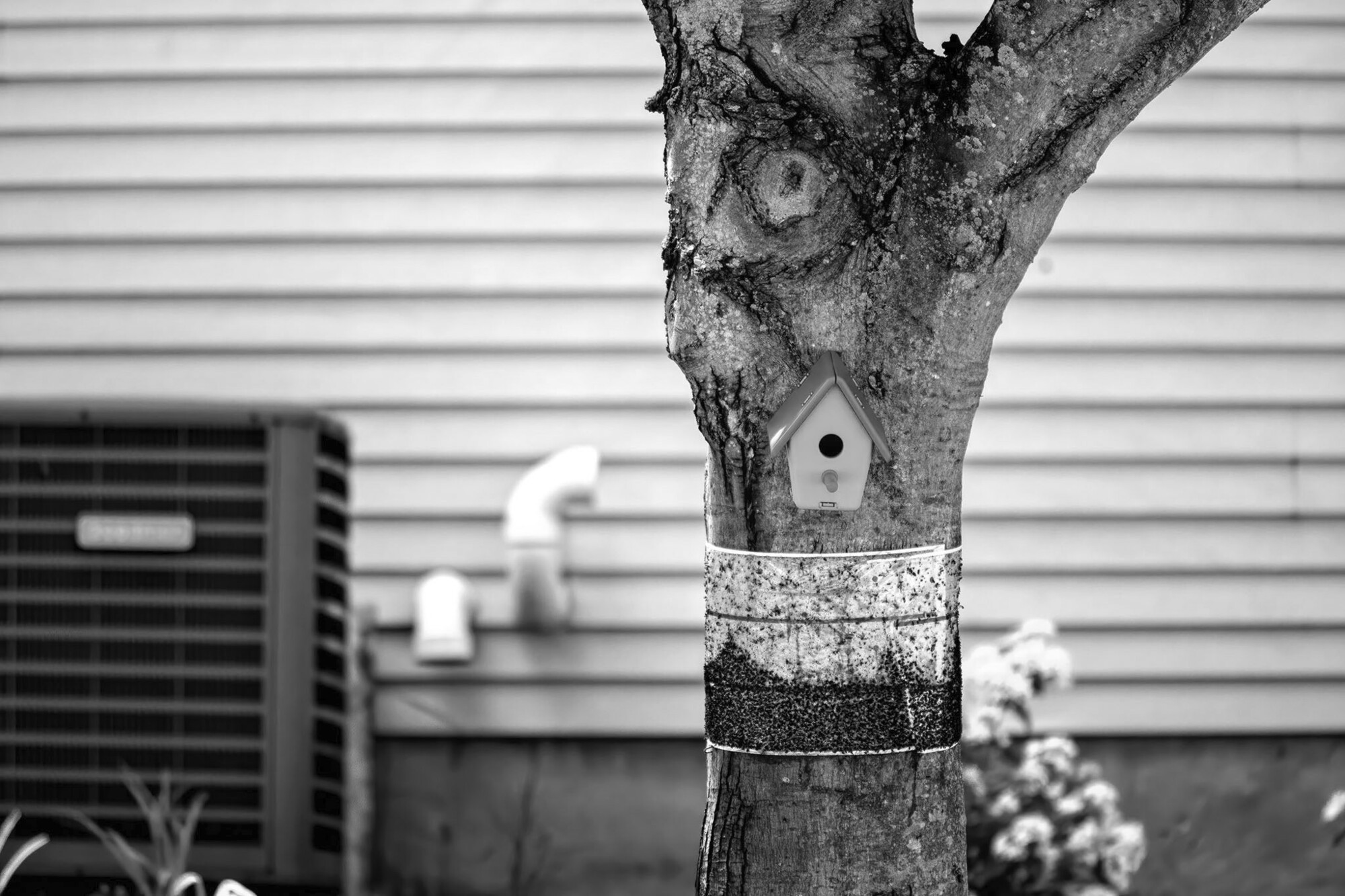
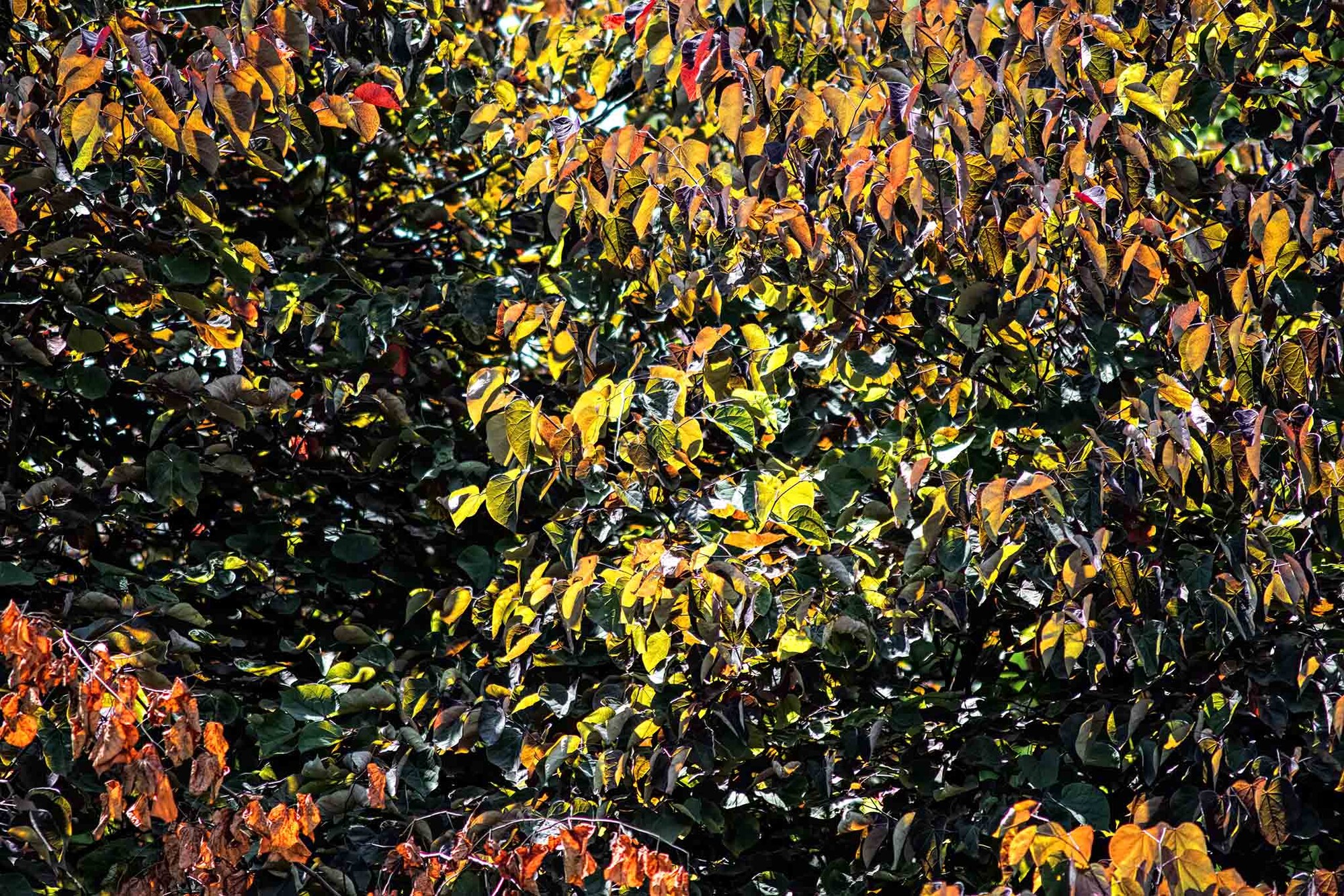
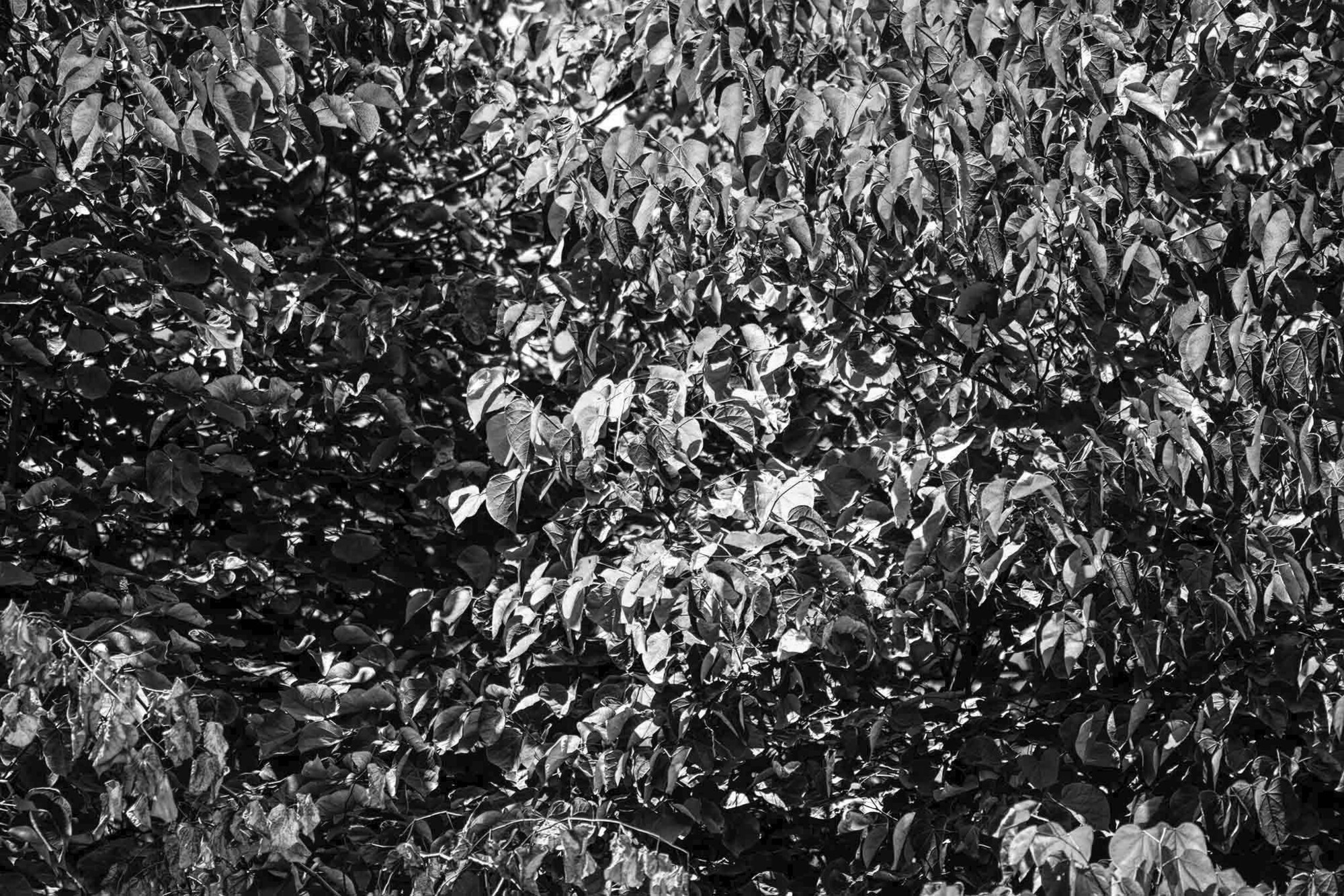
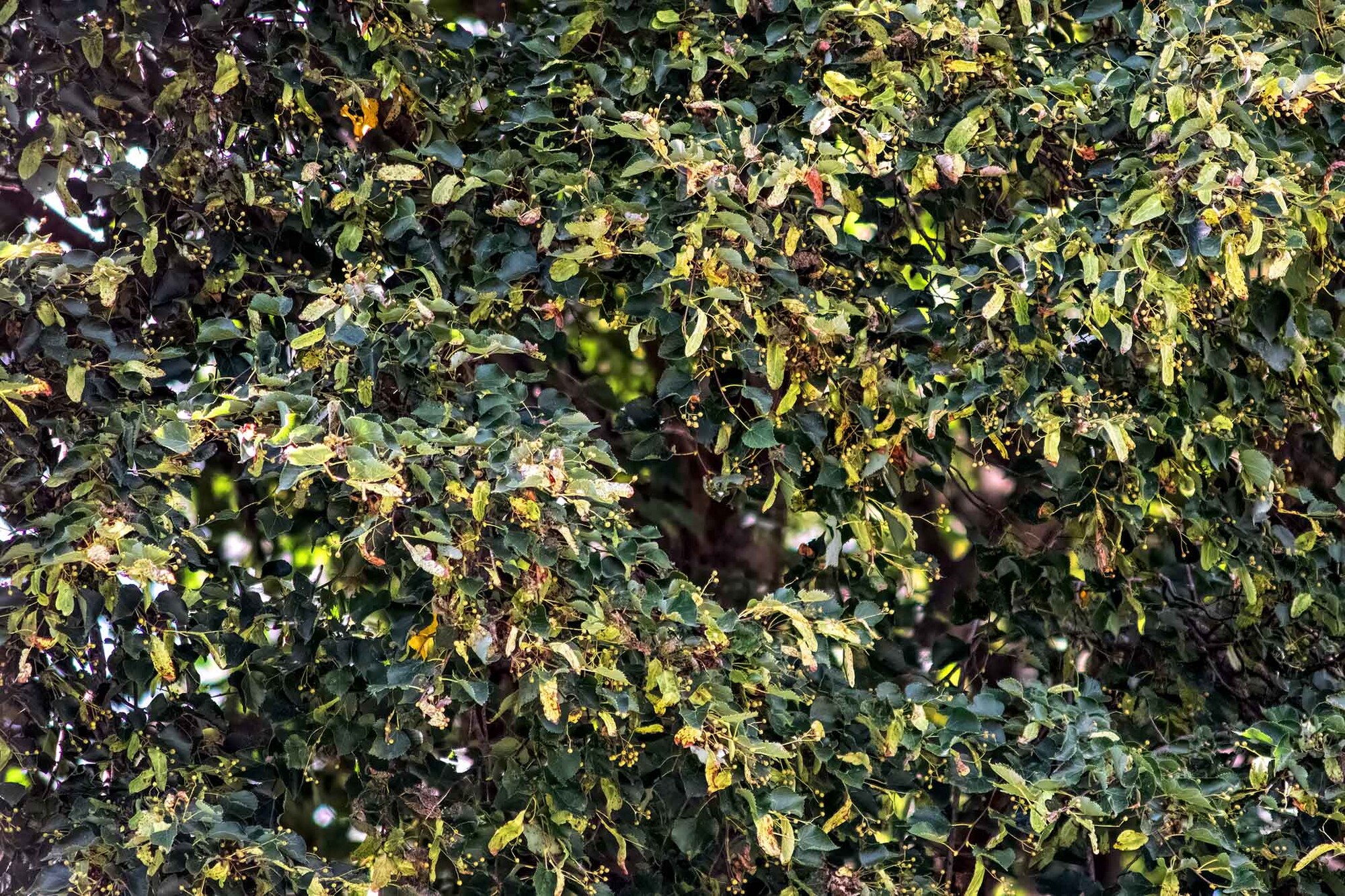
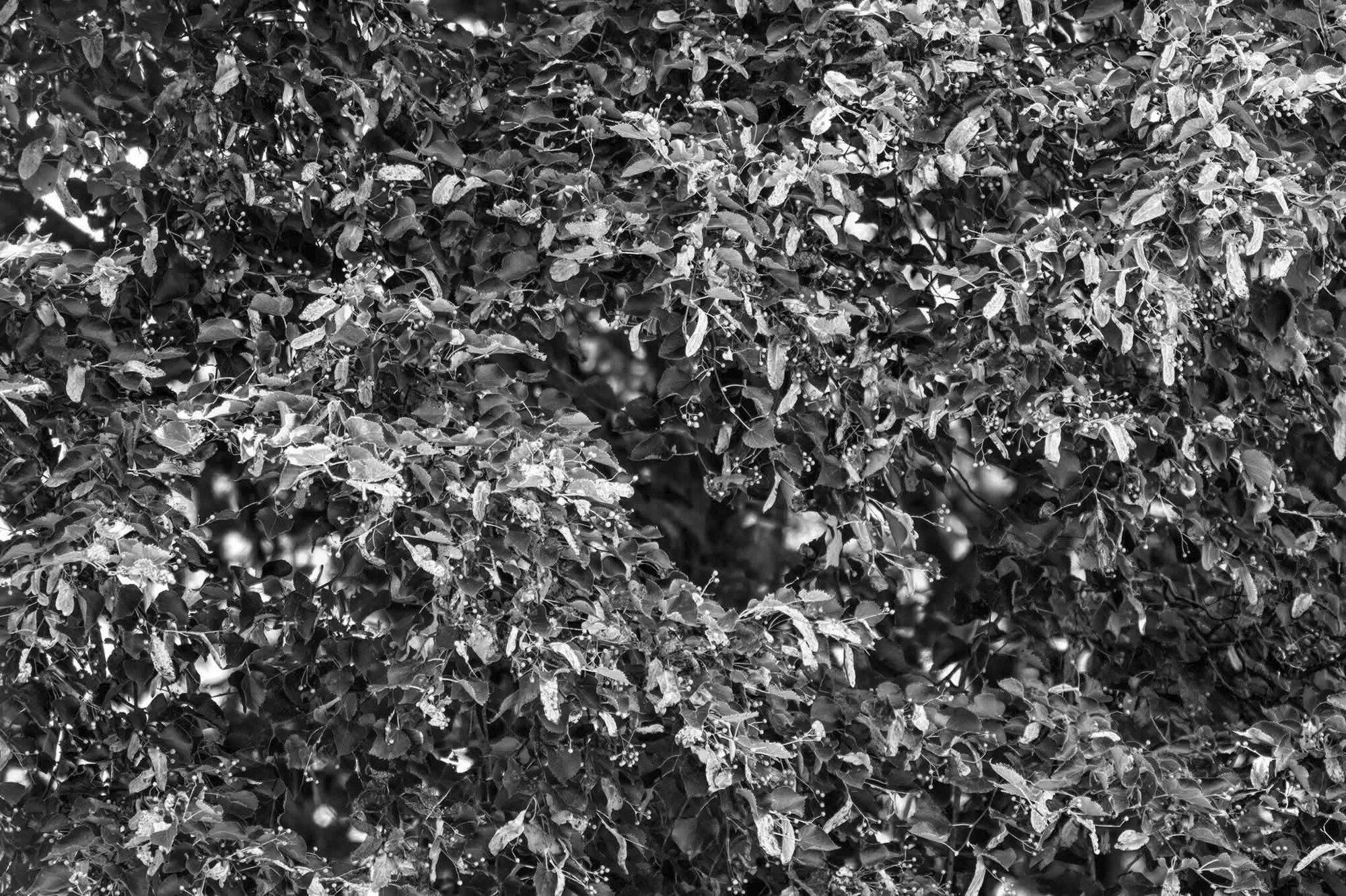
These are color and BW versions of three images I shot last week, processed, and stripped the color information. To my eye, it is obvious which ones work and which ones do not, but I am no closer to a cohesive theoretical framework.
Harry has been no help whatsoever, as dogs are color blind. He did pee on the middle bush.


4 Comments
Never short of an opinion, Andrew, I'll wade right in! I'm an avowed colour fan generally, and am often motivated to make an image by colour, so that's my bias. However, some of my favourite photographers are known for B&W work. I'm a fan of the visual arts generally. I can't share the viewpoint of some, that B&W conveys the essence of a scene, as a generalisation.
I have found myself developing some of my own images as monochromes, and have set out to make B&W images, looking for a suitable location e.g. a tree outlined against the sky, especially a leafless one.
With your images here, for my tastes in the first pairing the mono DOES somehow capture some essence, and the colours, though interesting per se, detract.
The subsequent images both work better to my eye in colour, which gives them more depth and structure, whereas the mono looks a bit chaotic (rather than, say, creating an interesting overall texture, sometimes very effective).
Interesting questions you raise! Thanks for this thought-provoking post.
Hi Andrew. during my present growing stature in photography have slowly and steadily started developing clear inclination towards particulars. Have not heard the music you mentioned and will not be able to relate to the inception reasons of your frames. with that attempting to share my reflections.
IMAGE 1: for the nature of these frames my perception was looking for any focal element to hold to. the bird house provided that. (am ignoring many distractions though). Colour image scored the distinction. However, with conceptual processing of BW, it may have better potential.
IMAGE 2: unable to find ay interest in either. (could not relate to the music as yet). BW may be taken for further processing of contracting elements potentially
IMAGE 3: Felt mid-tones of green soothing. however, interestingly, BW has a hidden serpentine wave of shadows for me. That can be exaggerated in processing and right cropping.
Feel free to ignore anything you do not appreciate. Good day !!
Hi Andrew, there's no hard and fast answer to this. My feeling is that B&W works best when color becomes a distraction within the image, drawing greater attention to contrast texture and form.
B&W also provides the greatest processing options, as the brightness of each color can be adjusted to balance the image.
Color works best when it is used to support the composition.
Both can be used to advantage by leading the viewers eye (B&W to light/sharp/contrasty elements, color to vibrant hues etc).
I actually wrote a blog entry on this some time ago - check it out if interested;
https://www.alanbrownphotography.com/blog/2018/10/14/seeing-in-black-an…
As for your images I find the first color drawing my eye to the birdhouse, but being pulled away by the distracting red label on the AC (and a little less so by the light green foliage). I think removing the label (desaturate or crop) would help.
The B&W image causes my eye to wander, especially as the brightest part of th image is the pipes & siding (if using LR you can adjust the brightness effect of each color to totally change this).
The others suffer as they don't have a focal point, so the eye wanders around the image with no resting point (subject). I think were you to get a lot closer you can look for a composition that brings out the form and colors of the leaves, or perhaps convert to B&W and create a composition using the light and shade.
A the end of the day it is all subjective so flash the images up and see what hits you in the gut (or Harry's if he's up to it....).
Alan, I agree, now that you mention it, that the red label on the compressor and the green bush behind the tree are distracting, and if when I include this image in the project's final edit, I'll do something about them. Thanks. That one really has to be in color to contrast the birdhouse with the green adhesive tape around the tree. We have a real problem around here with Spotted Lanternflies (SE Pennsylvania,) and that tape is one method of minimizing their impact. However, birds, squirrels, and other small critters can get caught, too. So, I thought it strange that someone would place the birdhouse and tape so close together.
As for the others, I like their cropping the way they are, and they, too are part of an ongoing series that I have tentatively labeled Chaos. I think #2 works better in color and the third may well be better in B&W. This may be because #2 simply has more "hot" color.
If Harry cannot sniff it or pee on it, he's generally indifferent.
Thanks.