
MANIFESTEATION !!
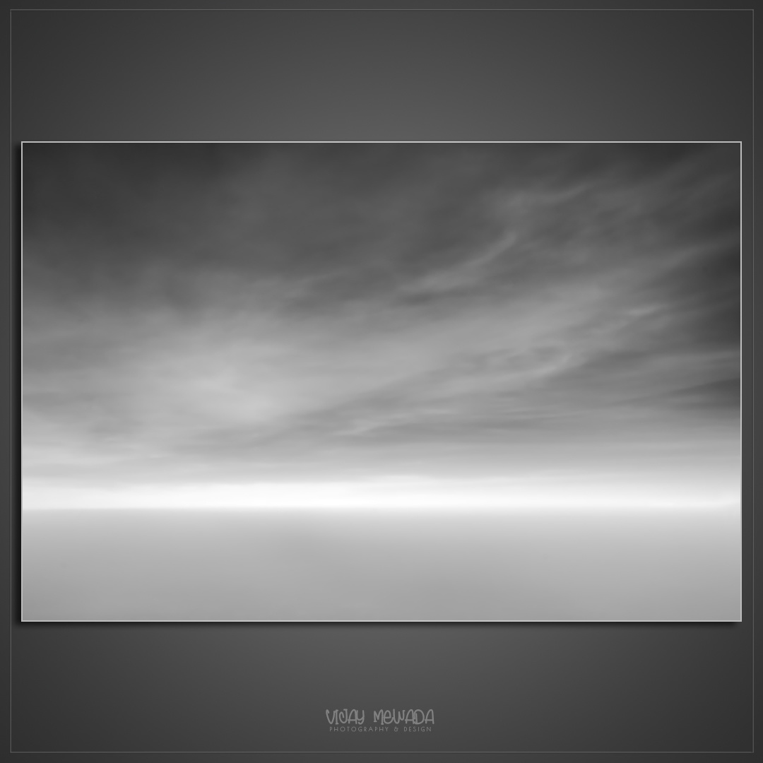
36000 ft above all the disturbances. With "Outer" and "Inner" a little closer.
Black and White conversion is through PS. Applied all that I learned to achieve the calm and serene mood. Yet I feel the image is yet to reach there.
Any creative input and pointer will help growing my art. Inviting Critical comments.


21 Comments
I love this. The softness, calm as you say, nice tones (in my opinion).
My only critique would be that your whites at the horizon line look clipped?
If they are, you can create a new layer, mode to "darken" and Clone-brush in some detail from another area of the scene, then reduce the opacity of that new layer to like 15~25%. The idea is to bring in just enough information to remove the clipping (if it's clipping that is).
Hi Joe. Feedback is appreciated. Will surely try that.
I wanted the white line to command the final attention. perhaps it got clipped without realizing.
Thanks.
I think it's only clipped in the very middle, not significantly, Joe. Here's what my software shows:
Ahh gotcha, I was just eyeing it and should have checked.
After checking and getting the same result... I will say, even though it's technically not clipped, it's really close, even for the software... Which is probably why the eye preceded it as such even though it's not.
Joe, I moved on from LR. while working in PS, I ignored a thin line on white at histogram. I though that much can be acceptable.
Its all good my friend, it's all good. I stand corrected.... I still love the image and your style. :)
your comment was all fine. I learnt about the suggested technic in workflow.
Hi Vijay,
I love the mood and feel of the image but to address your concerns i played around with tje saturation, contrast and brightness.
The differences are quite subtle... Have look and i hope this might give you some pointers...
Hi Mike. Appreciate your time in suggesting these versions. will surely refer them in attentive compassion.
Thanks.
Lovely image Vijay. I agree absolutely with Joe and his recommendations. Assuming clipping the white would just need the slightest of detail, a mere hint.
Other than that the only thing I can suggest that you might try is to add a slight exposure gradient from the bottom.
Hi Alan. your suggestion is interesting. Will surely check the same.
Hi Fellows. While discussing a thought occurred. among the 2 rotate versions, which one appeals most to you?
My take, and it's probably due to playing a sci-fi table top games at the moment..
In the first image I feel like I'm in a spaceship flaying "under" a planet with the star just about to appear upon the horizon.
In the second image I feel the same but flying "over" the planet.
In this context I feel the top image portrays a moody or foreboding feeling while the second just the opposite, a sense of freedom or liberation.
Joe. Thanks for sharing. The Top image is the original version. 2nd image was rotated.
You've achieved what you describe very well indeed for me, Vijay.
I'm curious, though, about your presenting the photographic image itself on that dark grey background with the narrow white border and drop shadow. I don't recall you doing anything of this sort before. Is this specific to this image, and the mood you were trying to convey? Or perhaps a more general style of image presentation you intend to use more broadly?
Hi Chris. Different portal on social media has different standard of image sizes and acceptability. in that jargon, I thought square was the best suit. However, for me, actual size of image depends on the content and not what they want. so mounting on square format was solving the issue of both worlds. After trying out different colours, Grey was considered (by me) kind of universal background.
having said thus, am open about any other interesting suggestion and possibility.
I can follow that logic; a way to control whats being seen on sites that cover the spectrum of differing styles and requirements.
I, myself, have been hooked on 5% white boarders as of late... On white sites the images appear slightly smaller, but on black sites the contrast "cleanses the eye palette", so to speak.
The grey backgroiund and the whole effect is very attractive to my eye, Vijay. It enhances the mood you wanted in this image. You have gone to some trouble here, with the subtle tonal gradients in the grey. I imagine it will also work for vibrant colour images, but I'll be very interested to see if you think it works in the long run.
I've faced a related question in looking for a universal framing solution that suits all images adequately, if not optimally for each one, so I can swap prints within a frame over time. It has worked reasonably well with a pale grey mat - much paler than a grey card or your borders here, which look very classy.
Chris. So far my solution is working for varied images. let's see how it goes further.
Chris, what's your take between 2 versions of rotation I posted in comments.
I'm a bit of a purist, Vijay, so one has to be "wrong"! My gut reaction to each is much like Joe's. They both look OK, but the version with clouds at the bottom seems likely to be the original, given your introduction, so I'd go with that one. As originally posted, it could be a seascape.
I like photography as some version of what the photographer actually perceived, rather than viewing the camera as being a source of material for photo-based art. That's just my bias; others including Alan Brown here, view this differently.
Then again, maybe you did a headstand in the plane to take the photo, before the cabin crew subdued you. You enigma, you!