Modernism gone silly...
Thought I'd share a couple of images of a gloriously silly bit of Modernist architecture. An ocean liner on the beachfront!
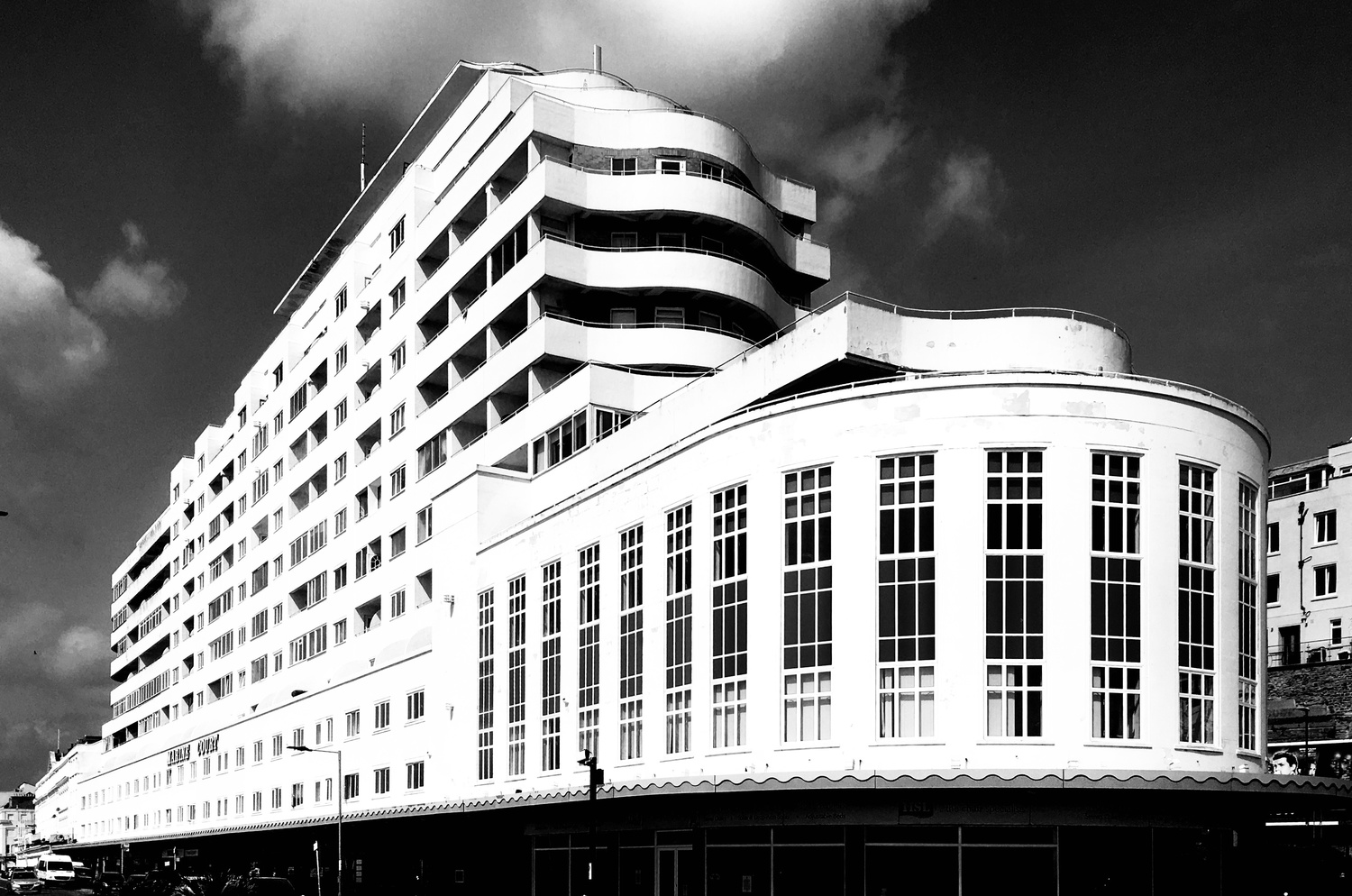
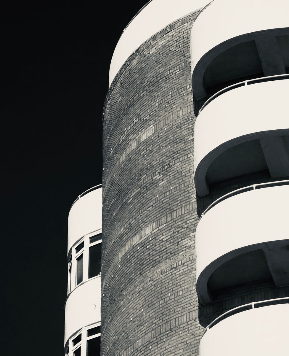

Thought I'd share a couple of images of a gloriously silly bit of Modernist architecture. An ocean liner on the beachfront!
Was down in Austin for a bit on a work trip. I've always heard how beautiful the skyline is from the river.
Was a little let down by the clouds, but what can I do!
My two favourite images from my recent night time adventure in Tenerife. Foregrounds and skies were shot separately and blended in PS.
Hi all, I was looking for such a group but see that although there are many members there hasn’t been a single post. Is there interest out there in getting this group going?


6 Comments
More fine images from you, William! You have any eye for these wonderful buildings. You might like the monograph "bau1haus" by Jean Molitor (Hatje Cantz). a fine celebration of this style..
Since I presume you're interested in CC, I'm curious about your handling of convergence in these upwardly-looking images. It's perfectly corrected in the first wide-angle image, which EXIF suggests was taken with an iPhone 6s. I thought you might have used a shift lens. In the second, with narrower field of view, it's still present. I think the image is rotated a bit as well, the combination making the white part at right tilt in a bit much, to be a slight visual distraction for me. I've corrected these here as best I can, at the cost of a fair bit of cropping. Sometimes leaving a little residual convergence prevents a "looming" effect, which I think is arguably just evident in your first image.
Any comment?
Hi Chris. Thanks so much for the feedback. You are absolutely right about the second image. It was shot with a different camera (Fujifilm HS50). I actually made a later stab at the perspective correction myself, (which you can see in my portfolio), but it was done using phone-based editing software, so it’s quite crude and doesn’t fully fix the looming problem. Your edit is so much much better though! I saved yours alongside it so you can see the difference. Oh, and I finally fixed that unintentional ‘silver tone-like’ issue that it had. I really appreciate the time and effort you gave for this valuable feedback! Huge thanks Chris.
Chris. Just checked out your book recommendation. Exquisite stuff! I am an architect myself and have always loved the (perhaps) naive Utopianism of that era. It feels like architecture that thought better of mankind than mankind ultimately thought of itself. I’m only just getting back into photography at the moment. It was an indispensable design tool and process for me when I was young and everything was analogue! I still have my old cameras and lenses though, but it’s increasingly difficult and expensive now to get film processed and printed.
You're welcome, William. I'm flattered to be the retoucher on your portfolio. I've just given us 5 stars! ;-)
I loved my Kodachrome, but once I went digital there was no going back. Especially when it comes to the "digital darkroom" and producing a colour print. I'm still blown away every time one comes creeping out of the machine. If only we could have the watery gloss of Cibachrome (without its colour shifts).
😆 Kodachrome was superb. I shot a lot of that. Ektachrome was my favourite though. Slightly cooler and with less latitude but sharper than a gnats needle! Never did my own colour processing though - I always talked Joe’s basement into giving me mates rates! Loved doing the black and white though. Kinetic photograms onto Ilford multigrade... Aah... happy days!
These are great William! The high contrast perfectly brings out the lines in the architecture. I particularly like the second as the texture of the brick is a great foil to the stark blocks of black and white on the sides. Very nicely done!