
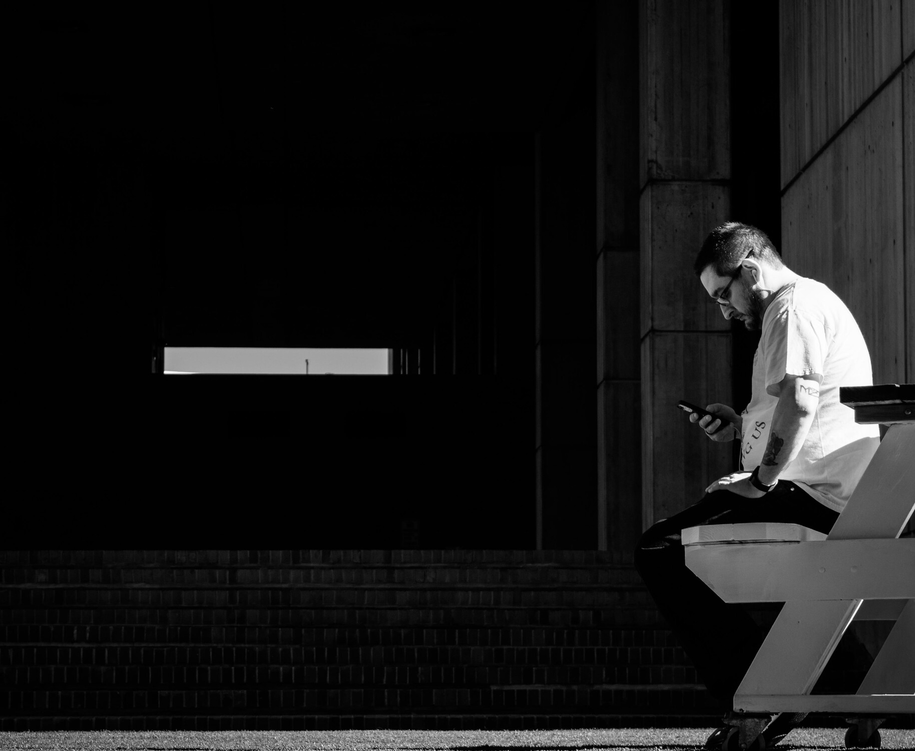
A question of balance
Just throwing this out there to allow the community to add their critical feedback.
My intent was to use the light coming through the structure as a visual counterweight to the subject.
What are your initial gut feeling on this (ie the feeling you have BEFORE your mind starts to analyze)?
I'd love to hear comments from novices as I often feel they are more driven by emotion and less encumbered by rules.
All opinions are respected equally, none can be wrong.


17 Comments
A questions is, where is the eye drawn? In the image as it appears on this page, my eye is drawn to the man; however, when I click on the image for a larger size, my eye is drawn to the light coming in through the structure. Which do you want?
Thanks Chaz, great question. When I first took the image my intent was to attempt to create a balance between the light on the left and the bulk of the figure.
However, this turned out to be a great example of discord, with as you suggest the eye bouncing between each of the light areas.
A little less black from the top and left. Too much empty/"boring" black. (Though that 2 o'clock line above him shouldn't be cut off.) More bright border on the bottom and on the right. The man/main subject is too far on the right. A little more highlighting of the steps. It would have been more interesting with him looking straight ahead... "what is he looking at/contemplating?
looks like his cellphone.
I was saying, IF he was looking straight ahead, it would add to the story/mystery - the addition of "what is he looking at?"
Oh, misunderstood.
:-)
Thanks Charles, I know what you mean on the gaze. I still think the subject needs to be to the right, but to work I would have to reduce the visual weight on the left
Thanks Charles. I love the way you have thought about this and ways to 'fix it'. I think the fact that the man and the rectangle are competing against each other means the image can never work as intended.
If I were to process further I think I would try and bring up the shadows in the area surrounding the rectangle to lessen the stark contrast (and visual weight) and draw to the eye.
I find the center rectangle perfectly fine. I call it balance.
Hi Alan. For me, the left rectangle is distraction. However, any elements connecting the rectangle and human subject would be a meaningful story.
Cheers.
I agree wit the distraction Vijay, more so a competing element demanding attention.
Alan, For my academic learning i had thought about one possibility. did not post it though.
the vertical columns could be seen in fading light continued till the window opening...this would create depth as well.
I dig the (im)balance. For me, it’s pretty obvious when photogs who know the “rules” are breaking them on purpose. The shot loses me because of the guy, but in fairness you weren’t asking about him.
Totally agree your observations Robert. This WAS a conscious attempt to break the rules but my plan for balance just didn't work out.
Thanks to all who took the time to look, analyze and comment. I did put this out there to generate discussion, as I think that is healthy for the growth of us all.
This is an image that I have played with many times and never been able to get away from the contention between man & rectangle.
Thanks for being brave enough to return honest opinions, that's what these discussions are all about.
One of the possibility. 2 min quicky to make the point...