
A Bridge Too Far?
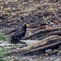
I was having fun at Henderson Falls late in 2015, and saw a beautiful detail - green moss (maybe liverworts - you experts can tell me) on a glistening black log, which I thought could make a great, basically simple image: a black-and-green diagonally divided rectangle, like a flag, but with the beautiful natural textures to enrich it.
Back at HQ, the reality of the capture fell short of the vision - know that feeling, perhaps? Sigh... ;-)
Just for fun, I set to work - for a long time, as it turned out! - trying to approximate what I'd seen in my mind's eye. The end result was my "flag". However, as I looked at it, I thought it departed so far from the reality that I have held off using the image or putting it in my portfolio, even though I do like it. Was it "cheating" too much? Am I true to my idea of showing the wonder of the world I saw, rather than what I might have seen, or wish I'd seen, but didn't?
My processing skills then were limited. I think I used the equivalent of LR (ACDSee Develop mode) for all but the final image, which only adds a mild vignette and a signature at bottom left, probably invisible on this FS post. This last step involved Edit mode, more like PS I think. I'd probably use a different technique now, but probably end up with much the same result.
You can scroll through the successive edits to see how it progressed - or not!
PS: I've added a further edit, the fifth beyond the SOOC version, taking it further still down the same path.


15 Comments
It's always super interesting to see another artists thought process over a series of photos like this. I def understand and have several photos I keep going back too as they are not quite reflecting what I wanted to capture. I can see why you were drawn to take this photo, the diagonal with the log and moss is indeed striking.
As far as editing, and over editing goes... This is fstoppers; we do minimal edits compared to others.... To each their own of course, art is..... I feel your edits here have only strengthened the concept and vision of the piece.
"This is fstoppers; we do minimal edits compared to others" - REALLY? Could've fooled me. I'm still trying to work in a sky replacement for this image, Joe. ;-)
I'm a bit torn with it, because the final result looks plausible, but it's so far from reality that it breaks one of my usual principles. I'm not a stickler for principles of this kind at all, more reflecting on my own ambivalence.
For instance, I had no qualms about posting the following image in my portfolio, when it's obviously far from reality. In the case of this B&W image, I was inspired by Asian scroll paintings, so had a "look" in mind, but with the mossy log I just wanted to show people the beauty I'd seen, my usual photographic motivation.
Haha. Gotcha! Though, still minimal edits compared to others. :P But it's all good... you get what I mean. :)
Looking over the progression of photos in the series; with the flattening of the depth of the photo - removing the vignette and the filling in of the leaves.. The photo is becoming more graphic in my view; but not a bad thing at all. I could easily see it as a printed piece up on a wall. :)
I wonder what it would look like with the structure reduced and simplified?
Not sure what you mean by the last point, Joe. Do you mean in effect shooting from a greater distance so the bark ripples look more closely spaced and the textures are finer? I couldn't back off any further as the log was not large & shot from as far away as I could (hence the receding plane I've "flattened" at bottom left).
Different programs call it different things, Clarity, Texture, Structure..
Then there is Structure Simplification which would bring it more towards an "art" edit by removing super fine details.
Here is an example of both, Negative Structure in the first then Simplification in the second.. Toggle between the two.
Thanks, Joe. New to me, esp. simplification. Food for thought. Are your two edits done in one of the regular photo processing programs? Or did you do it yourself from scratch somehow?
Can all be done in Photoshop.. but programs make it easier due to sliders. First one can be done in Lightroom, negative "texture" and "clarity"...
Simplification is easiest done in Topaz Studio using "Abstraction" and utilizes 5 different sliders. It can get crazy but just a little bit cleans out the very fine details.
Both can also be done in Lightroom/Photoshop using the various Art Filters and their sliders. Most of the Art (if not all) can only be accessed (not grayed out) only when the photo is 8-bit. So best to be one of the final stages before saving a version for web (which is also 8-bit). A lot of people use the filter "oil painting" and set the sliders so that the stylized look dose not appear, but it smooths out the very fine details in a similar way..
Hi Chris, I think you know my feelings on manipulation.
Whether is be exactly what you saw (or inspired by?) or what you would like it to be I think unless you are trying to present something as a true documentary then you shouldn't feel guilty about your personal expression.
That said I do respect your need for authenticity.
I understand the feeling of 'cheating when manipulating images using software, but let's face it this is not much different to work formerly done in the darkroom, and even more basically manipulation once made through the choice of film and lens etc.
At the end of the day the result is something you alone have to be happy with, for what it's worth I appreciate all of your edits and feel they align with the concept you were looking for.
To requote one of your earlier comments, perhaps you are being too hard on yourself?
Thanks, Alan. I don't feel bad here; I just thought I'd air my own musings about processing and portraying reality, and the contradictions and tussles in my own thinking, to see others' reactions and views on this.
Specifically here, "flattening" the image to reduce the effect of curvature of the log at bottom left, and most particularly cloning in lots of moss that wasn't there to create the green-carpet effect were things I began to think were lies if not admitted to. Or something like that.
I really like the the second to last photo the best. The rock is brighter, shimmering and the moss is a nice, bright green.
I too, am one of those that finds what's out there amazing and try to make my photos as close to reality as possible. I love subtilty and even "bland" colors. (To me, almost all the editor's choice photos' colors here are a bit unrealistic and slightly bothersome despite the great photography, which is why I've reduced my time on fstoppers. The people in this group are nothing but great though.)
Agreed.
I will say, I do internally struggle with the greens of nature under direct, hard, sunlight; as it can come off as unnatural; but it is natural.
I've recently learned to change the sunlight - shade settings whenever I take a photo.
Man after my own heart, Charles! 👍 Here's to understatement.
Hey Chris, I think my personal choice is your third iteration, maybe because of the increased contrast/darker tones, followed by the fifth. However, if only one version was provided, with nothing to compare it to, they probably all would stand alone as perfectly fine images in their own right.
Thanks for your observations and kind words, PK. The third is closer to the reality in one major respect; the succeeding ones "flatten" the log, which was barely contained in the frame, and curving away from the picture frame at bottom left and top right.